
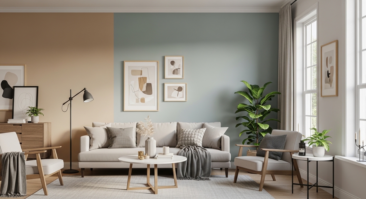
Choosing the right paint color for a living room can transform the space, making it feel cohesive, stylish, and inviting. The challenge is finding hues that complement a variety of furniture and decor styles while creating a balanced, welcoming atmosphere. Designer-approved colors ensure versatility, sophistication, and timeless appeal.
The best living room paint colors adapt to multiple styles—from modern minimalism and cozy rustic to eclectic or traditional interiors. They enhance light, create depth, and act as a canvas for accents, artwork, and furnishings while keeping the room harmonious.
Here are 16 paint colors that work beautifully in any living room, no matter the decor style.
1. Warm White
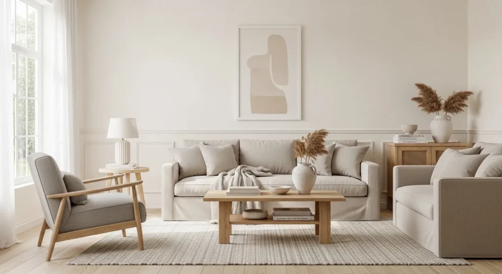
Warm white is timeless and versatile, offering a soft backdrop that complements virtually any decor. Its gentle undertones add warmth while keeping the space bright and airy.
Pair with wood accents, colorful textiles, or metallic finishes to create a cozy yet sophisticated living room. This color provides flexibility, ensuring your furniture and decor always harmonize without clashing, making it perfect for long-term style consistency.
2. Soft Beige
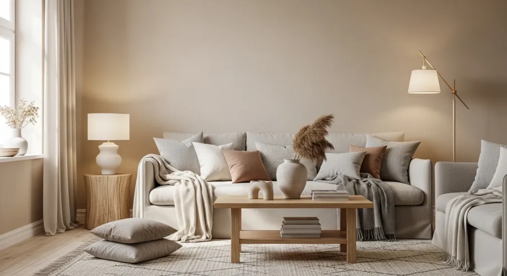
Soft beige offers warmth and elegance without overpowering the space. Its muted tones adapt to both modern and classic interiors, enhancing a welcoming and balanced atmosphere.
Combine with patterned rugs, soft fabrics, or subtle accent colors. Beige provides a neutral canvas that ties together furniture, decor, and lighting, making the living room feel cohesive, stylish, and versatile.
3. Light Gray
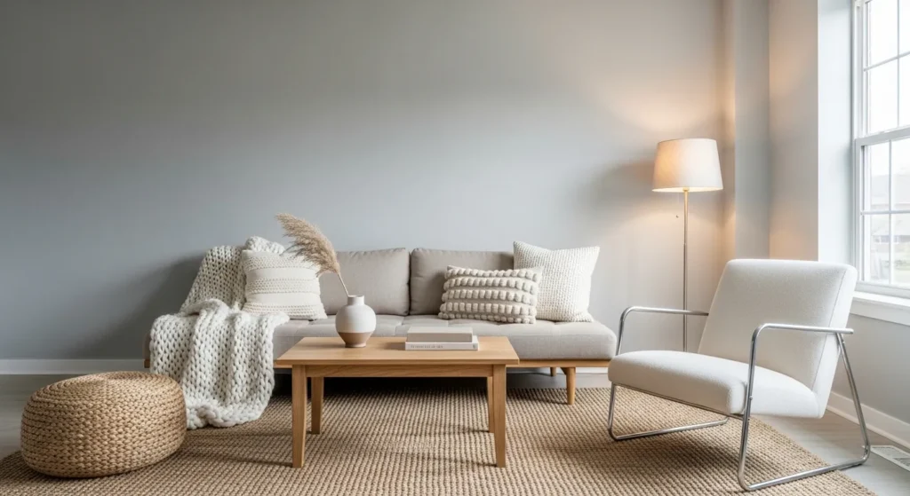
Light gray is cool, modern, and endlessly versatile. It complements bold or muted furnishings, from sleek minimalism to plush traditional sofas, without dominating the room.
Pair with whites, blacks, and metallic accents to achieve a sophisticated look. Gray creates a calming environment, enhances natural light, and serves as a neutral yet elegant backdrop for diverse decor styles.
4. Greige
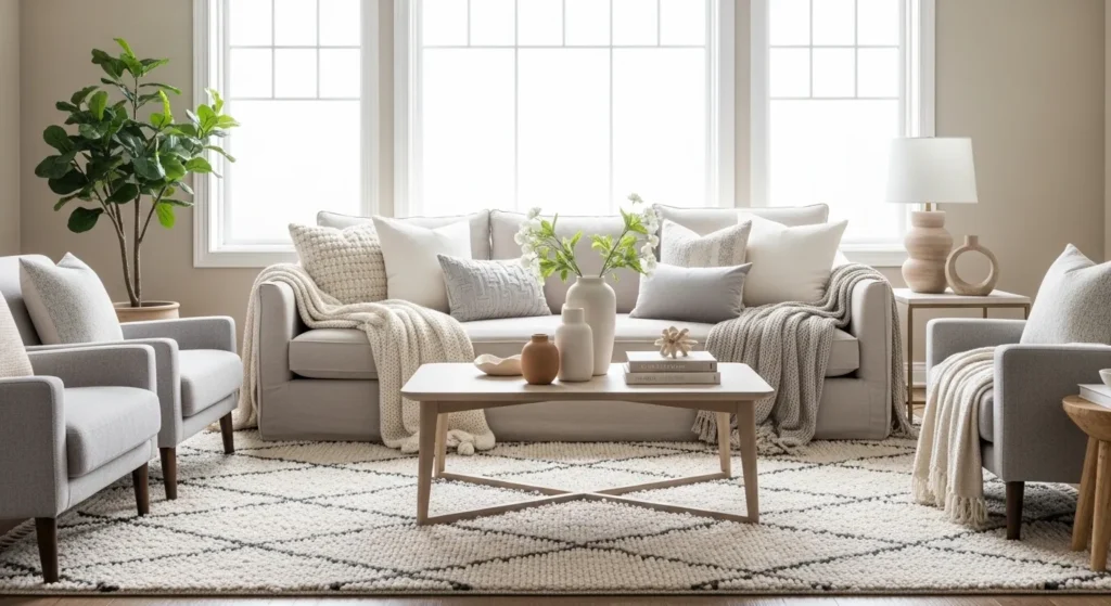
Greige—a balanced mix of gray and beige—works beautifully with warm and cool tones. Its adaptability makes it ideal for living rooms that incorporate varied furniture or layered textures.
Use as a primary wall color to unify eclectic decor, pairing with wood finishes, soft textiles, and muted accents. Greige provides a timeless, designer-approved canvas for versatile living room styling.
5. Muted Sage Green
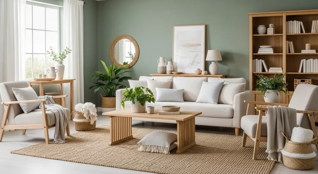
Muted sage green adds subtle color and a natural feel while remaining understated. It harmonizes with neutrals, warm woods, or metal accents, making it flexible for different decor styles.
This calming shade introduces warmth and serenity, enhancing living room comfort. Sage green creates a cohesive space that balances personality with versatility, perfect for modern, rustic, or transitional interiors.
6. Soft Taupe
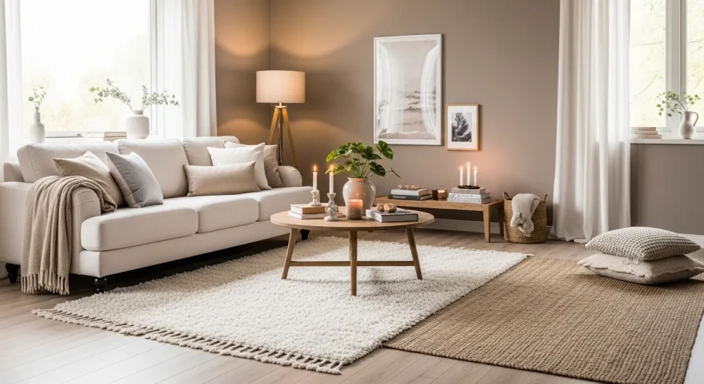
Soft taupe is a warm, sophisticated neutral that pairs effortlessly with bold and muted accents alike. Its subtle warmth provides a cozy yet refined backdrop for any furniture style.
Use alongside cream, gray, or metallic accents. Taupe enhances depth and harmony in the room, making it an ideal choice for living rooms that require a versatile, timeless base color.
7. Creamy Ivory
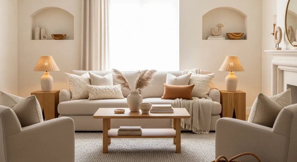
Creamy ivory adds light and warmth without stark contrast, creating a balanced, airy living space. Its soft hue works with traditional, modern, or eclectic furnishings, maintaining a cohesive aesthetic.
Pair with light woods, neutral fabrics, or muted colors. Ivory enhances brightness, visually enlarges rooms, and provides a polished, versatile backdrop that complements any decor style.
8. Pale Blush
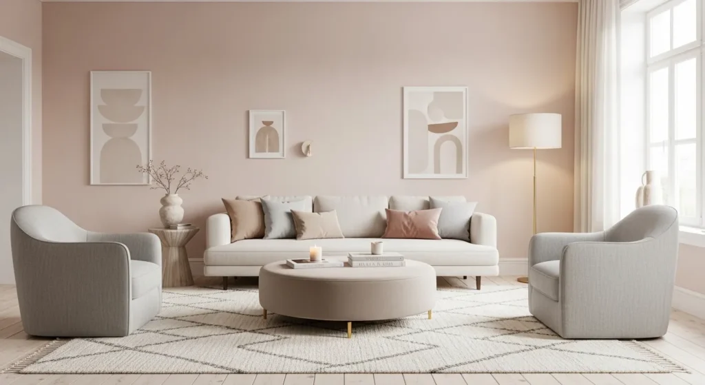
Pale blush introduces warmth and subtle color without overpowering the room. It adds a gentle vibrancy that pairs with neutrals, woods, or soft metallics, keeping the space light and airy.
Perfect for accent walls or full-room coverage, blush creates a welcoming and stylish atmosphere. Its muted tone ensures versatility, making it compatible with contemporary, traditional, and eclectic living room designs.
9. Soft Sky Blue
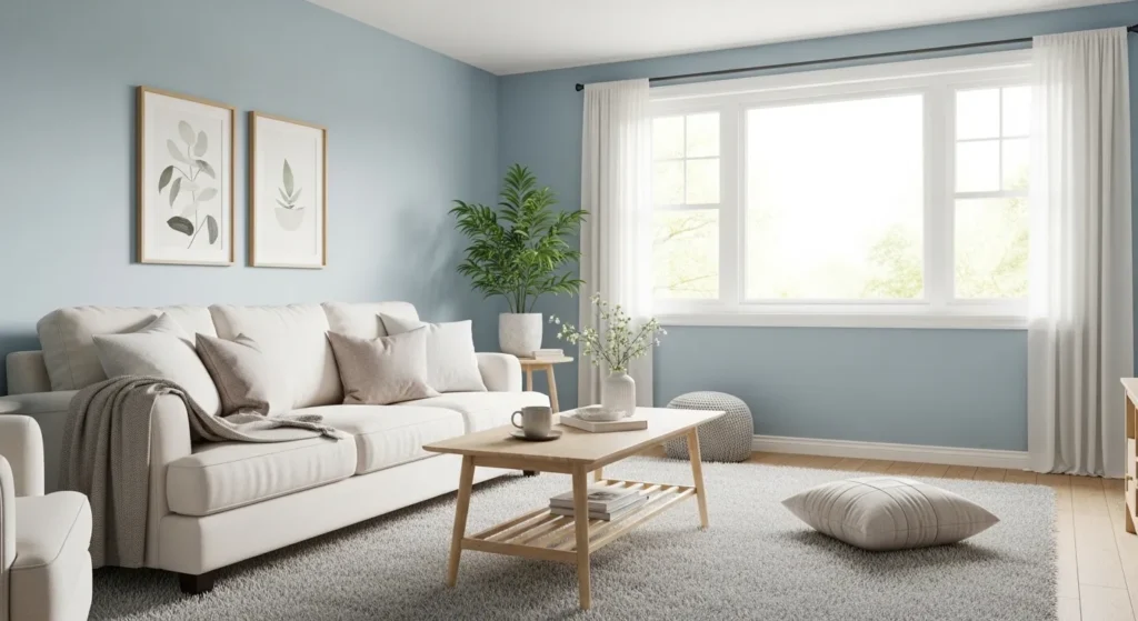
Soft sky blue promotes calmness and pairs beautifully with warm and neutral furnishings. Its gentle tone enhances natural light and adds depth, making the room feel airy and open.
Combine with whites, creams, and subtle wood accents for a cohesive design. Sky blue provides serenity while complementing multiple decor styles, from coastal-inspired spaces to modern minimalist interiors.
10. Warm Sand
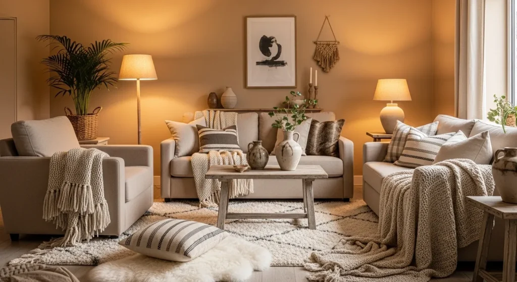
Warm sand offers an inviting, neutral backdrop that balances both cool and warm accents. Its earthy undertones harmonize with wood, textiles, and metallic finishes.
Use as a primary wall color or combined with soft accent walls. This versatile hue creates a comfortable, cohesive living room that works with a wide range of furniture styles and color palettes.
11. Muted Terracotta
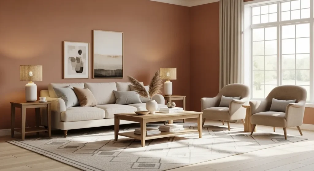
Muted terracotta adds warmth and subtle depth to a living room without overwhelming the space. Its earthy red-orange tones create a cozy, inviting atmosphere that complements a variety of furniture styles.
Pair with beige, cream, or gray accents and natural wood finishes. Terracotta provides richness and texture while remaining versatile, making the space feel sophisticated, balanced, and harmonious across different decor styles.
12. Soft Olive Green
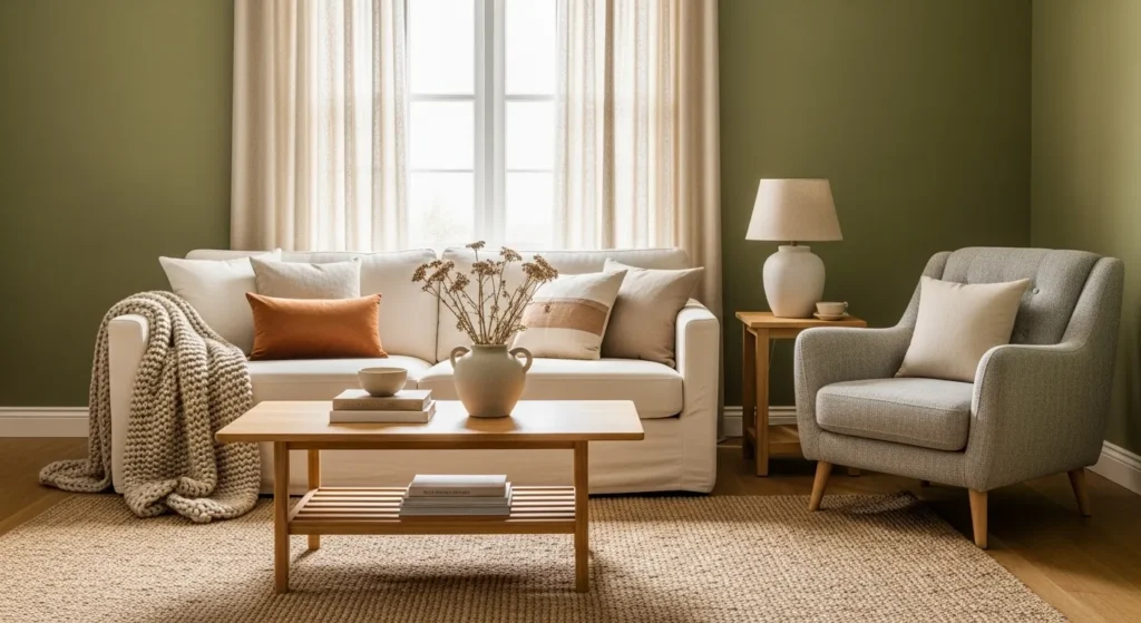
Soft olive green is a natural, calming color that blends seamlessly with warm neutrals and modern or traditional furnishings. Its muted shade introduces subtle personality while keeping the room cohesive.
Combine with cream, beige, or taupe accents to create depth and interest. Olive green fosters a serene, elegant environment, making the living room feel grounded, welcoming, and stylishly adaptable to any decor.
13. Light Mocha
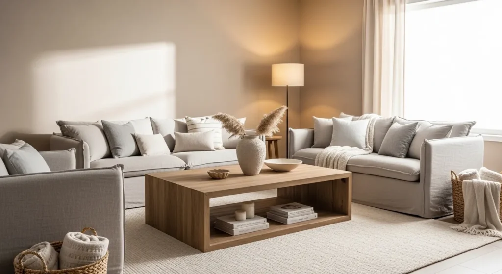
Light mocha is a warm, versatile tone that works well in both bright and dimly lit spaces. It creates a sophisticated backdrop that allows furniture and decor to stand out without clashing.
Pair with cream, white, or muted accent colors. This shade adds warmth and comfort while maintaining neutrality, giving the living room a polished, timeless feel that suits any interior style.
14. Soft Aqua
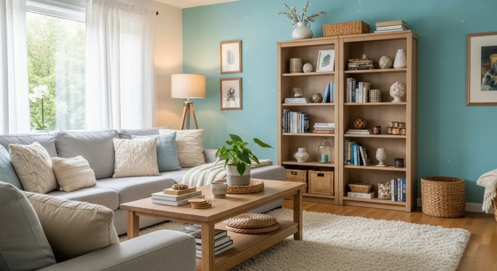
Soft aqua brings freshness and tranquility to a living room. Its gentle blue-green undertones complement a wide range of colors while keeping the room airy and inviting.
Combine with white, beige, or gray furnishings for balance. Aqua adds subtle vibrancy without overpowering the space, making it an adaptable choice for coastal, modern, or eclectic interiors.
15. Pale Gray-Beige
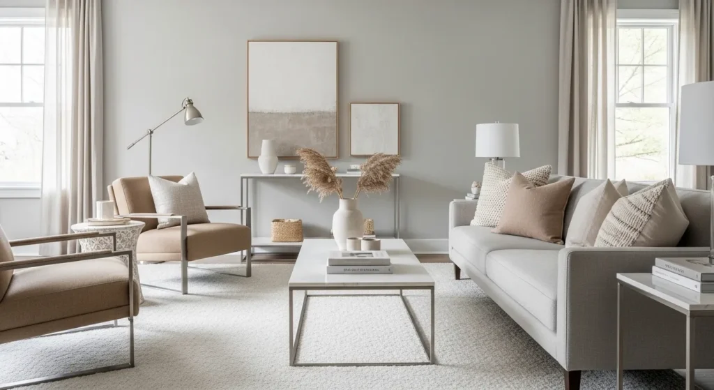
Pale gray-beige, or greige, is a neutral that balances cool and warm tones. It creates a versatile backdrop suitable for modern, traditional, or eclectic living rooms, enhancing cohesion and style.
Pair with muted pastels, natural textures, or metallic accents. Greige harmonizes furniture and decor, allowing flexibility while maintaining a polished, sophisticated aesthetic throughout the living space.
16. Soft Charcoal
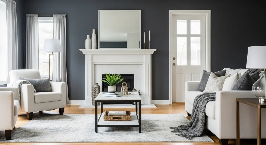
Soft charcoal is a deeper neutral that adds depth and elegance while remaining surprisingly versatile. It pairs beautifully with light-colored furniture, metallic accents, and natural textures.
Use as an accent wall or throughout the room for a bold yet adaptable look. Charcoal enhances contrast and sophistication, creating a balanced living room that works with modern, industrial, and traditional decor styles alike.
Conclusion
Choosing the right living room paint color is essential for creating a space that feels cohesive, stylish, and adaptable. Colors like warm whites, soft neutrals, muted pastels, and versatile earthy tones provide a foundation that works with nearly any decor style.
By selecting colors that reflect light, complement furniture, and harmonize with accents, you can craft a living room that is inviting, elegant, and flexible for future design updates. These hues enhance comfort, warmth, and visual balance while maintaining timeless appeal.
With these 16 designer-approved paint colors, your living room can effortlessly blend with various interior styles, create a welcoming atmosphere, and serve as the perfect backdrop for both relaxation and entertaining guests.
FAQs
Which living room colors are most versatile?
Warm whites, soft beiges, greige, and muted pastels adapt well to different furniture and decor styles.
Can dark colors work in a living room?
Yes, soft charcoals or muted deep tones work best as accent walls or paired with lighter furnishings to prevent the space from feeling closed in.
Do neutral tones suit all decor styles?
Absolutely. Neutrals like beige, taupe, and ivory provide a timeless backdrop compatible with modern, traditional, eclectic, and rustic interiors.
Should living room colors match adjoining rooms?
While exact matches aren’t necessary, using complementary tones or consistent undertones ensures visual flow and cohesion.
How do I choose a color if my furniture is colorful?
Opt for soft neutrals, muted shades, or versatile tones that allow your furniture to stand out while maintaining harmony in the room.
15 Essential Questions About Living Room Paint Colors That Refresh Your Space
1. What makes a living room paint color feel refreshing rather than just new?
Refreshing means energizing without being overwhelming. The color should invigorate and inspire without demanding constant attention.
True refresh comes from colors that feel intentional and considered, not rushed or random. A well-chosen color transforms how you experience the entire space.
Great living room colors make you want to gather, entertain, and genuinely enjoy the space—not just pass through it.
2. What paint colors instantly refresh tired, outdated living rooms?
Soft sage green creates organic freshness. It feels contemporary while remaining timeless and calming.
Warm white or cream feels instantly brighter and more modern than yellowed off-whites. This simple shift feels transformative.
Soft blue-gray feels sophisticated and contemporary. This color works in virtually any design style.
Warm taupe adds subtle sophistication. It feels intentional without being bold or demanding.
3. Why do certain colors feel more refreshing than others?
Color psychology affects mood. Greens and blues feel fresh and calming. These colors literally boost mood and energy.
Brightness affects perception of freshness. Pale colors feel brighter and more energizing than dark colors.
Contemporary colors (soft gray, pale blue, muted green) feel more refreshing than dated colors (beige from 2000s, builder-grade white).
4. Should living room paint be cool or warm tones for a refreshing feel?
Both work—it depends on your preference and existing décor. Cool tones (soft blue, pale green) feel contemporary and fresh.
Warm tones (cream, warm gray, soft taupe) feel inviting and energizing. Warmth creates comfort alongside refresh.
Either direction works beautifully. Consistency in undertone family matters more than cool vs. warm choice.
5. How do I choose between bold refresh colors and subtle refresh colors?
Bold colors (deep green, soft burgundy, warm gold) make dramatic statements. These work beautifully in open spaces with excellent lighting.
Subtle refresh (pale gray, soft blue, warm white) works everywhere. These feel refreshed but not jarring.
Consider your lifestyle. Entertainer? Bold works. Introvert preferring calm? Subtle feels better.
6. What’s the relationship between paint color and perceived spaciousness in living rooms?
Light colors make rooms feel larger and more open. Pale paint refreshes by creating an airier, brighter feeling.
Dark colors make rooms feel cozier but smaller. If your living room needs spaciousness refresh, go lighter.
Medium tones create balance. They feel refreshed without losing intimacy.
7. How does lighting affect living room paint color refresh?
Natural light showcases colors beautifully and supports the refreshing feel. Maximize windows when choosing refreshing colors.
Artificial light affects color perception dramatically. Test paint samples under your actual evening lighting.
Excellent overall lighting (layered sources) makes any refreshing color work better. Poor lighting diminishes even beautiful colors.
8. Can I refresh a living room with paint without changing furniture?
Absolutely. Paint is the single most impactful, lowest-cost refresh available. New paint often makes existing furniture look intentional.
The right paint color makes everything around it look better. This is why paint refresh feels so transformative.
Quality paint ($40-60 per gallon) covers better and lasts longer than cheap alternatives. Invest here for genuinely fresh results.
9. What paint colors refresh without requiring décor changes?
Neutral refreshes (soft white, pale gray, warm taupe) work with virtually any existing décor. No changes needed.
Soft greens and blues work with most furniture styles and colors. These feel refreshingly contemporary.
Warm neutrals work with traditional, transitional, and contemporary furniture equally well.
10. How do I refresh a dark living room with paint color?
Light colors brighten dark rooms dramatically. Soft white, pale gray, or cream feel like turning on lights.
Pale green or soft blue brighten while adding color personality. These feel more refreshing than simple white.
Excellent lighting complements lighter paint. Together, they transform dark spaces completely.
11. Should accent walls refresh living rooms more than full-room color?
Full-room color creates more dramatic refresh. One consistent color feels more cohesive and intentional.
Accent walls work beautifully if they’re strategic (behind seating, fireplace wall) and use refreshing colors.
For maximum refresh impact, paint all walls. This creates the most transformative effect.
12. What paint colors refresh without feeling trendy or dated?
Soft green, pale blue, warm gray, and cream are genuinely timeless. These looked beautiful a decade ago and will in a decade more.
Avoid very trendy colors (millennial pink, mustard, sage from 2020s color trends). These date quickly.
Classic refreshing colors feel contemporary today and will feel classic tomorrow. This longevity matters.
13. How do I coordinate refreshing living room paint with other rooms?
Maintain undertone consistency throughout your home. If living room is soft blue, bedrooms should coordinate with same undertone family.
Slight color variation creates flow. Living room pale blue, kitchen soft gray—same cool family feels connected.
Avoid jarring transitions between spaces. Paint refresh should enhance your entire home’s flow.
14. What’s the best approach to refreshing a living room on a budget?
Paint is the highest-impact, lowest-cost refresh. One gallon of quality paint ($40-60) transforms everything.
Skip expensive furniture or décor changes. New paint often eliminates the need for other updates.
DIY painting saves labor costs. Quality paint + your effort = maximum budget impact.
15. What mistakes do people make when refreshing living rooms with paint?
Choosing trendy colors that date quickly. Stick with timeless, genuinely refreshing options.
Forgetting to test paint samples. Small cards are deceptive. Paint large swatches on walls and live with them.
Choosing color without considering lighting. Test samples in your actual room under your actual lighting conditions.
Using cheap paint. Budget paint requires more coats and lasts shorter. Quality paint is better investment long-term.
Ready to refresh your living room with transformative paint? Discover more refreshing color inspiration and practical design strategies on our homepage. Explore how to choose paint colors that instantly revitalize and energize your space. Visit homeisdecor.com and find comprehensive living room paint color ideas plus strategies for creating a space that feels intentionally designed, beautifully refreshed, and genuinely inviting for gathering, entertaining, and genuinely enjoying your home every single day today.