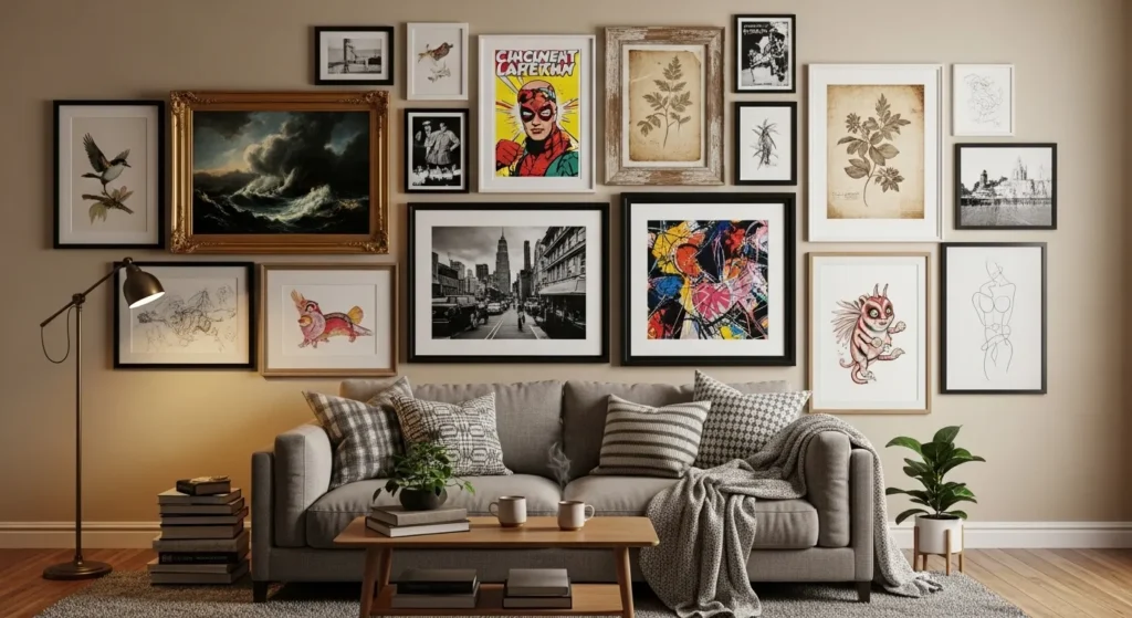
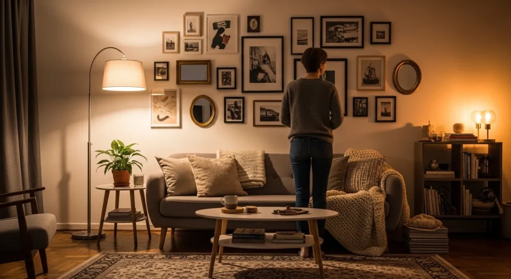
Gallery walls are a fantastic way to showcase personality, style, and creativity, but they can quickly go from stylish to chaotic if not carefully planned. Many people make avoidable mistakes that affect balance, cohesion, and overall visual appeal. Understanding common pitfalls helps ensure your gallery wall enhances the room rather than detracts from it.
This guide outlines 17 mistakes to avoid, from improper spacing to mismatched themes, and provides practical tips for creating a gallery wall that looks intentional, harmonious, and visually striking. Each tip will help you achieve a polished, cozy, and well-curated display.
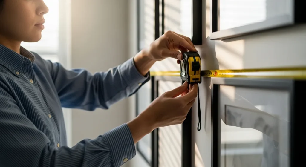
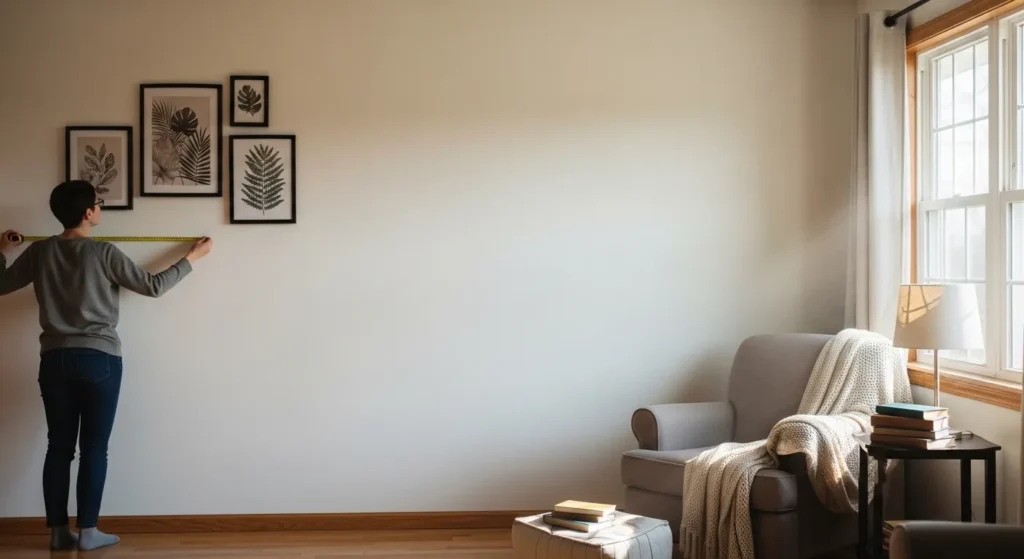
1. Skipping the Planning Stage
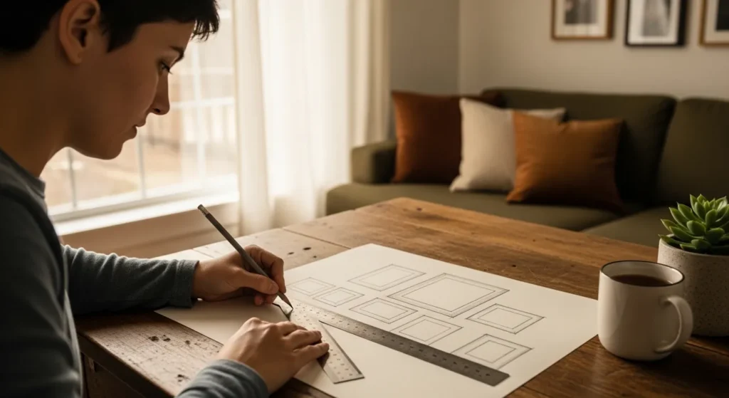
Jumping straight to hanging frames without planning is a common mistake. A lack of layout planning can result in uneven spacing, misaligned pieces, or awkward visual flow.
Take time to measure your wall, mark positions, and decide on frame sizes and arrangements. Planning ensures your gallery wall is balanced, cohesive, and visually pleasing before making permanent holes in the wall.
2. Using Frames That Are Too Large or Too Small
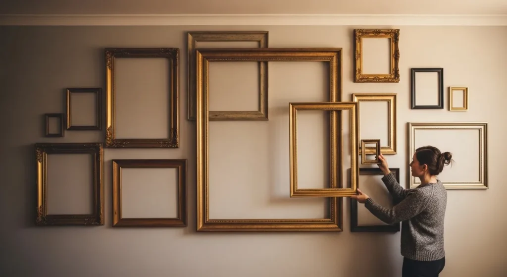
Frames that don’t match the scale of the wall or each other can overwhelm or underwhelm the space. Too-large frames dominate a small wall, while tiny frames can get lost on a large wall.
Choose frames proportional to your wall size and the surrounding furniture. A balanced scale ensures a harmonious gallery wall that feels intentional and inviting.
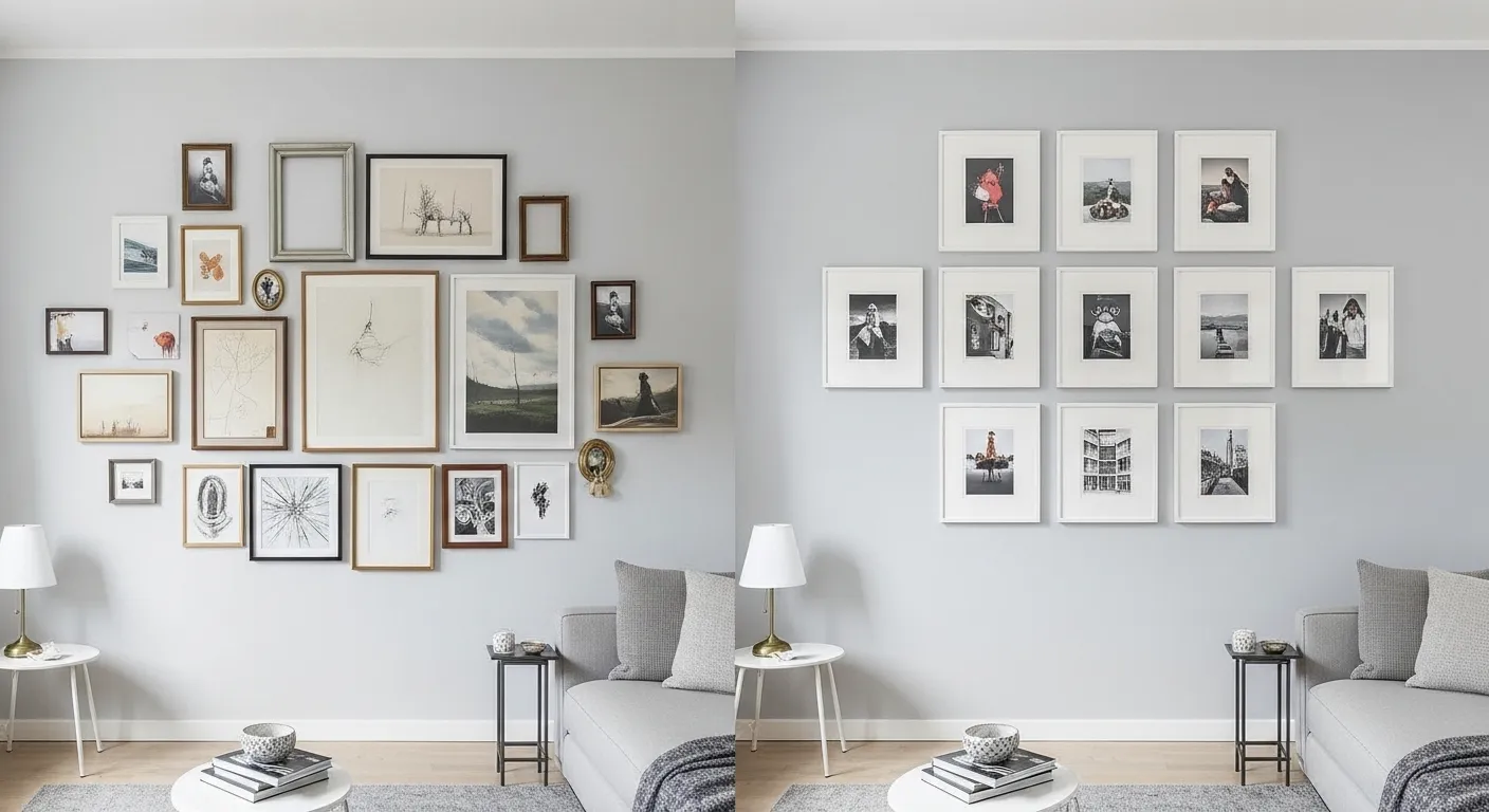
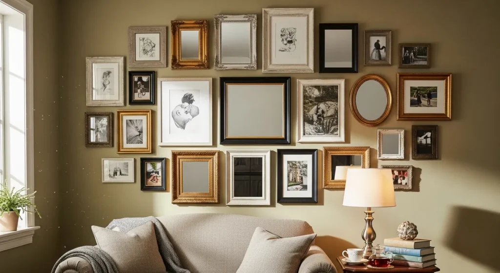
3. Ignoring Frame Consistency
Mixing too many frame styles, colors, or finishes without a unifying element creates a disjointed look. The wall can appear chaotic and unplanned.
Select a consistent frame color, style, or material to maintain cohesion. Even in eclectic designs, a common thread helps the gallery feel curated and visually appealing.
4. Spacing Frames Unevenly
Uneven spacing between frames makes a gallery wall look messy and unprofessional. Small inconsistencies disrupt the flow and balance.
Use a tape measure, ruler, or level to maintain consistent spacing. Even spacing keeps the gallery wall organized, polished, and harmonious.
5. Neglecting the Eye-Level Rule
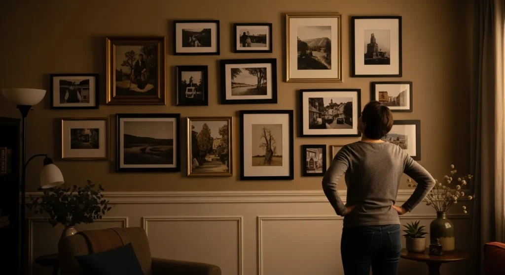
Hanging artwork too high or too low reduces impact and can strain viewers’ eyes. Most gallery walls are most effective when the center is at eye level.
Measure carefully and adjust placements so the central artwork aligns roughly with the average eye height. Proper positioning enhances readability, engagement, and overall aesthetic.
6. Ignoring the Room’s Style
A gallery wall that doesn’t complement the room’s decor can feel out of place. Clashing styles, colors, or themes create visual tension.
Choose artwork, frames, and layouts that harmonize with the room’s existing furniture, lighting, and overall aesthetic. Cohesion ensures the gallery wall enhances, rather than distracts from, the space.
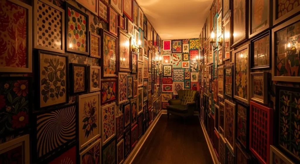
7. Overcrowding the Wall
Filling every inch of wall space with frames makes the gallery feel overwhelming and chaotic. Overcrowding diminishes the impact of individual pieces.
Leave breathing room between frames and consider negative space as part of the design. Well-spaced walls feel airy, organized, and inviting.
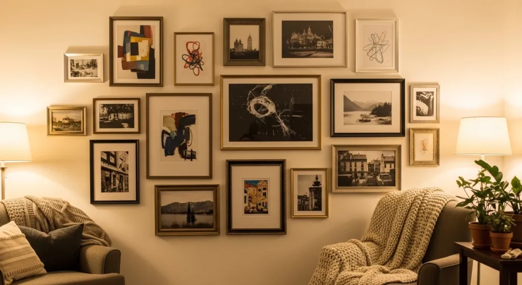
8. Choosing Incoherent Themes
Using unrelated artwork without a connecting theme can confuse the eye. Lack of thematic coherence makes the gallery look random rather than intentional.
Stick to a theme, color palette, or style, even when mixing art types. This creates visual harmony and a cohesive story across the wall.
9. Forgetting About Wall Height and Width
Ignoring wall dimensions often leads to arrangements that feel cramped or lost. Too-small clusters on a large wall or oversized arrangements on a small wall disrupt balance.
Scale your frames and layout to suit the wall size. Proper proportions create a gallery wall that feels integrated, polished, and comfortable to view.
10. Using Weak Hanging Hardware
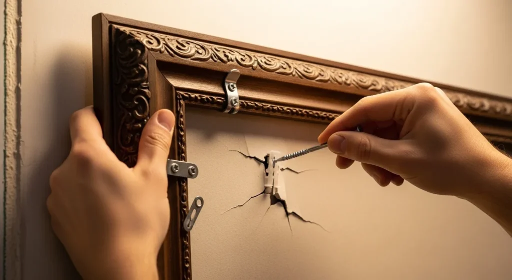
Frames that are too heavy for the hardware can fall and damage walls. Using weak nails or anchors is a common mistake.
Choose appropriate hooks, screws, or wall anchors based on frame weight. Secure hardware ensures safety and longevity while keeping your gallery wall intact.
11. Not Using a Level or Measuring Tools
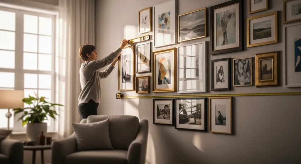
Hanging frames without a level or ruler often results in crooked or uneven gallery walls. Even slight misalignments can disrupt the visual flow and make the wall appear sloppy.
Always use a spirit level, measuring tape, and pencil marks to ensure every frame is straight and evenly spaced. This small step prevents frustration and creates a polished, professional-looking arrangement.
12. Forgetting About Lighting
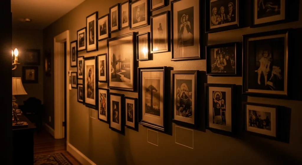
Insufficient lighting can make even the most beautiful gallery wall appear dull or hard to appreciate. Shadows or uneven light can distort colors and details.
Consider the room’s natural light and supplement with wall sconces or track lighting if needed. Proper illumination highlights your artwork, adds depth, and enhances the cozy ambiance of the space.
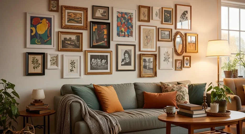
13. Ignoring the Furniture Relationship
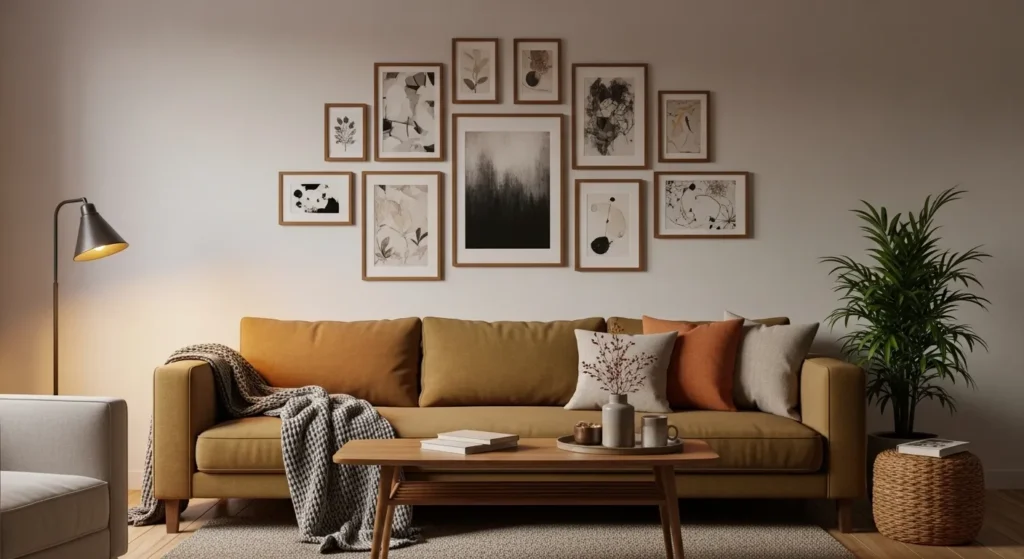
Placing frames without considering nearby furniture can make the arrangement feel disconnected. Hanging too high or too low relative to furniture disrupts visual balance.
Align the bottom or center of your gallery with key furniture pieces like a sofa, console, or table. This integration ensures harmony and strengthens the overall design.
14. Overlooking Frame Orientation
Mixing portrait and landscape frames without planning can create a chaotic look. Misaligned orientations interrupt the visual flow and diminish the overall aesthetic.
Plan frame orientation in advance and maintain a rhythm, either alternating or grouping similar orientations. This ensures balance, readability, and a clean, intentional design.
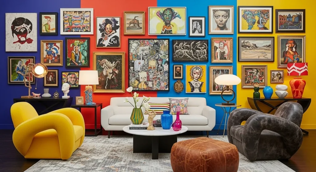
15. Using Too Many Colors
Overloading a gallery wall with too many colors can be visually jarring. Random or conflicting hues distract from the artwork itself.
Stick to a cohesive color palette or neutral base with selective accent colors. Controlled use of color enhances harmony, making the gallery feel inviting, stylish, and well-curated.
16. Forgetting to Step Back
Failing to step back during installation can result in a layout that looks fine up close but feels unbalanced from a distance. Perspective is key to visual flow.
Regularly step back to view the arrangement as a whole. This ensures proper alignment, spacing, and overall aesthetic appeal, resulting in a cohesive and polished gallery wall.
17. Ignoring Personal Taste

Following trends blindly without incorporating your personal style can make the gallery wall feel impersonal or generic. Art should reflect your personality, memories, or aesthetic preferences.
Mix personal photos, meaningful artwork, or unique pieces with trendy prints. This combination creates a gallery wall that feels authentic, cozy, and timeless, showcasing your style and making the space truly yours.
Conclusion
Avoiding these 17 common gallery wall mistakes ensures that your display is visually cohesive, balanced, and appealing. From planning layout and spacing to selecting the right frames and colors, every detail matters in creating a polished, welcoming space.
When carefully curated, gallery walls add personality, warmth, and visual interest to any room. By steering clear of these pitfalls, you can design a gallery wall that not only looks professional but also reflects your personal taste, enhances your interior, and becomes a focal point that impresses every visitor.