
As an Amazon Associate, I earn from qualifying purchases. This means I may earn a commission if you purchase through links on this page — at no extra cost to you.
Home office paint is not about picking a pretty color. It is about picking a color that supports the work you actually do in the room, under the light the room actually has, on walls you will stare at for hours. A color that feels calm during a weekend repaint can feel draining by Wednesday afternoon, and a color that looks energizing in a paint-store swatch can turn harsh under a desk lamp. The way to avoid both traps is to choose by work type first, light second, and color family last — not the other way round.
Start With the Work, Not the Color
Different work asks different things of a wall. Writing, reading, and focused solo work suit quieter walls: muted greens, soft blues, warm grays, and pale warm neutrals that sit behind you without demanding attention. The wall’s job here is to disappear, so the screen or page holds the eye. Video calls ask something else: the wall behind you is on camera, so it needs to read as calm and tidy on a webcam, which favors mid-tone colors over very pale ones (pale walls wash out on camera) and over very dark ones (dark walls make the camera overexpose your face). Creative work — sketching, brainstorming, making — tolerates more energy: warmer accents, a single bold wall, or a deeper tone that makes the room feel like a distinct place rather than a corner of the house.
If the room serves more than one kind of work, paint for the dominant one and let the rest adapt. A room used mostly for focused work with occasional calls should be painted for focus, with the camera background fixed by what sits behind the desk — a tidy shelf, a single framed print — rather than by repainting the whole room for the camera. A room used mostly for calls should be painted for the camera, because a wall that looks wrong on every call is a daily irritation, while a slightly less-than-ideal focus color is a minor one.
Light Direction Changes Everything
The same paint looks different in every direction, and offices are where this matters most because you sit in the room all day. North-facing rooms get cool, indirect light that flattens warm colors and makes cool colors look colder; in a north-facing office, a warm-leaning neutral or a muted warm green usually reads better than a cool gray that turns icy by afternoon. South-facing rooms get strong, warm light that intensifies color, so a saturated color that looked moderate on the swatch can feel loud by midday; softer versions of the same family are the safer choice. East-facing rooms are bright in the morning and flat later, which suits morning workers but can make an east-facing office feel dull in the afternoon — a color with a little warmth helps the later hours. West-facing rooms reverse the pattern: dull mornings, warm golden afternoons that push warm colors toward orange.
Artificial light matters as much as daylight in an office, because desk lamps dominate the wall you face. Warm bulbs push whites toward cream and make cool colors look muddy; cool daylight bulbs keep colors truer but can make a room feel clinical. The practical fix is to test under the light you will actually work in: paint a large swatch, then look at it during a normal work session, morning and afternoon, with the desk lamp on. A swatch judged only under showroom lighting has told you nothing about your office.
Color Families That Work in Offices
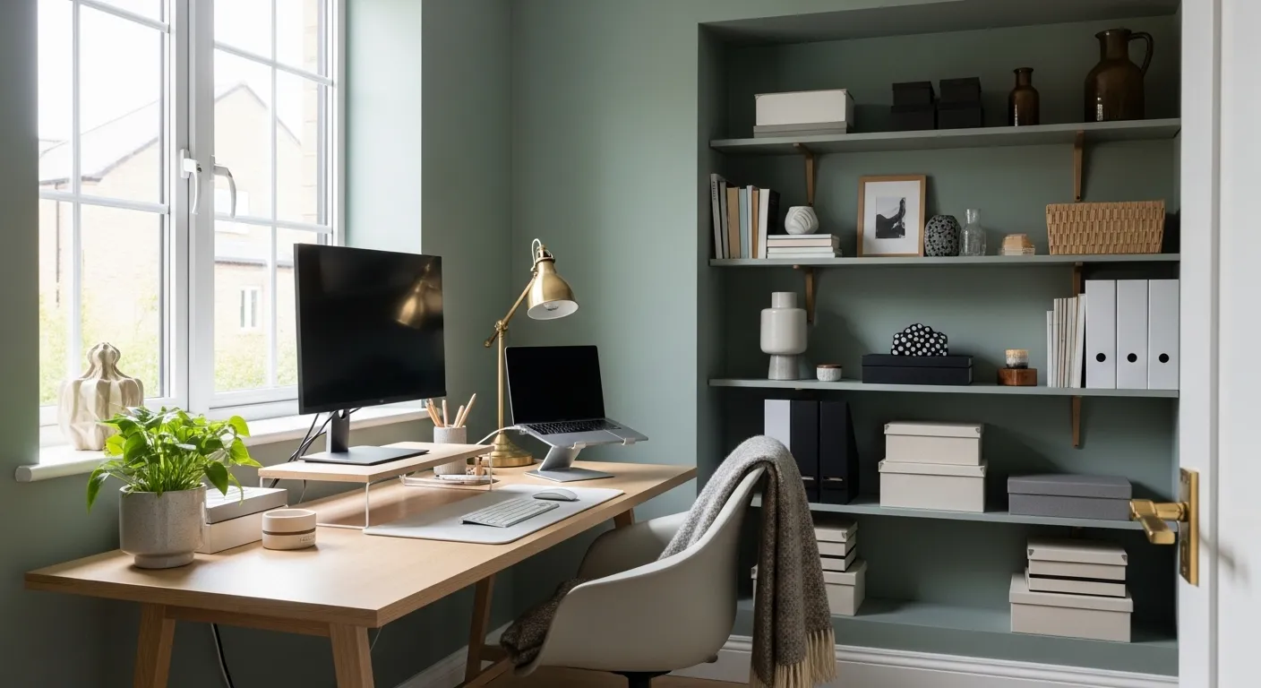
Rather than twenty near-identical shades, think in families. Soft sage and muted olive greens are the most forgiving office colors: they read as calm without feeling cold, they suit both north and south light, and they pair with wood desks and black office equipment without clashing. Pale blues and dusty blues suit focus work and small rooms, but they need warm light or warm wood nearby, or they can feel chilly; in a north-facing room, a blue with a green leaning works better than a blue with a gray leaning. Warm neutrals — warm taupe, soft beige, warm cream — are the safest choice for video calls and shared rooms, because they flatter skin tones on camera and never fight with furniture. They are also the easiest to live with for years, which matters in a room you repaint less often than a bedroom.
Deeper colors have a place, but a narrower one. A deep green or muted terracotta accent wall behind the desk can make a video-call background look considered rather than blank, and it gives a creative room a sense of occasion. But a fully dark office shrinks visually and demands good lighting; if the room is small or dim, keep the deep color to one wall and the rest pale. Pale colors — soft white, pale mint, soft peach — suit very small offices because they reflect light, but they show scuffs from chairs and bags quickly, so they need a washable finish (see below) or they will look tired within a year. Avoid very bright or saturated colors on all four walls: a vivid coral or teal that feels inspiring for a week often feels tiring by the second month, because there is nowhere for the eye to rest.
🛒 Shop This Look:
Finishes That Survive Daily Office Use
Office walls take more abuse than bedroom walls: chair backs rub, bags scuff, coffee splashes, and tape leaves marks. A flat finish hides wall imperfections beautifully but marks easily and is hard to clean, so it suits only low-traffic offices. An eggshell or satin finish is the practical default for most home offices: it wipes clean, resists scuffs reasonably well, and still looks soft rather than shiny. Semi-gloss belongs on trim and doors, where its hardness pays off, not on large wall areas, where it highlights every bump and roller mark. If the office doubles as a craft or kids’ homework room, step up to a scrubbable satin on the lower walls at least, because that is where the damage happens.
Ceiling and trim deserve a decision, not an afterthought. A white ceiling keeps the room feeling tall; a ceiling painted the same color as the walls, but lighter, makes a small office feel enveloping rather than boxy. Trim in crisp white sharpens any wall color and gives the eye a clean edge, which matters on camera. If the office has dark wood trim, avoid very cool wall colors, which clash with warm wood; warm neutrals and sage greens sit comfortably against wood, while icy grays fight it.
How to Sample Properly
Sampling is where most office repaints go wrong, because people judge a tiny swatch under the wrong light. Buy sample pots of your two or three finalists, not twenty, and paint each one as a large patch — at least the size of a sheet of paper, preferably larger — on the wall you will face while working. Look at the patches at three times: morning daylight, afternoon daylight, and evening with the desk lamp on. Live with them for at least a few workdays before deciding, because a color that feels fresh on day one can feel cold or loud by day three. If two finalists look identical on the wall, choose the lighter one; rooms almost always read darker once fully painted than a single patch suggests.
Paint the patches where they will be judged: the wall behind the desk for call backgrounds, the wall you face for focus. A color that looks right on a side wall can look wrong on the wall you stare at, because the facing wall fills more of your visual field. When you have chosen, paint one wall first and check it in daylight before committing to the rest; a full room of the wrong color is a much bigger fix than a single wall.
Small offices benefit from one continuous color rather than competing walls, because breaks in color chop an already small room into smaller pieces. If you want an accent, make it the wall behind the desk and keep the rest of the room in a pale version of the same family, so the room reads as one space. Small-space accent wall ideas follow the same logic: the accent earns its place by anchoring the desk, not by shouting.
Renters face a different constraint: the paint may need to come off. Peel-and-stick options and removable wallpaper suit renters who cannot repaint, but if repainting is allowed with a return-to-white clause, choose a color you can cover in one or two coats — pale and mid-tone colors qualify, deep colors do not, because covering a deep color takes several coats and real effort. Rental-friendly paint colors for small apartments cover the same trade-off in more detail. In a shared room — an office corner in a bedroom or living room — the office color should be a quieter version of the room’s palette, not a separate statement, or the room will feel divided against itself.
🛒 Shop This Look:
What Goes on the Painted Wall
An office wall is not finished when the paint dries. What hangs on it changes how the color reads: a dark frame on a pale wall sharpens the wall, while a pale frame on a deep wall softens it. If the wall behind the desk will be on camera, keep it simple — one or two pieces with clear shapes, hung at a height that stays in frame when seated. A busy gallery wall behind a desk looks cluttered on video even when it looks charming in person. Scandi-style gallery walls show how restraint on the wall keeps the room feeling calm, which is exactly what a working wall needs.
Lighting for the wall itself deserves a thought. A desk lamp that throws light upward onto the wall behind the monitor reduces eye strain by softening the contrast between screen and wall, and it makes the wall color look intentional rather than incidental. If the office has a single overhead light, it will flatten the wall color and cast the worker’s shadow on camera; a second, lower light source — a desk lamp or a floor lamp — fixes both problems at once.
Mistakes to Avoid
The first mistake is choosing from a screen. Screens shift color, and a shade that looks like sage online can arrive as mint or gray. Always judge a physical swatch on the actual wall. The second mistake is painting all four walls in a bold color because it looked good as an accent online; accents work because the other walls are quiet, and removing the quiet walls removes the effect. The third mistake is ignoring the ceiling: a bright white ceiling over mid-tone walls is fine, but a dingy ceiling over fresh walls makes the whole room look unfinished — paint the ceiling if it has yellowed. The fourth mistake is skipping primer over a dark or patched wall, which leads to uneven color that no second coat fully fixes. The fifth mistake is painting in a rush the weekend before a deadline; paint needs drying time and a second look in daylight, and a rushed office repaint usually gets redone within months.
Quick Answers
What is the safest office color? A warm neutral or muted sage green, in an eggshell finish, tested on the wall you face. What if the office is north-facing? Lean warm: warm neutrals, sage with a warm leaning, or soft cream rather than cool gray. What if the office is tiny? One continuous pale-to-mid color, with the accent (if any) confined to the desk wall. What finish for a hard-working office? Eggshell or satin on walls, semi-gloss on trim. How long should sampling take? A few workdays at minimum, judged morning, afternoon, and under the desk lamp. And the rule that saves the most repaints: when two finalists look the same on the wall, pick the lighter one.
🛒 Shop This Look: