A gallery wall above the sofa can completely transform your living room, turning a simple wall into a stylish focal point. Whether you love clean grids, layered clusters, or playful mixed shapes, the right layout adds personality, depth, and visual interest.
These 27 ideas show how to make your sofa wall feel curated, balanced, and Pinterest-worthy, no matter your style.
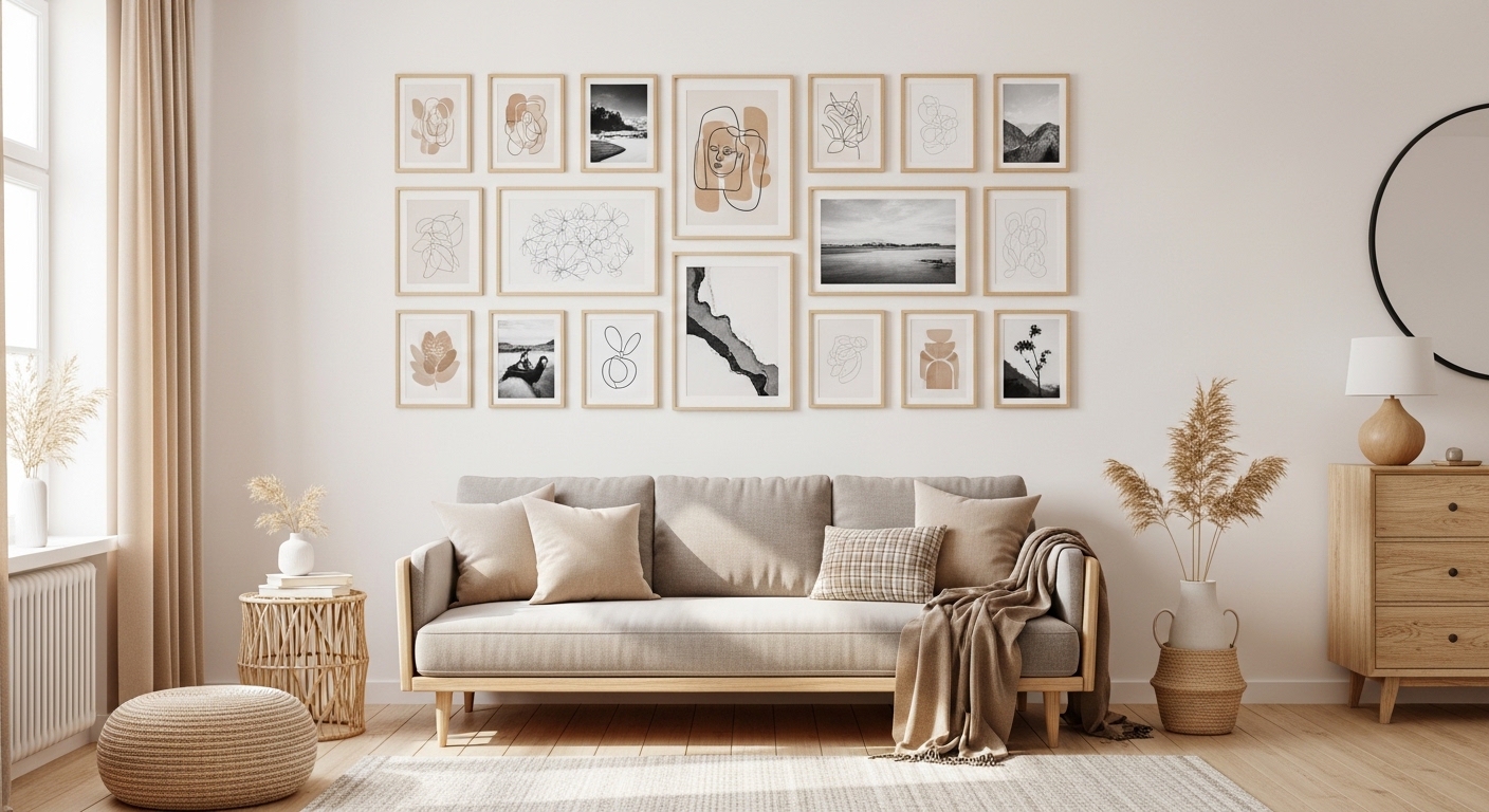
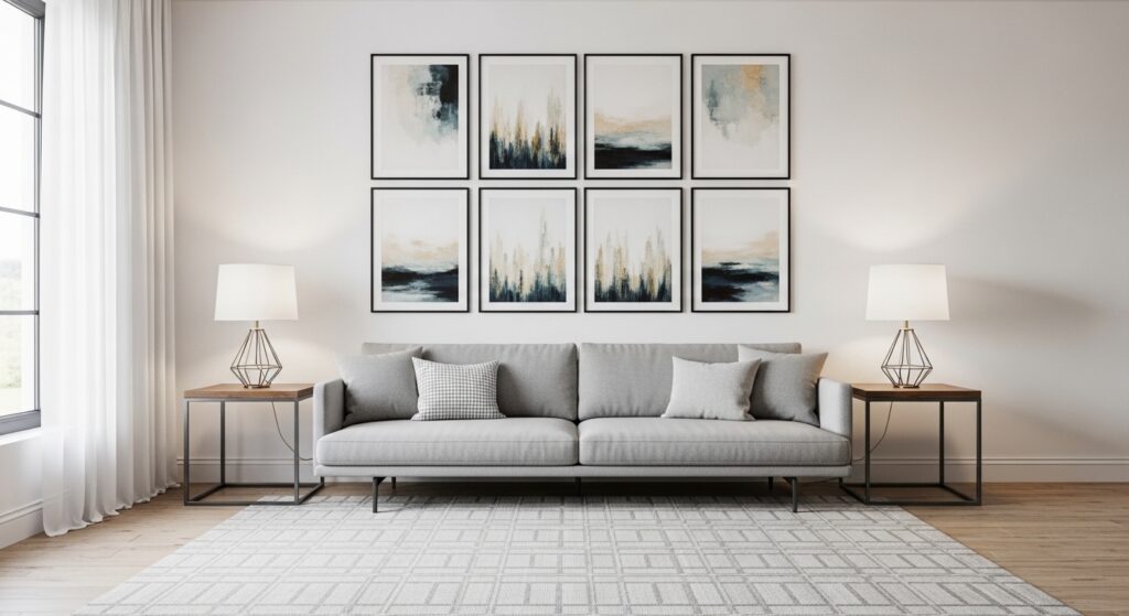
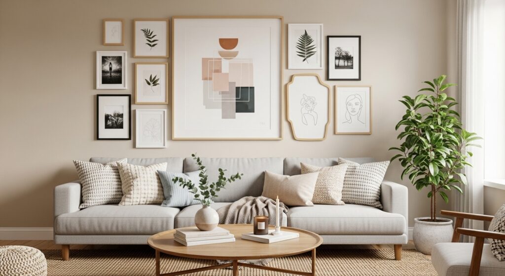
1) Symmetrical Grid Gallery Wall
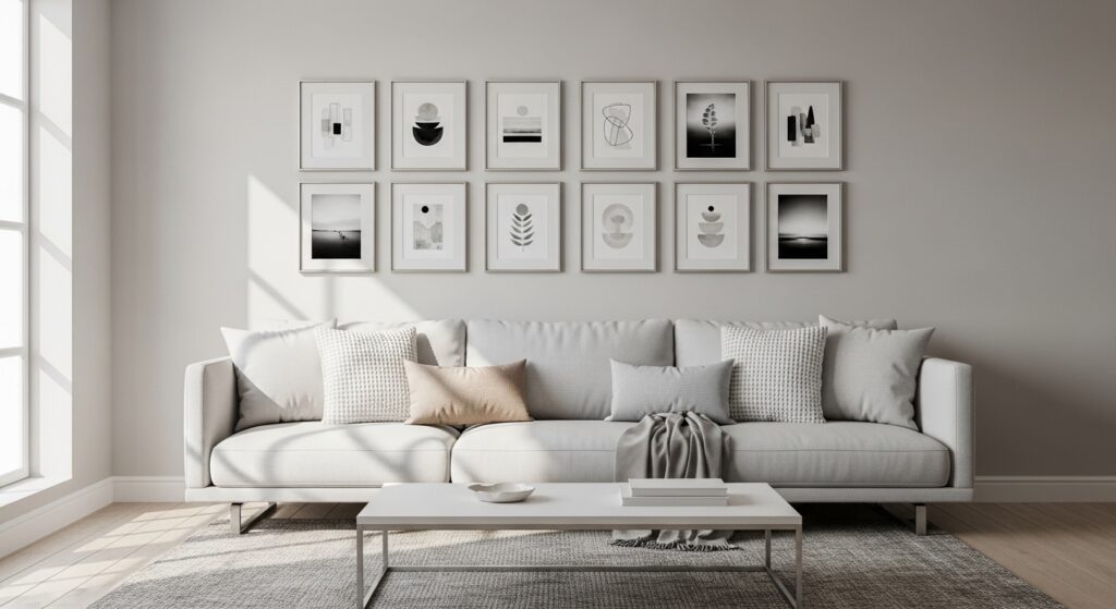
A symmetrical grid layout creates an instantly polished look above the sofa. Evenly spaced frames form a clean rectangle that feels intentional and calming. This structure works beautifully in modern or minimalist living rooms where balance is key. The repetition allows artwork to shine without overwhelming the wall, making the space feel organized and visually grounded. Because the layout is predictable, the eye reads it as harmony, which naturally complements the horizontal line of the sofa.
This arrangement is especially effective when frames share a consistent finish or color palette. Neutral tones help the artwork become the focal point while keeping the room cohesive. The grid structure also makes planning easier — you simply measure equal spacing and align rows. The result is a gallery wall that feels curated and timeless, elevating the sofa area into a refined focal zone.
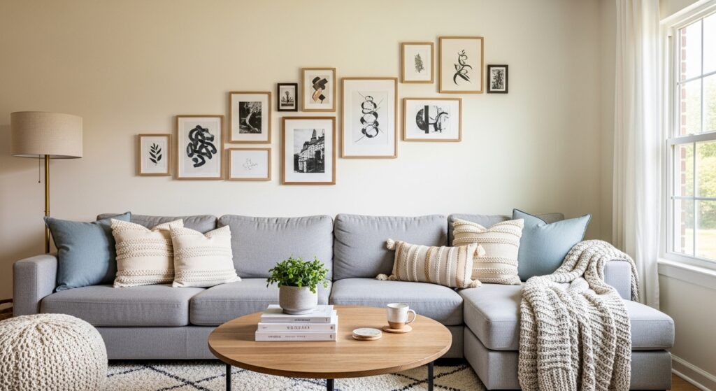
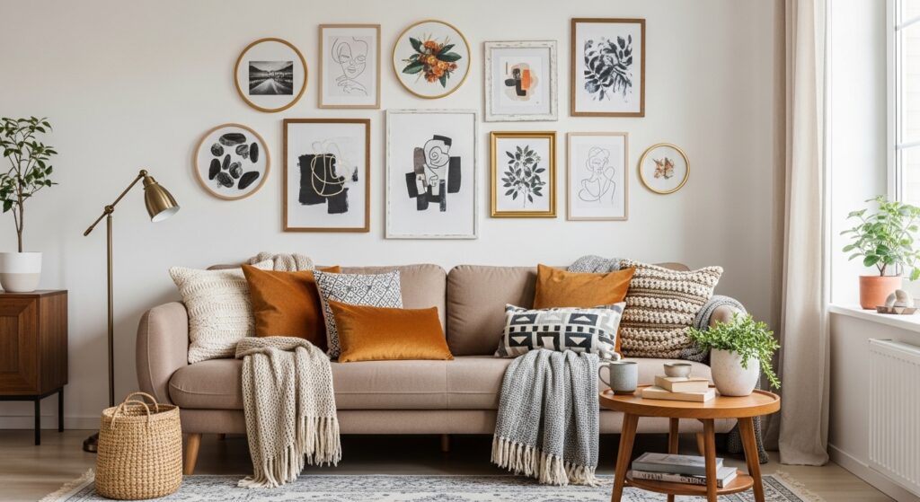
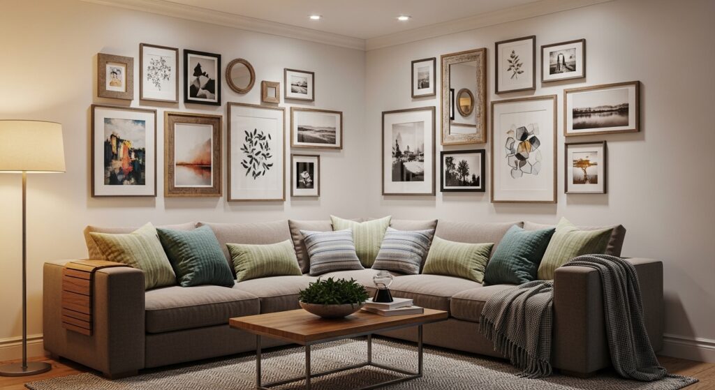
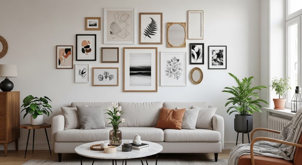
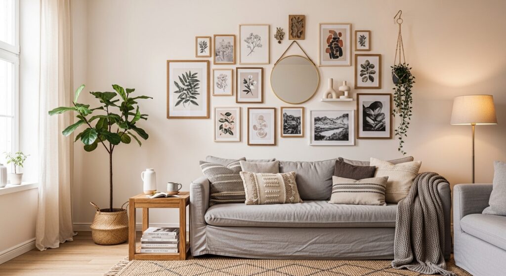
2) Organic Salon-Style Cluster
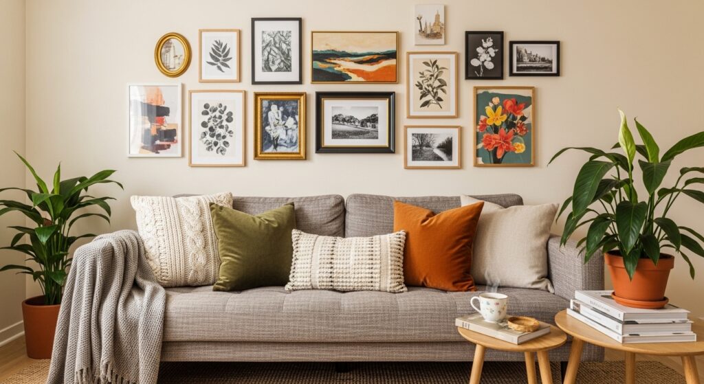
An organic salon-style layout embraces variety and personality. Instead of strict alignment, frames are arranged in a flowing cluster that feels collected over time. This approach adds warmth and character, making the living room feel lived-in and expressive. The mix of artwork sizes encourages visual movement, drawing attention across the wall without rigid structure. It’s perfect for creative homes where storytelling matters more than symmetry.
To keep the layout cohesive, repeat colors or frame finishes throughout the arrangement. Begin with a central anchor piece and build outward, balancing heavier visuals with lighter ones. The relaxed structure softens the sofa area, making it feel welcoming and layered. The result is a gallery wall that feels personal and dynamic, transforming the seating zone into a creative statement.
3) Linear Horizontal Row
A linear horizontal gallery wall mirrors the shape of the sofa, reinforcing clean architectural lines. Frames are aligned in a single row, creating a streamlined focal point that feels modern and uncluttered. This layout is ideal for smaller living rooms where simplicity helps maintain openness. The consistent baseline guides the eye smoothly across the wall, enhancing the sense of width.
Keeping frame sizes uniform strengthens the minimalist aesthetic. Neutral artwork or subtle color palettes prevent visual overload while still adding personality. This arrangement pairs beautifully with contemporary furniture and understated decor. The result is a sleek gallery display that elevates the sofa wall without competing for attention.
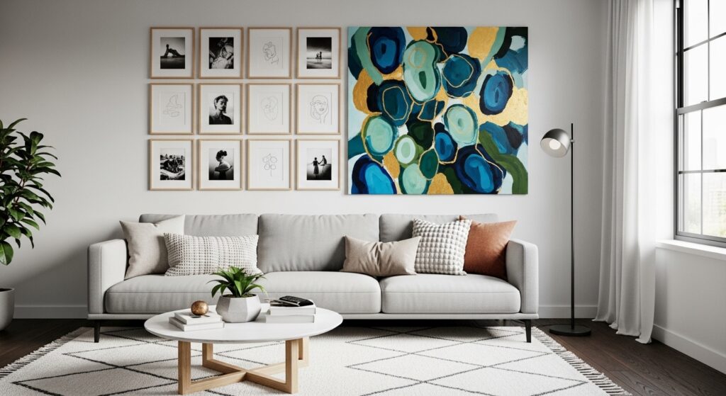
4) Centered Statement + Supporting Frames
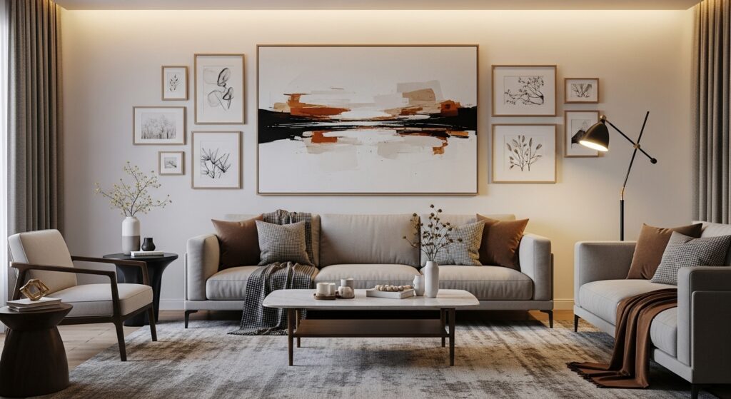
This layout begins with a bold central artwork that anchors the composition. Smaller frames surround it, creating balance while allowing the main piece to stand out. The arrangement feels intentional and layered, adding dimension without chaos. It works well when you want a focal point that immediately captures attention.
Spacing is key — supporting pieces should feel connected, not crowded. Repeating colors or themes ties the collection together. The centered structure aligns beautifully with the sofa, reinforcing symmetry while maintaining visual interest. The result is a gallery wall that feels curated and gallery-like, enhancing the room’s focal area.
5) Stair-Step Diagonal Layout
A stair-step diagonal layout introduces movement and energy above the sofa. Frames climb upward in a stepped rhythm, breaking traditional alignment and adding playful geometry. This design draws the eye naturally across the wall, creating a sense of motion that energizes the seating area.
Balancing frame sizes prevents the diagonal from feeling chaotic. Repeating materials or tones maintains cohesion. The angled flow complements contemporary interiors and adds personality without overwhelming the room. The result is a dynamic gallery wall that feels modern, creative, and visually engaging.
6) Frame Ledge Layered Display
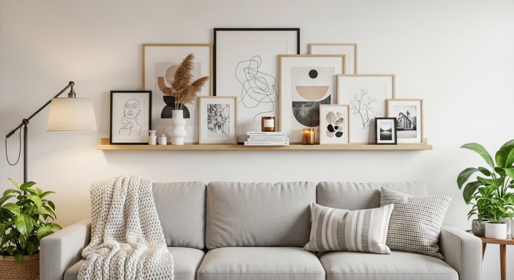
A frame ledge display replaces traditional hanging with layered styling. Artwork leans casually against the wall, creating depth and flexibility. This arrangement feels relaxed yet intentional, perfect for evolving decor. It also makes swapping pieces effortless, encouraging creativity.
Layering different sizes adds visual interest while maintaining structure along the ledge. Decorative accents like small plants or objects enhance the composition. The result is a gallery wall that feels adaptable and cozy, turning the sofa backdrop into a living display.
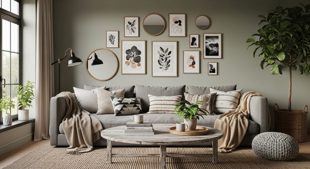
7) Mirror and Art Mix Layout
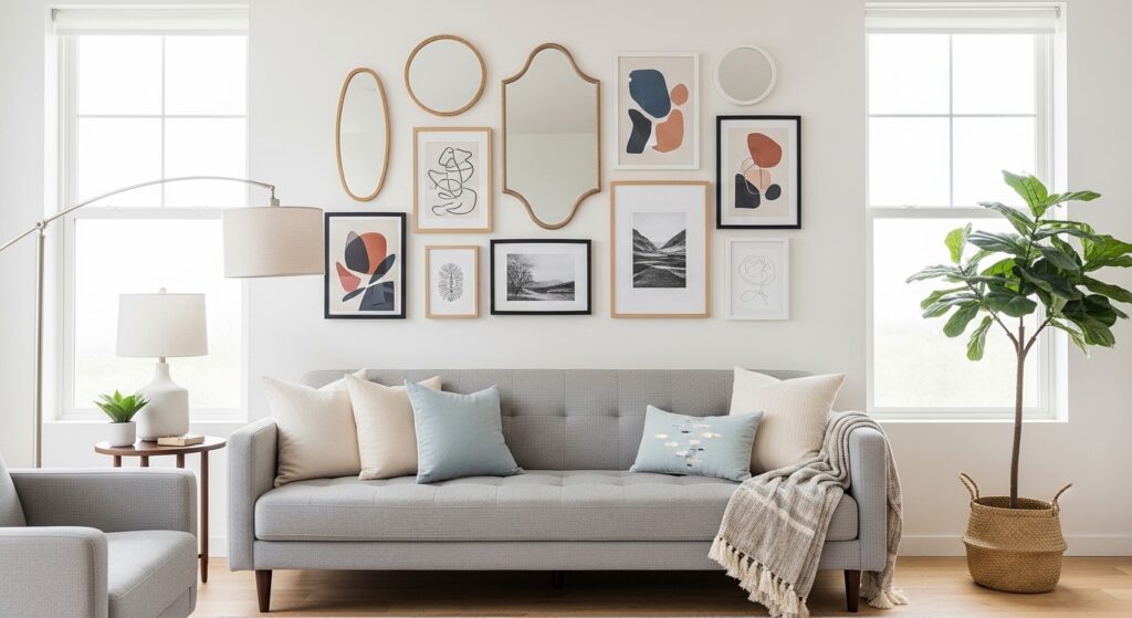
Combining mirrors with artwork introduces reflection and brightness to the sofa wall. Mirrors expand visual space while art adds personality, creating a balanced composition. This mix works especially well in smaller living rooms that benefit from extra light.
Arranging reflective pieces strategically prevents glare while enhancing depth. Repeating frame finishes ties everything together. The result is a gallery wall that feels luminous and layered, transforming the seating area into a stylish focal feature.
8) Vertical Column Pairing
Vertical column layouts emphasize height, making ceilings appear taller. Frames are stacked in balanced columns that create architectural rhythm above the sofa. This structure feels orderly and modern, ideal for clean-lined interiors.
Consistent spacing keeps the arrangement crisp and intentional. Neutral palettes maintain calm while allowing artwork to stand out. The result is a gallery wall that enhances vertical space and adds elegant structure to the room.
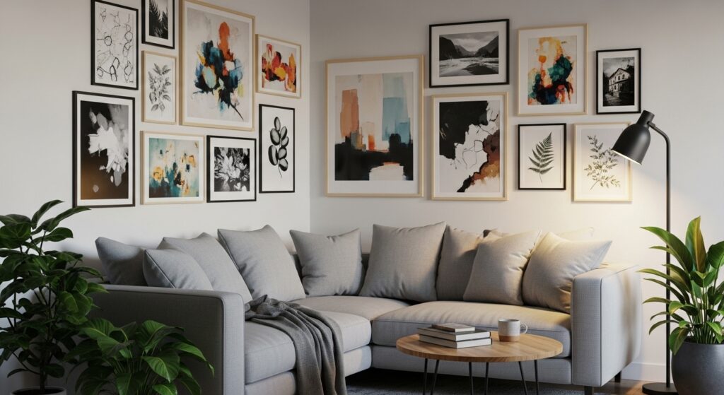
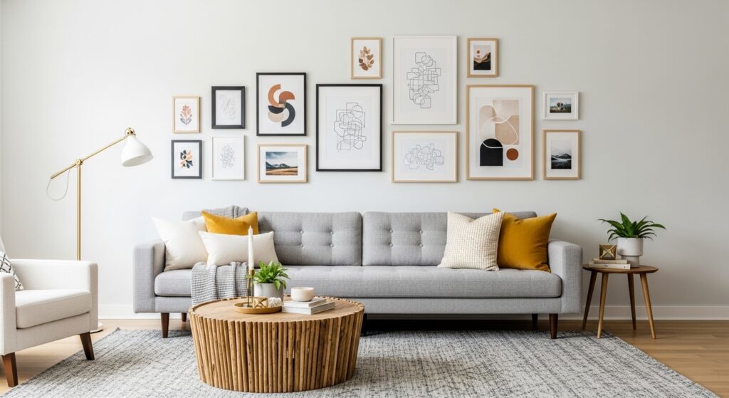
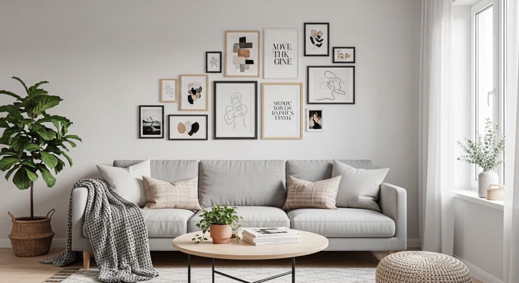
9) Eclectic Mixed-Shape Arrangement
Mixing frame shapes introduces playful contrast that energizes the sofa wall. Circular pieces soften the geometry of rectangular frames, creating visual balance and movement. This layout feels artistic and expressive, ideal for creative interiors.
Repeating colors or textures prevents the arrangement from feeling random. Starting with larger anchors helps guide placement. The result is a gallery wall full of personality that transforms the seating area into an engaging visual story.
10) Oversized Triptych Layout

A triptych layout uses three oversized pieces arranged side by side to create a strong, cohesive focal point above the sofa. The repetition feels structured while still offering visual interest through the artwork itself. Because the scale is generous, the wall feels anchored and intentional rather than sparse. This format works beautifully in modern living rooms where clean lines and bold statements define the space.
Keeping equal spacing between panels preserves balance and symmetry. A shared color palette helps the trio read as a single composition. The horizontal flow mirrors the sofa’s silhouette, reinforcing architectural harmony. The result is a gallery arrangement that feels gallery-grade and impactful, elevating the seating area with minimal clutter.
11) Centered Stack Arrangement

A centered vertical stack creates a clean focal column that draws the eye upward. Frames are aligned along a central axis, making the layout feel deliberate and architectural. This design is ideal for rooms where you want to emphasize height without filling the entire wall. The stack introduces structure while keeping the overall composition airy and uncluttered.
Consistent spacing ensures the stack feels intentional rather than crowded. Matching frames enhance cohesion, while varied artwork adds personality. Positioned directly above the sofa, the column becomes a sculptural visual element. The result is a refined gallery wall that balances simplicity with impact.
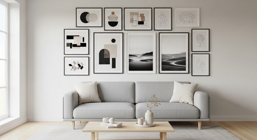
12) Wide Rectangle Frame Cluster

This layout forms a loose rectangular boundary using mixed artwork sizes. The outer edges align visually, creating a contained composition that feels organized while remaining flexible inside. It’s perfect for homeowners who want structure without strict symmetry. The rectangular silhouette complements the sofa’s proportions, making the wall feel intentionally framed.
Balancing heavier pieces with lighter visuals prevents visual tipping. Repeated tones or frame finishes unify the display. The arrangement reads as curated rather than random, adding depth and personality. The result is a gallery wall that feels full and expressive without overwhelming the seating area.
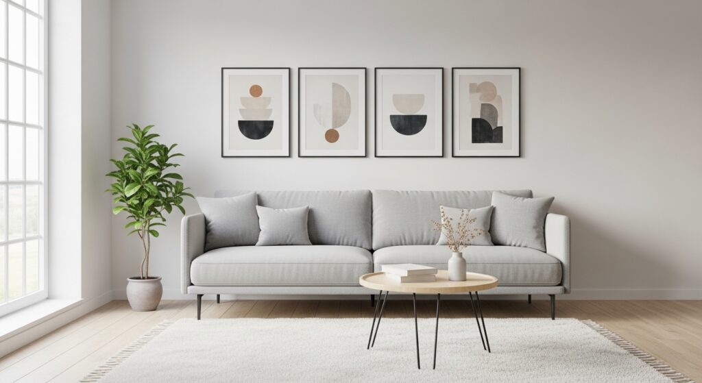
13) Minimal Two-Piece Balance
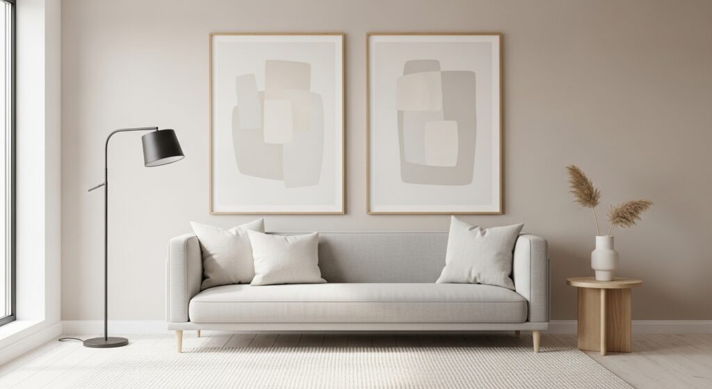
Sometimes simplicity creates the strongest impact. A two-piece layout places matching or complementary frames above the sofa, offering balance without clutter. This approach allows artwork to breathe while maintaining a focal presence. It’s ideal for minimalist interiors where restraint enhances sophistication.
Spacing plays a crucial role — equal distance from the sofa edges creates harmony. Coordinated colors ensure cohesion while letting each piece stand out. The result is a calm, elegant gallery solution that feels intentional and modern.
14) Shelf + Hanging Combo Layout
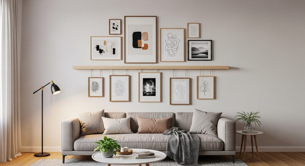
Combining a floating shelf with hanging artwork introduces dimension and layering. Frames above create vertical interest, while the shelf anchors the composition with decorative objects or leaning pieces. This layered approach adds texture without overcrowding the wall. It’s ideal for evolving decor styles.
Maintaining consistent spacing prevents visual chaos. Decorative accents echo colors found in the artwork, tying everything together. The result is a dynamic gallery wall that feels curated and adaptable, transforming the sofa area into a styled vignette.
15) Asymmetrical Corner Expansion
An asymmetrical layout pushes the gallery toward one side, creating intentional imbalance that feels artistic. This works beautifully when a lamp, plant, or furniture piece anchors the opposite side. The uneven spread introduces motion and personality without appearing random.
Balancing visual weight is essential — larger pieces ground the heavier side. Cohesive framing keeps the arrangement unified. The result is a gallery wall that feels modern and expressive, adding creative tension to the seating area.
16) Large Anchor + Mini Grid
This layout pairs a dominant statement piece with a compact grid of smaller frames. The contrast in scale creates hierarchy, guiding the viewer’s attention naturally. The large anchor establishes focus while the mini grid adds supporting detail and rhythm.
Aligning edges maintains visual order despite size differences. A shared palette ties the composition together. The result is a gallery wall that feels layered and intentional, balancing bold presence with refined structure.
17) Continuous Wrap Layout
A wrap layout extends artwork slightly beyond the sofa’s width, creating immersive continuity. The eye travels across and around the seating area, making the wall feel expansive. This approach works especially well in open-concept spaces where walls flow into one another.
Consistent spacing ensures cohesion as the display expands. Repeated themes or tones unify the arrangement. The result is a gallery wall that feels enveloping and thoughtfully integrated into the room’s architecture.
18) Mixed Frame Size Ladder Layout
A ladder layout arranges frames in ascending scale, creating visual progression that energizes the wall. The stepped rhythm adds movement without chaos, guiding the eye naturally upward and outward. This playful structure suits creative interiors.
Maintaining consistent gaps keeps the progression readable. Harmonized frames prevent distraction while allowing size variation to shine. The result is a gallery wall that feels dynamic and modern, adding personality above the sofa.
19) Floating Shelf Layered Grid

Using a floating shelf as the base for a layered grid creates versatility above the sofa. Larger frames rest on the shelf while smaller frames lean against the wall or hang slightly above. This creates dimension and allows easy rotation of artwork. The grid within this layout adds structure, keeping the wall balanced even with multiple layers.
Repeating colors or themes throughout the frames ties the composition together. Accent objects like small plants or vases enhance the display without overpowering the artwork. The result is a gallery wall that is adaptable, visually interesting, and effortless to update over time.
20) Overlapping Frame Collage
An overlapping collage layout introduces casual energy and depth to the sofa wall. Frames of varying sizes are partially layered, creating a three-dimensional effect. This approach works beautifully in eclectic or bohemian interiors, where a playful mix of artwork tells a story. The overlapping adds rhythm and keeps the wall from feeling static.
To maintain cohesion, repeat frame colors or tones within the mix. Position the largest frames as anchors, with smaller ones floating around. The result is a gallery wall that feels curated yet spontaneous, transforming the sofa area into an expressive visual feature.
21) Linear Triplet With Accents

A linear triplet combined with small accent frames introduces both symmetry and personality. The three primary pieces create a central anchor, while smaller frames around them soften the structure and add variety. This balance is ideal for modern interiors that favor clean lines with a touch of creativity.
Consistent spacing ensures a tidy composition. Matching tones in both large and small frames maintain visual harmony. The layout gives the sofa wall prominence while allowing decorative flexibility, resulting in a gallery that feels polished and approachable.
22) Diagonal Step-Up Layout
The diagonal step-up layout creates dynamic movement above the sofa. Frames increase in height along an upward angle, drawing the eye and adding energy to the space. This layout works well in rooms with angled ceilings or for accentuating furniture placement.
Repeating frame colors or similar artwork themes ensures cohesion. The staircase-like progression introduces visual rhythm and makes the wall feel lively. The result is a modern gallery display that adds dimension and personality above the seating area.
23) Circular and Rectangular Mix
Mixing circular and rectangular frames introduces softness to geometric layouts. The rounded shapes break the rigidity of rectangles, adding balance and flow. This playful combination works well for artistic homes or spaces that want personality without chaos.
Cohesive color themes keep the wall unified. Larger circular frames can anchor the layout while smaller rectangles fill gaps. The result is a gallery wall that feels layered, engaging, and visually balanced above the sofa.
24) Full-Width Horizontal Block
A full-width horizontal block aligns with the sofa, creating a clean, proportional display. Frames of similar sizes can fill the area, creating uniformity and structure. This approach anchors the seating area while emphasizing the sofa’s width, perfect for wide living rooms.
Even spacing and cohesive frames maintain balance. Adding subtle variations in artwork keeps it from feeling monotonous. The result is a polished gallery wall that feels integrated into the room’s architecture and elevates the entire living space.
25) Central Large Frame With Floating Minis
A dominant central artwork surrounded by smaller floating frames creates hierarchy and visual focus. The large piece immediately anchors the wall, while smaller frames add detail and balance. This is ideal for statement pieces in modern or transitional interiors.
Repeating frame finishes or palette across smaller pieces maintains harmony. The layout feels curated without being rigid, letting the centerpiece shine while supporting pieces add interest. The result is a gallery wall that combines drama with cohesion.
26) Layered Grid With Wall Objects
Adding wall objects like small shelves, clocks, or sculptural pieces within a grid introduces texture and dimension. This layered approach combines art with functional or decorative accents, creating a gallery that feels curated and alive. The structure keeps objects cohesive while allowing visual variety.
Consistent spacing and repeated colors unify the design. By blending art and decor, the wall becomes interactive and personal. The result is a gallery display that energizes the sofa area while showcasing creativity and style.
27) Minimal Floating Cluster

A minimal floating cluster uses a small number of frames to create impact without filling the entire wall. This layout is perfect for modern, airy spaces or smaller living rooms. The limited number of pieces allows each artwork to stand out and the wall to feel uncluttered.
Spacing and alignment are key for balance. Using similar frame finishes maintains cohesion. The result is a simple, elegant gallery wall that enhances the sofa area with understated sophistication.
Conclusion
A gallery wall above the sofa is more than decoration — it defines the heart of your living space. The right layout shapes how the room feels, whether calm and symmetrical, expressive and layered, or boldly architectural. Thoughtful placement, spacing, and cohesion transform artwork into a design feature that anchors the seating area and adds personality.
No matter your style, the key is balance. When layout, scale, and color work together, the wall becomes an intentional focal point rather than visual noise. With these ideas, you can design a gallery display that reflects your taste while elevating the entire room — proving that even a simple sofa wall can become a stunning centerpiece.