
As an Amazon Associate, I earn from qualifying purchases. This means I may earn a commission if you purchase through links on this page — at no extra cost to you.
By Ella Knight
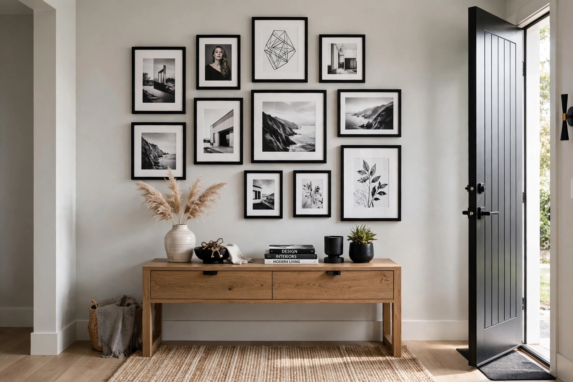
Black frames create bold contrast and make colors pop — best for white or light walls, colorful art, and modern spaces. White frames feel airy and blend seamlessly — best for dark or colored walls, minimalist interiors, and small rooms. For maximum versatility, black frames work in more situations, but white frames are better when you want the art (not the frames) to be the star.
Black Frames
Strengths
- Create strong definition around each piece
- Make colors appear more vivid
- Hide dust and fingerprints better
- Timeless — never goes out of style
- Work on any wall color
Considerations
- Can feel heavy in small rooms
- Show scratches more visibly
- May dominate delicate art
White Frames
Strengths
- Disappear into light walls for a floating effect
- Make small rooms feel larger
- Perfect for Scandinavian and coastal styles
- Let colorful art take center stage
Considerations
- Show dirt and yellowing over time
- Can look washed out on white walls
- Less dramatic impact
Room-by-Room Guide
We photographed eight rooms with both options. Black frames won in living rooms and offices (more presence). White frames won in bedrooms and bathrooms (calmer feel). Kitchens were a tie — depends on cabinet color.
The Third Option: Mixed
Don’t feel locked in. A gallery wall with 70% black frames and 30% white (or natural wood) frames looks intentionally curated. Just keep one finish dominant.
How Frame Color Changes the Art Itself
Frame color doesn’t just surround art — it actively changes how you perceive what’s inside the frame. This is a well-documented visual effect called simultaneous contrast: a black frame makes the colors inside it appear brighter and more saturated, which is why colorful prints and vivid photography look electric against black. The same artwork in a white frame will read slightly softer and calmer, because the white border lifts the overall brightness and reduces the punch of the colors.
🛒 Shop This Look:
For black-and-white photography, the effect flips in an interesting way. A black frame around a black-and-white photo deepens the blacks in the image — the photo’s darkest tones merge toward the frame, creating a bold, gallery-like intensity. A white frame does the opposite: it extends the photo’s highlights outward, making the image feel airier and more delicate. Neither is wrong; they’re different moods. Look at your art and ask what feeling you want: black frames add drama and weight, white frames add lightness and breathing room. When the art itself is the star and you want maximum impact, black usually wins. When you want the wall to feel calm and the art to float, white usually wins.
The 80/20 Rule for Mixed Gallery Walls
The “third option” of mixing black and white frames works best with intention rather than a 50/50 split, which can look indecisive. The ratio that consistently looks designed is roughly 80/20 — one frame color dominant, the other used as an accent. A wall that’s mostly black frames with two or three white ones feels curated and dynamic; the white frames become deliberate punctuation marks. Flip it for a light, airy wall with a few black frames anchoring the composition.
Placement matters as much as ratio. Scatter the minority frames across the arrangement rather than clustering them in one corner, which looks like you ran out of the main color. A good trick: place accent frames at visual anchor points — the center of the arrangement, or at the ends of a row — where they naturally draw the eye and look purposeful. Also keep frame styles consistent even when colors differ: all thin modern profiles, or all chunky vintage ones. Mixed colors with matched profiles look eclectic and intentional; mixed colors with mixed profiles often look accidental.
Frame Finish Matters as Much as Color
Not all black frames are the same black. A matte black frame absorbs light and recedes, letting art dominate — it’s the gallery standard for a reason and the safest choice for colorful or busy artwork. Glossy black reflects light and adds a dressier, more formal feel, but it can create glare under direct lighting and shows dust more readily. Distressed or textured black (common in farmhouse and vintage styles) softens the formality and pairs well with rustic or nostalgic art.
White frames have the same spectrum. Bright white is crisp and modern but can look stark against warm-toned walls or creamy art mats. Off-white and antique white finishes blend more gently with traditional decor and warm wall colors. One practical note: white frames show dirt, scuffs, and yellowing over time far more than black ones — in high-traffic hallways or kids’ rooms, black frames stay looking new with far less maintenance. If you love the white-frame look but dread the upkeep, look for white frames with a slight texture or distressed finish, which hide wear gracefully.
When to Break the Rules
Every guideline above has a worthy exception. Oversized black frames on a dark charcoal wall — breaking the “black needs light walls” rule — can look incredibly moody and sophisticated in a study or media room, as long as the art inside has enough contrast to read. White frames on white walls, which sounds invisible, actually work beautifully when the frame has a deep profile that casts a shadow line — the dimension, not the color, defines the edge.
🛒 Shop This Look:
The most reliable way to decide: mock it up. Cut kraft paper or newspaper to your frame sizes, tape them to the wall, and live with the arrangement for a few days. Then hold actual frame samples (even cheap ones from a craft store) against the wall in morning and evening light. Frame color is one of the few decor decisions you can fully preview before spending real money — take advantage of that. And remember that frames are not permanent: unlike paint, you can swap a black frame for white in an afternoon, so treat the decision as reversible and trust your eye.
Frame Color and Wall Color: The Complete Pairing Guide
The frame-art relationship gets all the attention, but the frame-wall relationship is equally decisive — it’s the larger visual field. Black frames on white or light walls are the classic high-contrast pairing: maximum definition, gallery energy, and the reason this combination dominates modern interiors. The contrast makes each frame read as a distinct object, which suits bold, graphic arrangements. Black frames on dark or moody walls (charcoal, navy, forest green) create a tonal, enveloping look — the frames nearly disappear and the art floats. This is sophisticated but demands art with enough internal contrast to read against the dark field; low-contrast art vanishes.
White frames on white walls sound invisible but work through shadow: the frame’s profile casts a subtle shadow line that defines each piece softly — serene, minimal, and very Scandinavian. It fails only with flat-profile frames that truly disappear. White frames on dark walls are the highest-drama pairing of all — each frame pops like a lightbox, which is stunning for black-and-white photography but can feel harsh with colorful art. On mid-tone walls (greige, sage, warm gray), both black and white frames work, and the choice becomes about mood: black adds structure and grounding, white adds airiness. One pairing to handle carefully: white frames on beige or cream walls — the low contrast can look washed out unless the art inside has strong darks to anchor each frame. When in doubt, hold the frame against the wall and squint: if you can still “see” the frame’s edge clearly, the pairing has enough definition.
Mixing Frame Colors With Different Art Styles
Frame color decisions get more interesting when the art styles vary — photography, abstracts, typography, vintage prints all on one wall. The unifying principle: let the frame color respond to the art’s dominant tone, not its style. A dark moody photograph and a dark abstract painting both want black frames even though they’re different mediums; a light airy watercolor and a minimal line drawing both want white. When you frame by tonal weight rather than by category, mixed-style walls cohere effortlessly.
Typography and graphic prints are the most frame-flexible — black text on white paper looks sharp in either black or white frames, so use these pieces as your “swing” frames to balance the wall’s overall ratio. Vintage and antique art (old maps, botanical prints, sepia photos) generally prefers black or dark wood — white frames can make aged paper look dirty by contrast. Very colorful contemporary art usually wants black for maximum pop, unless the piece is predominantly light and airy. When a single piece could go either way, default to the wall’s dominant frame color — consistency across the wall matters more than optimizing any individual piece. And remember the mat as a mediator: a white mat inside a black frame softens the transition for light art, while a black frame with no mat hits harder. The frame, mat, and art form a system — adjust all three together rather than treating frame color as an isolated choice.
🛒 Shop This Look:



