
As an Amazon Associate, I earn from qualifying purchases. This means I may earn a commission if you purchase through links on this page — at no extra cost to you.
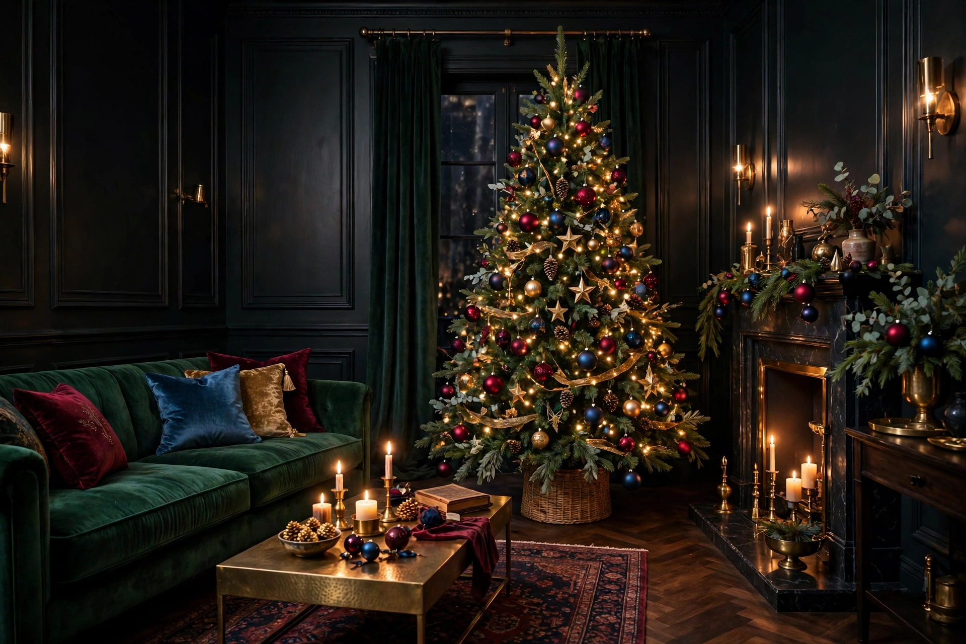
If you love a Christmas that feels rich, cozy, and a little dramatic — rather than bright or minimalist — jewel tones are made for you. Emerald, sapphire, deep burgundy, amethyst, and warm gold create a look that feels luxurious without feeling formal. They work in real homes, from small apartments to spacious living rooms.
You do not need to replace everything you own to try this look. Jewel tones layer well over the basics most people already have: a green tree, warm white lights, natural wood, and neutral sofas or walls. Add depth through color — deep-toned ornaments, a velvet throw, brass candlesticks — and the whole room shifts. This guide covers building a palette, using it room by room, mixing textures and metals, and avoiding mistakes that make deep colors feel heavy.
How to Build a Jewel-Tone Palette
Treat the palette like a recipe: pick one dominant color, one supporting color, and one metallic accent. That structure keeps the look cohesive and stops dark shades competing for attention. Repeat those elements in every room, changing the proportions, so your home feels connected.
Emerald Green: Your Anchor Color
Emerald is the easiest starting point because your tree is already green. Deep emerald extends that natural color into the rest of the room through stockings, pillows, table runners, and ribbon. It pairs well with warm wood, cream, and brass. If your walls or sofa are neutral, emerald is a safe dominant color — strong enough to set the mood, familiar enough not to overwhelm.
Sapphire Blue: Cool, Calm Depth
Sapphire and deep navy add a cool contrast that keeps emerald and burgundy from feeling too warm or traditional. Use sapphire in smaller doses: ornaments, a throw, napkins, or wreath ribbon. Blue also bridges cool neutrals — grey, white, black — and warmer jewel tones. For a calmer scheme, make sapphire dominant and let gold supply warming sparkle.
Burgundy and Wine: Warmth and Tradition
Burgundy, wine, and oxblood bring the warmth of classic Christmas decorating in a deeper, moodier form than bright red. These shades make candlelight look richer and greenery look fuller. Try burgundy where you want intimacy: on the mantel, in a centerpiece, or in bedroom textiles. Pair it with emerald for a traditional direction, or with amethyst and gold for something more glamorous.
Amethyst Purple: The Unexpected Accent
Amethyst and plum are the wild cards of the palette, and a little goes a long way. Purple can tip a scheme from classic to distinctive in glass ornaments, velvet ribbon, or a few stems tucked into a garland. Use it as a supporting color, repeated at least three times in a room — an ornament cluster, a cushion, a candle — so it looks intentional. Deep plum can also meet blush shades — see pink Christmas decor ideas for that softer direction.
🛒 Shop This Look:
Gold and Brass: The Metallic That Ties It Together
Every jewel palette needs a metallic, and warm gold or aged brass is the natural choice. Metal reflects light in rooms that could otherwise feel dark, and links your colors across ornament caps, candlesticks, trays, and bells. Choose one finish — shiny gold reads glamorous, brushed brass softer and more vintage — and repeat it consistently.
Jewel-Tone Ideas for the Christmas Tree
The tree is where this palette shines — deep colors against dark green branches create a layered, boutique look. Start with warm white lights rather than multicolored or cool white; warm light makes emerald, burgundy, and gold glow instead of turning muddy. Work in layers: larger ornaments and ribbon deeper in the branches first, then medium ornaments, then your most reflective pieces near the tips.
Use a rule of three colors on the tree. Let your dominant tone cover roughly half the ornaments, your supporting tone a third, and reserve the rest for metallics. Cluster two or three same-color ornaments together in a few places instead of spacing every color evenly — clusters look richer. Velvet or wired satin ribbon in burgundy or emerald, woven loosely through branches or tied in simple bows, adds softness glass alone cannot.
For help with placement, ribbon, and toppers, see these Christmas tree decorating ideas for 2026. Finish the base with a tree skirt or collar in a deep tone or metallic finish — grounding the tree makes it feel complete.
A Jewel-Tone Mantel That Feels Full, Not Cluttered
On the mantel, depth comes from layering, not quantity. Start with a garland and weave in one jewel color through ribbon, berries, or nestled ornaments. Add height with brass candlesticks or lanterns at each end, leaving the middle clearer for a mirror, artwork, or wreath above. Stockings in emerald velvet or burgundy bring the scheme to eye level.
Build in varied heights: a trio of candles, a stack of cloth-bound books in deep tones, a bowl of gold ornaments. If everything sits at one height it reads flat; if every inch is covered, it reads busy. Empty pockets let the rich pieces stand out. The same layering works year-round — carry it into your everyday living room ideas after the season.
Setting a Jewel-Tone Christmas Table
The table is the easiest place to experiment — linens and glassware are temporary and low-commitment. A deep emerald or burgundy runner over a plain cloth — or directly over wood — instantly changes the room. Add gold chargers or brass cutlery if you have them, napkins in your supporting color, and colored glassware in amber, green, or smoky plum.
Keep the centerpiece low so guests can see each other: a short garland down the center, dotted with tea lights in brass holders and a few palette ornaments. Once the table is set, remove one element — jewel-tone tables look luxurious when abundant, cluttered when every setting carries five accents.
Entryway: A Rich First Impression
Your entryway needs only a few touches. Hang a wreath tied with a wide velvet bow in burgundy or emerald, add a lantern or brass bells beside it, and put a metallic tray on the console for keys — functional pieces can carry the palette too. If there is a mirror, a short garland across its top corner reflects light and doubles the effect. In a small entry, pick one jewel color and repeat it three times: wreath ribbon, bench cushion, and a runner with a deep border. Repetition makes a narrow space look styled rather than sparse.
🛒 Shop This Look:
Bedroom Touches for a Cozy Jewel-Tone Finish
You do not need a tree in the bedroom — though a small tabletop tree with warm lights and deep ornaments is lovely — because textiles do the work here. Drape a velvet throw in amethyst or emerald across the foot of the bed, add a cushion cover or two in your palette, and run a short garland along the headboard or dresser. Keep bedding mostly neutral so accents stay accents; an all-dark bed can feel heavy in a room meant for rest. Finish with a candle in colored glass on the nightstand and warm-toned lamp bulbs. The goal is the quiet end of the celebration, not a second party space.
Mixing Metals and Textures
Texture stops jewel tones looking flat. Deep colors absorb light, so they need contrast in finish to come alive. Velvet is the hero: its sheen changes as you move, making emerald and burgundy shift from every angle. Pair it with smooth glass, glossy ceramics, and matte linen or wool.
- Velvet: ribbon, stockings, cushions, throws — the signature texture. Use it in at least two places per main room.
- Glass: ornaments, votives, colored glassware. It carries jewel color while letting light through, keeping arrangements from feeling heavy.
- Brass and gold: candlesticks, bells, trays, and ornament caps. Keep to one warm metal family for cohesion.
- Natural elements: pinecones, wood, greenery — these stop the scheme feeling too polished.
On metals, mix with intent. Gold and antique brass can share a room — they sit in the same warm family. Adding chrome or bright silver everywhere cools the palette and fights the mood. If you own silver pieces you love, group them in one spot rather than scattering them through gold displays.
Lighting Tips for Deep, Moody Color
Lighting makes or breaks this palette. Jewel tones suit warm, low, layered light, so switch key bulbs to warm white and rely on lamps rather than one bright ceiling light in the evening. Candles, real or flameless, in brass holders and colored glass votives add flicker that makes burgundy and amethyst glow. Warm white string lights are the right default on tree and mantel. Place a lamp so light grazes velvet and metallic surfaces from the side — side light reveals texture overhead light hides. By day, open curtains fully: deep colors need natural light to show richness rather than reading as near-black.
Common Mistakes to Avoid
- Using every jewel tone at full strength. Five saturated colors in equal amounts compete. One dominant, one support, one metallic is the reliable formula.
- Forgetting light. A dark palette in a dim room with cool bulbs turns muddy. Warm light and metallic accents are part of the scheme, not extras.
- Skipping neutrals. Cream, warm white, wood, and the green of the tree are the breathing room that lets jewel colors look rich instead of oppressive.
- Matching everything exactly. Slight variation — emerald ribbon beside bluer-green ornaments — looks layered. Identical sets can look flat.
- Ignoring scale. Tiny ornaments alone on a large tree, or one small cushion carrying a whole palette, will underwhelm. Repeat colors in a few substantial pieces.
FAQ
Which jewel tones work best together if I can only pick two?
Emerald with gold is the most foolproof pairing — the tree supplies the green, gold adds the light. Burgundy with gold is a close second for a warmer, traditional feel. For cooler rooms, sapphire and gold give depth with no red or green at all.
Can I use jewel tones in a small room without making it feel smaller?
Yes — proportion is key. Keep walls, sofa, and other large surfaces light, and concentrate jewel tones in the tree, textiles, and tabletop pieces. Use warm light, metallic accents, and one dominant color instead of all five.
Do jewel tones work with the decorations I already own?
Usually, yes. Gold, clear glass, and natural wood fit easily into a jewel scheme. Bright red and pastels are hardest to blend; retire them for a season, or soften bright red by placing it beside burgundy and emerald neighbors on the tree.
Is a jewel-tone theme suitable for a family home with young children?
It can be. Velvet cushions, throws, and linens carry much of the color, so reserve glass ornaments for higher branches and choose shatterproof versions in the same deep colors below. Dark tones also hide everyday visual clutter better than an all-white scheme.
A Richer Way to Do Christmas
Jewel-tone decorating is less about buying a whole new set and more about repeating a direction with confidence: one or two deep colors, a warm metallic, velvet, glass, and flattering light. Start with the tree, echo the palette on mantel and table, and let small touches in the entryway and bedroom make the home feel considered. The result is luxurious and welcoming — moody in the best way, and unmistakably Christmas.
🛒 Shop This Look:




3 thoughts on “Jewel-Tone Christmas Decor Ideas: Rich, Moody Color for a Luxe Holiday Look”
Comments are closed.