
As an Amazon Associate, I earn from qualifying purchases. This means I may earn a commission if you purchase through links on this page — at no extra cost to you.
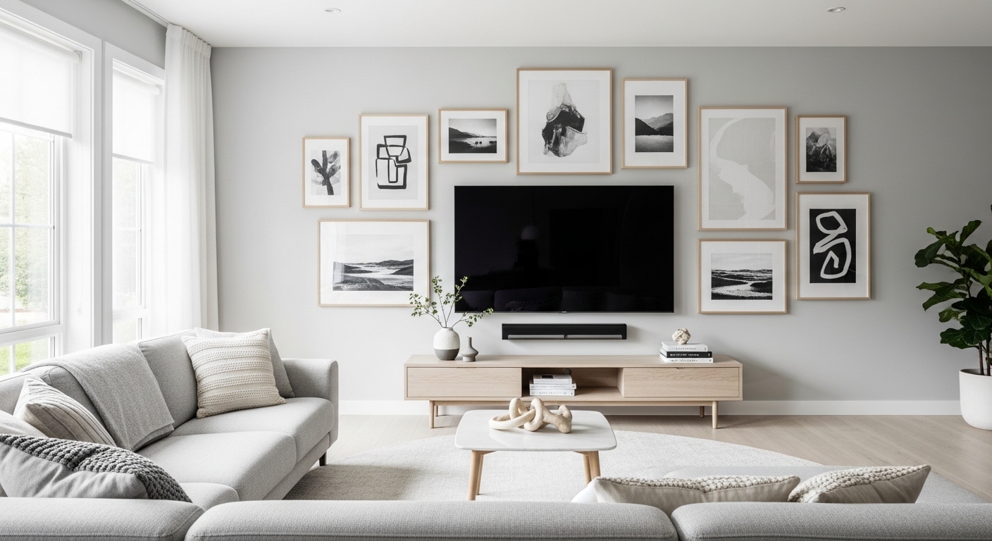
A gallery wall around a TV is a harder problem than a regular gallery wall, because the TV is not just another frame. It is a large black rectangle that turns on and off, reflects light, and demands attention on its own schedule. Done well, the TV disappears into a composed wall and the room feels finished. Done badly, the wall looks like clutter competing with a screen. The difference is not taste — it is a short list of decisions made in the right order: TV placement first, layout framework second, scale and spacing third, then glare and cables before a single nail goes in.
Start With the TV, Not the Art
Hang the art around the TV, not the TV around the art. Mount the TV at a comfortable viewing height first — the center of the screen roughly at eye level from your usual seat — and leave the wall around it as your canvas. Note the bezel color, because it sets the frame palette: a black-bezel TV pairs naturally with black frames, creating a cohesive dark band across the wall, while a silver or white bezel bridges better to lighter frames or natural wood. Note the width too, because the gallery should relate to it: a gallery much narrower than the TV looks like an afterthought, and one much wider swallows the screen.
Some people paint a large rectangle on the wall behind the TV in a dark tone, then hang art on the painted area. This creates a gallery zone that visually contains both the screen and the art as one composition, and it is especially useful when the TV sits on a light wall where a black screen otherwise floats. An accent wall behind the TV works the same way, giving the whole arrangement a boundary.
Choose a Layout Framework
Pick one framework and commit to it. Mixing frameworks is what makes TV walls look cluttered, because the eye cannot find the organizing idea.
Symmetrical grid. Equal spacing, consistent frame sizes, two or three rows above and beside the TV. This is the safest framework and the best for modern, minimalist rooms, because the grid’s order counteracts the TV’s visual weight. It demands discipline: one frame size change or one off-grid piece breaks the effect.
Vertical columns. Columns flanking the TV on both sides, aligned and evenly spaced, in a unified color scheme. Columns work well in rooms with tall ceilings or narrow wall space, because they frame the screen without needing width. Keep the columns the same height or the wall will feel lopsided.
Single column or small cluster. One vertical column next to the TV, or a compact cluster of three to five small prints above it. This is the right choice when the wall is small or the TV is large relative to it. A single statement frame above the TV also belongs here: one large piece, its width complementing the TV, anchoring the wall without competition.
Shelf-led gallery. Floating shelves with art leaned on them, layered frames, and a few small objects. Shelves are the most forgiving framework because you can rearrange without new holes, and they suit renters. Keep the shelf width slightly shorter than the TV for balance, keep objects minimal, and do not let the shelf become a storage ledge — every object on it should earn its place visually.
Asymmetry can work, but it needs anchors: larger prints near the TV’s corners acting as visual weight, smaller pieces balanced on the opposite side, and a consistent spacing and color palette holding it together. Without anchors, asymmetry around a TV reads as chaos, because the screen itself is already the biggest asymmetric weight on the wall.
🛒 Shop This Look:
Scale and Spacing Rules
Scale matters more around a TV than on a typical gallery wall. Pieces smaller than 8 by 10 inches tend to look like visual clutter next to a large screen, while oversized pieces can overwhelm the wall. The sweet spot is medium pieces in the 11 by 14 to 16 by 20 range, which hold their own against a 55 to 65-inch TV without dominating. If your TV is 75 inches or larger, go bigger with the art or use fewer, larger pieces rather than many small ones.
Spacing is the other half of uncluttered. Use one consistent gap between pieces — two to three inches is the usual range — and keep the same gap between the art and the TV’s edge, so the TV reads as part of the grid rather than an interruption in it. Consistent spacing is more important than perfect symmetry: a slightly asymmetric arrangement with even gaps looks curated, while a symmetric arrangement with random gaps looks accidental. Before drilling, lay the arrangement on the floor or trace each frame on kraft paper and tape the templates to the wall. Live with the templates for a day, checking from your usual seat, before committing.
For layouts above a sofa, the same spacing discipline applies with one extra rule: the gallery’s bottom edge should relate to the sofa, not float at a random height. See gallery wall layouts above the sofa for how that relationship works when seating is involved.
Glare and Reflections: Keeping the Screen Watchable
A gallery wall around a TV has one enemy that a regular gallery wall does not: glare. Glass-covered frames catch light from windows and lamps and throw bright reflections across the screen, which is distracting during a movie and tiring during a long show. The fix starts with placement. Notice which wall the windows face and avoid hanging glass-fronted frames directly opposite them. If the only available wall faces a window, that is the wall to fill with canvas prints, unglazed art, or frames fitted with anti-reflective acrylic instead of standard glass.
Frame glazing choices make a real difference. Standard glass is the most reflective option. Anti-reflective glass and acrylic cut reflections noticeably, and matte or museum-grade acrylic cuts them further, though it costs more. For pieces hung close to the TV, where reflections land in your peripheral vision, the upgrade is worth it. Canvas prints and wood-mounted art have no glazing at all, which makes them the safest neighbors for a screen. Keep mirrors away from the wall opposite the TV as well — a mirror there doubles every reflection in the room.
Lighting placement finishes the job. Aim picture lights and spotlights at the art, not across the screen, and keep lamps out of the direct line between the seating and the TV. A soft light behind the TV, known as bias lighting, reduces eye strain in a dark room and makes the screen’s own glare less noticeable. Before you finalize the arrangement, sit in your usual viewing spot at the time you normally watch, with the lights as you normally have them. Any reflection you can see from the sofa is one you will see every night — move that frame now, while the nails are still easy to adjust.
🛒 Shop This Look:
Choosing Art That Complements Your Screen
The art around a TV should enhance the viewing area without competing with the screen. Black-and-white photography is the safest choice because it recedes visually when the TV is on. Your eye naturally prioritizes the colorful moving image over monochrome stills. Abstract prints in muted tones work similarly. Avoid anything with bright reds, neon colors, or high-contrast patterns near the screen, as these pull peripheral attention during movies and shows.
Limit the palette and the frame colors. One or two frame colors, one color family in the art, and the TV’s bezel as part of the palette — that restraint is what separates a gallery from a collage. Mixed media can add dimension, but around a TV it should stay subtle: a small clock or a single sculptural piece, not a shelf of objects competing with the screen. Every piece should pass the same test: does it still look quiet when the TV is on?
Cable Management for a Clean Gallery Wall
Nothing ruins a gallery wall faster than visible cables snaking down from the TV. Before hanging any art, solve the cable problem. The cleanest solution is an in-wall cable management kit, which routes power and HDMI through the wall cavity to an outlet behind your media console. These kits are renter-friendly in many cases since they use existing outlet cutouts, but check your lease before cutting any new holes.
If in-wall routing is not an option, paintable cord covers are the next best choice. Run all cables through a single cover painted to match your wall color, routing it straight down behind where a tall frame or plant will sit. Position one of your gallery pieces strategically to hide the cover’s bottom exit point. With careful placement, visitors will never notice the cord management at all. Plan the cable route before you hang, because moving a frame to hide a cable you forgot is how walls end up with extra holes.
🛒 Shop This Look:
Hanging Order and Final Checklist
Hang in this order: TV mount first, then the largest anchor pieces, then the framework around them, then the small fillers. Check level after every piece, not at the end, because one tilted frame throws off the whole grid. Step back to your seat after each row and check the composition from where you will actually look at it, not from two feet away.
Final checklist before you call it done: one framework, not a mix; one consistent gap everywhere, including around the TV; no piece smaller than 8 by 10 next to a large screen; no glass-fronted frame opposite a window; no mirror on the wall opposite the TV; no visible cables; and a viewing test from the sofa at your normal watching time with normal lights. If every box is ticked, the TV stops being a black rectangle on a wall and becomes part of a gallery — which was the whole point.