Low-light rooms don’t have to feel dull or cramped — the right wallpaper can completely change how the space looks and feels. Thoughtfully chosen patterns add depth, softness, and subtle brightness by helping walls reflect ambient light.
Instead of fighting shadows, good design works with them, creating a cozy and intentional atmosphere. Whether you prefer gentle textures or structured patterns, wallpaper becomes an easy way to make dim spaces feel warm, layered, and visually inviting.
1) Soft Botanical Silhouettes

Low-light rooms often feel flat, but soft botanical silhouettes introduce gentle movement without overwhelming the space. A wallpaper featuring faded leaves or subtle vines in muted greens, creams, or dusty neutrals reflects what little light exists, creating an illusion of depth. Because the pattern is organic and flowing, the walls feel alive rather than dark or boxed in. This approach works beautifully in bedrooms or reading corners where calmness matters. The softness of the shapes prevents visual clutter, allowing the eye to travel naturally around the room.
Botanical silhouettes also pair wonderfully with natural materials like linen curtains, wooden furniture, and warm lighting. The wallpaper becomes a quiet background that enhances atmosphere instead of dominating it. In dim spaces, harsh contrast can feel heavy, but botanical tones soften transitions between light and shadow. Adding layered lighting — table lamps or wall sconces — makes the leaves appear subtly dimensional. The result is a room that feels breathable, serene, and visually expanded, even when natural light is limited.
2) Pearlized Geometric Grids
Geometric grids with a pearlized or satin finish are ideal for low-light rooms because they bounce ambient light without glare. The clean structure of repeating shapes introduces order and modernity while the subtle sheen acts like a soft reflector. Instead of appearing dark, the walls gain a gentle glow that changes throughout the day. This makes compact rooms feel intentionally designed rather than underlit. The geometry adds rhythm, helping define the space visually even when shadows dominate.
These patterns shine in modern interiors where sleek furniture and metallic accents enhance the reflective quality. A pearlized grid wallpaper works especially well behind sofas or desks, creating a focal wall that brightens the room indirectly. The repeating pattern prevents visual stagnation while remaining calm enough for everyday living. Paired with warm bulbs, the wallpaper emits a cozy shimmer that transforms dull corners into inviting design features, proving that structure and softness can coexist beautifully.
3) Watercolor Ombre Wash
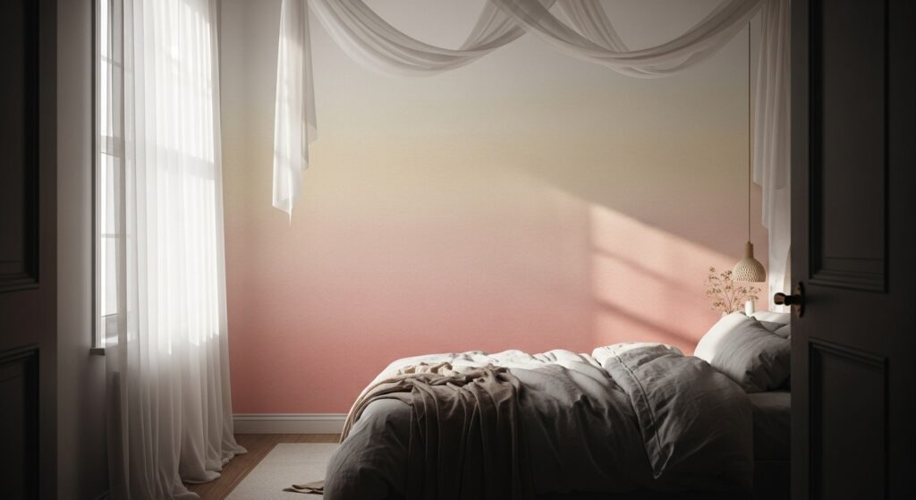
A watercolor ombre wallpaper introduces a gradient that visually lifts a low-light room. By fading from a lighter tone to a slightly deeper hue, the wall mimics natural light movement. This illusion adds vertical openness and prevents the space from feeling closed in. The fluid blending resembles hand-painted art, creating softness that diffuses shadows rather than emphasizing them. Such patterns are ideal for relaxation zones where mood matters more than sharp detail.
The dreamy texture pairs beautifully with plush fabrics, sheer curtains, and warm-toned lighting. In dim rooms, harsh edges can make walls feel heavy, but ombre transitions soften boundaries. The subtle color shift draws the eye upward, making ceilings appear taller and the room more expansive. When combined with layered textiles and neutral decor, the wallpaper feels like a glowing backdrop, turning low light into a design advantage rather than a limitation.
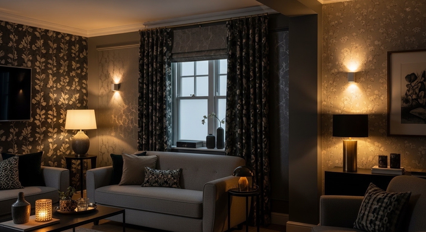
4) Micro Floral Scatter
Micro floral patterns bring charm and texture without overwhelming darker spaces. Unlike large florals that can dominate, small scattered blooms create visual interest that reads as softness from afar. In low-light rooms, this delicate repetition breaks up shadow-heavy surfaces and introduces warmth. Pastel palettes — blush, sage, cream — subtly brighten walls while maintaining a cozy atmosphere. The effect is welcoming and nostalgic, perfect for spaces meant for comfort.
The charm of micro florals lies in their ability to blend with vintage or cottage-inspired decor. Wooden furniture, layered fabrics, and warm lighting enhance the wallpaper’s gentle personality. Because the pattern is fine and continuous, it disguises uneven lighting while keeping the room lively. The space feels curated rather than dim, proving that subtle pattern density can create visual brightness without relying on bold color or excessive illumination.
5) Soft Marble Veining
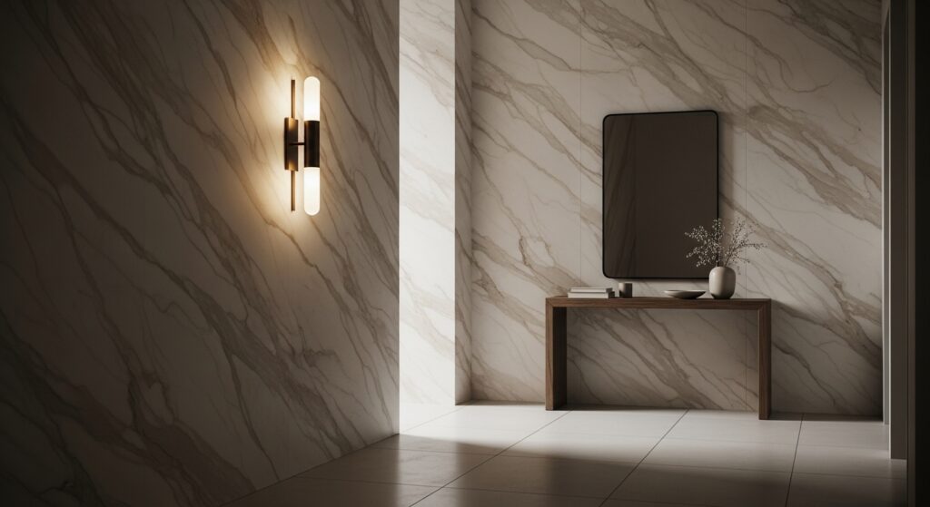
Marble-inspired wallpaper with gentle veining reflects light in unpredictable ways, adding movement to low-light rooms. The flowing lines mimic natural stone, introducing elegance without heaviness. Lighter marble tones — cream, beige, pale gray — bounce ambient light subtly, making walls feel luminous instead of dull. The organic veins prevent flatness and give the illusion of texture, elevating small or shadowed spaces.
This wallpaper pairs effortlessly with minimalist decor and metallic accents, enhancing its refined look. In dim hallways or bedrooms, the veining catches warm lighting, creating a soft glow that shifts throughout the day. The pattern acts like visual energy, guiding the eye and expanding perceived depth. Even without abundant sunlight, the room feels polished and airy, demonstrating how texture-based patterns can simulate brightness.
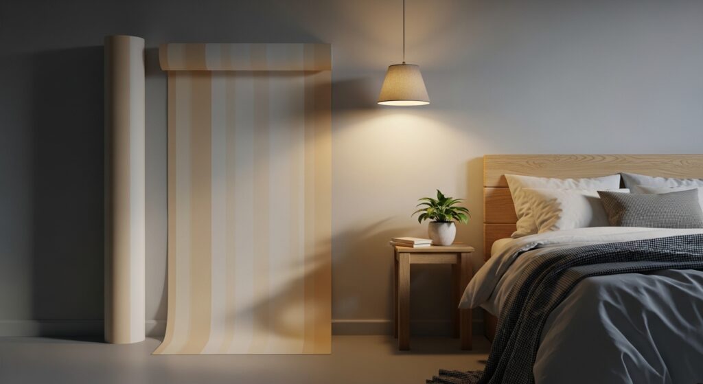
6) Subtle Vertical Pinstripes

Vertical pinstripes are a classic solution for visually stretching dim rooms. Thin lines draw the eye upward, making ceilings appear higher and spaces feel less compressed. In low-light settings, neutral stripes — ivory, sand, pale gray — reflect illumination evenly. The repetition introduces structure without heaviness, allowing shadows to blend naturally into the design.
Pinstripes work especially well in offices or narrow rooms where visual clarity matters. Paired with streamlined furniture and warm lighting, the pattern feels crisp yet welcoming. The linear design subtly enhances architectural proportions, transforming underlit walls into purposeful design features. The result is a room that feels taller, cleaner, and brighter, despite limited natural light.
7) Linen Texture Print

Linen-inspired wallpaper adds tactile warmth that softens shadow-heavy rooms. The woven illusion creates depth without bold pattern, allowing light to diffuse gently across the wall. Neutral tones reflect warmth, making dim spaces feel cozy instead of dark. The texture disguises uneven lighting and adds sophistication through subtle detail.
This pattern complements layered fabrics, wooden elements, and ambient lighting. In low-light rooms, smooth walls can feel flat, but linen texture introduces quiet complexity. The wallpaper becomes a comforting backdrop that enhances relaxation and visual balance. The room feels grounded, warm, and intentionally styled.
8) Delicate Metallic Dots

Metallic dot patterns act like tiny reflectors scattered across the wall. In low light, these subtle accents catch illumination and distribute it softly, creating sparkle without glare. The pattern feels playful yet refined, adding brightness through reflection rather than color.
When paired with warm lighting, the dots shimmer gently, bringing life to darker corners. The wallpaper balances elegance and whimsy, making rooms feel animated and inviting. It’s ideal for spaces that need visual lift without bold statements.
9) Cloud-Like Abstract Wash
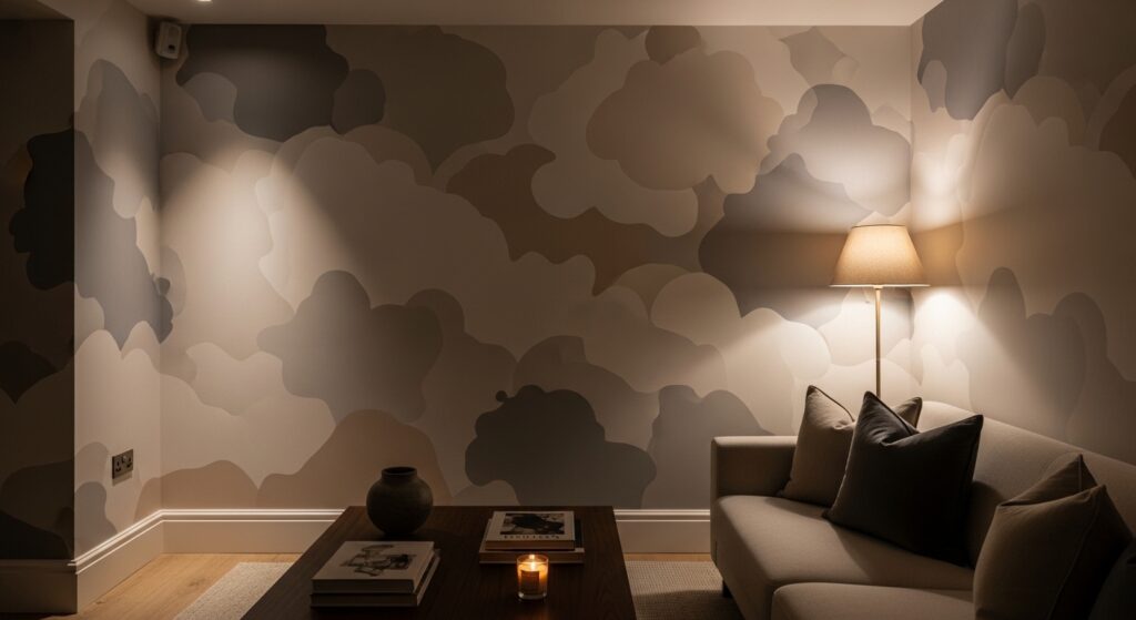
Cloud-inspired abstract patterns introduce softness that diffuses shadows naturally. The blurred shapes mimic atmospheric movement, preventing walls from feeling static or heavy. Light tones gently bounce illumination, creating a sense of openness.
The dreamy texture pairs beautifully with plush seating and layered lighting. Shadows blend into the design, making the room feel expansive and calm. It transforms low light into an intentional mood element.
10) Soft Damask Revival
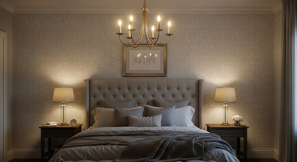
Modern damask patterns in muted tones bring timeless elegance without overpowering darker rooms. The intricate motifs create depth while lighter colors reflect ambient light. This balance keeps the room refined yet airy.
Warm lighting highlights the pattern’s details, creating a gentle glow that enhances sophistication. The wallpaper turns low light into a luxurious atmosphere, proving classic designs can feel fresh and bright.
11) Warm Neutral Herringbone
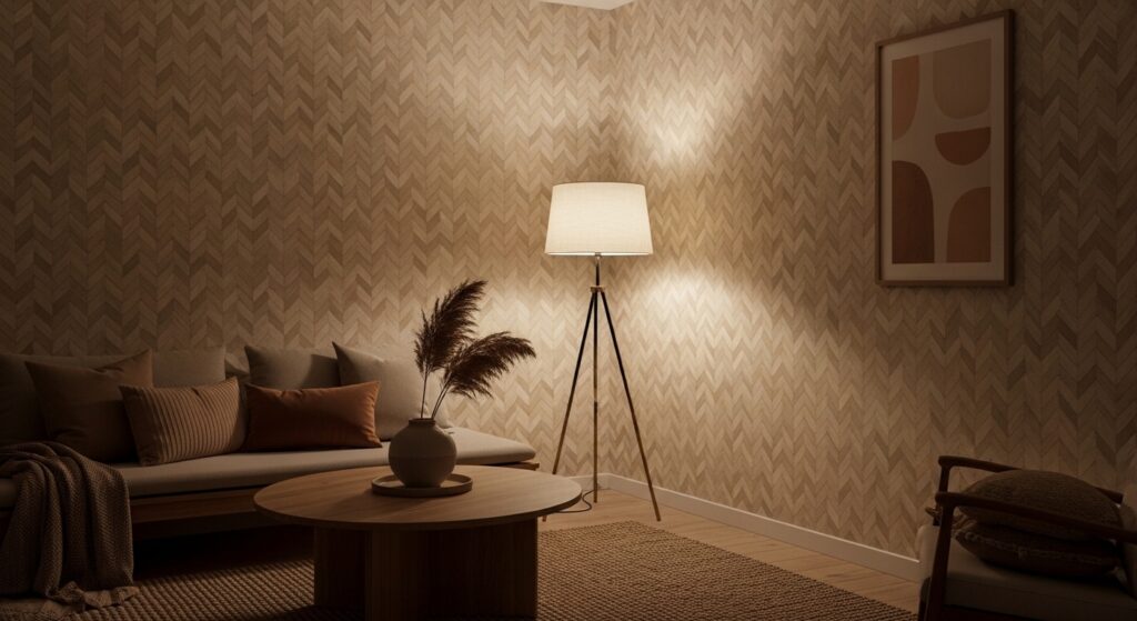
Herringbone patterns bring quiet movement to low-light rooms without overwhelming the eye. The angled repetition creates subtle rhythm, helping walls feel dynamic rather than flat. When rendered in warm neutrals like beige, sand, or soft taupe, the pattern reflects ambient light gently, preventing shadows from pooling heavily in corners. The zigzag structure guides the eye across the wall, visually expanding compact spaces. In dim rooms, this sense of movement keeps the environment feeling intentional and styled rather than underlit or dull.
The warmth of neutral tones pairs beautifully with layered lighting and natural textures. Wood finishes, woven rugs, and soft upholstery enhance the wallpaper’s grounded personality. Because the pattern is structured yet understated, it provides visual interest without competing with furniture. Warm bulbs amplify the reflective qualities of the angled lines, creating depth that shifts throughout the day. The overall atmosphere feels balanced, cozy, and thoughtfully designed — ideal for living spaces where comfort and style must coexist.
12) Pale Terrazzo Speckle
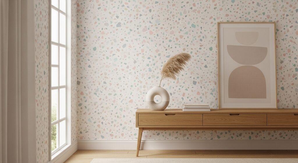
Terrazzo-inspired wallpaper introduces playful texture that brightens low-light rooms through scattered color. Pale bases combined with tiny pastel flecks reflect light unevenly, creating visual sparkle without harsh shine. This speckled effect breaks up shadow-heavy surfaces, making walls feel lively and dimensional. In smaller rooms, the pattern prevents visual stagnation by offering micro-details that keep the eye engaged. The randomness of terrazzo also softens rigid architecture, creating a welcoming atmosphere.
The pattern pairs effortlessly with modern decor and clean silhouettes. Warm lighting enhances the pastel flecks, giving the wall a subtle glow that shifts with perspective. Because terrazzo feels both contemporary and artistic, it injects personality without overpowering the room. The space becomes brighter in perception, even when natural light is limited. It’s an ideal choice for creative corners or living areas that benefit from texture-driven illumination.
13) Soft Gradient Stripes
Gradient stripes combine structure and softness, making them ideal for dim rooms. Instead of harsh line separation, the tones melt into each other, mimicking natural light transitions. This visual flow prevents stark shadows and helps walls appear luminous. Vertical gradients lift the room, creating a sense of height and openness. The subtle tonal shift keeps the design calming, perfect for bedrooms or relaxation spaces.
Paired with layered textiles and warm lighting, gradient stripes glow softly, enhancing the room’s atmosphere. The blended tones diffuse light evenly, reducing contrast that can make spaces feel heavy. Furniture silhouettes stand out gently against the backdrop, maintaining visual clarity. The overall effect is soothing and expansive — a design that turns limited light into an aesthetic advantage.
14) Feathered Abstract Lines
Feathered abstract lines introduce airy movement that lightens shadowed rooms. The flowing strokes mimic hand-drawn art, creating softness that diffuses darkness. Neutral palettes allow the pattern to reflect ambient light subtly while maintaining depth. The irregularity prevents monotony, giving walls a sense of organic motion.
Warm lighting accentuates the layered strokes, producing gentle highlights that change with perspective. This wallpaper pairs beautifully with contemporary decor, enhancing visual balance without clutter. The room feels breathable and expressive, proving abstract softness can transform low-light environments into inviting design statements.
15) Soft Checkerboard Fade
A softened checkerboard pattern offers structure without harsh contrast. Faded edges blend squares seamlessly, preventing the heavy visual breaks that darker rooms exaggerate. Light neutral tones reflect illumination gently, making the wall feel brighter and more spacious. The repeating grid introduces rhythm while remaining calm.
Under warm lighting, the softened geometry creates depth without glare. Furniture appears grounded against the subtle pattern, enhancing spatial clarity. This wallpaper balances modern structure with cozy ambiance, making low-light rooms feel curated rather than constrained.
16) Whispered Floral Vines

Whispered floral vines bring elegance through fine detailing. The trailing pattern adds vertical flow, helping dim rooms feel taller and more open. Pale tones soften shadows, while the delicate repetition keeps the wall visually active without dominance.
Warm lighting highlights the vine contours, creating gentle depth that enhances intimacy. Paired with soft fabrics and classic decor, the wallpaper cultivates a serene, romantic atmosphere. The room feels luminous and graceful despite limited light.
17) Textured Plaster Effect
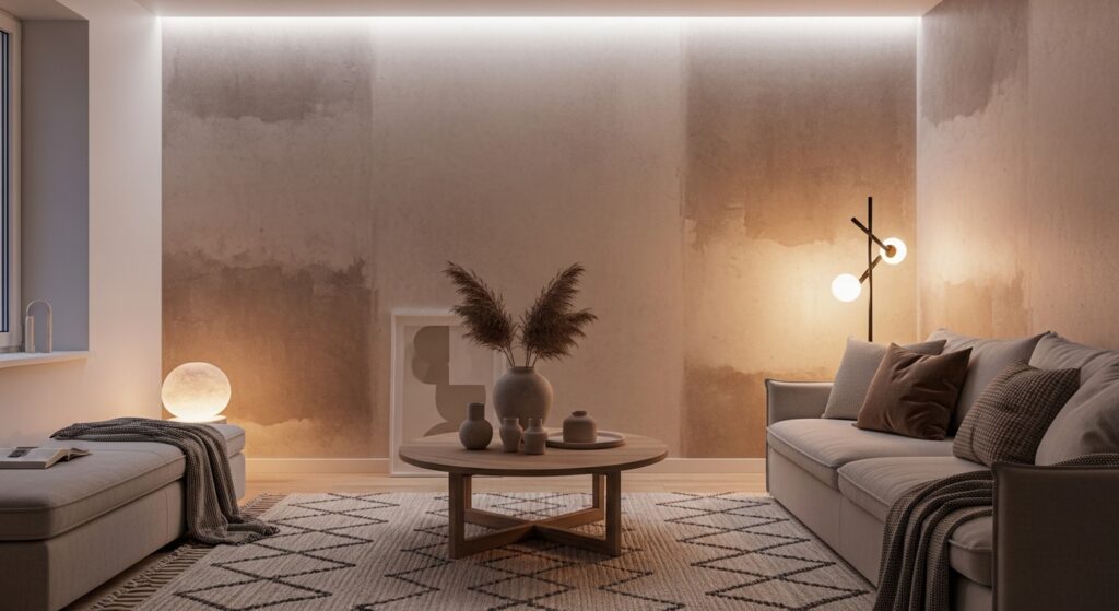
Plaster-inspired wallpaper simulates artisanal texture that diffuses light beautifully. The irregular surface illusion breaks up shadow lines, making walls appear softly illuminated. Warm neutral tones add coziness while maintaining brightness.
Under layered lighting, the texture seems to shift, giving the room subtle movement. This wallpaper complements minimalist interiors, adding character without pattern overload. The effect is warm, grounded, and visually expansive.
18) Tiny Starburst Pattern
Starburst motifs scatter energy across dim walls. Their radiating shapes catch ambient light, creating tiny highlights that animate the space. Neutral palettes keep the design gentle while maintaining brightness.
Warm lighting enhances the bursts, producing a soft shimmer that feels uplifting. The pattern adds personality without clutter, transforming darker rooms into lively yet calming environments.
19) Layered Tone-on-Tone Waves
Tone-on-tone wave patterns introduce flowing depth that softens shadows. The layered curves mimic gentle motion, making walls feel alive rather than static. Subtle tonal variation reflects light evenly.
With warm lighting, the waves gain dimension, enhancing spatial perception. The wallpaper pairs beautifully with modern furnishings, creating a soothing, expansive atmosphere perfect for dim interiors.
20) Minimal Dot Grid

A minimal dot grid adds structure without heaviness. Even spacing creates visual rhythm while pale tones reflect ambient light. The pattern prevents flatness and keeps walls engaging.
Under warm lighting, the dots produce gentle highlights that brighten perception. The wallpaper complements sleek decor, making low-light rooms feel organized, airy, and thoughtfully styled.
21) Soft Mosaic Tile Pattern
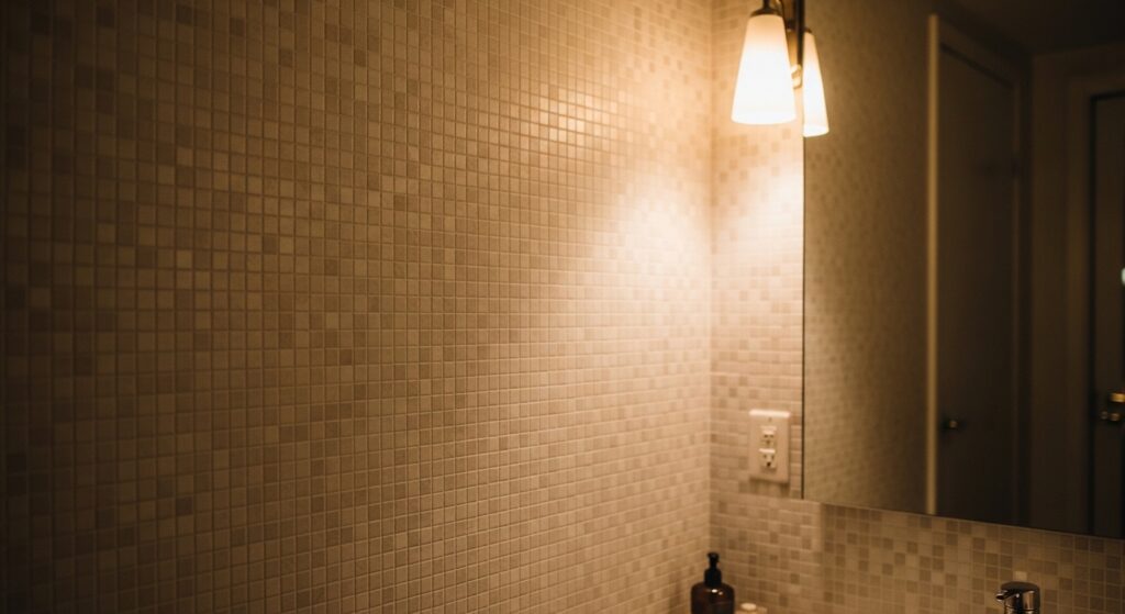
A soft mosaic tile pattern introduces intricate visual texture that keeps low-light rooms from feeling flat. The small repeating shapes create gentle contrast that reflects ambient light in tiny variations, helping walls appear brighter without harsh shine. Warm neutral tones like cream, beige, or pale sand soften shadow-heavy corners while maintaining depth. Because the pattern is detailed yet subtle, it gives the illusion of dimension and craftsmanship. In dim spaces, this layered look prevents walls from blending into darkness, instead offering a refined backdrop that feels intentional and visually engaging.
When paired with warm lighting and simple decor, mosaic wallpaper creates a welcoming atmosphere that feels both modern and timeless. The tiny shapes interact beautifully with soft light sources, producing a delicate glow that shifts throughout the day. This pattern works especially well in transitional spaces like hallways or bathrooms, where added brightness improves perception of size. The result is a room that feels polished and thoughtfully styled, proving that fine detail can transform low light into a cozy design feature.
22) Gentle Brushstroke Texture
Brushstroke-inspired wallpaper adds an artistic softness that diffuses shadows naturally. The layered strokes mimic hand-painted movement, creating visual flow that prevents walls from appearing static or heavy. Soft neutral palettes allow the strokes to catch ambient light subtly, producing depth without glare. This painterly effect makes low-light rooms feel curated and expressive rather than dull. The irregular texture also disguises uneven lighting, blending highlights and shadows into a cohesive surface that feels warm and alive.
Under warm lamps or sconces, the brushstrokes gain gentle dimension, enhancing the room’s atmosphere. This wallpaper pairs beautifully with natural fabrics, minimalist furniture, and organic decor elements. Because the pattern feels fluid and relaxed, it encourages a calming environment ideal for lounging or reading spaces. The artistic texture transforms dim lighting into part of the design story, creating a room that feels intimate, layered, and thoughtfully composed.
23) Subtle Honeycomb Pattern

Honeycomb patterns introduce structured geometry that adds brightness through repetition and spacing. The hexagonal shapes create a rhythmic surface that reflects ambient light evenly, helping walls appear more luminous. In pale tones like ivory or warm gray, the pattern enhances depth without overpowering the room. The clean geometry brings modern clarity while soft color transitions prevent heavy shadow contrast. This balance makes low-light spaces feel organized and visually expanded.
Warm lighting accentuates the honeycomb edges, producing a subtle glow that highlights the repeating structure. The wallpaper pairs well with sleek furniture and soft textiles, blending modern style with cozy ambiance. The consistent pattern guides the eye across the wall, creating a sense of openness that counteracts dimness. The result is a space that feels bright, contemporary, and inviting — ideal for dining or gathering areas that benefit from visual energy.
24) Airy Cloud Stripe Blend

Cloud stripe blends combine the openness of soft gradients with the structure of gentle lines. The blurred stripes mimic drifting clouds, diffusing shadows and creating an airy illusion that lifts low-light rooms. Pale tones reflect ambient lighting evenly, helping walls glow softly rather than absorb light. The flowing transitions prevent harsh boundaries, making the space feel calm and expansive. This wallpaper works especially well in bedrooms where softness enhances relaxation.
Layered lighting amplifies the dreamy quality of the stripes, giving the walls subtle movement as shadows shift. Paired with plush bedding and neutral decor, the pattern creates a serene atmosphere that feels light and breathable. The visual softness reduces contrast, making dim corners blend seamlessly into the design. The overall effect is tranquil and luminous — a perfect finishing touch for rooms that rely on mood lighting instead of strong natural light.
Conclusion
Designing for low-light spaces is all about balance and mood. The right wallpaper pattern softens shadows, adds dimension, and brings personality to the room without overwhelming it. When paired with warm lighting and simple decor, these designs transform darker areas into comfortable, stylish retreats. With a little intention, even the dimmest room can feel welcoming, bright in character, and beautifully designed.