
As an Amazon Associate, I earn from qualifying purchases. This means I may earn a commission if you purchase through links on this page — at no extra cost to you.
Bedroom wall art fails in predictable ways. It hangs too small above a wide bed, too high above a headboard, or as a random collection of pieces that share nothing but a wall. The rooms where bedroom art works do not necessarily have better art — they have art that relates to the bed, to the wall, and to the rest of the room. Getting those relationships right matters more than finding a perfect piece.
Start with the wall, not the art
Before shopping, measure. The wall above the bed is the main stage in most bedrooms, and its useful width is roughly the bed’s width, not the wall’s full width. Art that spans most of the bed’s width looks intentional; art that covers a third of it looks lost. Also note the viewing distance: the main viewpoint is usually the doorway, several steps back, so small detailed pieces that need close inspection lose their effect above a bed.
Note the fixed elements too. A tall or busy headboard competes with art hung directly above it — in that case, art on the side walls or a single calm piece above the headboard works better than a busy gallery. Windows, wardrobes, and doors limit where large pieces can go, so map the free wall space before falling for a piece that has nowhere to live.
One large piece or a gallery wall
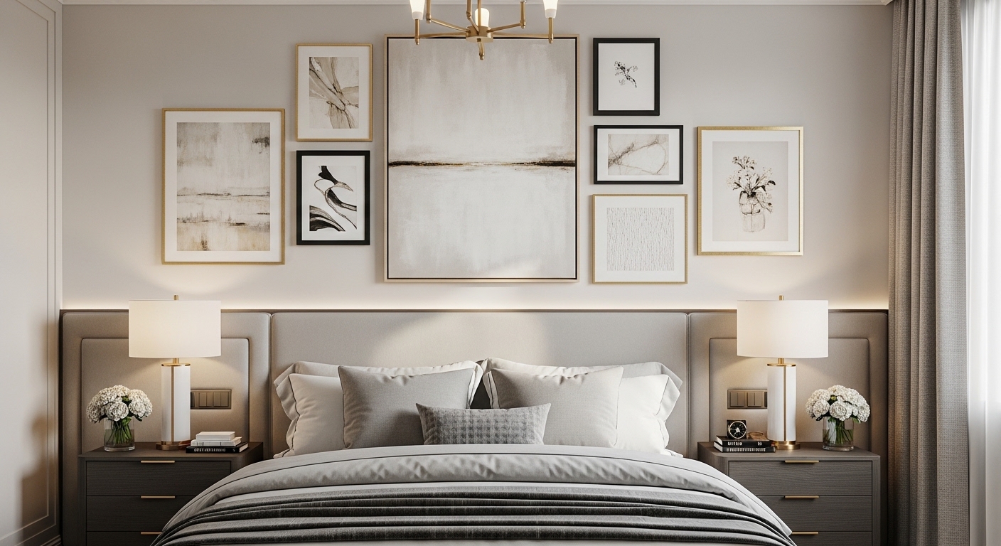
This is the first real decision, and it depends on the room’s temperament. One large piece suits calm, minimal bedrooms: it gives the eye a single resting place and keeps the room quiet. A gallery wall suits rooms with personality to show — travel photos, collected prints, family pieces — but it needs a plan, not just accumulation.
If you are torn, a middle path works: a pair or a triptych of related pieces, hung as one unit with consistent spacing. It has the calm of a single piece with the interest of several. Gallery walls work best when they share something — a frame finish, a mat color, a subject family — so the collection reads as one arrangement rather than several unrelated decisions. Minimalist gallery wall ideas cover spacing, layout templates, and how to keep a gallery from turning cluttered.
🛒 Shop This Look:
Size rules that actually work
Above a bed, aim for art that covers roughly two-thirds of the bed’s width — one wide piece, a pair, or a triptych measured as a group including the gaps between frames. Hang it so its center sits around eye level when viewed standing from the doorway, and low enough to relate to the headboard rather than floating near the ceiling. A gap of roughly a hand’s width to a little more between the headboard top and the frame bottom keeps the art connected to the bed instead of drifting.
Pairs above nightstands follow the same logic at smaller scale: each piece should relate to the nightstand’s width, and the pair should match in size and frame so they read as a deliberate set. On a side wall with no furniture beneath, the art relates to the wall itself — center it on the open wall area, not on the room’s center line, and size it to the empty space rather than to the bed.
Choosing art that suits a bedroom
Bedrooms reward art that calms rather than demands. That does not mean bland — a strong abstract in muted tones can anchor a room — but high-contrast, busy, or visually loud pieces facing the bed tend to fight the room’s purpose. Ask what the art does at a glance from the doorway: if it settles the room, it belongs; if it shouts, it belongs in a hallway or living space instead.
Pull color from the bedding rather than inventing a new palette for the wall. One or two colors shared between the art and the bedding or cushions tie the room together without matching everything. Personal pieces — travel photos, meaningful prints — work best when they are given the same framing care as bought art; a treasured photo in a cheap frame reads as an afterthought, while the same photo matted and framed properly reads as a choice.
Styles and what each one does
Different styles do different work. Abstract art adds color and movement without a subject to decode, which suits bedrooms well. Botanical prints bring a soft, organic feel and pair naturally with linen and wood. Black-and-white photography series look collected and calm, especially when the frames match and the subjects share a theme. Line art stays quiet and works in minimal rooms where anything busier would compete. Textile pieces — woven hangings, macrame — add texture that flat prints cannot, and they soften a room’s acoustics in a way that suits a bedroom’s purpose.
Mixing styles is fine when something unifies them: consistent frames, a shared color, or a shared subject family. Mixing styles with nothing in common is how gallery walls turn into notice boards. If you love several styles, give each wall its own logic rather than forcing them all onto one wall.
Frames and mats
Frames and mats change how art reads more than most people expect. A mat gives the art breathing room and makes a modest print look larger and more finished; a wide mat on a small print is often the difference between a piece that looks bought and one that looks placed. Frame weight should match the art’s scale — a heavy dark frame can overwhelm a delicate print, while a thin frame can look lost around a large canvas.
If you mix frames, limit the mix: one metal finish and one wood tone at most, with a consistent mat color across the group. Gold and black frames can coexist when the mats match; five different frame styles with five different mats cannot. And check the glass: non-reflective glazing matters on walls opposite windows, where glare can erase a piece for half the day.
Small bedrooms and rentals
Small bedrooms need art that earns its wall space. One well-sized piece beats several small ones that chop the wall up. Ledges let you lean art and swap it without new holes, which suits both small rooms and rented walls. Leaning a large piece on a dresser or the floor against a wall can look deliberate when the piece is big enough; small leaned pieces tend to look temporary.
For rentals, adhesive strips work for light frames — check the weight rating and the wall surface, since they hold poorly on textured walls and can damage paint if overloaded. Command-style hooks and picture ledges cover most rental situations without drilling. Best space-saving wall art for tiny rooms has more ideas for getting art onto small and restricted walls.
🛒 Shop This Look:
Hanging it right
Wide pieces need two hooks, not one — a single hook lets a wide frame tilt over time, and a tilted frame undermines even good art. Use proper picture wire or D-rings rated for the frame’s weight, and a level for the final adjustment; eyeballing works for small pieces and fails for wide ones. For heavy pieces, find a stud or use wall anchors rated for the weight rather than trusting a plain nail in plasterboard.
Light the art if the room allows it. A battery picture light above a main piece, or a lamp positioned to wash the wall, makes art visible in the evening when bedrooms are most used. Watch for glare: art with glass opposite a window will reflect the window for part of the day, so angle the piece slightly or choose a wall that does not face the window directly.
Budget moves that still look finished
A finished look does not require expensive art. Printable art in a good frame with a proper mat looks as intentional as a bought print, and it lets you test a style before committing to an original. Thrifted frames with new mats rescue good frames from bad art. One large piece costs less than a gallery of small framed pieces and usually looks better in a bedroom. And swapping art seasonally — a lighter piece in summer, a warmer one in winter — keeps the room feeling current without new purchases. Budget-friendly wall decor ideas for bedrooms cover printables, DIY framing, and renter-friendly display ideas in more detail.
Bedrooms that do double duty
Many bedrooms also serve as offices, guest rooms, or dressing areas, and the art has to work for both jobs. In a bedroom-office, keep the wall behind the desk calm and uncluttered — video calls pick up whatever hangs behind you, and a busy gallery reads as noise on camera. One composed piece, or a pair with breathing room, looks professional without making the room feel like an office.
In a guest bedroom, personal art is a risk: a wall of family photos can make guests feel like intruders in someone else’s room. Neutral art — landscapes, abstracts, botanicals — welcomes guests without imposing a story on them. Keep one personal piece if you like, but let the room’s art be something a stranger can enjoy without context. And in a bedroom with a dressing area, a full-length mirror deserves its own wall space rather than competing with art; hang art where it can be seen from the bed and the door, and let the mirror own its corner.
The test for a double-duty bedroom is simple: stand in the doorway and ask what the room’s art says about the room’s purpose. If it says bedroom first and everything else second, the balance is right.
Mistakes to avoid
The classic mistakes are all avoidable. Art too small for the wall above the bed. Art hung too high, floating near the ceiling instead of relating to the furniture. A gallery with no spacing plan — fix this by cutting paper templates, taping them to the wall, and living with the arrangement for a day before hanging anything. Art competing with a busy headboard instead of complementing it. Glass glare from an opposite window. And hanging every piece at the same height in a gallery, which flattens an arrangement that should have rhythm: vary heights slightly while keeping the overall group balanced.
Bedroom art works when it is sized to the furniture, placed to relate to it, framed with care, and chosen for calm rather than impact. Get those four things right and almost any style of art will look like it belongs.
🛒 Shop This Look:
For more bedroom direction, explore more bedroom ideas for inspiration.