
As an Amazon Associate, I earn from qualifying purchases. This means I may earn a commission if you purchase through links on this page — at no extra cost to you.
Wallpaper doesn’t inherently make a room look smaller — poor choices do. Dark, high-contrast, small-scale patterns in a dim room feel enclosing; light, large-scale, low-contrast patterns can make the same room feel larger. The wallpaper itself is neutral; pattern, color, and lighting decide the effect.
When Wallpaper Makes Rooms Feel Smaller
- Dark colors + small busy patterns + poor lighting
- High-contrast prints that fragment the wall visually
- Bold print on all four walls of a tiny room with no visual rest
When Wallpaper Makes Rooms Feel Bigger
- Large-scale prints that blur wall boundaries
- Light colors that reflect light
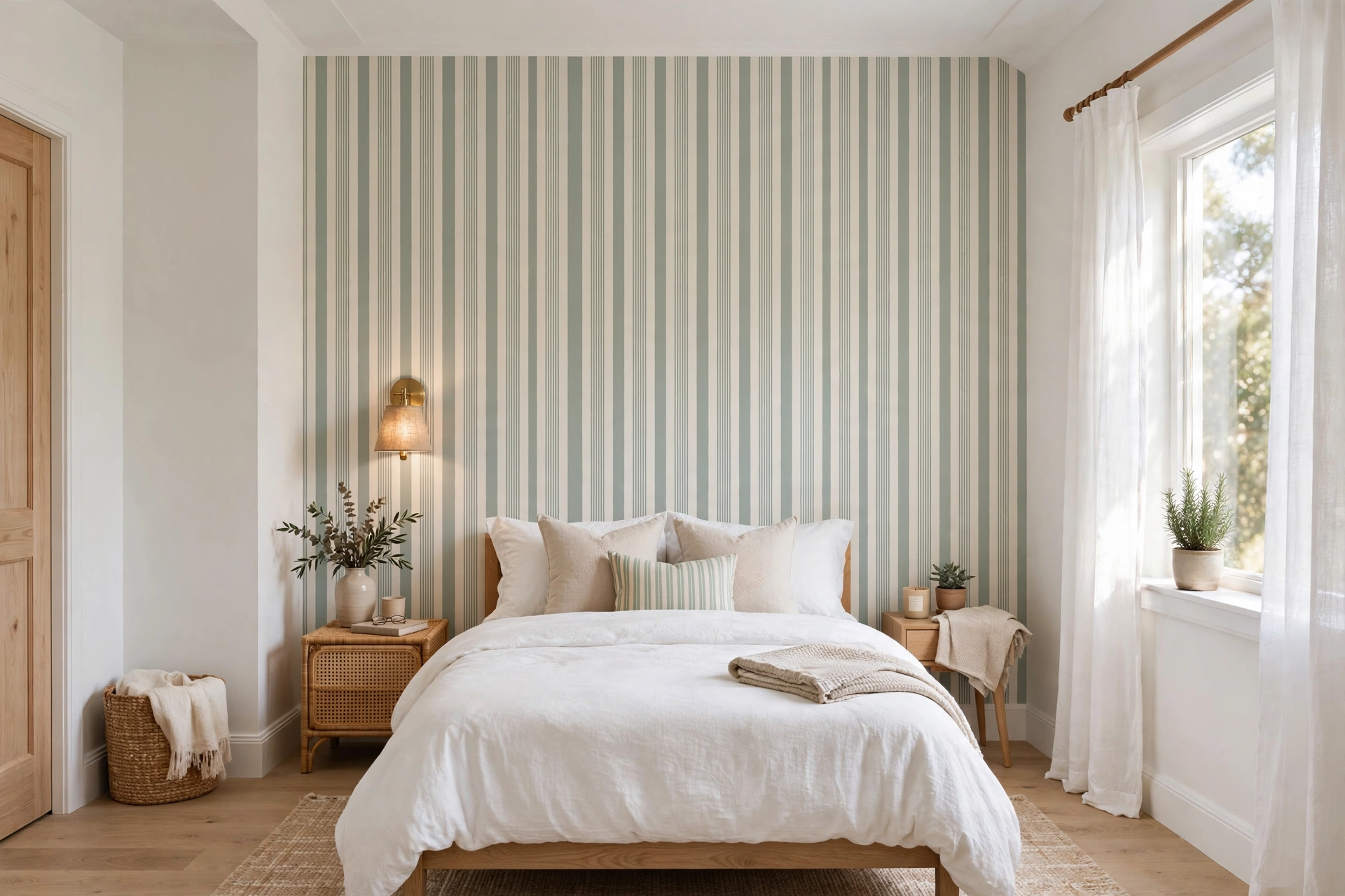
- Vertical stripes that lift the ceiling
- Mural-style scenic prints creating false depth
The Powder Room Proof
Designers put the boldest, darkest wallpaper in the smallest room — the powder room — and it works every time. Small rooms read as intentional; a confident pattern feels like a jewel box, not a cave.
Pattern Scale: The Real Deciding Factor
Pattern scale — the size of the motif relative to the wall — influences perceived room size more than color does. Small, dense patterns (tiny florals, mini geometrics) chop a wall into visual fragments, and the eye reads that fragmentation as a smaller surface. Large-scale patterns (oversized botanicals, big geometrics, mural scenes) do the opposite: a motif that spans two or three feet gives the eye long, continuous paths to follow, which makes the wall feel expansive.
A practical rule: in rooms under about 100 square feet, choose patterns with motifs at least 6 to 12 inches across, and avoid repeats tighter than a few inches. The wallpaper’s repeat size (listed on the roll or product page) tells you how often the pattern restarts — a 24-inch repeat reads as large-scale, a 4-inch repeat as small-scale. One more nuance: patterns with plenty of background space between motifs feel airier than all-over prints where the pattern covers every inch, even at the same scale.
Color, Contrast, and Light Reflectance
After scale, contrast is the next lever. High-contrast patterns (black on white, navy on cream) draw hard boundaries around every motif, which visually subdivides the wall. Low-contrast patterns (tone-on-tone damask, grasscloth texture, soft watercolor washes) let the wall read as one continuous surface — and a continuous surface always feels larger.
Color depth matters too, but through the mechanism of light reflectance. Light colors bounce both natural and artificial light around the room; dark colors absorb it. In a small room with one window, a dark wallpaper can make the walls feel like they are closing in by evening. The same dark paper in a small room with generous lighting and white trim often feels dramatic rather than cramped. So the question is never “is dark wallpaper bad for small rooms?” but “does this room have enough light to carry it?”
If you love a dark or high-contrast paper for a small room, confine it to one feature wall and keep the other walls light and plain. You get the drama without the enclosure — and the light walls do the work of keeping the room feeling open.
Proven Layouts for Small Rooms
Beyond choosing the right paper, where you put it changes the effect. These layouts consistently make small rooms feel larger:
🛒 Shop This Look:
The single feature wall: Paper the wall behind the bed or sofa; paint the rest. The eye travels to the patterned wall as a focal point while the plain walls recede, which reads as depth.
Wallpaper on the ceiling: In a tiny room, a patterned ceiling draws the eye upward and makes the ceiling feel higher — especially with vertical-stripe or trellis patterns. Keep walls light so the ceiling becomes the star.
Below the chair rail: In dining rooms and hallways, papering only the lower third of the wall (or wainscot-height panels) adds pattern at eye level while the upper walls stay light and open. This works beautifully in narrow hallways that would feel tunneled by full-height pattern.
Inside niches and alcoves: Papering the back of a bookshelf, a closet interior, or a window alcove adds surprise pattern that reads as depth — the recessed surface appears to sit farther back than it does.
Wallpaper by Room Type
Small bedrooms: Large-scale, low-contrast patterns in soft colors. Avoid papering all four walls if the room is under 120 square feet — do the headboard wall and paint the rest. Vertical stripes are the classic choice for low ceilings.
Bathrooms and powder rooms: Small bathrooms are the famous exception — bold, dark, even busy wallpaper almost always works because the room is understood as a jewel box, not a living space. Use moisture-resistant papers (vinyl or vinyl-coated) and ensure decent ventilation.
Hallways: Narrow hallways are the trickiest space. Keep patterns light and vertical to counteract the tunnel effect, and consider papering only one wall or the lower half. Mirrors opposite the papered wall double the perceived width.
Home offices and nooks: A single papered wall behind the desk creates a finished video-call backdrop and a sense of place without overwhelming a compact workspace.
Lighting: Your Secret Weapon
Lighting and wallpaper are a system, not separate decisions. A small room with layered lighting — overhead plus lamps or sconces — can carry dramatically bolder wallpaper than the same room lit by a single ceiling fixture. Light washing across a textured paper (grasscloth, embossed vinyl) creates subtle shadows that add depth and dimension, making the wall feel farther away, not closer.
🛒 Shop This Look:
Before committing, tape up a large sample (at least 2 by 3 feet — a tiny swatch lies to you) and observe it at three times of day: morning, midday, and evening under artificial light. A pattern that feels expansive in daylight can turn oppressive under a single warm bulb at night. This one test prevents more wallpaper regret than any rule of thumb.
Frequently Asked Questions
Does textured wallpaper make a room look smaller? Subtle textures like grasscloth or linen-look usually do not — they read as a solid color from a distance while adding richness up close. Heavy, high-relief textures with strong shadows can feel busier, so keep them to feature walls in small rooms.
What about removable wallpaper in small rentals? The same rules apply. Removable papers come in every scale and color, so choose large-scale, light, low-contrast designs. One advantage: you can test a full wall and peel it off if the room feels smaller.
Do horizontal stripes make a room look wider? They can, slightly, but horizontal stripes also visually lower the ceiling — a bad trade in most small rooms. Vertical stripes are the safer choice for compact spaces.
Can wallpaper fix a dark, windowless room? Wallpaper with metallic accents, a slight sheen, or a mural with painted light (like a landscape with a bright sky) can suggest depth and brightness. But no paper replaces light — in a windowless room, pair the wallpaper with strong layered lighting and a large mirror.
Wallpaper Finishes and Their Visual Effect
The paper’s finish changes how it interacts with light, which changes perceived room size. Matte finishes absorb light and keep the pattern flat against the wall — the safest choice for small rooms because nothing jumps forward visually. Metallic and pearlescent finishes reflect light, which can make a small room feel brighter and more expansive — but the reflective motifs also advance toward the viewer, so keep metallic patterns large-scale and low-contrast. Textured finishes (grasscloth, embossed, flocked) add tactile depth; from across a small room they read as a solid color with subtle variation, which is why grasscloth is a designer staple for compact spaces. High-gloss papers are the riskiest in small rooms — every reflection defines the wall’s boundaries sharply, making the room’s exact dimensions impossible to ignore.
Awkward Small Spaces: Sloped Ceilings, Nooks, and L-Shapes
Sloped ceilings (attic bedrooms, dormers): papering the slope in the same paper as the walls blurs the line where wall becomes ceiling, making the room feel taller and less chopped up. Stopping the paper at the slope’s edge emphasizes the low ceiling — the opposite of what you want. L-shaped rooms: treat each leg of the L as its own zone — paper the far wall of each leg as a focal point and keep the connecting walls plain, which gives each area definition without visual clutter. Rooms with lots of doors and windows: heavy pattern gets chopped into fragments by openings and looks busy; in these rooms, either use a subtle texture-only paper or confine bold pattern to the one uninterrupted wall.
A Renter-Friendly Testing Strategy
If you are unsure how a paper will affect your small room, test without commitment. Order removable wallpaper samples in your top two or three choices — most companies sell large swatches or single panels. Apply a full panel (not just a swatch) to the wall you intend to paper and live with it for at least three days, viewing it in morning, midday, and evening light. Photograph the room with the sample up; photos reveal the overall effect more honestly than standing in the room, because they flatten the space the way your eye summarizes it. If the room feels smaller in the photo, it will feel smaller in person — choose the lighter, larger-scale option. This test costs a fraction of a full installation and eliminates the most expensive decorating mistake: papering a whole room, hating it, and paying to remove it.
🛒 Shop This Look:



