
As an Amazon Associate, I earn from qualifying purchases. This means I may earn a commission if you purchase through links on this page — at no extra cost to you.
One line can hold a wall if you let it breathe. That is the whole promise of minimalist line art: a single continuous gesture — a face, a branch, a curve — drawn with nothing to hide behind, and given enough empty space that the eye follows the line instead of hunting for detail. When it works, a line print feels calm, confident, and complete. When it fails, it is almost always for the same reasons: too small, too crowded, or hung where its one line has to compete with everything else in the room.
What Line Art Is
Line art is drawing reduced to its essentials: contour without shading, gesture without background. A continuous line print follows one unbroken path; a contour print traces edges with a few deliberate strokes; a geometric line print builds shapes from straight lines and arcs. What they share is negative space — the empty paper is part of the drawing, not a gap in it. Judge a line print by its negative space first: if the empty areas feel balanced and intentional, the drawing works. If they feel accidental, no frame will save it.
Line art is not sketching, and it is not a coloring page. A sketch shows process — construction lines, corrections, shading studies. A line print shows decision — one path chosen and committed to. That distinction matters when choosing prints: a print with hesitant, scratchy, overworked lines reads as unfinished on a wall, while a print with a confident single gesture reads as art even at a glance. Choose the confident line.
Subjects: Faces, Botanicals, Geometry, and More
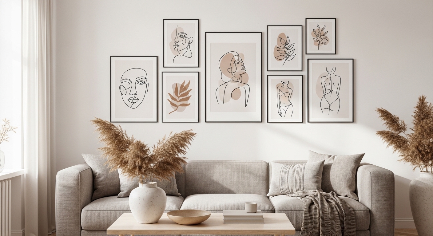
Faces are the classic line-art subject because the eye reads a face instantly, even from a single contour. An abstract face in one continuous line suits living rooms and bedrooms, where it becomes a quiet focal point. Botanical line drawings — a stem, a leaf, a branch — suit kitchens, bathrooms, and hallways, where their organic curves soften hard surfaces. Geometric line art suits offices and modern rooms, where its order matches the furniture.
Animals and landscapes work when they stay simple. A minimal animal outline — a bird, a cat, a deer — reads as a symbol rather than an illustration, which keeps it calm. A landscape in lines works when it keeps to two or three elements — a horizon, a hill, a sun — instead of trying to draw the whole scene. The rule across subjects is the same: one idea per print. A print that tries to be a face and a landscape and a pattern is three half-ideas competing on one sheet.
Choosing for the Room
Choose by the room’s existing lines. A room full of straight furniture lines — a boxy sofa, a rectangular table, square shelves — welcomes a curved botanical or face print, because the curve breaks the grid. A room full of curves — an arched mirror, a round table, soft bedding — welcomes a geometric print, because the straight lines give the eye something to hold. Matching the room’s lines exactly doubles them; contrasting them gently completes the room.
Color in line art is a single decision, not a palette. Black on white suits nearly every room. One accent color — drawn from the rug, a cushion, or a chair — ties the print to the room, but a second accent starts a competing conversation. Terracotta, sage, and ochre all work as single accents in warm rooms; navy and charcoal work in cool ones. Keep the background quiet — white, cream, or pale gray — so the line stays the subject.
🛒 Shop This Look:
Printing for a Wall
Print on matte paper, at a size the wall deserves. Glossy paper throws glare across a line print and breaks the single gesture into reflections; matte paper keeps the line continuous from every angle. Choose a paper weight that lies flat — light paper buckles with humidity and makes the line ripple. For a statement piece, print large enough that the line reads from the doorway, not just from a chair: a line print that spans roughly two-thirds of the furniture width below it looks proportioned, while a small print on a large wall looks like an afterthought.
Check ink density before framing. A line that looks bold on screen can print thin and gray, especially on home printers running low on ink. Print a test at full size, tape it to the wall, and look at it in daylight and lamplight. If the line fades in daylight, increase the print darkness or choose a bolder print. One test sheet costs little and saves a framed piece that disappears on the wall.
Frames and Mats
The frame should be quieter than the line. Thin black, natural wood, or white frames suit line art because they add no competing geometry. A wide mat gives a small line print presence — the mat becomes the quiet field the line needs, and it keeps the eye from reading the paper edge. Match the mat to the paper or sit one quiet step away from it; a bright or patterned mat fights the single line for attention and loses the room’s calm.
Glass protects the print but adds glare in bright rooms. In a room with a window opposite the wall, hang the print where it avoids direct reflection, or choose non-reflective glass for a statement piece. In a bedroom or hallway with soft light, standard glass is fine. Keep frames consistent across a wall — one finish, one mat style — so multiple line prints read as a set rather than a shelf of separate purchases.
Placement: Single, Pair, and Grid
A single line print works best where the wall gives it room: centered above a sofa, a console, or a bed, with empty wall on both sides. The empty wall is part of the piece — fill it and the line loses its calm. Hang the center near standing eye level, and keep the gap between the furniture and the frame bottom to about six to eight inches so the print reads as connected to the room rather than floating.
A pair works when the two prints share a subject family and a frame — two botanicals, two faces, two geometrics — hung at the same height with a consistent gap. A grid works when the prints share size, frame, and spacing exactly; a grid with mixed sizes and gaps looks accidental, not curated. Three prints in a row suit a long hallway wall; four in a square suit a large square wall. In both cases, measure the total arrangement against the furniture below it, not each print alone.
Pairing Line Art With Words
Line art pairs naturally with quote printables because both rely on restraint — one line, few words, much empty space. The pairing works when one of them leads: a line print as the statement with a small quote beside it, or a quote as the statement with a line print as the quiet companion. Two statements on one wall compete; a statement and a companion complete each other.
Keep the pairing rules strict: one frame finish, one palette, consistent gaps, and a shared subject mood — a botanical line with a nature quote, a face line with a personal line, a geometric print with a short direct quote. The minimalist quote printables guide covers word choice and typography for the quote half of the pairing. When in doubt, hang the line print alone first and add the quote only if the wall still asks for it after a week.
🛒 Shop This Look:
Line Art in Small Rooms
Small rooms are where line art earns its keep, because a single line adds interest without adding visual weight. A small bedroom, hallway, or reading corner has no room for a busy gallery, but it has room for one confident print — and one print on an otherwise quiet wall makes the room feel considered rather than empty. The rule in a small room is one statement, not a collection: one line print, one frame, generous empty wall around it.
Scale matters more in a small room than in a large one. A print that is too small disappears against the bed or sofa, while a print that is too large crowds the wall and makes the room feel smaller. Measure the furniture the print will hang above and aim for roughly two-thirds of that width, as with any statement piece — but in a small room, err toward the smaller end of that range and let the empty wall do the rest of the work. A narrow hallway suits a vertical line print, which draws the eye along the wall instead of across it.
Pairing in a small room should stay minimal. A line print beside a small mirror works because the mirror adds light without adding subject matter — the line stays the only thing to read. A line print beside a shelf works when the shelf holds one or two quiet objects, not a crowded display. Renters in small rooms get the same result with leaning: a framed line print leaned on a dresser or a narrow console gives a finished look with no holes, and it moves to the next home unchanged. Whatever the fixing, keep the wall around the print empty — in a small room, the empty space is what makes the single line feel generous instead of lost.
Mistakes That Weaken a Line
Too small is the first mistake. A line print that cannot be read from the doorway is decoration for no one, and a wall of tiny line prints reads as clutter no matter how good each one is. Go larger than feels safe, and let one print carry the wall. The second mistake is crowding — shelves, plants, and ornaments piled around a line print until the line competes with everything. Give the print its empty field.
The third mistake is subject clash: a face, a botanical, and a geometric print on one wall with no shared rule. Variety without a rule reads as a sample book. Pick one subject family per wall, or one frame and palette rule that unifies different subjects. The fourth mistake is glossy glare in a bright room — a line broken by window reflection is a line interrupted. Move the print, change the glass, or choose a wall that does not face the window directly.
Care and Swapping
Line prints last well with simple care. Keep them out of direct sun, which fades ink and yellows paper over time. Keep them out of steamy rooms unless framed behind sealed glass. Dust frames with a dry cloth; wipe glass with a barely damp cloth, never spraying cleaner directly onto the frame where it can seep under the edge.
Swap prints with the seasons or the mood of the room rather than buying more. One frame, several prints in rotation, keeps a wall fresh without new holes or new spending. Store retired prints flat, in a folder or between sheets, so the line stays crisp for its next hanging. A line print that returns to the wall after a rest often looks new again — the eye had simply stopped seeing it. For the room around the line, explore more wall decor ideas for inspiration.
🛒 Shop This Look: