Paint colors never look the same in every light. Sunlight, artificial bulbs, and even shadows change how a shade appears on your walls. Understanding light helps you choose the right color for any room.
From morning sun to evening glow, each light source highlights different undertones. Layering natural and artificial light ensures colors stay true and spaces feel harmonious. These tips show how lighting can transform your walls.
1. Morning Sunlight and Warm Hues
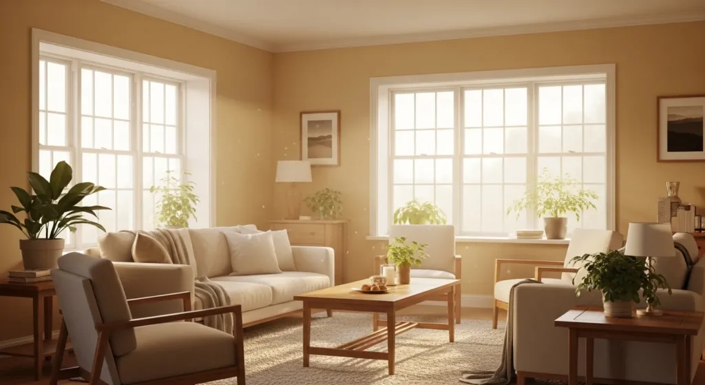
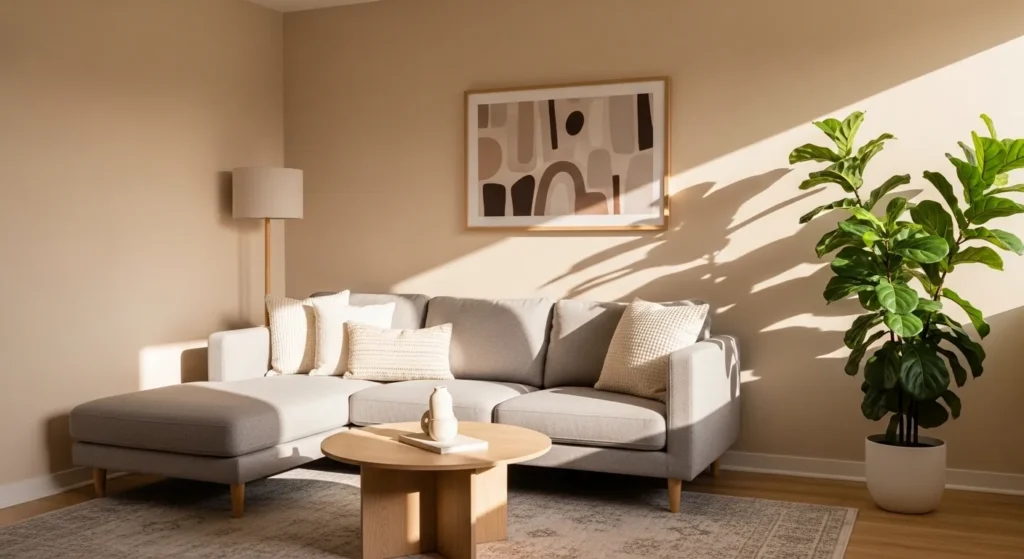
Morning sunlight brings out warm undertones in paint, making soft yellows, creams, and light beige feel richer. Natural light highlights subtle variations and textures that artificial lighting may mask.
Positioning key furniture near sunlit walls enhances the warmth. Paints that look muted under artificial light often glow beautifully in morning sun. Understanding this helps you choose colors that shift naturally throughout the day.
2. Afternoon Light and Cool Tones
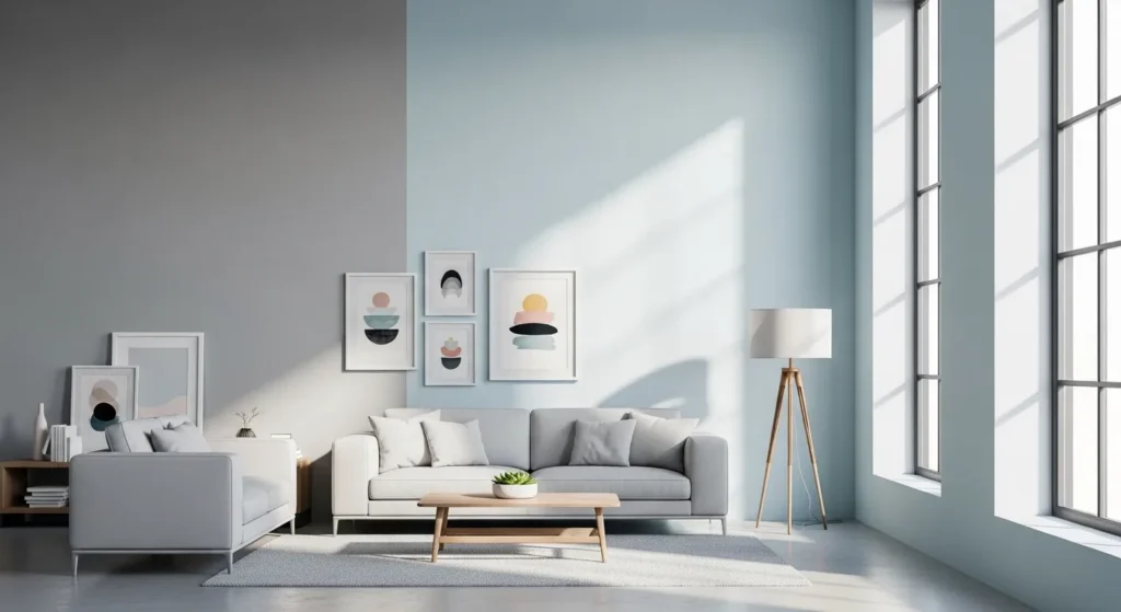
Afternoon sunlight has a cooler, brighter quality. Cool colors like gray, soft blue, or mint feel fresher and more vibrant in this light. Walls that seem dull under soft lighting can appear lively in the afternoon.
Consider how wall color interacts with sunlight direction. A color that feels cold or sterile in one room may feel airy and calm in another depending on light intensity.
3. East-Facing Rooms and Pastels
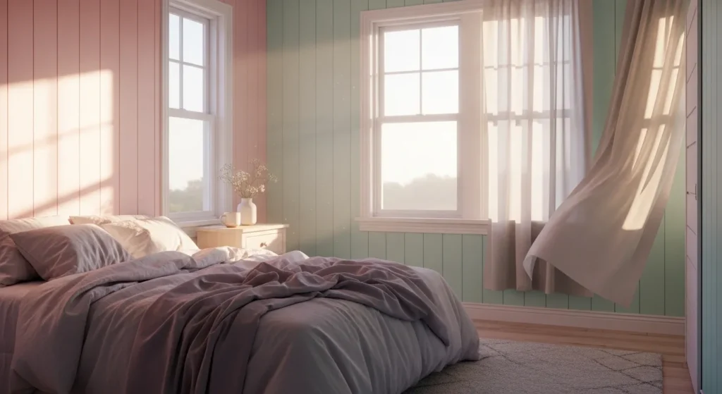
East-facing rooms receive gentle morning light, which enhances pastel tones. Soft pinks, blues, and greens feel warm and inviting at sunrise. These colors often look more vibrant in the morning than midday.
If your space gets primarily morning sun, pastels are a safe choice. Testing swatches during early hours reveals the truest tones for a soft, welcoming atmosphere.
4. West-Facing Rooms and Gold Undertones
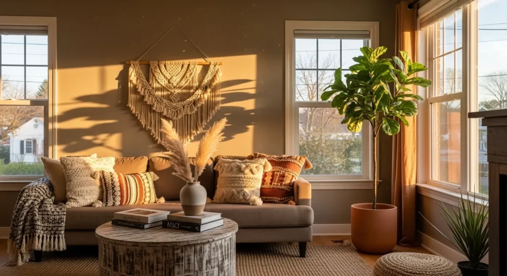
West-facing rooms capture the warm glow of evening sunlight. Paints with gold or red undertones appear richer and more dramatic in this light. Warm neutrals and earthy tones come alive as the sun sets.
Choose colors that complement the room’s orientation. Evening light can exaggerate warm tones, so test samples in late afternoon to ensure the effect is desirable.
5. North-Facing Rooms and Soft Blues

North-facing rooms get cooler, indirect light year-round. Colors with blue or gray undertones may look darker or cooler than expected. Warm paints can feel muted, while soft blues remain calming and consistent.
When choosing paint, sample swatches in different times of day. North-facing rooms often benefit from warmer accents to counteract cool light and maintain balance.
6. South-Facing Rooms and True Colors
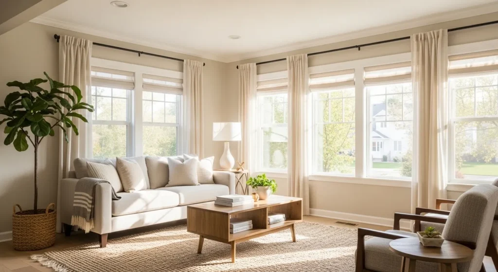
South-facing rooms receive bright, direct light most of the day, which shows colors close to their true tone. Neutral and medium shades appear accurate and balanced.
Test swatches in peak daylight. South-facing walls provide the most reliable representation of paint color, making them ideal for rooms where color accuracy is important.
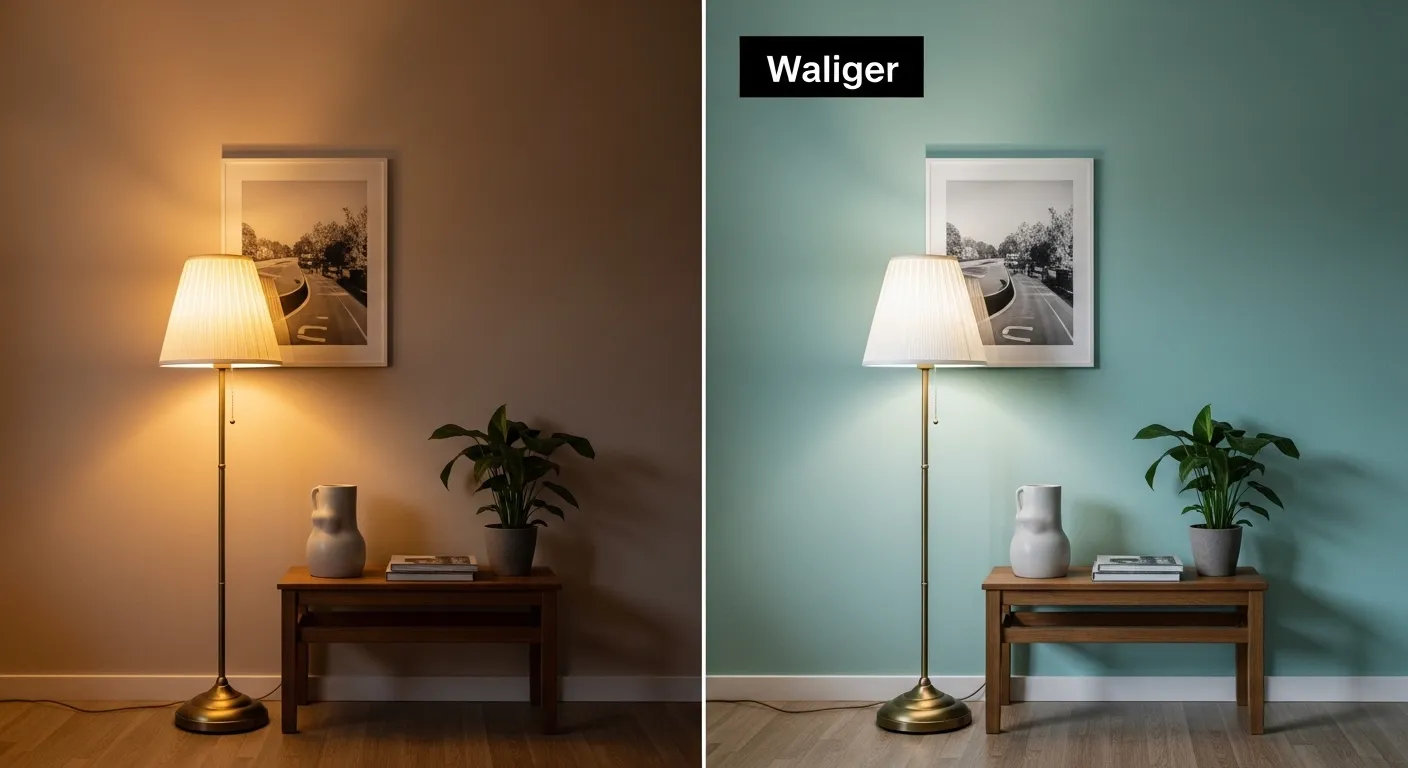
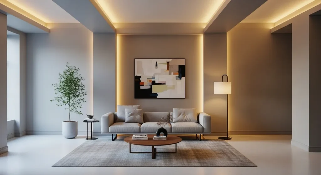
7. Artificial Light and Warm Bulbs
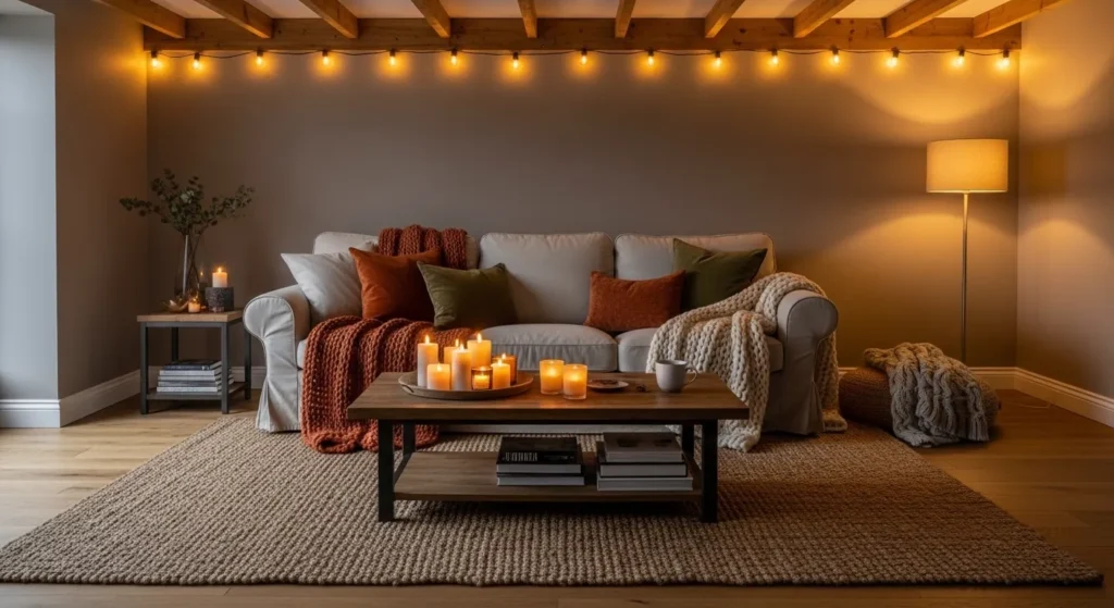
Warm artificial lighting (2700–3000K) enhances reds, yellows, and oranges. Walls appear cozier and more inviting under warm bulbs compared to daylight, which may cool them down.
Consider how overhead and lamp lighting interact with wall color. Lighting choice can completely change the perceived tone, making a room feel warmer or softer in the evening.
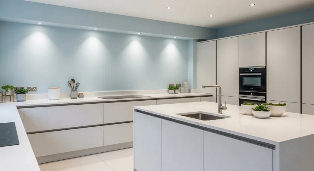
8. Artificial Light and Cool Bulbs
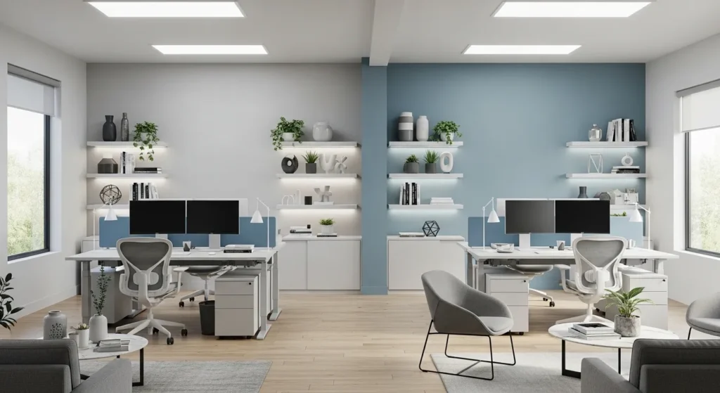
Cool artificial light (4000–5000K) emphasizes blues and greens. Warm tones may appear muted or washed out under this lighting, making it ideal for offices or workspaces needing focus.
Evaluate how paint looks under intended artificial light sources. Rooms with primarily cool bulbs may benefit from cooler shades to maintain vibrancy and clarity.
9. Accent Walls and Spotlighting
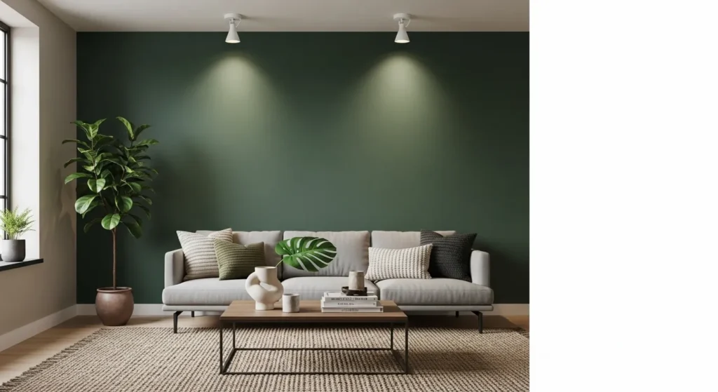
Spotlighting or directional lighting can dramatically change how an accent wall is perceived. Deep colors gain depth, shadows emphasize texture, and the wall becomes a focal point.
Place spotlights carefully to avoid glare. Accent walls work best when you understand how both natural and artificial light interact, enhancing the desired effect.
10. Shaded Corners and Color Shifts
Shaded areas show paint differently than sunlit walls. Colors may appear darker or cooler, altering the mood of the room subtly. Even neutral shades shift in intensity depending on exposure.
Check swatches in all corners of the room. Understanding light variation prevents surprises and helps balance the overall color scheme for harmony and visual consistency.
11. Sheer Curtains and Filtered Light

Sheer curtains diffuse sunlight, softening how paint appears on walls. Warm colors feel lighter and more subtle, while cool shades gain a muted, gentle tone.
Test colors behind curtains during different times of day. Filtered light can change the perception of saturation, making rooms feel airy and delicate without altering paint color itself.
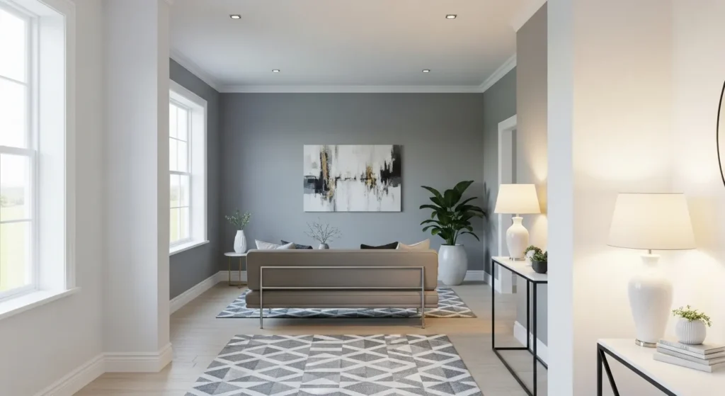
12. Overhead Lighting Effects
Ceiling or overhead lighting can cast shadows that affect how color is perceived. Light hitting walls directly may intensify saturation, while angled light softens it.
Consider the type and angle of overhead lighting. Adjust fixtures or lamp placement to prevent harsh highlights or unwanted shadowing that can distort wall colors.
13. Recessed Lighting and Highlighting
Recessed lights allow precise highlighting of walls or features. Pale colors can appear brighter and more vibrant when lit directly, while darker tones gain depth.
Use this technique for feature walls or small areas needing emphasis. Strategic lighting ensures paint colors convey the intended mood.
14. Track Lighting for Galleries
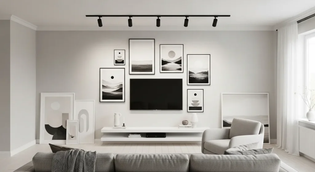
Track lighting enhances both paint color and artwork. By controlling direction and intensity, it creates focus and can subtly warm or cool wall tones.
Adjust brightness and angle to complement paint undertones. Properly positioned track lights prevent glare while making walls feel lively and dynamic.
15. Lamps with Color Temperature
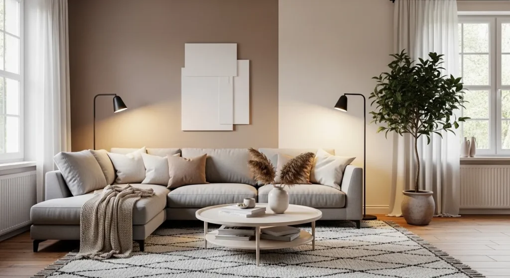
Lamp light color temperature changes wall perception. Warm lamps make beige and yellow hues glow; cool lamps enhance grays and blues.
Test wall color under the lamp you plan to use most. This ensures the room maintains the desired ambiance and prevents mismatched tones between natural and artificial light.
16. Evening Light Transitions
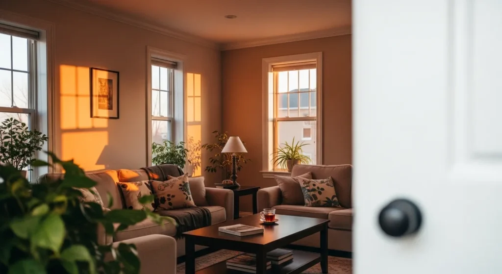
Evening sunlight creates dramatic shifts in paint color. Warm tones intensify, shadows lengthen, and the room takes on a cozy, inviting glow.
Observe how colors change as the sun sets. Choosing paint with complementary undertones ensures your space feels balanced throughout the day and evening.
17. Layered Lighting for Accuracy
Using multiple light sources helps reveal the truest paint color. Layered lighting balances natural and artificial tones, minimizing harsh shadows or unwanted color shifts.
Mix ambient, task, and accent lighting for flexibility. This approach gives consistent perception of paint colors, making your room feel harmonious in any light.
Conclusion
Lighting dramatically alters paint perception. Warm, cool, natural, or artificial light can make the same color feel different throughout the day.
Test swatches in all lighting conditions and consider layered lighting for balance. By understanding light effects, you can pick colors that look perfect at every hour, creating a room that feels vibrant, cozy, and intentional.