
As an Amazon Associate, I earn from qualifying purchases. This means I may earn a commission if you purchase through links on this page — at no extra cost to you.
Bold, colorful wall art can wake a room up — or tip it into chaos. The difference is discipline: one anchor color, a limited palette, the right scale, and calm surroundings that let the bold pieces lead. Printable art is ideal for this because you can test a loud look cheaply and swap a print that fights the room. This guide covers how to choose bold prints, print them well, and place them so a room feels energized rather than overwhelmed.
Start With One Anchor Color
Every bold wall needs an anchor: one color pulled from something already in the room — a rug, a cushion, a chair, a book spine. That anchor is the thread that ties the prints to the room instead of letting them float as random color. Build around it with a simple structure: one dominant color that appears most, one secondary color that supports it, and one accent that appears sparingly. When a print does not contain the anchor or at least sit comfortably next to it, it will look like it wandered in from another room.
Undertones matter more than color names. A warm red and a cool red clash even though both are “red,” and the same goes for blues, greens, and yellows. Hold candidate prints next to each other and next to the anchor item before printing at full size. If two colors vibrate uncomfortably when placed side by side, drop one — the wall will feel calmer for it.
Bold by Room: Where It Works, Where to Restrain
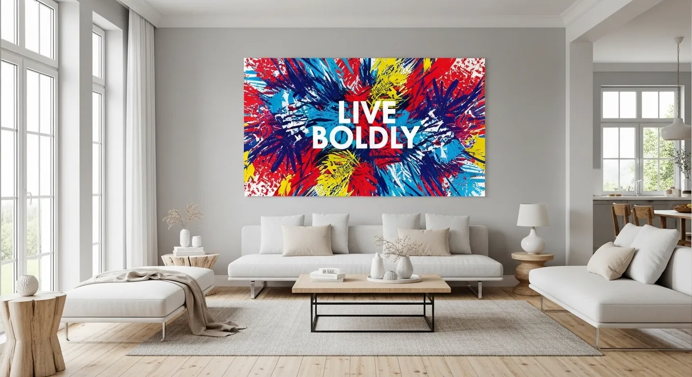
Living rooms take bold art best, especially on one main wall where people gather. A large colorful abstract or a grid of bright prints gives the room a focal point, and the rest of the furniture can stay neutral to balance it. Home offices take bold art well too, because color wakes up a workday — but keep the boldest piece out of the direct line behind a video-call background if it distracts.
Kids’ rooms are natural homes for bold color, and printable art made for kids’ rooms is designed to be bright without being harsh. Bedrooms need restraint: one bold print can work as an accent, but a whole wall of loud color fights sleep. Kitchens and hallways suit bold prints in small doses — a single vivid piece in a narrow hall adds energy without crowding a space people pass through quickly.
🛒 Shop This Look:
Choosing Prints That Hold Together
A set of bold prints holds together when it shares a palette, not when it shares a subject. An abstract, a botanical, and a typography print can sit happily together if they share two or three colors; three prints with unrelated palettes will fight even if their subjects match. Lay the candidates on the floor, step back, and squint — the colors should read as one family, not as separate shouts.
Mix print types carefully. Abstract color bursts are the easiest bold choice because they carry no subject to clash with. Typography prints add energy but demand attention to wording — short, confident phrases work; long sentences become visual noise at a distance. Botanical prints in bold colors bring a natural shape that softens loud palettes, which is why a bold botanical often anchors a set that would otherwise feel harsh. Photography in bold color works when the image is simple; a busy, multicolored photo competes with everything around it.
Scale and Placement
Bold art needs scale to work. A single oversized print — large enough to span roughly two-thirds of the furniture below it — reads as a confident statement. A cluster of small bold prints can work too, but only with generous, even spacing; small bold prints packed tightly read as clutter. Above a sofa, the bottom of the frames should clear the cushions by a hand’s width, and the center of the arrangement should sit near eye level when standing.
For a gallery wall of bold prints, plan the layout on the floor first. Arrange the frames, step back, and check two things: that no two loud prints sit directly beside each other without a calmer piece between them, and that the overall shape is balanced rather than heavy on one side. A guide to styling large-scale prints covers sizing rules that apply just as well to bold pieces, since scale mistakes hurt bold art more than quiet art.
Printing Bold Color Well
Bold color is where home printing most often disappoints, because screens and printers render color differently. A vivid orange on screen can print dull, and a deep blue can print darker than expected. Always print a small test first, check it in the room’s actual light, and adjust in small steps. Use a heavier matte paper for most bold prints — it holds saturated color without the glare that glossy paper adds, and glare washes out exactly the boldness you want.
For anything larger than letter size, a print shop is usually worth it: larger printers lay down more even color, and banding that is invisible on a small test shows clearly at poster size. Keep the original file at full resolution and avoid re-saving it repeatedly, which degrades color and sharpness. If a print comes back duller than the screen, the usual fix is a slightly brighter file and a paper with a little more tooth, not a different printer.
🛒 Shop This Look:
Frames That Let Color Lead
Frames for bold art should be simple: thin black, white, or natural wood. A colored or ornate frame competes with the print and splits attention. Black frames sharpen bold colors and suit modern rooms; white frames soften them and suit lighter rooms; natural wood warms them and suits rooms with other wood tones. Pick one finish for the whole arrangement — mixed frame finishes break a bold wall into pieces.
Mats deserve the same restraint. A white or off-white mat gives bold color breathing room and makes the print feel finished; a colored mat usually fights the print. For very bold pieces, a wider mat than usual helps — it creates a quiet border that lets the eye settle before meeting the color.
Balancing Bold Walls With Calm Surroundings
Bold art works because the rest of the room stays calm. If the walls, sofa, and rug are all neutral, one bold wall sings. If everything is already loud, adding bold art just adds noise. The practical version: pick one wall for bold art and keep the others quiet, or pick one bold piece per wall and leave the rest of that wall empty.
Mirrors and glass help balance bold walls by adding light and reflection without adding color. A mirror hung near bold art bounces light around and keeps the wall from feeling heavy, and a guide to mixing art and mirrors covers placement that adds light without glare. Plants help too — green sits next to almost any bold palette without competing, and a plant beside a bold print softens the whole arrangement.
Mistakes That Turn Bold Into Chaos
The first mistake is too many competing bolds. Five vivid prints in five unrelated palettes do not add up to energy; they add up to noise. Cut the weakest one or two and the wall immediately improves. The second is neon everywhere — a touch of neon as an accent can be electric, but a wall of neon is tiring to live with.
The third is ignoring light. Bold colors shift dramatically between daylight and lamplight, and a print chosen at noon can look wrong at night. Always check candidates in evening light before committing. The fourth is clashing undertones — warm and cool versions of the same color fighting each other. The fifth is hanging bold art too high or too small, which makes it feel accidental rather than intentional. Bold art should look placed on purpose, at eye level, at a scale the wall deserves.
🛒 Shop This Look:
Bold Art in Small Rooms
Small rooms can take bold art — they just need it confined. The rule that saves small rooms is one bold wall, or one bold piece, with everything else calm. A single vivid print above a small desk, or one bold wall in a tiny living room, adds energy without crowding. What shrinks a small room is bold art on every wall, or a large bold gallery crammed into a wall that is barely wider than the sofa.
Scale down, do not mute down. A small room does not need pastel versions of bold prints; it needs the same bold prints at a smaller size and in fewer numbers. One oversized bold print actually suits a small room better than six small bold prints, because the single piece reads as a deliberate focal point while the six read as clutter. Leave generous empty wall around it — the empty space is what keeps the bold piece from pressing in on the room.
Light is the other lever. Bold art in a dim small room turns muddy and heavy, while the same art in a bright small room stays vivid. If the room is dim, add a light source aimed at the art — a picture light, a directed lamp — before blaming the print. And keep the surrounding walls light: bold art against pale walls pops, while bold art against mid-tone walls competes for attention it cannot win.
Starting Small With Bold Color
If a full bold wall feels risky, start with one print. Hang a single vivid piece where you see it most — above a desk, in an entryway, over a sideboard — and live with it for a week. Notice whether it energizes the room or tires you. If it energizes, add a second print that shares its palette; if it tires, swap it for something calmer and keep the lesson for the next choice.
Travel prints are a gentle entry point into bold color because they carry memories that soften loud palettes — a vivid market scene or a bright coastal print feels personal rather than merely loud. Whatever the subject, the rule stays the same: one anchor color, a limited palette, the right scale, and calm surroundings. Follow that, and bold art energizes a room instead of overwhelming it.