
As an Amazon Associate, I earn from qualifying purchases. This means I may earn a commission if you purchase through links on this page — at no extra cost to you.
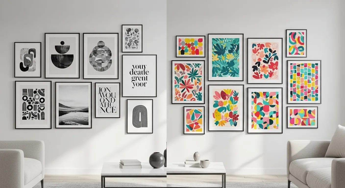
The monochrome versus vibrant question has no universal winner, because the prints are not competing on the same terms. Monochrome prints calm a room and let texture, furniture, and light do the talking. Vibrant prints energize a room and demand attention, which means they also demand restraint everywhere else. The right choice depends on what the room already is — its existing color load, its light, its purpose — and on what you want the wall to do: settle the room, or wake it up.
What Each Style Does to a Room
Monochrome prints — black and white, single-color, or tonal ranges of one hue — create continuity. They read as a single visual idea even across several frames, which makes them forgiving in rooms that already have strong furniture, patterned rugs, or bold wall color. They also age gracefully: a black-and-white print rarely clashes with a future sofa or rug change, because it commits to no color at all.
The risk of monochrome is flatness. A wall of similar black-and-white prints in identical frames can read as decoration rather than display — pleasant but forgettable. The fix is texture and scale variation: mix a large print with smaller ones, vary mat widths, combine a photograph with a line drawing, and let one frame material (wood, black metal) differ slightly to keep the wall from looking stamped out.
Vibrant prints — saturated color, strong contrast, multiple hues — create a focal point. They pull the eye immediately, which is exactly what you want above a plain sofa or on an empty hallway wall, and exactly what you do not want in a room that already has a patterned rug, colorful cushions, and bright art competing for attention. Vibrant prints need neutral neighbors: plain walls, calm furniture, and breathing room around the frame.
The risk of vibrant is fatigue. A color that excites on first sight can tire over months if it fights everything else in the room. The fix is anchoring: repeat one color from the print in a small dose elsewhere — a cushion, a throw, a vase — so the print reads as part of the room rather than an interruption in it.
Decide From the Room, Not From the Feed
Start with the room’s existing color load. Count the strong colors already present: sofa, rug, curtains, cushions, existing art. If the count is already high, monochrome prints add display without adding color load. If the room is mostly neutral — beige sofa, plain rug, pale walls — a vibrant print gives the room its missing energy without overwhelming it.
Next, consider light. Bright, sunlit rooms carry vibrant color well, because daylight keeps saturated hues looking rich rather than harsh. Dim rooms and north-facing rooms can make vibrant prints look muddy, while monochrome prints hold their contrast in low light and keep the wall readable. If the wall gets little daylight, favor monochrome or muted vibrant tones over full saturation.
Then consider purpose. Workspaces and bedrooms usually benefit from calm — monochrome or muted prints that do not demand attention while you work or wind down. Social rooms — living rooms, dining rooms, entryways — can carry vibrant prints, because the room’s job includes energy and conversation. Kitchens sit in between: a vibrant print above a plain counter works; a vibrant print competing with colorful tile and appliances does not.
Finally, consider what you already own. If your frames are black, monochrome prints slot in immediately. If your frames are natural wood, both styles work, but vibrant prints gain warmth from wood while monochrome gains contrast. Do not buy new frames for every print decision — let the frames you own narrow the choice.
🛒 Shop This Look:
Monochrome Done Well
Vary scale deliberately. One large monochrome print with two or three smaller ones creates hierarchy; a wall of identically sized prints creates a grid that can feel institutional. Let the largest print set the tone and the smaller ones support it.
Vary texture within the monochrome range. A photograph, a line drawing, and a typographic print in the same black-and-white family read as a collection rather than a set, because the eye finds different surfaces to explore. Matte paper suits monochrome particularly well — it avoids glare and keeps the tonal range soft.
Use one accent material to keep the wall from going flat. A single wood frame among black frames, a brass clip frame, or a natural linen mat introduces warmth without introducing color. The accent should appear once or twice, not everywhere — repetition of the accent turns it into a second theme.
Mind the mats. Wide mats give monochrome prints breathing room and make small prints feel intentional rather than lost. A mat that is too narrow crowds the print; a mat that is too wide swallows it. As a starting point, a mat width roughly proportional to the print size — wider for larger prints — keeps the balance without measuring rules that feel fussy.
Vibrant Done Well
Pick one hero print. In a vibrant display, one print should clearly lead — the largest, the most saturated, or the most detailed — and the others should support it. Two competing heroes on one wall create a shouting match; one hero with quieter supporters creates a composition.
Limit the palette count. A vibrant print with five or six strong colors needs a calm room; a vibrant print with two or three strong colors is far easier to live with. When choosing between two vibrant prints you love, favor the one whose colors already appear somewhere in the room — even in a small dose — over the one that introduces an entirely new palette.
Anchor the color in the room. Repeat one color from the hero print in a cushion, a throw, a vase, or a book spine. The repetition does not need to match exactly — a terracotta print echoed by a rust cushion reads as intentional, not as color-matching. Without any anchor, a vibrant print can feel like it wandered in from another house.
Give vibrant prints space. A vibrant print crowded by neighboring frames loses its impact, because the eye cannot settle on it. Leave more breathing room around vibrant prints than around monochrome ones, and keep the wall behind them plain — patterned wallpaper behind a vibrant print is usually one pattern too many.
🛒 Shop This Look:
Mixing Both in One Home
Most homes do not need to choose one style for every room. The workable approach is per-room roles: calm rooms get monochrome, social rooms get vibrant, and transitional spaces — hallways, entries — get whichever bridges the rooms they connect. A hallway between a monochrome bedroom and a vibrant living room can carry a muted print that borrows from both, easing the transition rather than announcing a switch.
Use consistent frames as the unifier. If every room uses black frames, a monochrome bedroom and a vibrant living room still feel like one home, because the frame language is shared. Changing frame styles room by room, on top of changing print styles, is what makes a home feel disjointed.
Watch the sightlines between rooms. If a vibrant living-room wall is visible from a monochrome bedroom doorway, the contrast will feel abrupt. A hallway print in a middle register — muted color, not full saturation — softens that boundary. You do not need to see it to feel it; the eye registers the transition even in passing.
Printing: Paper, Size, and Test Prints
Paper choice changes how both styles read. Matte paper suits monochrome depth — it avoids glare and keeps blacks soft rather than shiny. Luster or satin paper suits vibrant color — it adds a slight sheen that makes saturated hues look richer without the mirror glare of full gloss. Gloss paper is best reserved for photographs meant to be viewed up close, not for large wall prints viewed from across a room.
Size follows viewing distance. A print viewed from across a living room needs to be large enough to read at that distance; a print viewed from a hallway needs less size because the viewer is closer. As a practical check, tape a paper outline of the intended size to the wall and view it from the room’s usual seating or standing positions before printing — a size that looks generous up close can disappear from the sofa.
Always test-print before committing to a large size. Print a small section at the intended paper and settings, check it in the room’s light, and look for two things: whether dark areas hold detail rather than crushing to black, and whether vibrant areas stay clean rather than oversaturating. A test strip costs little and prevents the most common printable regret, which is a large print that looked perfect on screen and muddy on paper.
Resolution sets the ceiling on size. A low-resolution file printed large will soften visibly, and no paper choice rescues it. If the file is small, print smaller or choose a different image for the large spot — a sharp small print beats a soft large one every time. For more on the black-and-white side specifically, see gallery walls with only black-and-white photos, and for a minimalist printable direction, see minimalist quote printables.
Frames, Mats, and Placement
Black frames sharpen both styles: they make monochrome prints crisper and give vibrant prints a clean boundary. White frames soften both: they lighten monochrome displays and calm vibrant ones. Wood frames warm both: they suit rooms with natural materials and prevent a display from feeling clinical. The frame choice should echo something already in the room — floor, furniture, or existing frames — rather than introducing a new material for its own sake.
Placement follows the same eye-level rule as any wall art: the center of the arrangement sits around standing eye level, adjusted down for rooms viewed seated. Spacing between frames should be consistent — a hand’s width or so for a tight arrangement, wider for a relaxed one — and consistent spacing matters more than the exact gap, because the eye reads inconsistency instantly.
Group by intention, not by leftover space. A cluster of prints that share a theme, a palette, or a frame style reads as a display; prints scattered wherever wall space remained read as storage. If a print does not fit the group, it belongs on a different wall, not squeezed into the gap.
Mistakes to Avoid
The first mistake is choosing by screen appeal rather than room fit. A vibrant print that glows on a phone screen can overwhelm a small, dim room, and a monochrome print that looks elegant online can vanish on a large, bright wall. Judge prints in the room, at the room’s size, in the room’s light.
The second mistake is mixing too many vibrant palettes in one room. One vibrant palette, anchored in the room, works. Two unrelated vibrant palettes compete, and the room feels restless rather than lively.
The third mistake is identical framing for everything. Uniform black frames across a whole home can feel like a catalog rather than a collection. One varying element — a wood frame, a wider mat, a different size — keeps a display feeling personal.
The fourth mistake is ignoring the wall color behind the print. A white-matted monochrome print on a white wall can disappear; a vibrant print on a strongly colored wall can clash. The print, the mat, and the wall are one composition — check all three together, not just the print alone.
A Starter Plan
Walk the room and count its strong colors, note its light, and name its job — calm or social. If the count is high or the job is calm, start monochrome: one large print, two smaller supporters, varied textures, one warm accent material. If the room is neutral and social, start vibrant: one hero print, a limited palette, one color anchored elsewhere in the room, generous breathing space. Print a test strip first, tape the size outline to the wall, check it from the room’s usual viewpoints, and only then commit to the large print. The wall will tell you quickly whether the choice fits — and a test strip is far cheaper than a reprint.
🛒 Shop This Look: