
As an Amazon Associate, I earn from qualifying purchases. This means I may earn a commission if you purchase through links on this page — at no extra cost to you.
Nobody great paints a room one color and stops. A room painted entirely in one flat tone, even a beautiful one, tends to look unfinished, because there is nothing for the eye to rest on and nothing to give the space shape. Combinations do that work: a main color carries the room, a second color supports it, and a small accent gives it life. Get the combination right and an ordinary room looks considered; get it wrong and even expensive paint looks off.
Undertone First, Color Second
Every paint color leans warm or cool, and that lean matters more than the color name on the swatch. A gray that leans blue will clash with a cream that leans yellow, even though gray and cream sound like a safe pair. Two colors with the same undertone direction sit together calmly; two with opposing undertones fight, often in a way that is hard to name but easy to feel.
To check undertones, hold swatches next to a true white card in daylight. The lean becomes visible fast: the gray goes blue or violet, the beige goes pink or yellow, the white itself goes warm or cool. Compare your candidates against each other, not against the store lighting, which flatters everything.
Fixed elements have undertones too. Your floor, countertops, fireplace stone, and large furniture all lean warm or cool, and your wall combination has to live with them. A warm wood floor argues for warm-leaning wall colors; a cool gray tile floor argues for cool-leaning ones. When a combination looks wrong and you cannot say why, a fixed element with the opposite undertone is usually the culprit.
A Working Method: Main, Support, Accent
A simple method keeps combinations from drifting: one main color for most of the walls, one supporting color for trim, an accent wall, or large furniture, and one small accent for accessories, art, or a single piece of furniture. The main color should be the quietest of the three, because it covers the most area. The accent should be the boldest, because it covers the least.
This is guidance, not a formula with a guaranteed result. Rooms differ in light, size, and furniture, so the proportions shift: a small room may need the main color on even more of the walls, while a large room with good light can carry a bolder supporting color. The principle holds regardless: the more area a color covers, the quieter it should be.
Start with the main color, then choose the supporting color against it, then the accent last. Choosing all three at once from a fan deck is how people end up with three colors they each love and that hate each other. Build the combination one decision at a time, checking each new color against the ones already chosen.
🛒 Shop This Look:
Combination Families That Hold Together
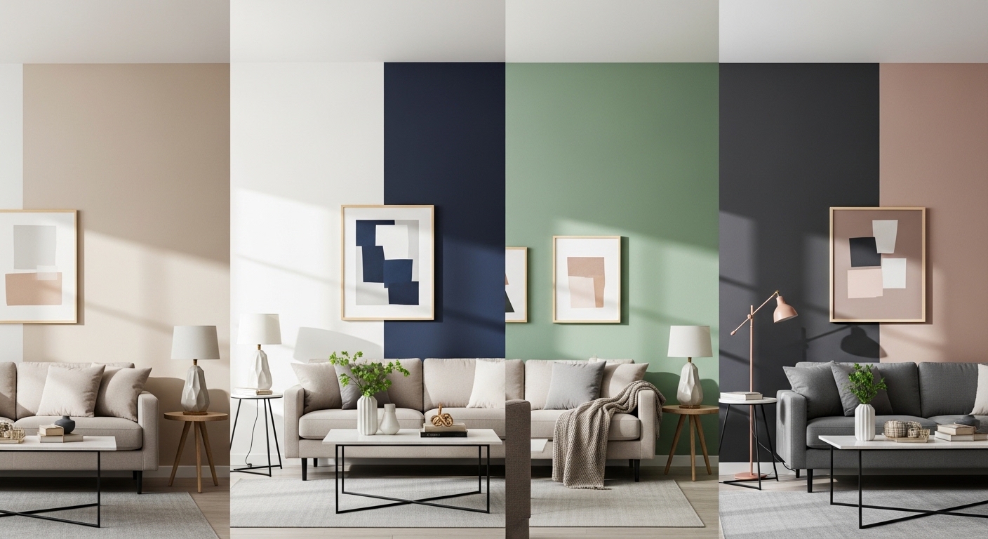
Warm neutrals are the most forgiving family: warm white, soft beige, warm gray, and a muted terracotta or olive accent. They suit rooms with warm wood floors and natural light, and they rarely clash because the whole family leans the same way. The risk is flatness, so add texture: linen curtains, a woven rug, wood grain, and the neutrals stop looking like a single beige blur.
Cool and natural is the second family: cool gray or blue-gray walls, white trim, natural wood, and a deep green or navy accent. It suits rooms with gray floors, stainless kitchens, and cooler light. Keep the wood warm enough to stop the room feeling clinical; pale oak or walnut does that job better than gray-washed wood.
Dark and light pairings are the boldest reliable family: a deep color on one wall or on cabinetry, with light neutrals everywhere else. Deep navy with warm white, charcoal with cream, forest green with soft white: the dark color gives drama, the light colors give breathing room. The rule is dose: the dark color earns its place on one wall, one bank of cabinets, or one large piece of furniture, not on every surface.
Muted color with one clear accent is the fourth family: a muted sage, dusty blue, or warm taupe as the main color, with a single stronger accent in art, a chair, or a rug. This suits people who want color without committing a whole wall to it, and it is the easiest family to change later, because the accent lives in objects rather than paint.
Light Changes Every Combination
The same two colors look different in different light, and that is the most common reason a combination that looked perfect in the store disappoints at home. North-facing rooms get cool, steady light that strengthens cool colors and dulls warm ones. South-facing rooms get warm, changing light that strengthens warm colors and softens cool ones. East rooms are bright in the morning and flat later; west rooms are flat in the morning and golden in the evening.
Test combinations in the actual room, at three times of day if you can: morning, midday, and evening under the lights you actually use. Paint large swatches, at least the size of a sheet of paper, and put them on two walls, because a color on a wall facing the window reads differently from the same color on the wall beside it.
Artificial light matters just as much. Warm bulbs make warm combinations glow and cool combinations look muddy; cool bulbs do the reverse. If you are repainting and relighting at the same time, decide the bulbs first, because they change how every swatch reads after dark.
Room by Room: Where Combinations Differ
Living rooms can carry the boldest combinations, because they are social spaces with varied light and furniture. A dark accent wall, a strong rug, and layered art all have room to breathe here. Keep the main walls quiet enough that the room still feels open when it is full of people.
Bedrooms want quieter combinations. The main color should be restful, the supporting color soft, and the accent small: a throw, a headboard, a piece of art. Strong contrasts in a bedroom can feel stimulating at exactly the hour you want to wind down, so save the boldest pairing for the living room.
Kitchens and bathrooms have fixed elements that constrain combinations: cabinets, countertops, tile, and fixtures. Match the wall combination to those fixed colors first, and let the accent live in accessories, a backsplash, or a single painted cabinet run rather than fighting the tile.
🛒 Shop This Look:
Two-Tone Walls and Painted Trim
Two-tone walls are a combination inside a single wall: a darker color below a chair rail and a lighter color above, or a bold color on the lower half of a wall with white above. They add structure to a room and let you use a bolder color in a controlled dose. The dividing line matters: a crisp line at chair-rail height or at picture-rail height reads intentional, while a line at a random height reads like an unfinished job.
Painted trim is another quiet combination. White trim is the safe default, but trim painted in a slightly darker or lighter version of the wall color adds depth without a new hue, and trim painted in a contrasting color, like deep green against warm white walls, frames the room like a picture. The guide to two-tone wall paint ideas shows how these divided walls work in practice, including where the dividing line should sit.
Ceilings count as a color too. A white ceiling is the default that makes walls read taller; a ceiling painted a pale version of the wall color makes a room feel cozier and more enveloping. A dark ceiling is a bold move that suits large rooms with good light and high ceilings, and it can make a small or low room feel lower, so use it with care.
Pairing Paint With Wallpaper
When one wall carries wallpaper, the paint on the other walls should come from the paper, not compete with it. Pull the quietest color out of the pattern for the main walls, and let the paper be the bold note. A busy pattern with bold painted walls beside it turns the room into two competing statements.
If the wallpaper is subtle, textured, or tone-on-tone, the paint can be slightly stronger, because the paper is not fighting for attention. Grasscloth, linen-look, and subtle geometric papers all pair well with a muted paint color pulled from their own fibers.
Sample the paint against the actual paper, not against a photo of it. Screens shift color, and the paper’s texture changes how the paint beside it reads. Hold a painted swatch directly against a paper sample in the room’s light before committing to either.
Sampling Properly Before You Commit
Buy sample pots, not just swatches. Paint two coats on a large board, not directly on the wall, so you can move the board between walls and lighting conditions without repainting. Live with the boards for at least two days, checking them in morning, midday, and evening light.
Test the full combination together, not one color at a time. Three boards side by side, in the proportions they will appear in the room, tell you things that three separate swatches never will. If the combination feels off, change one color, not all three; most failed combinations have one wrong member, not three.
Finish matters too, and it changes how a combination reads. Matte finishes soften color and hide wall flaws; eggshell and satin reflect more light and make colors read slightly stronger and cleaner. Use matte on large wall areas and a slightly glossier finish on trim, and the same color family will read as a deliberate combination rather than a single flat coat.
🛒 Shop This Look:
Mistakes That Ruin Good Combinations
Choosing colors under store lighting and never testing them at home is the first mistake, and the most expensive. Store lights are designed to flatter paint; your living room is not.
Ignoring undertones is the second. Two colors with opposing undertones will clash no matter how good each looks alone, and the clash is hard to fix without repainting one of them.
Using too many bold colors at once is the third. A combination needs a quiet majority. If every color in the room is shouting, none of them reads, and the room feels chaotic rather than colorful.
Forgetting the fixed elements is the fourth. Floors, countertops, and large furniture are part of the combination whether you planned them or not, so check new colors against them before you buy.
A Starter Plan for One Room
Pick the room, note its fixed colors and light direction, and choose a main color that leans the same way as the floor. Add a supporting color that shares the undertone, then one accent that you love and that appears in small doses. Sample all three on boards, live with them for two days, adjust one color if needed, and only then buy the full cans.
That slow, one-decision-at-a-time method is the whole secret. Designers do not have a magic eye for combinations; they have a method, and the method is undertone first, main color second, support third, accent last, tested in the real room. Follow it, and your combinations will hold together without needing a professional eye. For more paint and wallpaper direction, the paint colors and wallpaper hub collects related guides, from two-tone walls to mixing paint and paper in one room.