
As an Amazon Associate, I earn from qualifying purchases. This means I may earn a commission if you purchase through links on this page — at no extra cost to you.
It feels wrong, which is why it works so well. Dark walls do not close rooms in — they dissolve the boundaries, making corners disappear and ceilings recede into shadow. The room feels larger because you can no longer see exactly where it ends. It is the jewelry-box effect: small, dark, and deep. But the effect is conditional. Dark paint rewards rooms with enough light and the right finish, and it punishes rooms without them. This guide explains how dark colors create that larger-room feeling, how to choose among them, and when to leave the dark tin on the shelf.
Why Dark Walls Can Make a Room Feel Larger
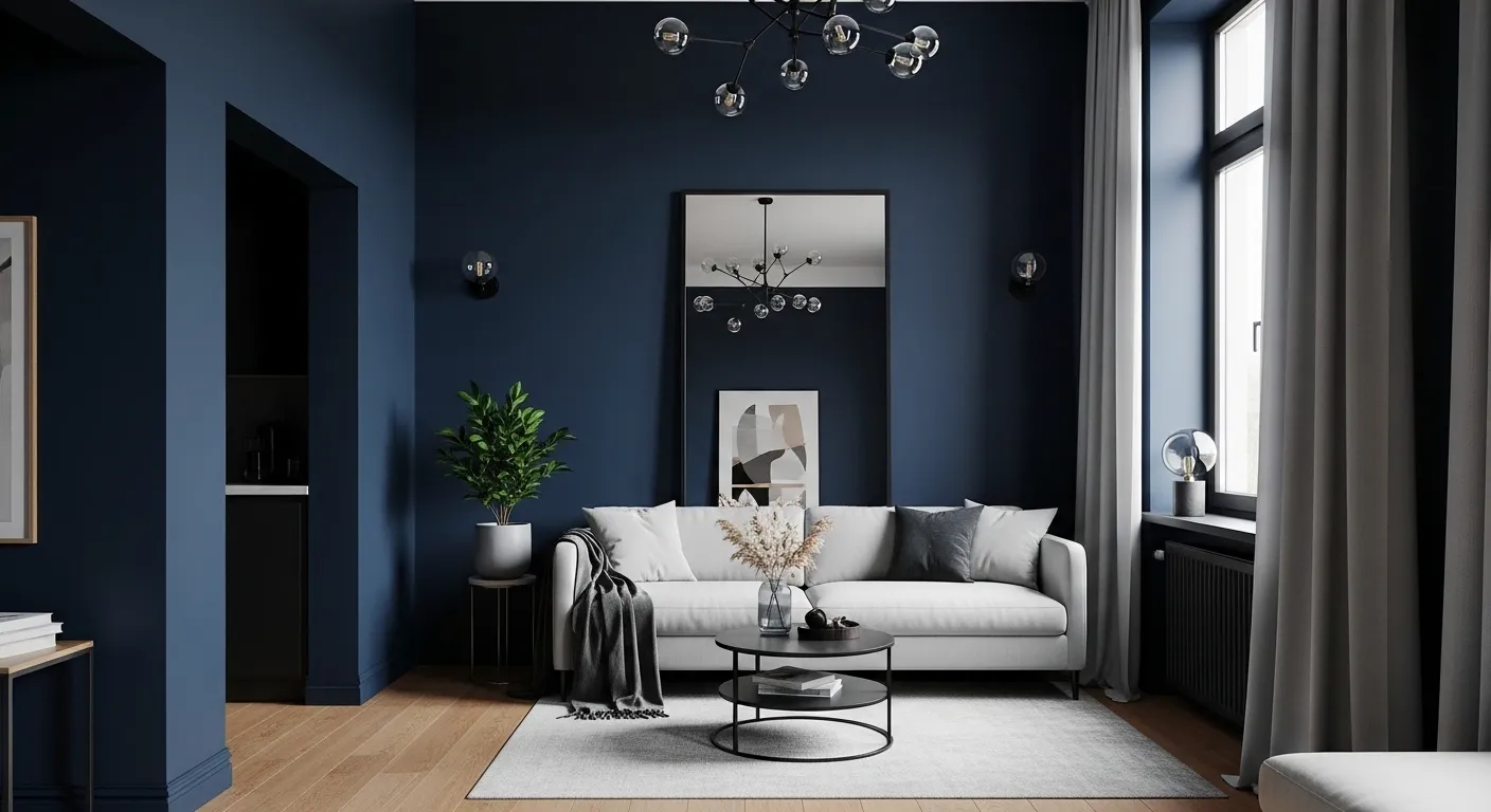
A pale wall shows every edge: where wall meets ceiling, where one wall meets the next, where a shadow falls. The eye measures the room by those edges. A dark wall hides them. Corners soften, the ceiling line blurs, and the eye stops measuring and starts wandering. That is the whole trick: the room feels larger not because it grew, but because its limits stopped announcing themselves.
The effect is strongest in rooms where the furniture and art are lighter than the walls. Light objects advance against a dark ground, so a pale sofa, a bright rug, or white bedding reads clearly and pulls the eye across the room. Dark walls with dark furniture do the opposite: everything merges into one dim mass and the room feels smaller. The pairing matters as much as the paint color itself.
First, Read Your Light
Light decides whether dark paint works before any color choice matters. A room with a large window and daylight for most of the day can carry a deep navy or charcoal on all four walls. A room with one small window, or a window facing a wall or alley, should limit dark paint to one wall or a lower portion, with pale surfaces elsewhere to bounce what light exists.
Check the room at three times: morning, midday, and evening with lamps on. A color that reads as rich navy at noon can read as near-black at dusk, and a near-black room at night needs lamp light planned in, not discovered afterward. If the evening check leaves the room feeling gloomy rather than cozy, the answer is not a different dark color — it is less dark surface, or more light. North-facing rooms and rooms with shaded windows are the hardest cases: dark paint there needs the most lamp light and the palest trim to succeed.
Choose by Color Family, Not by Color Name
Paint names mislead. Two tins both called navy can sit far apart in warmth and depth, and a list of two dozen near-identical dark shades helps no one choose. Choose by family instead, and judge each family by how it behaves in your light.
Navies and midnight blues are the safest dark family: they read as color rather than as black, they pair with warm wood and brass, and they hold their character in moderate light. Charcoals and graphites are the most neutral: they recede the most, which suits rooms where art or furniture should lead, but they can read flat and cold without warm accents nearby. Greens — forest, olive, deep emerald — bring a natural depth that suits bedrooms and studies, and they tolerate lower light better than blues because the eye reads green as a living color even when dim.
Teals sit between blue and green and shift with the light: greener by day, bluer by lamplight. That shift is a feature in rooms used both day and evening, and a risk in rooms where you want one stable mood. Purples — eggplant, aubergine, burgundy-leaning tones — are the boldest family: they create a cocooning effect in bedrooms but can feel heavy in workrooms or kitchens. Browns and near-blacks — cocoa, charred wood, inky black — give the strongest boundary blur, and the strongest demand for light and pale contrast. Use them where the room has the light and the light furniture to carry them.
Within a family, undertones decide the mood. A navy with a warm undertone feels cozy; the same depth with a cool undertone feels crisp and distant. Compare swatches against your fixed surfaces — floor, sofa, bedding — not against each other on a white card. The fixed surfaces are what the paint has to live with.
🛒 Shop This Look:
Finishes Matter More on Dark Walls
Finish shows more on dark paint than on pale paint. Every scuff, brush mark, and touch-up reads clearly against a deep ground. Matte and flat finishes hide wall imperfections best and give the soft, velvety look that suits the jewelry-box effect, but they mark easily and are harder to clean. Eggshell offers a middle path: a soft glow that lifts the color slightly, with enough washability for living rooms and bedrooms.
Satin and semi-gloss suit kitchens, bathrooms, and hallways, where walls get touched and splashed, but they reflect every bump in the plaster, so wall preparation matters more. Whatever finish you choose, buy enough paint from one batch for the whole job and keep a small amount for touch-ups: a later batch can shift slightly, and on a dark wall even a slight shift shows as a patch.
Ceilings, Trim, and the Edges
Ceilings decide whether a dark room feels cocooning or oppressive. A white or pale ceiling lifts the room and marks a clean top edge, which suits most dark rooms and all low ceilings. Painting the ceiling the same dark color removes the top edge entirely and deepens the cocoon effect — it works in rooms with generous height and good light, and it backfires in low rooms, where it can feel like the ceiling is pressing down.
Trim is the frame that keeps dark walls intentional. White or cream trim draws a crisp line around doors and windows and gives the eye resting points. Same-color trim, painted in a slightly glossier finish than the walls, makes the trim disappear and the wall feel continuous — a sophisticated choice that suits rooms where the architecture is plain. Pick one approach per room and stay consistent; mixed trim treatments make dark walls look unfinished rather than deliberate.
How Much Wall to Paint
Full-room dark paint gives the strongest boundary blur and suits rooms with good light and a clear purpose: bedrooms, studies, dining rooms used in the evening. One dark accent wall gives most of the depth with less risk, and suits rooms with limited light, rooms shared with pale furniture, and anyone trying dark paint for the first time. The accent wall should be the wall the eye lands on from the doorway — usually the wall behind the bed, the sofa, or the fireplace — not a random side wall.
A third option suits tall rooms and hallways: dark paint on the lower portion with a pale upper wall, divided by a chair rail or a painted line. The dark lower half grounds the room while the pale upper half keeps the height. Whichever scope you choose, paint the chosen walls fully and evenly; a half-painted dark wall, or a dark wall with pale patches where furniture stood, reads as a mistake rather than a choice.
🛒 Shop This Look:
Sampling the Right Way
Small swatches lie about dark colors. A chip the size of a stamp cannot show how a deep color behaves across a wall in changing light. Paint large test patches — at least the size of a sheet of paper, ideally larger — on the actual wall, in two spots: one near the window and one in the darkest corner. Live with both patches for several days, checking them in morning light, midday light, and lamplight.
Test against the room’s fixed elements, not against a white background. Hold the swatch beside the sofa fabric, the floor, and the bedding or rug, because those are the colors the paint must sit with. If a color looks right on the wall but wrong beside the sofa, it is the wrong color. Narrow the choice to two finalists, paint both large, and choose in the room’s worst light — the darkest corner at dusk — because a color that survives the worst light will thrive in the best.
Light and Mirrors With Dark Walls
Lamp light is part of the paint plan on dark walls, not an afterthought. Plan for light at three heights: a ceiling light for general glow, table or floor lamps for pools of warm light, and a small light near any reading or work spot. Warm-toned bulbs suit dark walls better than cool ones, because cool light on a dark wall can read clinical. Mirrors help by doubling the light and the view: a large mirror opposite or beside a window bounces daylight across the room and keeps the dark walls from absorbing all of it.
If the room’s depth comes partly from wallpaper rather than paint, the same rules apply: deep hues need light and pale contrast to read as depth rather than gloom. See the guide to dark, moody wallpaper for how patterned deep hues behave differently from flat paint, especially in small rooms where a pattern’s scale changes the effect.
🛒 Shop This Look:
Mistakes That Shrink the Room
The first mistake is dark paint in a room without the light to carry it: a windowless room, a heavily shaded room, or a room used mostly at night with one overhead bulb. Dark paint there does not blur boundaries; it removes them into gloom. The second mistake is dark walls with dark furniture and dark floors all together, leaving nothing light for the eye to land on. Keep at least one large pale element — bedding, rug, sofa, or curtains — to anchor the room.
The third mistake is sampling too small and choosing in the store’s light, then discovering at home that the color reads black or muddy. The fourth is ignoring the ceiling: a dark ceiling in a low room, or a stark white ceiling that cuts the cocoon effect in half when a softer pale tone would have eased the transition. And the fifth is painting only part of a wall and stopping at a random point. Dark paint needs a clean stopping edge — a corner, trim, or a deliberate line — or it looks unfinished.
A Quick Plan
Start by checking the room’s light at three times of day and deciding the scope: full room, accent wall, or lower portion. Choose a color family by the mood you want and your fixed surfaces, then narrow to two finalists and paint large test patches near the window and in the darkest corner. Decide the ceiling and trim approach before opening the tin, plan lamp light at three heights, and keep one large pale element in the room. Done in that order, dark paint gives the jewelry-box effect: a room that feels deeper than its walls. For more paint and wallpaper guidance, see the site’s paint colors and wallpaper ideas hub.