Printable wall art is an affordable and versatile way to refresh any space. Choosing between monochrome and vibrant designs can significantly affect the mood, balance, and overall look of a room. Monochrome printables create timeless elegance, while vibrant prints introduce energy and personality.
Understanding where each style works best allows homeowners to make thoughtful decisions. From small apartments to spacious living rooms, and from cozy bedrooms to lively kitchens, the right choice can enhance décor, highlight furnishings, and reflect personal style.
1. Monochrome for Minimalist Spaces
Monochrome printables are ideal for minimalist interiors. Their neutral palette blends seamlessly with walls, furniture, and décor while creating a clean, timeless aesthetic.
This approach works well in bedrooms, living rooms, or offices where simplicity is key. Black-and-white artwork adds contrast without overwhelming the space, maintaining visual calm.
Monochrome designs allow for subtle expression. They complement textures, patterns, and shapes already present in the room, enhancing sophistication and cohesion without competing for attention.
2. Vibrant Prints in Small Rooms
Vibrant printables instantly energize small rooms, adding colour, personality, and visual interest. They draw the eye and can serve as a focal point in otherwise neutral spaces.
This technique works well in compact apartments or studios. Choosing one or two bold prints prevents the room from feeling cluttered while making the space feel lively and inviting.
Vibrant printables allow homeowners to experiment with colour and style. Even a single bright piece can dramatically change a room’s mood, reflecting personality and creativity.
3. Monochrome in Workspaces

Monochrome printables in workspaces create a professional, calming environment. Neutral tones reduce visual distractions while providing style and elegance.
This approach works well for offices, studios, or study corners. Monochrome designs encourage focus, making them ideal for productivity while still enhancing the décor.
Adding monochrome art in offices allows personal expression without overwhelming the functional space. The subtle tones complement furniture and accessories, ensuring the workspace feels cohesive and inspiring.
4. Vibrant Prints in Social Areas
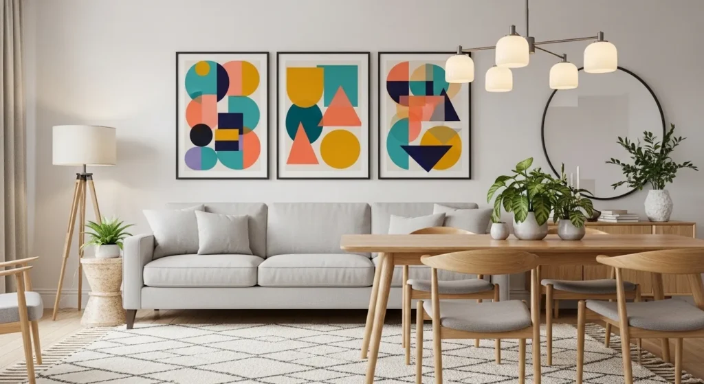
Vibrant printables energize social spaces, such as living rooms or dining areas, creating a lively and engaging atmosphere. Bold colours stimulate conversation and draw attention, making the wall a focal point.
This technique works well in rooms where energy and personality are desired. Pairing vibrant prints with neutral walls or furniture prevents the space from feeling chaotic.
Vibrant prints allow homeowners to express creativity and fun. They bring warmth and excitement to communal spaces, transforming simple walls into memorable design statements.
5. Monochrome Prints with Patterned Backgrounds
Pairing monochrome printables with subtle patterns adds dimension and interest. The black-and-white designs stand out against gentle textures while maintaining a calm, sophisticated palette.
This technique works well in hallways, bedrooms, or living rooms. Monochrome designs prevent busy backgrounds from feeling overwhelming, while creating a polished and cohesive look.
Using monochrome with patterns enhances depth. The artwork remains timeless, providing balance and harmony in spaces that might otherwise feel visually cluttered.
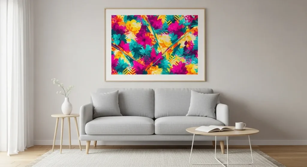
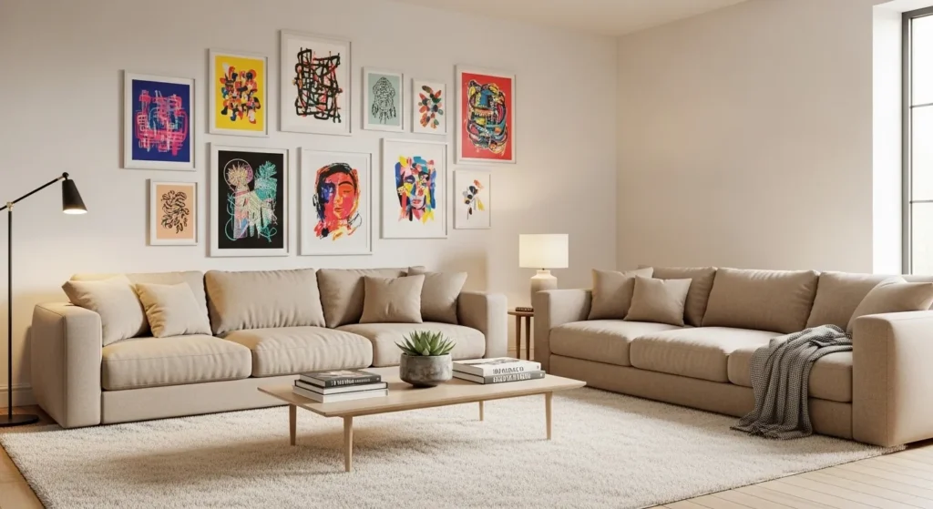
6. Vibrant Prints as Accent Pieces

A single vibrant printable acts as an accent piece, bringing energy without dominating the entire room. It adds colour and focus while maintaining overall balance.
This approach works well in minimalist or neutral interiors. One bold piece can elevate the room’s style, reflect personality, and create a visually engaging focal point.
Vibrant accent prints offer flexibility. They are easy to swap or reposition, allowing homeowners to refresh their space seasonally or as tastes evolve.
7. Monochrome with Metallic Frames

Monochrome printables paired with metallic frames add subtle sophistication. The reflective finishes complement the neutral tones while elevating the overall aesthetic.
This technique works well in living rooms, bedrooms, or entryways. Metallic frames add elegance without overpowering the calming effect of monochrome prints.
Using monochrome with metallics allows the wall to feel polished and dynamic. The combination reflects light subtly, enhancing both the art and the room’s overall ambiance.
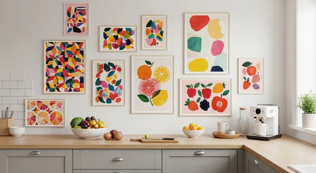
8. Vibrant Prints in Kitchens
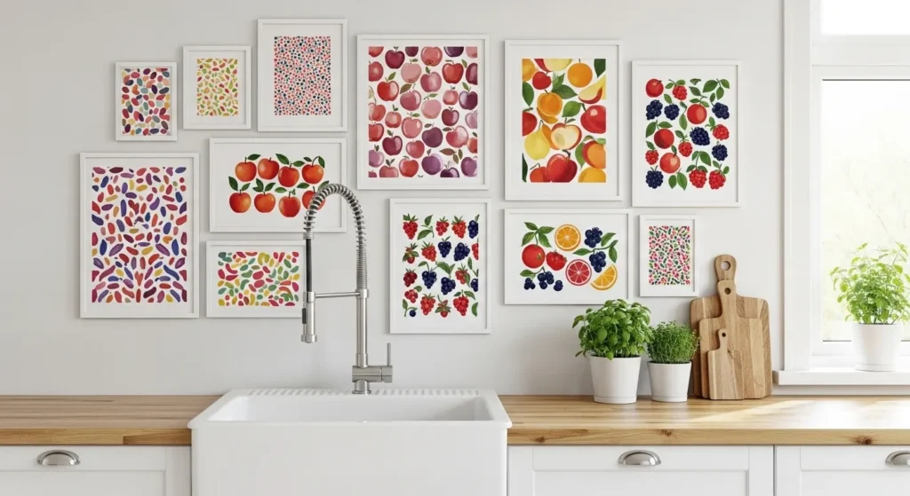
Vibrant printables in kitchens add energy and personality to what can otherwise feel like a utilitarian space. Bold colours create visual interest and can coordinate with accessories like dishware or textiles.
This approach works well on small walls or above counters. A single statement print or a small cluster can brighten the room without overwhelming the space.
Vibrant prints in kitchens bring fun and warmth. They make daily routines feel lively, while reflecting personal style in a room where style often takes a backseat to function.
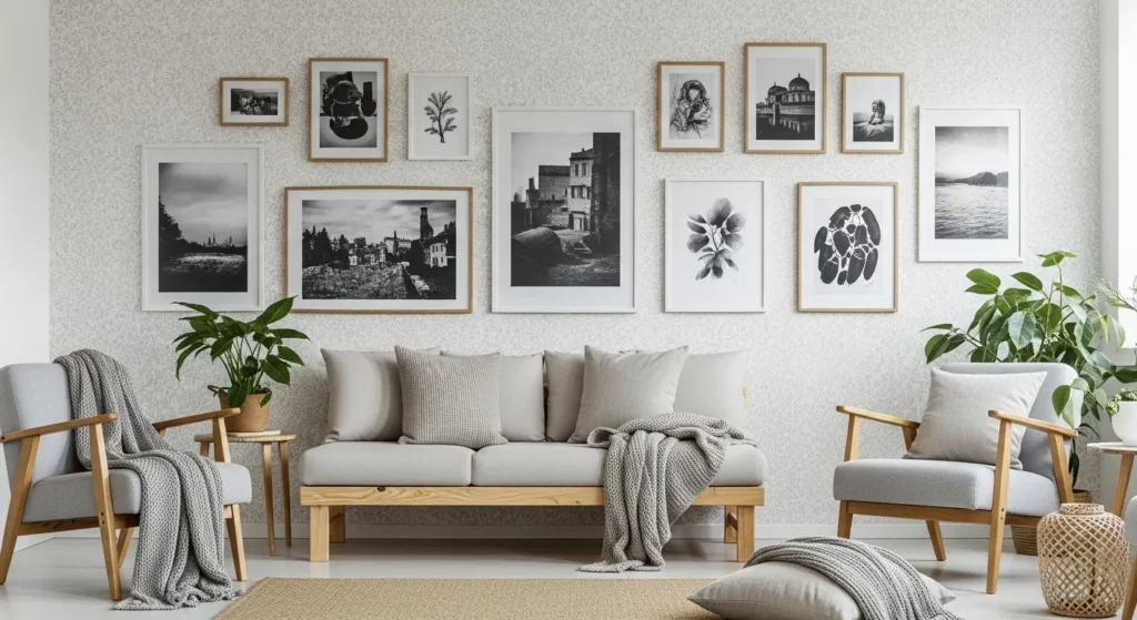
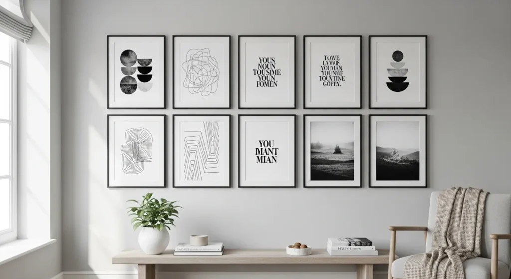
9. Monochrome for Gallery Walls
Monochrome printables are ideal for gallery walls. Using a single colour palette creates cohesion, letting multiple pieces coexist without overwhelming the viewer.
This technique works well in living rooms, hallways, or large bedrooms. It allows for mixing styles—abstract, typography, photography—while maintaining balance and sophistication.
Monochrome gallery walls offer timeless appeal. They are easy to update with new prints and ensure the arrangement remains elegant, versatile, and visually harmonious over time.
10. Vibrant Prints with Neutral Furniture
Vibrant prints pop against neutral furniture, creating a focal point that immediately draws attention. The balance keeps the space from feeling chaotic while injecting personality and life.
This approach works well in modern or minimalist interiors. The neutral surroundings let the colours shine while maintaining harmony throughout the room.
Using vibrant prints with neutral furniture allows homeowners to experiment with bold colour choices safely. It refreshes the space, adds warmth, and makes walls feel alive without clutter.
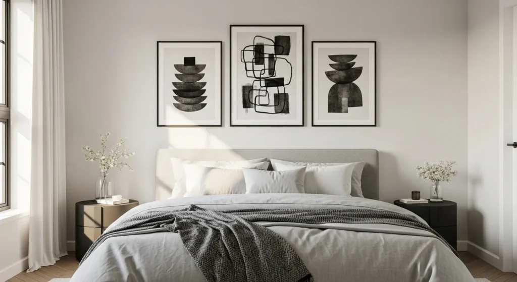
11. Monochrome Prints in Bedrooms

Monochrome prints create a calm, serene atmosphere in bedrooms. The neutral tones complement bedding and furniture, making the space feel restful and sophisticated.
This approach works well in small or large bedrooms. By keeping the colour palette consistent, monochrome prints reduce visual noise while highlighting textures and shapes.
Monochrome printables in bedrooms offer timeless elegance. They enhance the room’s tranquility while allowing furniture, textiles, and decorative elements to shine without distraction.
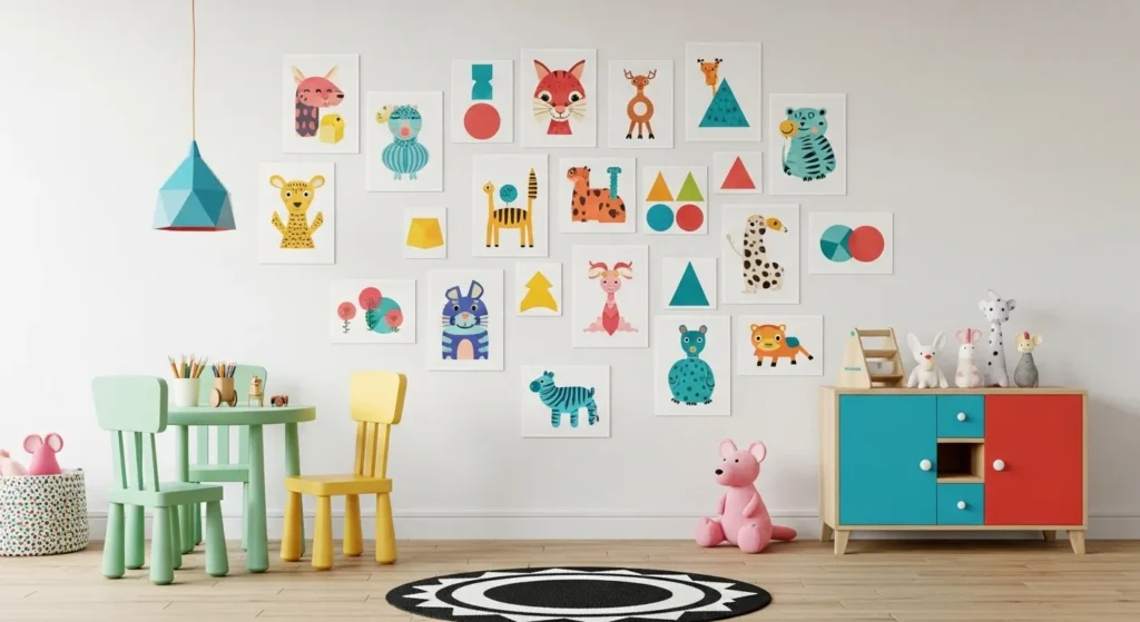
12. Vibrant Prints in Playrooms
Vibrant prints are perfect for playrooms, creating a fun and stimulating environment. Bright colours encourage creativity and energy, while visually organizing the space.
This approach works well in areas designed for children. Bold, cheerful prints make the room inviting and engaging, providing both decoration and inspiration.
Using vibrant prints in playrooms allows personality to shine. They brighten the space, encourage imaginative play, and make walls as dynamic as the room’s activities.
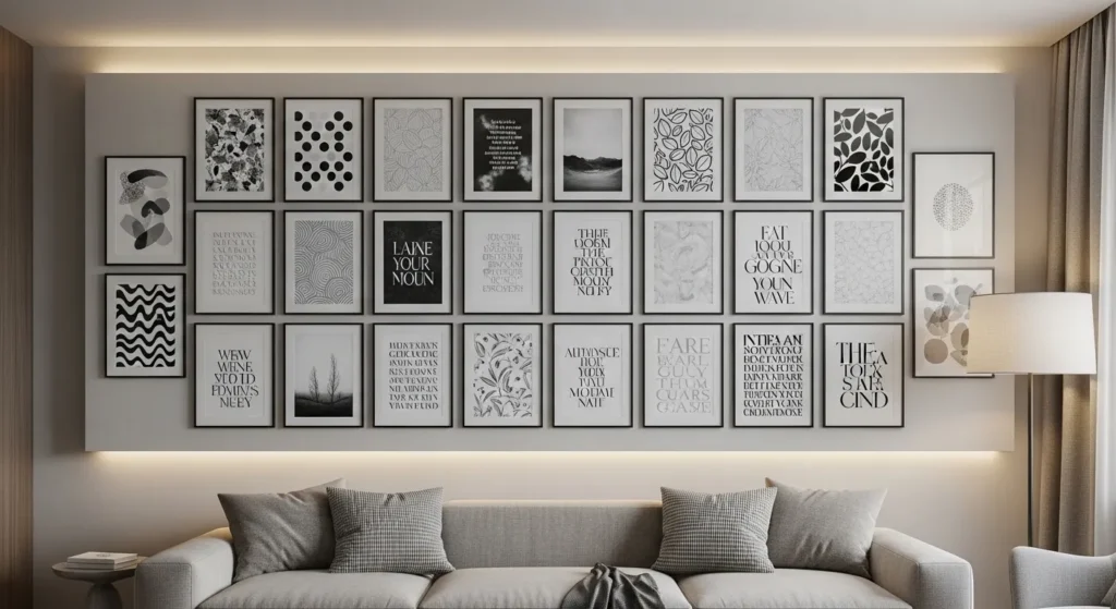
13. Monochrome with Typography
Typography in monochrome adds personality without overwhelming the space. Inspirational quotes or typographic designs create focal points while maintaining a calm, professional aesthetic.
This approach works well in offices, living rooms, or entryways. Black-and-white tones keep the design readable and elegant while complementing other décor elements.
Monochrome typographic printables combine functionality with style. They provide motivation or personality while enhancing balance and sophistication on walls of any size.
14. Vibrant Prints in Entryways

Vibrant printables energize entryways, offering a warm welcome and making a bold first impression. The colourful artwork can set the tone for the rest of the home’s décor.
This approach works well in narrow or compact spaces. Even a single piece of vibrant art creates visual interest and liveliness without overpowering the area.
Using vibrant prints in entryways allows personality to shine immediately. It brightens the space, enhances mood, and transforms a simple wall into a dynamic focal point.
15. Monochrome in Hallways
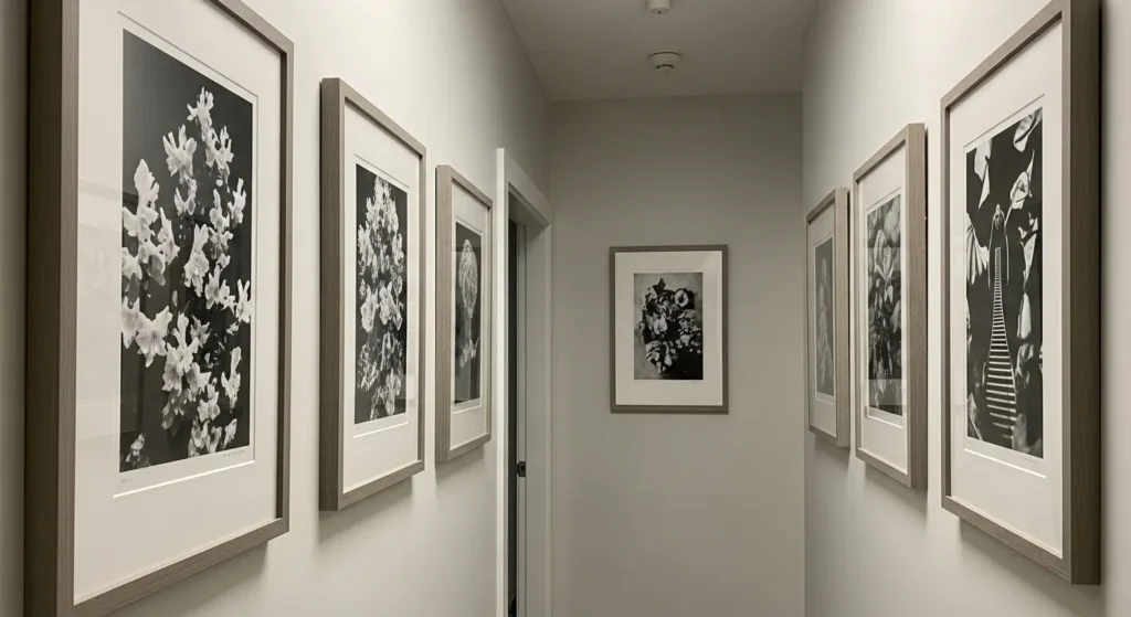
Monochrome printables are perfect for hallways, creating a clean, elegant path without overwhelming the space. Their neutral tones complement walls and flooring while maintaining a timeless aesthetic.
This approach works well in narrow or long corridors. Black-and-white designs keep the space visually calm and cohesive, letting textures and lighting play a larger role.
Monochrome art in hallways adds sophistication. It highlights the architecture subtly while allowing for a curated gallery feel that won’t feel busy or cluttered in small spaces.
16. Vibrant Prints for Seasonal Updates
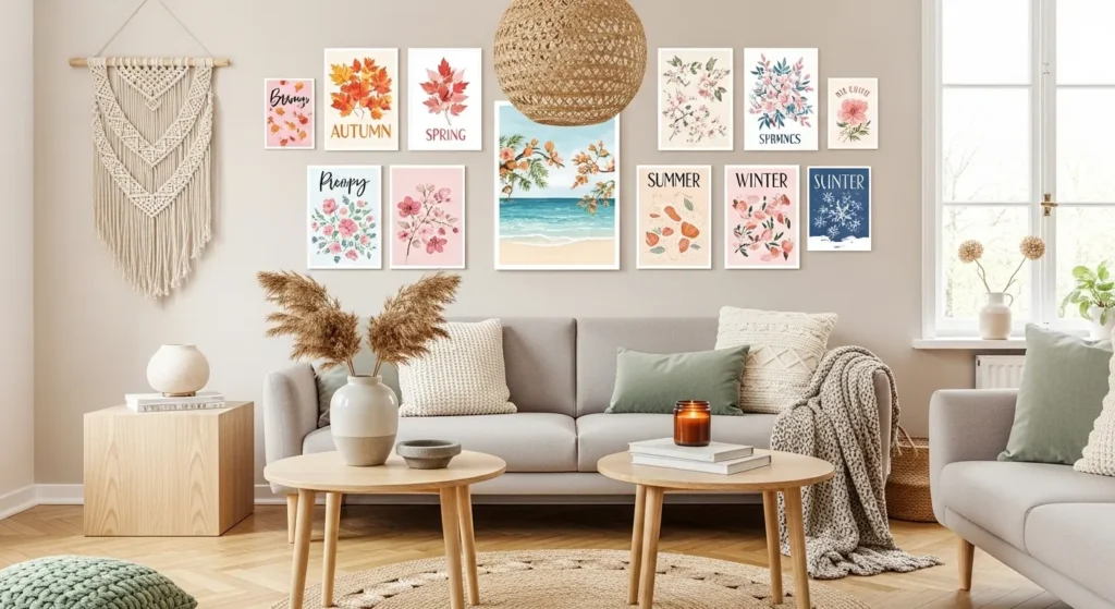
Vibrant printables are great for seasonal updates. Bold colours and themed designs allow homeowners to refresh a room quickly without repainting or major décor changes.
This approach works well in living rooms, kitchens, or bedrooms. Rotating prints with the seasons keeps spaces fresh and dynamic, creating a visually engaging environment.
Using vibrant printables for seasonal décor adds personality and variety. They provide an easy, budget-friendly way to reinvent a space while keeping it lively and inviting.
17. Monochrome Prints for Galleries
Monochrome printables are ideal for gallery walls because they maintain balance while allowing multiple artworks to coexist. Their simplicity ensures cohesion across varied designs.
This approach works well in large living rooms or dining areas. By sticking to a neutral palette, homeowners can experiment with styles, textures, and mediums without overwhelming the space.
Monochrome gallery walls offer elegance and timelessness. They create a cohesive, sophisticated look while allowing homeowners to swap in new pieces easily without disrupting the harmony.
18. Vibrant Prints in Bedrooms

Vibrant printables energize bedrooms, adding personality and warmth. Bold artwork can be a striking focal point that enhances mood and style in a personal space.
This approach works well when walls are neutral and furniture simple. The contrast ensures that prints shine without overwhelming the room’s calming atmosphere.
Using vibrant prints in bedrooms allows self-expression. Colourful artwork brings life and individuality to the space while balancing comfort and visual interest.
19. Monochrome Prints with Natural Elements

Monochrome prints paired with natural elements like wood and greenery create balance and sophistication. The art remains subtle while textures and natural colours provide warmth.
This approach works well in living rooms, dining areas, or bedrooms. Neutral tones let natural elements stand out, creating a cohesive, grounded aesthetic.
Monochrome prints with natural accents provide timeless elegance. They harmonize with décor, reflect calmness, and add dimension to walls without competing with other elements.
20. Vibrant Prints in Kitchens and Dining Areas
Vibrant printables in kitchens and dining areas create energy and a lively atmosphere. Colourful artwork draws attention and complements meals and gatherings with warmth.
This approach works well for small or open-plan kitchens. Even one large vibrant piece can serve as a focal point, lifting the space instantly.
Vibrant prints enhance social areas. They provide personality, mood-lifting energy, and a visually engaging feature wall that’s easy to refresh or update over time.
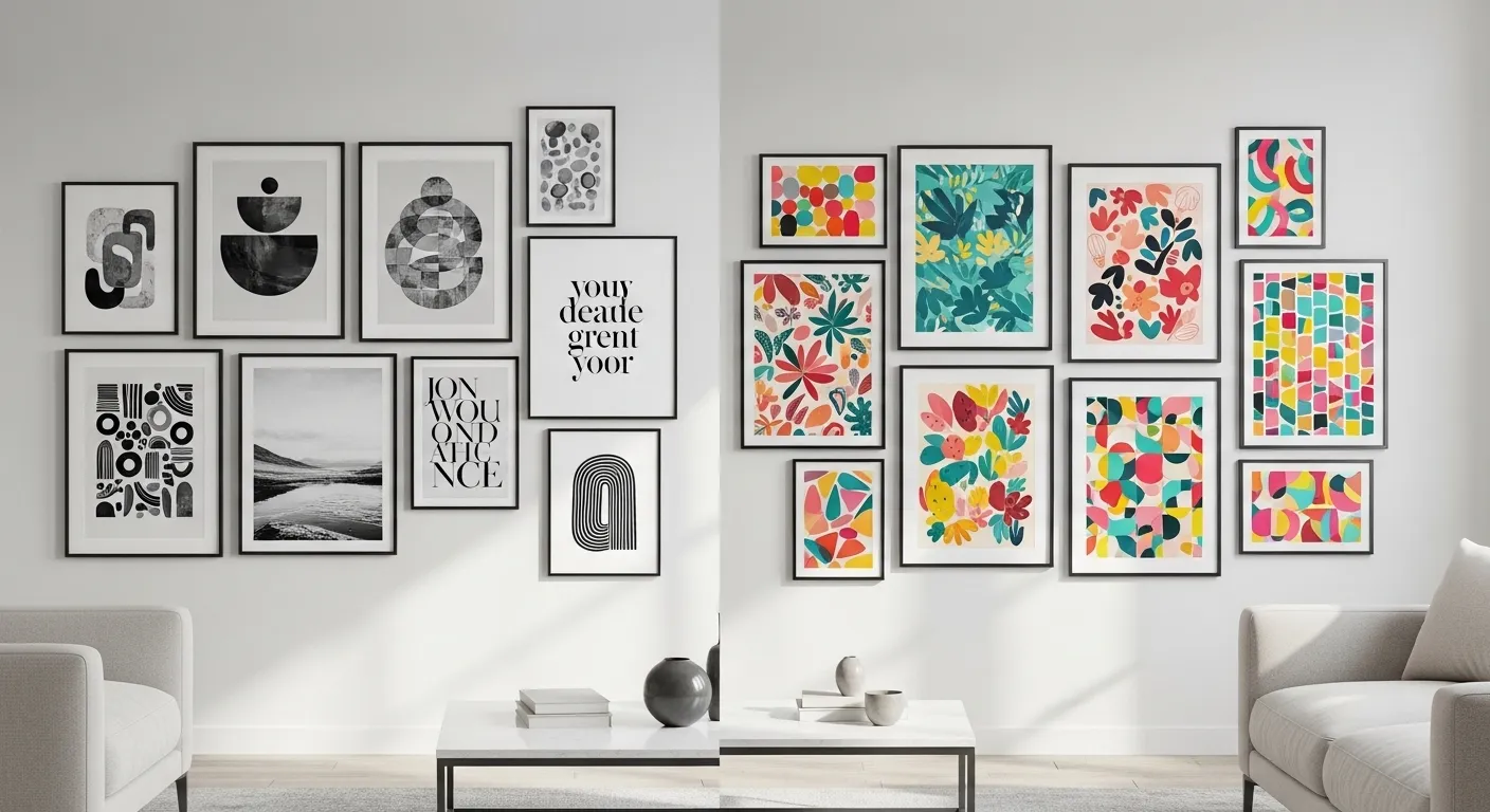
21. Mixing Monochrome and Vibrant
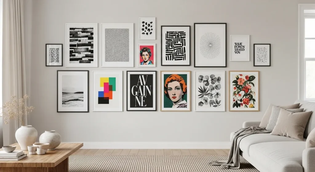
Combining monochrome and vibrant printables allows balance between sophistication and personality. The neutral pieces provide cohesion, while vibrant prints draw attention and add life.
This approach works well in living rooms, hallways, or bedrooms. Careful placement ensures the gallery wall remains cohesive, avoiding visual chaos while showcasing colour strategically.
Mixing monochrome and vibrant artwork provides flexibility and style. It allows homeowners to enjoy timeless elegance alongside expressive, playful elements, creating a curated and dynamic wall display.
Conclusion
Choosing between monochrome and vibrant printables depends on the room, mood, and personal style. Monochrome designs create timeless elegance, cohesion, and calmness, making them ideal for galleries, bedrooms, or workspaces. Vibrant printables add energy, personality, and visual impact, perfect for entryways, social areas, kitchens, or small rooms.
For a balanced look, combining monochrome and vibrant pieces can create a curated, dynamic display that reflects style and enhances a room’s atmosphere. Thoughtful placement ensures harmony, allowing printables to transform walls into lively, stylish, and personalized spaces.