
As an Amazon Associate, I earn from qualifying purchases. This means I may earn a commission if you purchase through links on this page — at no extra cost to you.
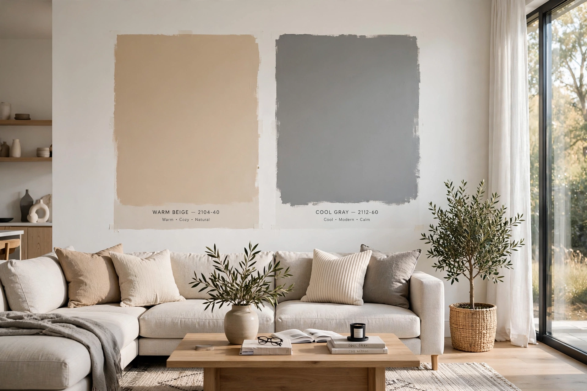
Every paint color — even “neutral” whites, grays, and beiges — has an undertone: a subtle hint of another color lurking beneath the surface. Warm undertones lean yellow, orange, pink, or red. Cool undertones lean blue, green, or purple. Learning to spot undertones is the single most important skill for choosing paint colors that actually look right on your walls.
Why Undertones Trip People Up
That “perfect greige” that looked amazing in the store? On your wall it might scream pink or turn muddy green. This happens because undertones become more visible at scale and in your specific lighting. The small swatch hides what four walls reveal.
How to Identify Warm Undertones
The white paper test: Hold the swatch next to a pure white sheet of paper. Warm undertones will show yellow, peach, or pinkish casts against the stark white.
Compare with similar colors: Line up 3-4 similar swatches. The warm ones will suddenly look yellow or rosy compared to their cooler neighbors.
Check in natural light: Take swatches to a window. Warm undertones intensify in afternoon sun and become most obvious then.
How to Identify Cool Undertones
Cool undertones show as blue, green, lavender, or gray against white paper. They’re most visible in morning light or under cool LED bulbs. Gray paints are notorious for hidden blue or purple undertones that only appear once painted.
Common Undertone Traps
“Greige” gone pink: Many popular greiges have pink undertones that emerge in warm lighting. If you hate pink, test carefully.
“Neutral” gray gone blue: Cool grays can read as baby blue in bright natural light. Compare against a true neutral to check.
White gone yellow: Warm whites intensify in south-facing rooms. What looks creamy in the store can look buttery on a sunny wall.
Beige gone green: Some beiges have green undertones that appear muddy under fluorescent or cool LED lighting.
Matching Undertones to Your Space
Fixed elements first: Check your flooring, countertops, tile, and large furniture. Identify their undertones, then choose wall colors with compatible undertones. Pink-beige tile needs warm walls; gray-blue carpet needs cool walls.
When in doubt, go neutral: Colors with minimal undertone (like Benjamin Moore White Dove or Sherwin-Williams Accessible Beige) are the most forgiving because they don’t fight with existing elements.
🛒 Shop This Look:
The Bottom Line
Always compare swatches against each other, not in isolation. Test on your actual wall. Observe at different times of day. And trust what you see — if a “neutral” looks pink to you, it IS pink, regardless of what the color name suggests.
The Paint Chip Test: A Foolproof Undertone Method
There’s a simple test that reveals undertones more reliably than staring at a single chip: compare the color against the purest version of itself on the paint strip. Paint strips are arranged from lightest to darkest, and the darkest color on the strip shows the undertone most honestly — it’s the same base with less white diluting it. If you’re considering a light greige, look at the darkest chip on its strip: does it read brown-purple? green-gray? That’s your undertone, revealed.
A second test works for any color: place the chip next to a true white piece of paper in natural daylight. The white reference strips away the eye’s adaptation and exposes the hidden hue — a “neutral” gray will suddenly show its blue, green, or purple leanings against pure white. Do this test outdoors or by a bright window, because indoor lighting tints everything. And test at the lightness level you’re actually buying: undertones hide in pale colors and shout in saturated ones, so the palest chip on a strip is the hardest to read and the one most people choose. That’s exactly why undertone mistakes are so common.
Undertones and Fixed Elements: The Part Everyone Forgets
The most expensive undertone mistakes don’t involve other paint colors — they involve the fixed elements you can’t easily change: flooring, countertops, tile, fireplace stone, and cabinetry. These all have undertones too, and they dominate the room. Oak floors with golden undertones will fight a cool gray wall; Carrara marble’s cool blue-gray veining clashes with warm beige walls; cherry cabinets with red undertones make green-gray walls look sickly. Related: Marble vs Marble-Look Quartz Countertops: Can You Tell.
The fix is to choose wall undertones that harmonize with the largest fixed surface, which is usually the floor. Hold your paint chip directly against the flooring in the room’s natural light — not in the store. If the floor is warm (honey oak, terracotta tile, warm beige carpet), lean warm with your walls: warm whites, warm grays (greige), beiges with yellow or pink bases. If the floor is cool (gray tile, cool-toned luxury vinyl, concrete), lean cool: blue-grays, cool whites, taupes with gray bases. When fixed elements conflict with each other (warm wood floors plus cool gray tile), pick the undertone of the element with the largest visual area, and use furnishings and textiles to bridge the rest. This single step prevents more repainting than any other undertone advice.
Undertone Fixes: What to Do When You’ve Already Painted Wrong
If the paint is already on the wall and the undertone is fighting everything, you have options short of repainting. Lighting changes are the cheapest fix: swapping cool daylight bulbs for warm 2700K bulbs adds yellow that softens cool undertones; going the other direction cools down an overly warm wall. This alone can shift a wall’s perceived undertone by a surprising amount.
Textiles and decor are the second lever. A gray wall that reads too blue can be warmed with cognac leather, warm wood tones, brass accents, and cream textiles — the warm elements in the room visually counterbalance the cool wall. A beige wall reading too pink can be cooled with charcoal, navy, and cool-toned art. Large-scale art is particularly effective because it covers significant wall area with colors you control. If the undertone clash is severe and localized (one wall against clashing floors), repainting just that wall in a corrected color is a legitimate strategy — an accent wall in the right undertone can look entirely intentional. Only when the whole room fights its fixed elements is a full repaint the honest answer, and even then, you’ve learned exactly what not to choose next time.
🛒 Shop This Look:
Undertones by Color Family: A Quick Reference
Each popular neutral family has typical undertone traps worth knowing before you shop:
- Whites: rarely pure — they lean yellow (creamy), blue (crisp), pink (soft), or green (subtle). Yellow-whites warm up north-facing rooms; blue-whites can look cold and stark in the same light.
- Grays: the trickiest family. Blue-grays, green-grays, and purple-grays (from red undertones) each create completely different moods. Purple-gray is the most common surprise — it emerges under warm lighting.
- Beiges and tans: lean yellow, orange, pink, or green. Pink-beige is the classic 2000s builder beige people now want to escape; green-beige (khaki) goes muddy in low light.
- Greiges (gray-beige blends): the undertone determines everything — warm greiges read cozy, cool greiges read sophisticated, and the wrong one for your light looks dirty rather than neutral.
Use this as a starting lens, not a verdict: always verify with the chip-against-white test in your actual room before buying gallons.
Testing Undertones in Your Actual Light: The 48-Hour Method
Undertone evaluation can’t be rushed — it needs your room’s full daily light cycle. Paint large test boards (2×2-foot foam core, two coats) rather than dabbing directly on the wall; boards are movable, which is the whole point. Move each board around the room over 48 hours: prop it against the wall it’ll live on, lean it near the window, hold it beside fixed elements (flooring, counters, tile). Undertones reveal themselves in comparison — a gray that looked neutral in isolation will show its violet lean the moment it sits beside your beige tile.
Check the boards at four key times: bright morning, midday, late afternoon, and evening under artificial light. You’re watching for the undertone that appears and disappears — the pink that only shows at night under warm bulbs, the green that emerges in afternoon shade. The undertone visible in the most lighting conditions is the color’s true undertone; one that appears only in a single condition is a lighting artifact you can potentially manage with bulb changes. Photograph each board at each time (same phone, no flash) — cameras exaggerate undertones slightly, which actually helps you see what your adapting eyes miss. If a color’s undertone bothers you in two or more lighting conditions, eliminate it — you’re seeing its nature, not a trick of the light. The colors that survive 48 hours of scrutiny are the ones you’ll live with happily for years.
Undertone-Safe Neutrals: The Most Forgiving Choices
Some neutrals are simply more forgiving of undertone mistakes than others — useful to know when you’re choosing for a tricky space. Warm whites with yellow undertones (think creamy, buttery whites) are the most universally flattering: yellow undertones read as warmth rather than color, they flatter skin tones, and they harmonize with both warm wood floors and most furnishings. They’re the safe choice for north-facing rooms and spaces with mixed fixed elements.
True greiges (balanced gray-beige, neither strongly warm nor cool) are the most adaptable mid-tone neutrals — they shift subtly with the light rather than fighting it, which makes them forgiving in rooms with changing conditions. Soft black-green charcoals (deep tones with the slightest green base) are surprisingly neutral as accents — the green reads as natural rather than colorful. The least forgiving neutrals: cool grays with blue or purple undertones (they expose every warm element in the room as clashing), pink-beiges (the undertone everyone is trying to escape), and stark blue-whites (beautiful in the right modern space, clinical everywhere else). When in doubt, choose the warmer, more muted option — warmth and mutedness both increase forgiveness, while coolness and clarity both increase risk. This isn’t a rule against cool colors; it’s risk management for the colors you’ll live with longest.
🛒 Shop This Look:



