
As an Amazon Associate, I earn from qualifying purchases. This means I may earn a commission if you purchase through links on this page — at no extra cost to you.
By Ella Knight
Yes, a black and white photo gallery wall is one of the most timeless and sophisticated options. It works in any room, matches any decor style, and eliminates color-clashing worries entirely. For best results, use consistent black frames with white mats, vary the photo sizes for visual interest, and include a mix of subjects (landscapes, portraits, architecture) to keep it dynamic.
Why It Works So Well
- Timeless: Black and white never goes out of style
- Cohesive: No color coordination needed — everything matches
- Sophisticated: Instantly elevates any space
- Versatile: Works with modern, traditional, and eclectic decor
5 Stunning Examples
1. The Classic Grid
Nine 8×10 black-and-white photos in black frames with white mats, arranged 3×3. Clean, timeless, perfect for hallways.
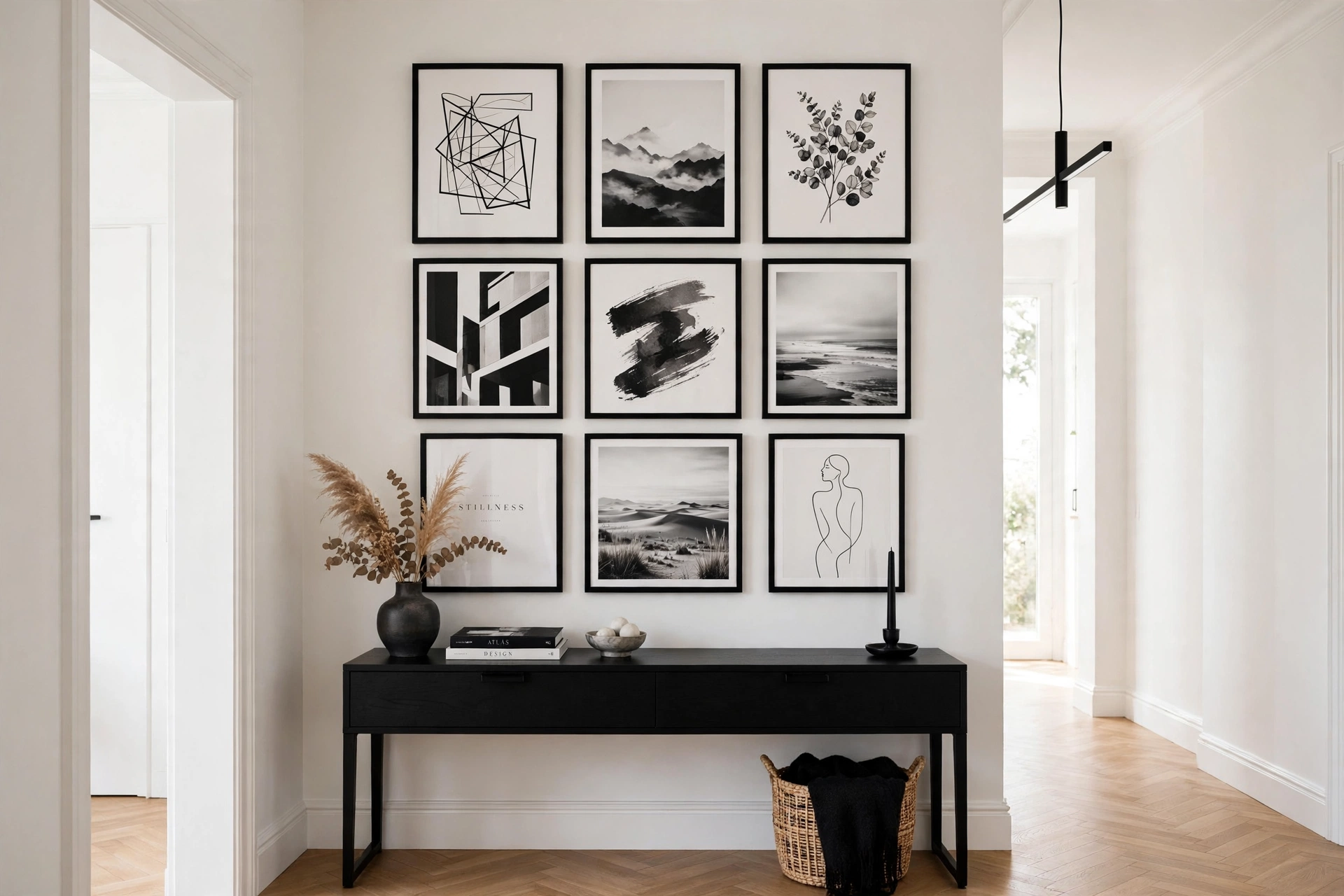
Sheffield Home 9 Piece Gallery Wall Frame Set, 11×14 in. matted to 8×10 in., Matte Black
Best for the classic 3×3 grid of 8×10 photos with white mats.
2. The Salon Mix
Varied sizes (5×7 to 16×20) in mixed black frames. Eclectic but unified by the monochrome palette.
ArtbyHannah Assorted Sizes Gallery Wall Frame Set, Black Picture Frame Collage (Large)
Best for a salon-style mix of varied sizes in black frames.
3. The Linear Hallway
Five 11×14 prints in a single row. Dramatic and elongating.
4. The Oversized Statement
One massive 24×36 black-and-white landscape flanked by two smaller prints. Bold and gallery-like.
Best for the oversized 24×36 statement landscape.
🛒 Shop This Look:
5. The Mixed Media
Black-and-white photos interspersed with abstract black-and-white art prints. The most designer-looking option.
Best for square 8×8 photos in a designer-looking mixed-media wall.
Converting Color Photos
Use your phone’s built-in editing tools or free apps like Snapseed. Increase contrast slightly — black-and-white photos need more contrast than color ones to avoid looking flat. Print on matte paper for a fine-art feel.
Frame Recommendations
Thin black frames with wide white mats are the gold standard. The white mat creates separation between the photo and frame, making each piece feel like gallery art.
Best for a multi-size black-frame collage with the gallery look described above.
Getting the Tones Right: Matching Blacks, Whites, and Grays
A black-and-white gallery wall lives or dies on tonal consistency. The most common mistake is mixing true black-and-white photos with sepia or warm-toned prints — the warm images stick out like sore thumbs against cool monochrome neighbors. Before printing or framing, convert everything to the same monochrome treatment. Most photo editors offer several black-and-white presets; pick one (high-contrast, soft matte, etc.) and apply it uniformly so the whole wall shares a tonal language.
Pay attention to paper and mat tones too. Bright white mats next to cream or ivory mats create a subtle but visible mismatch that undermines the crisp monochrome look. Choose one mat color — bright white for a modern punch, or warm white for a softer gallery feel — and use it across every frame. The same goes for the “blacks”: a photo with rich deep blacks hung next to a faded gray-toned print looks unbalanced. When converting color photos, push the contrast slightly higher than feels natural on screen; prints always lose a touch of punch compared to backlit displays, and monochrome images need that contrast to hold their own on a wall.
What Pairs With a Black-and-White Gallery Wall
One of the great strengths of a monochrome gallery wall is how little it demands from the rest of the room — but a few pairings elevate it from nice to striking. One color accent in the room (a rust-colored throw pillow, a deep green plant, a brass lamp) gives the eye somewhere to rest and makes the monochrome wall feel like a deliberate design choice rather than a safe default. Without any color at all, some rooms can feel flat or cold.
Texture is the other essential partner. A B&W photo wall above a nubby linen sofa, beside a jute rug, or against a grasscloth or limewash wall gains the warmth and dimension that monochrome alone can’t provide. Wood tones — especially medium and warm woods — are the classic companion, which is why black frames with warm wood furniture is such an enduring combination. If your room is already cool-toned (gray sofa, chrome accents, white walls), consider warm white mats and natural wood frames for some pieces to keep the space from feeling icy. The wall is the constant; the room around it supplies the warmth.
🛒 Shop This Look:
Black-and-White Gallery Walls by Room
The monochrome approach adapts to every room, but the execution should shift with the space. In hallways, a linear arrangement of same-size B&W prints in matching frames creates a gallery corridor that makes a narrow space feel intentional and expansive — keep the frames at consistent eye level and spacing for maximum effect. In living rooms, go larger and more varied: an oversized black-and-white landscape or portrait as the anchor, surrounded by smaller pieces, holds its own against big furniture.
Bedrooms suit softer monochrome treatments — lower contrast, generous white mats, and calm subject matter (abstracts, botanicals, serene landscapes) keep the mood restful. Avoid high-drama, high-contrast imagery above the bed if you’re sensitive to visual stimulation before sleep. In home offices, black-and-white architectural photography or typography prints look sharp and professional on video calls — a tidy monochrome wall behind your desk reads as polished without being distracting. Staircases are natural homes for chronological B&W arrangements (family photos through the years, travel sequences) since the ascending layout mirrors a timeline.
Keeping a Monochrome Wall From Feeling Flat
The risk of an all-black-and-white wall is monotony — without color variation, the eye needs other kinds of variety. Mix subject matter deliberately: portraits, landscapes, architecture, abstracts, and typography together create visual rhythm that a wall of all-portraits lacks. Vary the tonal range across pieces too — some images predominantly dark and moody, others light and airy. A wall where every photo is mid-gray and medium-contrast will feel flat no matter how good the individual images are.
Frame variety within the monochrome palette adds another layer: mostly black frames with a few white ones, or a mix of thin and chunky profiles, keeps the wall dynamic. Consider adding one or two non-photo monochrome elements — a black-and-white textile, a charcoal sketch, a white ceramic piece on a small shelf integrated into the arrangement — to break the frame-photo-frame rhythm. Finally, lighting transforms monochrome walls: a picture light or well-aimed track lighting adds depth and shadow that makes black-and-white art glow. Monochrome photography was made for dramatic lighting — give it some.
Best for adding depth and shadow so black-and-white art glows.
Sourcing Black-and-White Art: Free and Affordable Options
A monochrome gallery wall is one of the cheapest impressive walls to build, because black-and-white art is everywhere and often free. Your own photo library is the best source — nearly every phone photo converts beautifully to monochrome, and personal photos beat generic art for emotional impact. When converting, bump contrast 10–15% beyond what looks right on screen; prints lose punch compared to backlit displays, and monochrome needs that extra definition on a wall.
Public domain archives are a goldmine: museum open-access collections (the Met, the Smithsonian, and many national galleries offer free high-resolution downloads) include stunning historical photography and etchings that look incredibly expensive framed. Printable shops on Etsy sell curated monochrome sets — often 10–20 coordinated prints for $5–$12 — solving the cohesion problem instantly since the set was designed to hang together. For large statement pieces, drugstore and warehouse photo printing (or online print services) produce 16×20 and larger prints for a fraction of art-store prices; the quality gap at normal viewing distances is negligible. Thrift stores frequently yield black-and-white prints and photography in existing frames — sometimes the frame alone is worth the $3 price. One caution: resolution matters at large sizes. A phone photo that looks crisp at 8×10 will pixelate at 24×36 — check the file’s dimensions before ordering big prints (roughly 150 DPI minimum at final size for wall viewing distances). Build the wall around what you can source well rather than forcing a layout that demands sizes your files can’t support.
Black-and-White Gallery Walls in Colorful Rooms
A monochrome gallery wall in an otherwise colorful room is a power move — the wall becomes a visual palate cleanser that makes the surrounding color look more intentional. The key is letting the wall be truly neutral: keep frames, mats, and images strictly black, white, and gray, with zero color creeping in (that one “almost black-and-white” print with a hint of sepia will undermine the effect). Against a colorful wall — deep green, navy, terracotta — a B&W arrangement pops with extraordinary clarity, because there’s no color competition.
Scale up in colorful rooms: the wall color is visually loud, so the gallery needs presence to hold its own — larger pieces, bolder blacks, more contrast. A timid small-print arrangement gets swallowed by a saturated wall. Frame choice matters more here too: black frames on a dark colorful wall can disappear (use white or natural wood instead for definition), while white frames on a dark wall create striking punctuation. On a light colorful wall (sage, dusty blue, blush), black frames provide the grounding contrast the wall needs. One advanced trick: echo the wall color in the room, not the gallery — pull the wall’s hue into textiles and decor elsewhere, and let the gallery wall remain the room’s neutral anchor. The contrast between the calm monochrome wall and the expressive color around it is the entire design statement; protect it by keeping the wall disciplined.
🛒 Shop This Look:



