
As an Amazon Associate, I earn from qualifying purchases. This means I may earn a commission if you purchase through links on this page — at no extra cost to you.
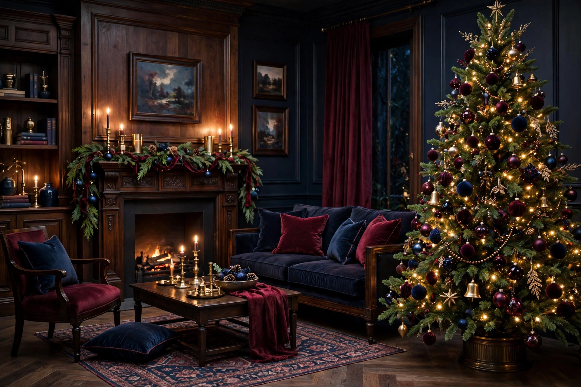
Some Christmas rooms feel cheerful but forgettable. Others feel like they have a history — like the decorations came out of a trunk opened every December for thirty years. Modern Heritage Christmas decor aims for that second feeling, with a twist: the shapes and rituals are classic, but the palette is deeper and the styling cleaner than the traditional red-and-green look. Instead of bright scarlet and kelly green, this style leans on burgundy and midnight blue, warmed with brass, cream and dark wood.
The result reads as elegant rather than busy, cozy rather than dark, timeless rather than trendy. It suits homes with traditional bones, but works in modern spaces too — the clean lines keep it from feeling like a period reenactment. If you love jewel tones, this is their more restrained, heirloom-minded cousin. Below: what defines the look, how to balance two deep colors, and room-by-room ideas to adapt to what you already own.
What “Modern Heritage” Actually Means
Heritage, in decorating terms, means leaning on forms that have been part of Christmas for generations: a full green tree, tapered candles, velvet ribbons, wreaths on doors, garlands on mantels, and ornaments in classic shapes — balls, bells, stars and finials. Nothing about the silhouettes is new, and that is the point. The comfort of this style comes from recognition.
The “modern” part shows up in two places. The first is the palette. Burgundy — a deep, wine-toned red — replaces bright cherry red, and midnight blue steps in where you might expect forest green or black. Both feel storied, like book cloth, old tartan and winter evenings, and together they give the scheme a moodier, more grown-up register. The second is editing: fewer, better-chosen pieces with breathing room between them, repeating a tight set of colors and materials so the eye reads the room as one composed picture.
If you are browsing living room ideas for a scheme that will still look right in ten years, this is a strong candidate: deep enough to feel current now, classic enough not to date quickly.
Building the Palette: Balancing Burgundy and Midnight Blue
Two dark colors can either enrich each other or fight. The trick is to give one the lead and the other a supporting role, then add a consistent set of neutrals and one metallic to hold everything together.
Pick a Lead Color
In most rooms, burgundy works best as the lead because it is warm and naturally reads “Christmas.” Use it for the largest textile moments: tree ribbon, stockings, a throw, table linens. Midnight blue becomes the depth color — ornaments, a second ribbon, napkins, a tree skirt. Roughly a 60/40 split keeps the scheme from feeling like two competing themes. In a blue room — navy walls, blue-grey sofas — flip the ratio and let midnight blue lead instead.
Add the Peacemakers
Cream, warm white and natural linen stop burgundy and midnight blue from merging into one dark blur. Use them generously: a cream tree skirt, ivory candles, linen napkins, a pale throw. Dark wood — walnut, mahogany tones, stained oak — bridges the two colors and adds the heritage weight. Finally, brass is the metallic of this palette: its warmth flatters burgundy and lifts midnight blue, and aged or brushed finishes suit the mood better than shiny gold. Repeat it in small doses: candlesticks, frames, bells.
🛒 Shop This Look:
Where the Green Goes
Greenery is still essential — the third “color” of the scheme and its freshest element. Deep green foliage sits comfortably between burgundy and midnight blue and keeps both from feeling flat. Real or faux, choose a rich, slightly blue-green tone rather than bright lime, and repeat it in every room so the palette feels continuous.
The Tree: Deep Color on a Classic Shape
Start with a full, traditional green tree — this palette looks best against dense foliage rather than a heavily flocked white tree, which pushes the mood icy instead of warm. Warm white lights soften burgundy and make midnight blue glow rather than disappear.
Build the color in layers. Work burgundy in first through ribbon — wide velvet or satin, looped and tucked rather than wrapped in tight spirals — then add midnight blue ornaments in the gaps, where the tree needs depth. Mix finishes within each color: matte, glossy and glittered versions of the same hue create dimension without adding new colors. Brass and warm gold ornaments are the highlight layer; scatter them evenly so the tree sparkles from every angle.
For the topper, a classic star or finial in aged brass suits the style. Finish with a cream or dark-plaid tree skirt. For a step-by-step order, the ribbon, lights and layering sequence in these Christmas tree decorating ideas translates directly to this palette.
The Mantel: Symmetry and Candlelight
Heritage styling loves symmetry, and the mantel is where to use it. Anchor the center with a mirror, artwork or a wreath in a brass or dark wood frame, then build outward in matching pairs: candlesticks, small potted greenery, stacks of books with burgundy or blue bindings.
Drape a full garland along the shelf, letting the ends fall a little at each side, and weave in burgundy ribbon and a handful of midnight blue ornaments nestled into the greenery. Stockings in burgundy velvet, cream cable knit or a muted plaid keep the look collected rather than matched; if the stockings are patterned, keep everything else on the mantel solid.
Candlelight is non-negotiable here. Brass candlesticks with ivory tapers at two or three heights give the mantel its glow. Where open flames are impractical — near greenery, or in homes with small children or pets — warm-toned flameless tapers in the same holders work fine; the silhouette matters more than the flame.
The Dining Table: The Palette’s Showcase
If any surface deserves the full treatment, it is the holiday table — both colors flatter food, candlelight and glassware. Start with a cream or natural linen cloth (white can read too stark against them), or bare dark wood with a burgundy runner.
Build a low centerpiece so guests can see each other: greenery running the table’s length, brass candlesticks at intervals, ornaments or pomegranates tucked in for color. Layer cream plates over brass or dark chargers, then choose your split: burgundy napkins with midnight blue as the smaller echo — a ribbon around each napkin, blue glassware — or the reverse.
One discipline keeps the table elegant: limit it to the palette, skipping novelty pieces and clashing glitter. For a richer, more saturated table, the layering principles in these jewel tone Christmas decor ideas pair naturally with this scheme — the two styles share a love of depth, just at different volumes.
🛒 Shop This Look:
Entryway and Bedroom: Carrying the Theme Through
Entryway
The entry sets expectations, so echo the main room in miniature. A wreath in deep greenery with a burgundy velvet bow and brass bells states the palette immediately. Inside, a garland along a stair railing or console, a bowl of midnight blue and brass ornaments, and a plaid throw repeat the theme without much effort.
Bedroom
Bedrooms need a lighter hand. Change one layer, not the whole room: a burgundy or deep plaid throw across the foot of the bed, cream shams with a burgundy or midnight blue lumbar cushion, and a small nightstand arrangement — a candle in brass, greenery in a dark glass vase, a tiny bowl of ornaments. A tabletop tree or a wreath over the headboard is plenty.
Materials That Sell the Look
Modern Heritage is as much about texture as color:
- Velvet — ribbon, stockings, pillow covers, bows. Velvet absorbs light, which is what deep colors need to look rich instead of flat.
- Brass — candlesticks, bells, frames, trays. Aged and brushed finishes over polished ones.
- Dark wood — furniture, frames, chargers, nutcrackers. It grounds the palette and supplies the “heritage” note.
- Plaid, used sparingly — a throw, one ribbon, a tree skirt. A classic tartan in burgundy, navy and green ties the palette together, but head-to-toe plaid tips the room into lodge territory. One or two appearances per room is the discipline.
- Wool and cable knit — throws and stockings add the stored-in-a-trunk warmth that keeps deep colors cozy.
- Glass — mercury glass, smoky glass and cut crystal catch candlelight and stop the scheme feeling matte and heavy.
Keeping It From Going Too Dark or Heavy
The honest risk of this palette is a room that feels like a library at midnight. A few habits prevent that. First, protect your light colors: cream textiles, ivory candles and pale ceramics should make up roughly a third of what the eye sees. Second, use light deliberately — tree lights, candles at multiple heights, lamps rather than overhead lights — so the deep colors glow instead of swallowing light.
Third, leave gaps. Heritage rooms of the past were full; the modern version edits. If every surface holds something, remove one item per surface and notice how the remaining pieces look more valuable. Fourth, check the room in daylight: if the daytime view is flat, the fix is usually more cream and more glass, not more color. Finally, keep greenery fresh-looking and plentiful — it stops the two dark colors reading as upholstery swatches.
FAQ
Can I do Modern Heritage if my walls are light?
Yes — light walls make the palette easier, because the room’s brightness is already handled. Lean on the cream elements less and let burgundy and midnight blue carry more of the textiles and ornaments. Anchor the scheme with dark wood and brass.
What if I already own bright red and green decorations?
You do not need to start over. Burgundy sits comfortably next to classic red, so layer red ornaments deeper in the tree and put burgundy ribbon and textiles in front — the eye reads the deeper color. Swap a few high-visibility items first (tree skirt, stockings, table runner), add midnight blue as the new accent, and retire the brightest pieces gradually.
Does midnight blue work with a green tree and green garlands?
It works beautifully — blue and green are neighbors, and deep foliage green is the bridge that makes midnight blue feel at home in a Christmas scheme; the combination reads like winter woodland at dusk. Just add the cream and brass layers so the pairing does not go cold — warmth is what separates this palette from a purely wintry one.
How much plaid is too much?
A useful rule: one plaid piece per sightline — a plaid throw on the sofa or a plaid tree skirt, not both in the same view, plus small ribbon accents if you like. Because a classic tartan usually contains both burgundy and navy, one piece quietly explains the whole palette; repeating it everywhere makes it stop feeling special.
Conclusion
Modern Heritage Christmas decor is for people who love tradition but want it composed: classic shapes, an edited hand, and burgundy and midnight blue held together with cream, dark wood and brass. Give one color the lead, repeat your materials from room to room, and protect the light — in both senses — and the scheme will feel collected rather than decorated. Best of all, it is built on pieces that never go out of style, so what you gather this year can come out of the trunk for many Decembers to come.
🛒 Shop This Look:




1 thought on “Modern Heritage Christmas Decor: Burgundy, Midnight Blue and Timeless Polish”
Comments are closed.