
As an Amazon Associate, I earn from qualifying purchases. This means I may earn a commission if you purchase through links on this page — at no extra cost to you.
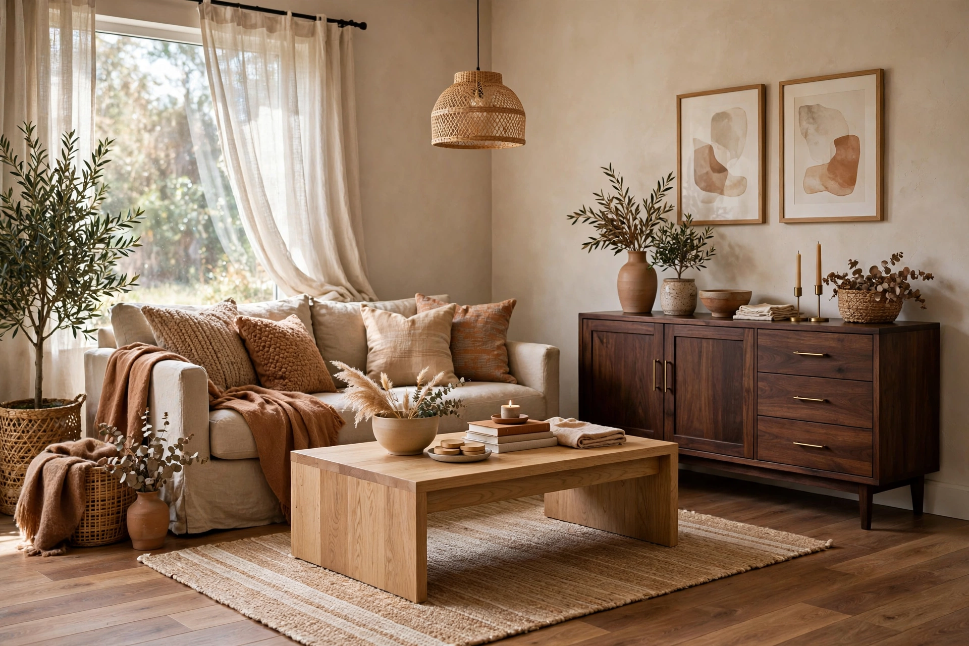
Yes, you can absolutely mix wood tones — designers do it constantly. The rule is to repeat each tone at least twice, keep undertones consistent (all warm or all cool), and let one tone dominate while others accent. Matching all your wood is what actually looks dated.
The 3 Rules of Mixing Woods
Rule 1: Repeat Each Tone Twice
A single walnut piece among oak looks like a mistake. Walnut appearing in the coffee table and a picture frame looks intentional. Every wood tone needs a partner.
Rule 2: Match Undertones, Not Colors
Woods have warm (red/orange/yellow) or cool (gray/ash) undertones. Warm oak + warm walnut = harmonious. Warm cherry + cool gray-wash oak = clash. Check undertones in natural daylight.
Rule 3: One Dominant, Rest Accent
Let 60–70% of the wood be one tone (usually the floor or largest piece), with 1–2 accent tones in smaller doses. Equal amounts of three woods looks busy.
6 Wood Combinations That Work
- White oak + walnut: the designer favorite. Light + dark contrast, both warm.
- Oak + black-stained wood: black acts as a neutral anchor.
- Walnut + maple: rich + light, both warm undertones.
- Reclaimed wood + new oak: texture contrast unifies different tones.
- Cherry + mahogany: tonal warm woods for traditional rooms.
- Light oak + rattan/cane: natural materials that share warm undertones.
The Bridge Trick
If two woods feel disconnected, add a “bridge” piece containing both tones — a rug with both colors, art with wood frame mixing, or a textile that picks up both. The eye reads the bridge as permission for the combination.
Frequently Asked Questions
Do floors have to match furniture wood?
No — contrast is better. Furniture in the exact same tone as the floor looks flat. Go lighter or darker than the floor for definition.
How many wood tones is too many?
Three is the practical max for most rooms. Two is the sweet spot. Four+ needs a very skilled hand.
🛒 Shop This Look:
Undertones Matter More Than Wood Species
The number one reason mixed woods look wrong isn’t that the species clash — it’s that the undertones fight. Every wood finish leans warm (red, orange, yellow) or cool (gray, blue, ashy). A warm cherry floor and a cool gray-washed oak table will look off together even though both are “medium brown.” Two completely different species with the same warm undertone will look harmonious.
To check undertones, look at the wood in natural daylight next to a sheet of white paper. The paper gives your eye a neutral reference, and the wood’s lean becomes obvious. Warm woods glow slightly golden or reddish; cool woods look flat, gray, or silvery. Aim to keep all your woods within the same temperature family, and mixing becomes dramatically easier.
This is also why wood changes over time can surprise people. Cherry darkens and reddens with sun exposure; pine yellows; some stained woods fade. If you’re mixing, favor woods that age gracefully in the same direction, or choose pieces where the current tone is what matters most to you.
The 60-30-10 Formula for Mixed Woods
Borrowed from color theory, this ratio keeps mixed woods looking deliberate:
- 60% dominant wood: Usually your flooring or largest furniture piece. This sets the room’s wood “base note.” Everything else relates back to it.
- 30% secondary wood: A contrasting tone — your dining table, media console, or shelving. This should be noticeably different from the dominant wood, not almost-the-same.
- 10% accent wood: Small doses — picture frames, a side table, lamp bases, cutting boards on display. This is where you can go boldest.
The key insight: “noticeably different” beats “close but not matching.” Two woods that are almost the same tone but not quite look like a mistake — your eye reads them as a failed match. Two woods that are clearly different read as a choice. If your floor is medium oak, don’t add a slightly-darker oak table; add a dark walnut one or a pale ash one.
Pairings That Almost Always Work
Some combinations are forgiving enough for beginners:
- Dark walnut + light oak: The classic high-contrast pairing. Works in modern, traditional, and Scandinavian rooms alike. The contrast is strong enough to always read as intentional.
- Warm medium woods + black-stained accents: Black reads as a neutral, not a wood tone, so it pairs with any undertone. Black frames, legs, or shelving ground a room full of warm wood.
- Reclaimed or weathered wood + one clean modern wood: The texture contrast does the work. A rough reclaimed coffee table next to smooth walnut shelving looks collected rather than mismatched.
- Same species, different stains: Oak flooring with a darker-stained oak table is safer than mixing species, because the grain pattern ties them together even when the color differs.
- Wood + painted furniture: A painted dresser (white, navy, sage) between wood pieces acts as a visual palate cleanser. The paint breaks up the wood so tones don’t have to match at all.
Combinations That Need Extra Care
- Red-toned woods (cherry, mahogany) with orange-toned woods (pine, some oaks): Both warm, but the red-orange clash can look muddy. If you must, separate them physically — cherry bookcase on one wall, pine bench across the room, not side by side.
- Gray-washed wood with warm honey wood: The cool-warm divide is stark. A rug or upholstered piece between them helps bridge the gap.
- More than three distinct wood tones: Two to three wood tones is the sweet spot. Four or more starts to look busy unless the room is large and the tones are carefully graduated from light to dark.
- Trying to match existing wood exactly: Matching new flooring to old trim usually fails visibly. When in doubt, go deliberately contrasting instead of approximately matching.
How to Test a Mix Before Committing
Wood looks different in the store than in your living room, so test before you buy when you can. Bring home a sample — a drawer front, a flooring plank, a swatch of the stain — and look at it next to your existing wood at different times of day. Morning light is cool and honest; evening lamplight is warm and forgiving. If the pairing looks good in morning light, it’ll look good always.
Photograph the combination with your phone, then look at the photo. Cameras flatten undertones in a way that reveals clashes your eye adapts to in person. If the photo looks harmonious, you’re safe.
🛒 Shop This Look:
For furniture you can’t sample, use the undertone rule: identify whether your existing wood is warm or cool, then filter your shopping to the same family. Most product listings describe finishes with words like “honey,” “golden,” “espresso,” “weathered gray,” or “natural” — those adjectives are undertone clues.
Bringing It Together Room by Room
In practice, apply the formula to the pieces you already own. Start with the floor as your 60%. Look at your largest furniture piece — sofa-adjacent tables, media console, bookshelf — and decide whether it works as the 30% contrast or needs to shift. Small items (frames, trays, plant stands) become the 10% accent layer you can adjust cheaply.
If your room currently has four or five competing tones, don’t replace everything. Pick the two tones you like most, then neutralize the rest: paint a piece, drape a throw over it, or move it to another room. Subtraction is faster and cheaper than addition.
Finally, remember that upholstery and rugs are peacemakers. A rug that picks up both your light oak and dark walnut ties them together. Textiles with mixed warm tones do the same work. When woods won’t quite cooperate, a textile bridge usually solves it.
Common Mistakes
- The “almost match”: Near-matches look accidental. Commit to contrast.
- Ignoring the floor: Flooring is your dominant 60%. Always coordinate with the floor first — it’s the biggest wood surface in the room.
- Forgetting small wood items: Frames, baskets, cutting boards, and plant stands add up. If your “accent wood” appears in twelve tiny objects scattered everywhere, it stops being an accent and becomes noise. Corral small wood items into one or two zones.
- Mixing undertones across connected rooms without a bridge: It’s fine for the living room to be warm and the hallway cool, but the transition needs a buffer — a rug, a painted door, or a neutral wall color — so the shift doesn’t jar.
Frequently Asked Questions
Can you mix wood furniture with wood floors?
Absolutely — in fact, matching them exactly usually looks worse. Aim for clear contrast: if your floors are medium oak, choose furniture that’s distinctly darker (walnut) or lighter (ash, maple). The contrast makes both look better.
How many wood tones are too many?
For most living rooms, three is the practical limit: a dominant, a secondary, and an accent. Larger, open-plan spaces can handle four if the tones graduate smoothly from light to dark. If the room starts to feel busy, the answer is almost always “remove a tone,” not “add another.”
Do wood tones need to match between connected rooms?
They don’t need to match, but they should relate. Keep undertones consistent (all warm or all cool) across connected spaces, and repeat at least one wood tone in each room so the palette feels continuous as you move through the house.
What if my rental has wood tones I hate?
You can’t change the floors, so treat them as the dominant 60% and build around them. Large rugs cover a lot of flooring sins. Choose furniture in contrasting tones that you love, and the rental floor becomes a neutral backdrop rather than the star.
🛒 Shop This Look:



