
As an Amazon Associate, I earn from qualifying purchases. This means I may earn a commission if you purchase through links on this page — at no extra cost to you.
A gallery wall is a curated arrangement of multiple framed pieces — art, photos, prints, or objects — hung together as a single composition. The best gallery walls follow a clear layout logic (grid, salon, or linear), maintain consistent spacing of 2–3 inches between frames, and use a unifying element like matching frames or a cohesive color palette to feel intentional rather than cluttered.
Gallery walls work in virtually any room, but small spaces benefit most. A well-planned gallery wall turns an empty wall into a focal point without consuming floor space — making it ideal for apartments, narrow hallways, and compact living rooms where every square foot matters.
This guide covers gallery wall layouts for every room size, frame selection, spacing formulas, step-by-step hanging methods, and solutions for common problems like cluttered arrangements and falling frames.
Gallery Wall Layouts: 5 Proven Formulas
1. The Grid
The most structured layout. Frames of identical size hung in perfect rows and columns with equal spacing. Best for: modern and minimalist interiors, home offices, hallways.
How to execute: Choose frames all the same size (16×20 inches works well). Space them exactly 2 inches apart both horizontally and vertically. Use a level for every frame — imperfections are obvious in grids. Start from the center and work outward.
Small space tip: A 2×3 grid of 11×14 frames spans roughly 36×48 inches — substantial enough for a living room wall but compact enough for an apartment.
2. Salon Style
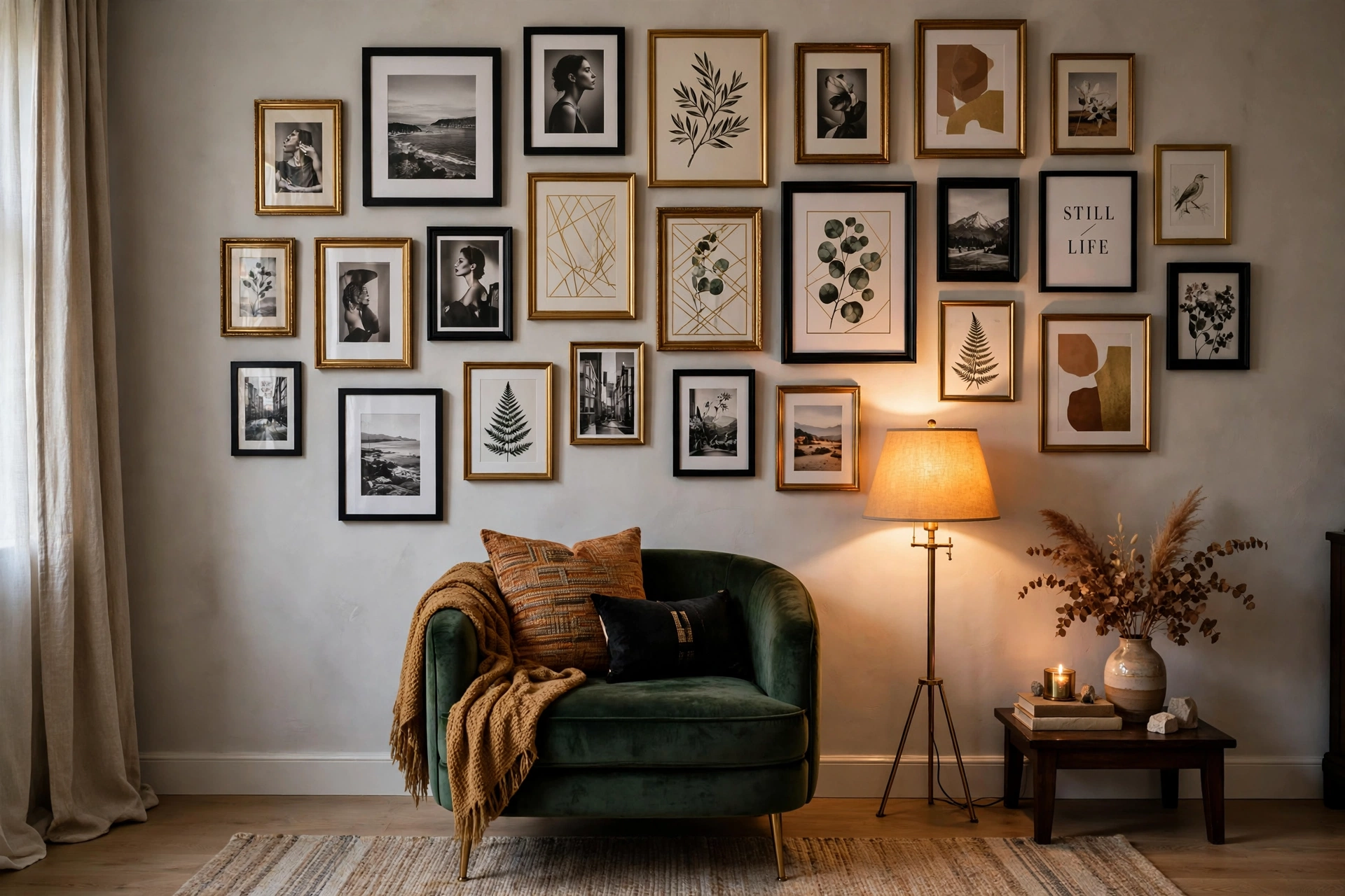
The classic eclectic arrangement. Mixed frame sizes and styles hung closely together, filling the wall organically. Best for: living rooms, stairwells, bedrooms with personality.
How to execute: Start with your largest piece slightly off-center. Build outward, filling gaps with progressively smaller frames. Maintain 2–3 inch spacing throughout. Step back frequently — salon walls are sculpted, not measured.
Small space tip: Salon style can overwhelm tiny walls. Limit the arrangement to 60–70% of the wall width and keep a clear border of empty wall around the grouping.
3. The Linear Row
Frames hung in a single horizontal (or vertical) line. Clean, simple, and ideal for narrow spaces. Best for: hallways, above sofas, above consoles, stairwells.
How to execute: Use identical frame sizes for the cleanest look. Center the row at 57 inches. For hallways, space frames to span 60–75% of the wall length.
Small space tip: A horizontal row above a sofa draws the eye sideways, making narrow rooms feel wider. This is the highest-impact layout for small living rooms.
🛒 Shop This Look:
4. The Ledge
Frames leaned on a picture ledge shelf rather than hung. The most renter-friendly and flexible option. Best for: renters, indecisive decorators, children’s rooms.
How to execute: Install one or two ledge shelves. Lean frames of varying sizes, overlapping slightly. Layer smaller frames in front of larger ones for depth. Rearrange anytime without new holes.
Small space tip: Ledges add display space without permanent commitment. A 48-inch ledge above a desk or dresser holds 5–7 frames.
5. Asymmetrical Cluster
A tight grouping with intentional imbalance — larger pieces anchor one side, smaller pieces trail off. Dynamic and modern. Best for: entryways, dining rooms, above fireplaces.
How to execute: Anchor with one large piece (24×36 or bigger). Arrange 4–6 smaller pieces around it, heavier on one side. Keep the overall shape roughly rectangular or oval — avoid stragglers.
Gallery Walls for Small Spaces
Small rooms need gallery walls more than large ones — bare walls in compact spaces feel especially empty. But the approach differs.
Rules for Small-Space Gallery Walls
- Go up, not out: Vertical arrangements draw the eye upward, making ceilings feel higher. A column of 3–4 frames works in narrow wall sections.
- Limit the palette: In small rooms, too many colors in art creates visual chaos. Stick to 2–3 dominant colors across all pieces.
- Use consistent framing: Matching frames (all black, all white, or all natural wood) unify diverse art and prevent the wall from feeling cluttered.
- Leave breathing room: Don’t fill the entire wall. A gallery occupying 50–60% of wall space feels curated; 90%+ feels crowded.
- Consider scale carefully: In a 10×12 bedroom, a gallery spanning 4 feet is proportional. The same gallery in a 20-foot living room wall would look lost.
Small Apartment Gallery Wall Ideas
Above the couch: A horizontal arrangement spanning two-thirds the sofa width. In a studio, this single wall often defines the living area.
Hallway gallery: Narrow hallways are perfect for a linear series. Same-size frames, evenly spaced, transform a pass-through into a destination.
Bedroom nook: A small cluster above a nightstand or dresser personalizes without overwhelming. Three frames in a triangle arrangement is enough.
Kitchen wall: Small framed prints or vintage food illustrations in a tight grid add warmth to compact kitchens.
Choosing Frames
Matching vs. Mixed Frames
Matching frames (all same color and style) create cohesion from diverse art. This is the safer choice and works in almost any interior. Black frames are the most versatile — they recede visually and suit any art style.
Mixed frames add eclectic character but require more skill. If mixing, limit to 2–3 frame styles and repeat each at least twice. A wall with ten different frames looks accidental; a wall with three frame styles, each used multiple times, looks curated.
Frame Sizes That Work Together
Standard sizes that combine well: 8×10, 11×14, 16×20, 18×24, 24×36. These share proportional ratios, so they look harmonious together. Avoid odd sizes that don’t relate proportionally.
🛒 Shop This Look:
Budget tip: IKEA Ribba frames offer the best value for gallery walls. Buy in bulk for matching sets. For a more elevated look, use wider mats inside standard frames — a $15 frame with a $10 mat looks like a $60 frame.
What About Canvas vs. Framed Prints?
Mixing canvas and framed prints in one gallery wall rarely works — the different depths and edge treatments clash. Stick to one format per wall. If you love canvas, do an all-canvas gallery. If you prefer framed, frame everything.
How to Plan Your Layout
The Floor Method (Most Reliable)
- Measure your wall space and mark the boundaries with painter’s tape on the floor.
- Arrange frames within the taped area. Start with the largest piece.
- Maintain 2–3 inch gaps. Use a ruler if eyeballing feels uncertain.
- Photograph the arrangement from directly above.
- Cut paper templates for each frame. Tape them to the wall in the same arrangement.
- Live with the paper templates for 24 hours. Adjust as needed.
- Hang frames, removing paper templates one at a time.
The Paper Template Shortcut
Skip the floor step: trace each frame on kraft paper, cut out, and tape directly to the wall. Mark nail positions on the paper. Hammer through the paper, then tear it away. This method is faster and works well for simpler arrangements.
Spacing Guide
Consistent spacing is what separates professional-looking gallery walls from amateur ones.
- 2 inches: Tight, modern, cohesive. Best for grids and small spaces.
- 3 inches: The standard. Works for most salon-style arrangements.
- 4+ inches: Airy but risks looking disconnected. Only use with large frames.
Pick one spacing and maintain it throughout. Mixed spacing (2 inches here, 5 inches there) is the fastest way to make a gallery wall look accidental.
Common Gallery Wall Mistakes
- Inconsistent spacing. See above — pick a number and commit.
- Too many small pieces, no anchor. Every gallery needs at least one piece that’s noticeably larger than the rest. Without an anchor, the eye doesn’t know where to land.
- Hanging too high. The center of the arrangement should be at 57 inches, not higher. Gallery walls that float near the ceiling feel disconnected from the room.
- Ignoring the furniture below. A gallery above a sofa should relate to the sofa’s width (two-thirds rule). A gallery floating on a vast empty wall with no furniture anchor can work, but it needs to be large enough to hold the wall on its own.
- Too much variety. Ten different art styles, eight frame colors, and no unifying thread equals visual noise. Constrain at least one variable: same frames, same color palette, or same subject matter.
- Using only personal photos. All-photo galleries can feel like a hallway in a dentist’s office. Mix in art prints, typographic pieces, or objects for visual interest.
Hanging Hardware Guide
- Light frames (under 3 lbs): Adhesive strips work on smooth walls. No holes.
- Medium frames (3–10 lbs): Monkey hooks or Hercules hooks. Single pinhole, strong hold.
- Heavy frames (10–25 lbs): Traditional picture hooks with nails, or French cleats for very heavy pieces.
- Plaster or brick walls: Masonry screws or specialized plaster hooks. Adhesive strips often fail on textured surfaces.
Gallery Walls Around TVs
The TV is the elephant in the living room. A gallery wall around it integrates the black rectangle into your decor instead of letting it dominate.
Approach: Treat the TV as the largest “frame” in your arrangement. Build the gallery around it symmetrically — matching pieces on left and right, smaller pieces above and below. Keep 3–4 inches between the TV edge and the nearest frame.
What works: Black frames echo the TV bezel. Keep art simple — the TV is already a visual focal point when on. Avoid pieces that compete for attention.
Frequently Asked Questions
How many pictures should be in a gallery wall?
There’s no magic number, but most successful gallery walls have 5–12 pieces. Fewer than 5 can look sparse (unless frames are large). More than 15 risks clutter unless the wall is very large. Start with 6–8 and add over time.
Can I do a gallery wall in a rental?
Absolutely. Use adhesive strips for light frames, picture ledges for flexibility, or washi tape grids for a temporary graphic look. Many renters do full gallery walls with Command strips and remove them cleanly at move-out.
Should all frames match?
Not necessarily, but matching frames are the easiest path to a cohesive look. If you mix, limit frame styles to 2–3 and repeat each multiple times.
How do I mix photos and art?
Convert photos to black and white for instant cohesion with art prints. Or choose art that picks up colors from your photos. The key is a visual thread — color, tone, or framing — that ties everything together.
By Ella Knight
🛒 Shop This Look:



