
As an Amazon Associate, I earn from qualifying purchases. This means I may earn a commission if you purchase through links on this page — at no extra cost to you.
Choosing wall art for your home comes down to three decisions: size, style, and placement. The right piece should span roughly two-thirds the width of the furniture below it, complement (not match) your room’s color palette, and hang with its center at 57 inches from the floor. Get these three right and almost any art looks intentional.
But “almost any art” hides a lot of nuance. A 24-inch print that looks perfect above a nightstand will disappear above a sofa. A bold abstract that energizes a living room can overwhelm a bedroom. And the difference between a $30 poster that looks cheap and one that looks curated often comes down to framing and placement, not the art itself.
This guide covers everything: how to choose art for each room, exact sizing formulas, style coordination, hanging techniques, and budget strategies. By the end, you’ll be able to walk into any room and know exactly what belongs on its walls.
How to Choose the Right Size Wall Art
Size is where most people go wrong. Art that’s too small is the single most common mistake — it makes walls feel empty and furniture look oversized. When in doubt, go bigger than you think.
The Two-Thirds Rule
Art hung above furniture should span approximately two-thirds to three-quarters the width of the piece below it. This creates visual balance — the art and furniture read as a single composed unit rather than disconnected elements.
- Above a 72-inch sofa: Look for art (or a grouping) spanning 48–54 inches wide
- Above a 60-inch console: Target 40–45 inches wide
- Above a 30-inch nightstand: 20–22 inches works well
- Above a 48-inch dresser: Aim for 32–36 inches
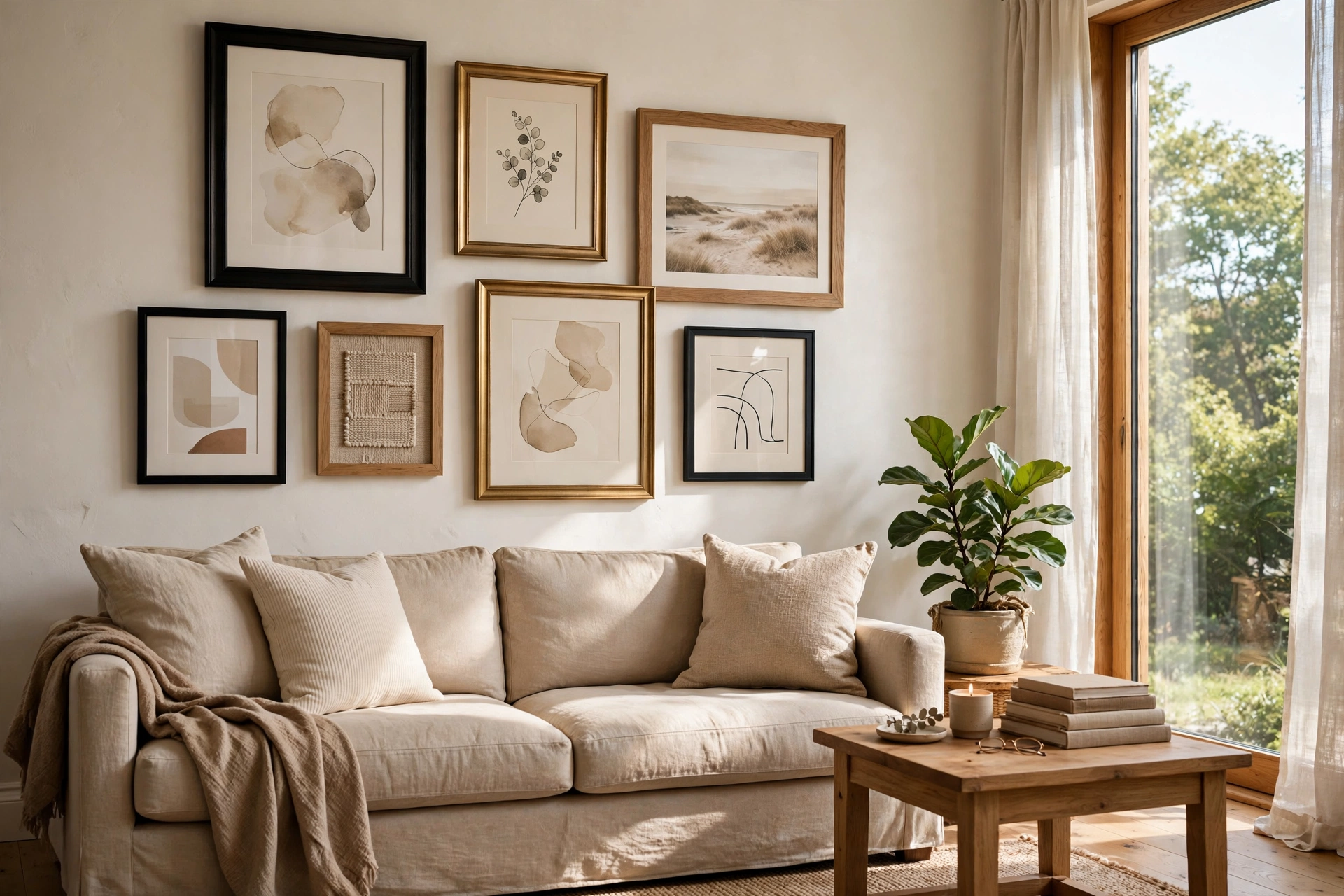
For a grouping or gallery wall, measure the total width of the arrangement, not individual pieces. A cluster of small frames spanning 48 inches above a sofa follows the same rule as a single 48-inch canvas.
The 57-Inch Rule
Museums hang art with the center at 57 inches from the floor — average human eye level. This applies to single pieces and to the visual center of groupings. Measure 57 inches up, mark it lightly, and center your art on that point.
Exceptions: above furniture, hang art 6–10 inches above the piece (not at 57 inches if that creates a gap). In dining rooms where people sit, drop to 54 inches. In hallways or stairwells, follow the sightline as it rises.
What Size Art for a Large Blank Wall?
For walls without furniture, art should fill roughly 60–75% of the available wall space. A 10-foot wall needs art spanning 6–7.5 feet — either one oversized piece or a generous grouping. A single small frame on a large wall looks like an afterthought.
If your budget doesn’t stretch to oversized art, a gallery wall is the answer. Multiple smaller pieces grouped tightly read as one large installation and cost far less than a single big canvas.
Wall Art for Every Room
Living Room
The living room is your most visible space — it’s where art makes the biggest impact. This is the room to invest in your largest, most confident piece.
Above the sofa: This is the primary art location. Use the two-thirds rule. A single oversized abstract, a diptych (two-panel piece), or a curated gallery wall all work. Avoid small lone frames — they get visually swallowed.
Style direction: Living rooms handle bold art well. Large-scale abstracts, black-and-white photography, or colorful contemporary pieces energize the space. If your furniture is neutral, art is where you inject personality and color.
What to avoid: Tiny frames scattered without a plan. One confident piece beats five timid ones.
🛒 Shop This Look:
Bedroom
Bedroom art should calm, not stimulate. You’re choosing pieces you’ll see first thing in the morning and last thing at night.
Above the bed: Follow the two-thirds rule relative to headboard width. A horizontal piece mirrors the bed’s shape and feels restful. Avoid anything heavy-looking or visually chaotic directly above where you sleep.
Style direction: Soft abstracts, serene landscapes, muted botanical prints, or black-and-white photography. Cool tones (blues, greens, soft grays) promote rest. Save the high-energy reds and oranges for other rooms.
What to avoid: Cluttered gallery walls (too stimulating), mirrors directly facing the bed (disruptive for light sleepers), and anything with jarring or aggressive imagery.
Kitchen
Kitchens are workspaces — art here should be simple, wipeable, and hung away from cooking splatter zones.
Best placements: Above open shelving, on the wall facing the main work area, or in a breakfast nook. Avoid directly above the stove or sink.
Style direction: Food-themed prints, vintage advertisements, botanical illustrations, or simple typographic art. Framed pieces behind glass are practical — they wipe clean.
What to avoid: Unframed canvas near cooking areas (absorbs grease), anything too precious for a high-traffic zone.
Bathroom
Yes, you can hang art in bathrooms. Humidity is the concern, not water directly.
Best approach: Use framed prints behind glass or acrylic. Powder rooms (no shower) can handle almost anything. Full bathrooms need sealed frames — avoid raw canvas or unprotected paper.
Style direction: Keep it light and simple. Small botanical prints, abstract watercolors, or humorous typographic pieces suit the space. This is not the room for your most expensive art.
Home Office
Office art affects your work mindset. Choose pieces that inspire focus without distracting.
Behind the desk (visible on video calls): This wall is your professional backdrop. A single sophisticated piece — abstract, architectural photography, or minimal landscape — reads well on camera. Avoid cluttered or overly personal displays here.
Style direction: Motivating but not chaotic. Think structured abstracts, black-and-white cityscapes, or nature scenes. Avoid anything you’d be embarrassed to explain on a client call.
Hallway and Entryway
Hallways are galleries by nature — long walls beg for a series. Entryways set the tone for your entire home.
🛒 Shop This Look:
Hallway: Hang a series of same-size frames in a straight line at 57 inches. Consistent framing unifies different images. Space them 2–3 inches apart.
Entryway: One welcoming piece — a landscape, abstract, or mirror-art combination. This is the first thing guests see; make it intentional.
Matching Art to Your Decor Style
You don’t need to match art to furniture — you need it to relate. Here’s how different styles pair:
- Modern/minimalist rooms: Large-scale abstracts, black-and-white photography, or single bold color fields. Less is more — one strong piece.
- Traditional rooms: Landscapes, oil-painting reproductions, botanical illustrations, or framed vintage maps. Ornate or wood frames complement classic furniture.
- Scandinavian rooms: Muted abstracts, line drawings, soft nature photography. Thin black, white, or natural wood frames.
- Bohemian rooms: Textile wall hangings, colorful global-inspired prints, layered gallery walls. Mix frame styles freely.
- Industrial rooms: Black-and-white urban photography, metal-framed pieces, oversized typography. Raw or black frames.
- Farmhouse rooms: Vintage botanical prints, landscape photography, rustic signage. Distressed wood frames.
How to Hang Wall Art Like a Professional
Tools You Actually Need
A hammer, a level, painter’s tape, and picture-hanging hooks rated for your frame’s weight. That’s it for most jobs. A laser level is nice but not essential.
The Painter’s Tape Method
Before putting holes in the wall: cut painter’s tape to the size of your frame, stick it on the wall, and live with it for a day. This prevents 90% of placement regrets. Move the tape around until the position feels right, then hang.
Hanging Without Nails
Adhesive strips (like 3M Command) work well for frames under 5 pounds on smooth walls. For heavier pieces or textured walls, use monkey hooks or Hercules hooks — they leave only a pinhole but hold up to 50 pounds. Always check weight ratings and follow the product instructions.
Gallery Wall Spacing
Keep 2–3 inches between frames for a cohesive look. Wider gaps (4+ inches) make groupings feel disconnected. Lay the arrangement on the floor first, photograph it, then transfer to the wall using paper templates.
Budget Guide: Great Wall Art at Every Price
Under $50
Printable art (Etsy downloads printed at a local shop), thrift store frames with new mats, and DIY abstract canvases. A $5 downloadable print in a $20 IKEA frame looks far more expensive than it is.
$50–$200
Society6, Juniqe, and Art.com for ready-made prints. IKEA’s larger frames with custom mats. This range gets you substantial pieces that anchor a room.
$200–$500
Limited edition prints, original small works from local artists, quality canvas prints. This is the sweet spot for living room statement pieces.
$500+
Original art from galleries or established online platforms. Buy what you love — original art holds personal value even when it doesn’t appreciate financially.
Common Wall Art Mistakes to Avoid
- Hanging art too high. The center should be at 57 inches, not near the ceiling. This is the #1 mistake.
- Choosing art that’s too small. When in doubt, size up. Small art on big walls looks lost.
- Matching instead of coordinating. Art doesn’t need to match your sofa — it needs to complement the room’s mood and palette.
- Ignoring lighting. Art in a dark hallway needs different treatment than art in a sunlit living room. Consider picture lights for important pieces.
- Cluttered gallery walls. Every piece should earn its place. Edit ruthlessly.
- Forgetting about frames. The frame is part of the art. A cheap frame can drag down good art; a good frame elevates affordable prints.
Frequently Asked Questions
How do I choose art if I have no idea what my style is?
Start with what you’re drawn to, not what you think you should like. Save images that catch your eye (Pinterest, Instagram, magazines). After 20–30 saves, patterns emerge — you’ll see color preferences, subject preferences, and mood preferences. That’s your style.
Can I mix different art styles in one room?
Yes, with a unifying element. Mixed styles work when frames match, color palettes overlap, or subjects relate. A black-and-white photo, a line drawing, and an abstract in identical black frames read as intentional. The same three pieces in mismatched frames look chaotic.
How much should I spend on wall art?
Spend the most where you spend the most time — living room and bedroom. A good rule: allocate 5–10% of your furniture budget to art. A $5,000 living room deserves $250–$500 in art, not a $20 poster.
Is it okay to leave some walls blank?
Absolutely. Not every wall needs art. Blank walls give the eye rest and make the art you do hang more impactful. Minimalism is a choice, not a failure to decorate.
By Ella Knight
🛒 Shop This Look:



