
As an Amazon Associate, I earn from qualifying purchases. This means I may earn a commission if you purchase through links on this page — at no extra cost to you.
Both green and blue kitchen cabinets are trending in 2026, but they create different moods. Green (especially sage and forest) feels organic, calming, and connected to nature — it’s the warmer, more versatile choice. Blue (especially navy) feels classic, sophisticated, and slightly more formal. Green is gaining faster in 2026 searches, but navy blue has longer staying power. Choose green for warmth and trendiness, blue for timelessness.
Green Cabinets: The 2026 Favorite
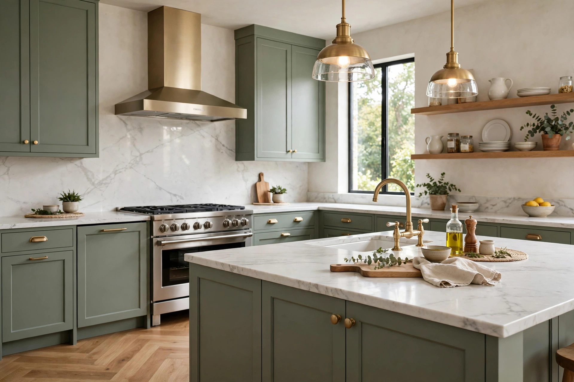
Sage green exploded in popularity and continues climbing. It pairs beautifully with brass, warm wood, and white marble. Deeper forest greens add drama while staying natural. Green feels fresh without being cold.
Best greens: Evergreen Fog (SW), Saybrook Sage (BM), French Gray (F&B)
Blue Cabinets: The Timeless Classic
Navy blue has been popular for a decade and isn’t fading. It’s the “safe bold” choice — dramatic but classic. Lighter blues (powder, slate) are emerging as softer alternatives.
Best blues: Hale Navy (BM), Naval (SW), Hague Blue (F&B)
Head-to-Head
| Factor | Green | Blue |
|---|---|---|
| Warmth | Warmer, more inviting | Cooler, more formal |
| Trend momentum | Rising fast in 2026 | Steady, established |
| Versatility | Pairs with more wood tones | Pairs with more metal finishes |
| Resale | Good, slightly trendy | Excellent, proven |
| Small kitchens | Light sage works well | Navy can overwhelm |
Design Principles: Why Color Cabinets Work at All
Before choosing between green and blue, it helps to understand why colored cabinets succeed where other bold choices fail. A kitchen’s cabinets cover more continuous surface than almost anything else in the home, so their color sets the room’s entire temperature. White cabinets are visually silent — they reflect the room back at you. Color cabinets speak, and what they say depends on where the color sits on the spectrum.
Green sits in the middle of the visible spectrum, which is why the human eye reads it as restful — it is literally the easiest color for our eyes to process. In a kitchen, that translates to a space that feels calm without feeling cold. Green also carries deep associations with nature, growth, and food itself (herbs, produce, gardens), so it feels thematically at home in the room where food is prepared. This is not mysticism; it is why green kitchens photograph well and feel welcoming in person — the color belongs to the room’s purpose.
Blue sits at the cool end of the spectrum and reads as orderly, clean, and composed. It is the color of water and sky — vast, stable, trustworthy. In a kitchen, blue conveys a kind of crisp professionalism; it is no accident that navy kitchens evoke classic European kitchen design and high-end culinary spaces. Blue recedes visually, which gives it a formal, tailored quality that green’s earthiness does not attempt.
The practical upshot: green warms a kitchen’s feeling while blue sharpens it. Neither is objectively better — they solve different design problems. A dark, north-facing kitchen benefits from green’s warmth; a kitchen that already runs warm (lots of wood, warm lighting) benefits from blue’s cooling discipline. Start from what your kitchen lacks, not from which color is trending.
🛒 Shop This Look:
Hardware, Countertop, and Backsplash Pairings
Cabinet color is only the opening move — the supporting materials decide whether the kitchen sings or clashes. Each color has natural partners.
Green cabinets love warmth. Brass and unlacquered bronze hardware are the classic pairing — the warm metal against sage or forest green is one of the most reliably beautiful combinations in kitchen design. For countertops, white marble (or marble-look quartz) with soft veining keeps the palette fresh; warm butcher block leans into the organic feeling. Backsplashes should stay quiet: handmade-look white or cream tile, soft zellige, or a simple warm white subway. Avoid cool gray tile with green cabinets — the undertones fight, and the kitchen ends up feeling muddy rather than earthy.
Blue cabinets take a wider range of metals. Polished nickel and chrome sharpen navy’s crispness; brass warms it up and is the livelier choice. For countertops, white marble is again the workhorse, but blue also pairs beautifully with light gray quartz and even dark soapstone for a moody, tonal look. Backsplash options are broader than with green: white subway, marble slab, light gray tile, even soft blue-gray glass tile for a tonal scheme. Blue’s coolness means it tolerates cool partners that would deaden green.
One pairing rule for both: the countertop should contrast with the cabinets in value (lightness/darkness) even when it harmonizes in temperature. Dark green cabinets with a dark countertop merge into one mass; dark green with a light countertop gives each surface definition. The same holds for navy. Contrast in value, harmony in temperature — that is the formula.
How Lighting Changes Green and Blue
Cabinet colors are chameleons under different light, and green and blue shift in different directions. This matters enormously because you will see your kitchen under at least three light conditions daily.
Green cabinets tend to go warmer and more yellow under warm artificial light (2700K bulbs, evening lamps) and cooler and grayer under daylight, especially north-facing daylight. A sage green that looks fresh and botanical at noon can read slightly olive or khaki at night under warm bulbs. If you love a particular green, check the sample under your actual evening lighting before committing — the nighttime version is the one you will live with most in winter.
Blue cabinets shift less dramatically but have their own quirk: navy can go nearly black in low light. A navy kitchen with poor lighting does not look blue — it looks dark, and the color you paid for disappears. Blue cabinets demand good lighting to earn their keep: under-cabinet task lighting, adequate ceiling lights, and as much natural light as the room offers. In a dark kitchen, medium blues (slate, powder, dusty blue) hold their color better than deep navy.
The testing method is the same for both: paint large sample boards, prop them against your existing cabinets or wall, and observe for 48 hours across daylight, evening lamplight, and with under-cabinet lights on and off. Colors also interact with your floor and wall colors, so test in the actual kitchen, not the paint store.
Longevity: Which Choice Ages Better?
A kitchen renovation lasts 15–20 years, so the question is not just what looks good now but what you will still like in a decade. Here the two colors have genuinely different risk profiles.
Navy blue has the longer proven record. It has been a staple of high-end kitchen design for well over a decade, cycling through periods of greater and lesser popularity without ever disappearing. That history is the best predictor available: colors with a decade-plus track record in kitchens have demonstrated they can survive trend cycles. Navy’s risk is not that it will look dated — it is that it is now common enough to feel expected rather than distinctive.
🛒 Shop This Look:
Green’s record is shorter but structurally sound. Sage and muted greens belong to the same family as the earthy neutrals that have anchored interiors for centuries — they are desaturated, nature-derived colors, and desaturated colors age far better than saturated ones. The greens at risk are the trendy extremes: neon-adjacent limes, ultra-dark near-blacks applied everywhere. A mid-tone sage or a deep forest green in a classic shaker profile has the same timeless bones as navy; it is simply earlier in its popularity cycle.
Two factors matter more than the color itself for longevity. First, saturation: muted versions of any color outlast vivid ones. Second, the cabinet style: a classic shaker or flat-panel door in green or blue will look current far longer than an ornate door style in the same color, because simple forms do not date. Choose a muted tone in a simple door style and either color is a safe decade-plus choice.
Making the Decision: A Practical Framework
If you are still torn, run through these five questions in order:
1. Which direction does your kitchen face? North-facing or dark kitchens usually benefit from green’s warmth; bright south-facing kitchens can handle blue’s coolness without feeling cold.
2. What are your fixed elements? If the floors are warm wood and staying, green harmonizes more easily. If you have cool gray tile or stainless-heavy finishes, blue integrates better. Work with what you cannot change.
3. What is the kitchen’s job? A kitchen that is the home’s social hub — open plan, island seating, gatherings — benefits from green’s welcoming warmth. A kitchen valued for crisp, clean efficiency leans blue.
4. How long will you stay? If resale within five years is likely, navy is the statistically safer choice with the longest buyer acceptance. If this is your long-term kitchen, choose the color you love looking at — you will see it every day for years.
5. Can you do both? The two-tone compromise — green or blue on the island, warm white or wood on the perimeter — captures the color’s personality at half the commitment. It is also the easiest to update later: repainting an island is a weekend project, repainting a whole kitchen is not.
There is no wrong answer between these two colors — both are established, versatile, and attractive. The wrong answer is choosing under pressure and second-guessing for years. Work the framework, test large samples in your light, and commit with confidence.
Our Take
Can’t decide? Sage green is the 2026 sweet spot — on-trend but not flashy, warm but not heavy. Navy blue is the forever choice that will never look dated. Both are excellent; it comes down to whether you want warmth (green) or formality (blue).
🛒 Shop This Look:



