
As an Amazon Associate, I earn from qualifying purchases. This means I may earn a commission if you purchase through links on this page — at no extra cost to you.
By Ella Knight
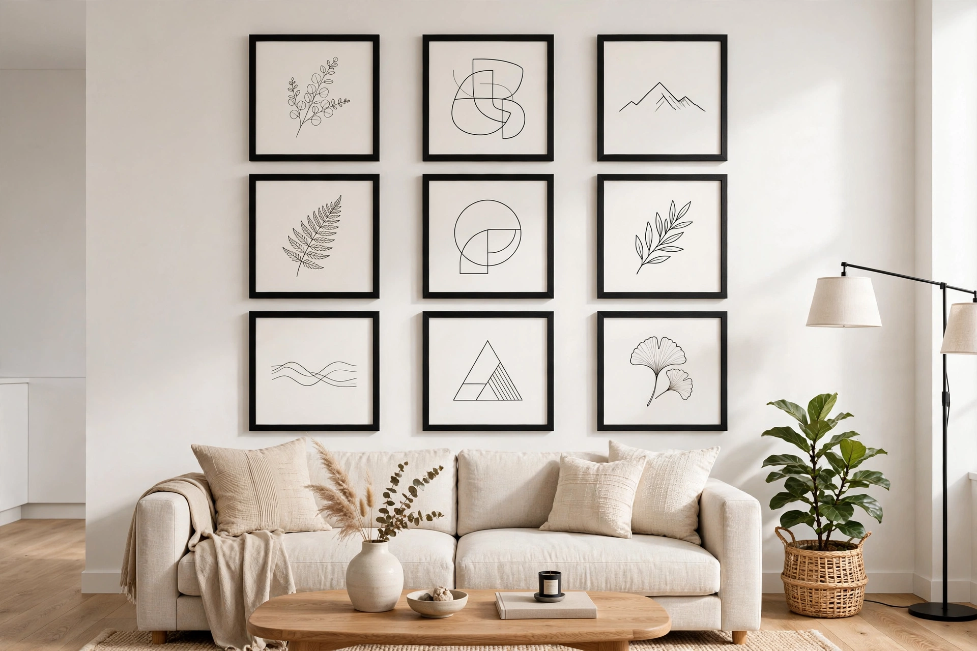
Gallery wall frames should be spaced 2 to 3 inches apart for most arrangements. Use 2-inch spacing for a tight, cohesive look in smaller spaces, and 3-inch spacing for larger walls where you want each piece to breathe. For oversized frames (16×20 inches and larger), increase spacing to 3-4 inches to maintain visual balance.
The Standard: 2-3 Inches
This range works for 90% of gallery walls. It’s close enough to read as one unified display, but far enough that individual pieces don’t feel crowded.
When to Go Tighter (1-2 Inches)
- Small walls where you want maximum impact
- Salon-style walls going floor to ceiling
- When frames are small (5×7 or 8×10)
When to Go Wider (3-5 Inches)
- Large walls with room to spare
- Oversized frames that need breathing room
- Minimalist arrangements with fewer pieces
Consistency Matters Most
Whatever spacing you choose, keep it consistent throughout the arrangement. Inconsistent gaps are the number one reason gallery walls look “off” even when the art is beautiful.
Measuring Tips
- Use painter’s tape to mark spacing before hanging
- Cut a 2-inch or 3-inch spacer from cardboard for quick reference
- Measure from frame edge to frame edge, not center to center
Spacing Rules by Frame Size
The 2-to-3-inch standard is a starting point, not a law — the right gap depends on the size of the frames you’re hanging. As a rule of thumb, spacing should be proportional to frame size: small frames want tight gaps, large frames need more air. Here’s how it breaks down in practice.
For small frames (5×7 and 8×10), keep gaps tight at 1.5 to 2 inches. Small pieces have less visual presence individually, so tighter spacing helps them read as one unified composition instead of scattered postage stamps. This is especially true in salon-style walls, where dozens of small frames packed at 1.5-inch gaps create that lush, collected density.
For medium frames (11×14 and 12×16), the classic 2 to 3 inches is the sweet spot. These are the most common gallery wall sizes, and the standard gap gives each piece enough presence without breaking the group apart. If you’re mixing medium frames with smaller ones, let the medium frames set the spacing and tuck the small ones in at the same gap for consistency.
🛒 Shop This Look:
For large frames (16×20 and up), widen to 3 to 4 inches. Big pieces carry a lot of visual weight, and crowding them makes the wall feel tense — each one needs breathing room to be appreciated. For oversized statement pieces (24×36 or larger) within a gallery, 4 to 5 inches keeps the composition from feeling cramped. The exception is a tight grid of identical large frames, where 2-inch gaps can look sharp and intentional because the uniformity does the unifying work that spacing usually does.
When mixing sizes — which most gallery walls do — pick the spacing that suits your largest frames and apply it everywhere. Consistent gaps matter more than theoretically perfect gaps, and a wall where every gap matches looks deliberate even if the number itself is a compromise.
Spacing for Different Layout Styles
Layout style changes what spacing is doing, so it changes what spacing works. In a formal grid, spacing is part of the architecture: every gap must be identical, because the eye reads the grid as a geometric pattern and any deviation jumps out. Measure carefully, use a level for every frame, and keep gaps in the 1.5-to-2.5-inch range. Tighter reads modern; slightly wider reads classic.
In a salon-style wall, spacing can be tighter and slightly more organic — 1.5 to 2.5 inches — because the density is the point. The frames should feel like they’re in conversation, nearly touching in places. What matters here is that no single gap is dramatically different from its neighbors. One 5-inch gap in a wall of 2-inch gaps looks like a mistake, not a design choice.
Linear arrangements — a single row or column — are the most spacing-sensitive of all. With only one axis of relationships, every gap is directly comparable to every other, so inconsistencies are brutally visible. Use a cardboard spacer cut to your exact gap and check every single one. Two to 3 inches is standard, with the row centered at 57 inches from the floor.
Asymmetrical or organic clusters get the most freedom: 2 to 4 inches, with the understanding that the arrangement’s balance does the heavy lifting. Here spacing can flex slightly to serve the composition — a touch wider around your anchor piece gives it prominence, a touch tighter in a cluster of smalls keeps them grouped. Just keep the variation subtle and intentional.
How to Test Spacing Before You Hang
The painter’s tape mockup is the single best way to test spacing, and it costs almost nothing. Once you’ve planned your layout on the floor, mark the outer corners of each frame’s position on the wall with small pieces of painter’s tape — or go further and tape full rectangles representing each frame. Step back to the far side of the room and look. Tape rectangles reveal spacing problems instantly: gaps that looked fine on the floor often feel too tight or too loose at wall scale.
The photograph test is the secret weapon of professional installers. Take a photo of your taped mockup and look at it on your phone. A camera flattens the scene and removes your brain’s habit of “seeing what you meant,” so imbalances and inconsistent gaps jump out in a photo when they’re invisible in person. Try it in black and white too — stripping out color lets you judge pure composition.
Live with the mockup if you can. Tape is cheap and harmless; leave your rectangles up for a day or two and glance at them in different light. Morning light, evening lamplight, and the view from the sofa all tell you different things. You’ll often find that a layout you’re unsure about at noon feels obviously right — or obviously wrong — by the next morning.
🛒 Shop This Look:
When you’re ready to commit, make a physical spacer from cardboard cut to your chosen gap width. Hold it between frames as you hang instead of measuring each time — it’s faster and guarantees consistency. And remember the golden rule of the mockup phase: moving tape is free, but patching holes costs you an afternoon. Every minute spent testing spacing now is a minute saved filling nail holes later.
Spacing Mistakes That Make Gallery Walls Look Amateur
Knowing the right spacing is only half the battle — avoiding the classic spacing errors is the other half. These are the mistakes that separate professional-looking walls from ones that feel “off” in a way guests can’t quite name.
Mistake 1: Measuring from the wrong edge. Spacing is measured from frame edge to frame edge — the visible gap between the frames themselves. A surprisingly common error is measuring from the center of one frame to the center of the next, or from the edge of the mat visible inside the frame. Both give you inconsistent visible gaps. Always measure the actual empty wall space between two frames.
Mistake 2: Letting gaps drift. You start at 2 inches, and by the fifth frame you’re at 3.5 because eyeballing drifted. This is the number one spacing killer, and it’s why the cardboard spacer trick matters: cut one spacer to your exact gap and physically hold it between frames as you hang. It takes seconds per frame and guarantees every gap matches.
Mistake 3: Spacing the wall but crowding the furniture. People obsess over gaps between frames and then hang the whole arrangement either touching the sofa back or floating a foot above it. The gap between your lowest frame and the furniture below should be 6–8 inches — close enough to feel connected, far enough to breathe. An arrangement floating 14 inches above a console looks disconnected no matter how perfect its internal spacing is.
Mistake 4: Equal gaps in an unequal arrangement. Here’s a subtle one: in an asymmetrical cluster, perfectly uniform gaps can actually look wrong if the pieces vary wildly in size. A tiny 5×7 needs a slightly tighter relationship to its neighbors to feel grouped; a big 16×20 can handle — and wants — a touch more air. The rule is consistency with judgment: keep gaps in the same family, but let them flex 0.5 inches to serve the composition.
Mistake 5: Forgetting the outer margin. Spacing isn’t just between frames — it’s also between the arrangement and everything around it: the ceiling, the adjacent wall, the door frame. Leave at least 3–4 inches of breathing room between your outermost frames and any architectural edge. A frame jammed half an inch from a door frame looks like a planning failure, even if every internal gap is perfect.
Spacing Cheat Sheet
Keep this quick reference on your phone while you hang. Small frames (5×7, 8×10): 1.5 to 2 inches. Medium frames (11×14): 2 to 3 inches. Large frames (16×20 and up): 3 to 4 inches. Formal grids: identical gaps of 1.5 to 2.5 inches, measured precisely. Gap between the lowest frame and furniture below: 6 to 8 inches. Margin between the outermost frame and any wall edge, door frame, or ceiling: at least 3 to 4 inches. When in doubt, mock it up with painter’s tape and photograph it — the camera never lies about spacing.
🛒 Shop This Look:



