
As an Amazon Associate, I earn from qualifying purchases. This means I may earn a commission if you purchase through links on this page — at no extra cost to you.
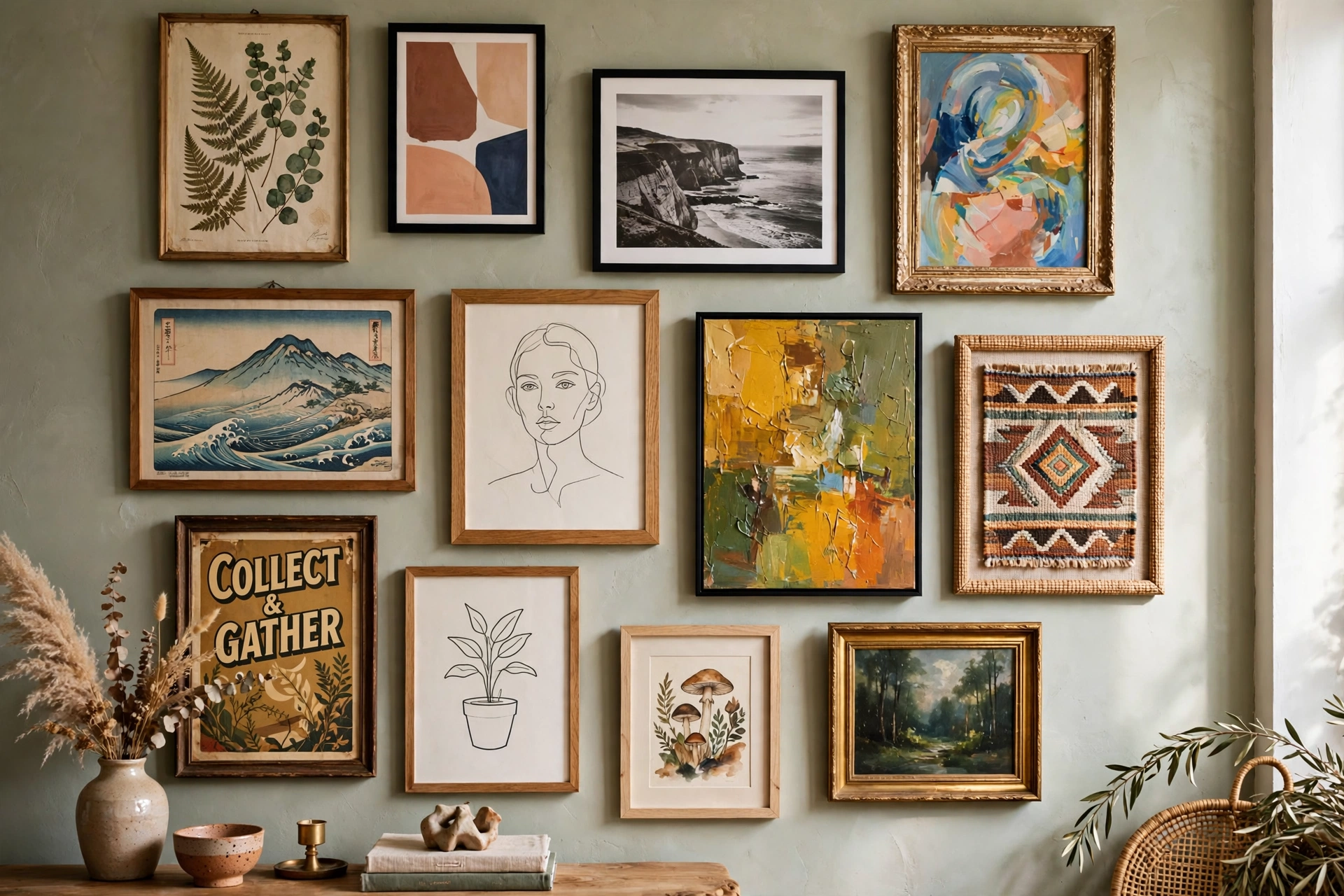
To mix wall art styles successfully, stick to a cohesive color palette across all pieces, vary the sizes and orientations for visual interest, use consistent framing (or intentionally varied frames), and limit yourself to 2-3 styles maximum. The secret is finding one unifying element — color, theme, or frame style — that ties everything together.
The Golden Rule: One Unifying Element
Every successful mixed gallery has something in common. Choose ONE:
Color: All pieces share 2-3 colors (e.g., all have black, white, and wood tones)
Theme: All botanical, all travel, all abstract
Frames: All black frames, even if art styles differ wildly
5 Formulas That Work
1. The Color Story
Pick art in completely different styles but the same color palette. A blue abstract, blue photograph, and blue typography print look intentional together.
2. The Frame Unifier
Use identical frames for wildly different art. Black gallery frames make a child’s drawing, a vintage poster, and a modern print look like a curated collection.

Gallery Perfect 9-Piece Black Gallery Wall Kit
Best for unifying wildly different art with identical black frames.
3. The Theme Cluster
Stick to one subject (botanicals, architecture, animals) but vary the artistic style — photo, illustration, abstract interpretation.
4. The Size Hierarchy
One large anchor piece + smaller supporting pieces in different styles. The large piece sets the tone.
5. The Salon Mix
Floor-to-ceiling, edge-to-edge mixing. Works best with a consistent frame color and 2-inch spacing throughout.
What to Avoid
- More than 3 distinct styles (looks chaotic, not curated)
- Clashing frame colors (pick one metal + one wood max)
- Ignoring scale (tiny pieces get lost next to oversized ones)
- No breathing room (leave at least 2″ between frames)
Planning Your Mixed Gallery: A Step-by-Step Layout Method
Successful mixed galleries are planned, not improvised — the effortless look is the most labor-intensive to achieve. Start by gathering every candidate piece and editing ruthlessly on the floor. Lay them out, then remove at least 20% — the pieces you like least, the ones that fight the palette, the duplicates. A mixed gallery with eight strong pieces beats one with twelve mediocre ones every time. This editing step is where most gallery walls are won or lost, and it costs nothing.
Next, establish your unifying element explicitly — write it down. “All pieces share black, white, and natural wood tones.” “All frames are thin black.” “Everything is botanical.” This written rule becomes your decision filter for every placement choice and every future addition. Without it, galleries drift: each new piece added on impulse dilutes the cohesion until the wall reads as random rather than curated. The rule also simplifies shopping — you will instantly know whether a candidate piece belongs.
Now build the layout on the floor. Start with the largest piece (the anchor) slightly off-center — dead-center anchors look static, while off-center placement creates dynamic balance. Arrange medium pieces around it, then fill gaps with smalls. Photograph from directly above; the photo reveals spacing inconsistencies and weight imbalances invisible at floor level. Aim for consistent 2-to-3-inch gaps — the regular spacing is the invisible grid that makes varied art read as one composition. Keep the outer boundary roughly rectangular; protruding pieces look accidental.
Transfer to the wall with paper templates. Trace each frame, cut out the shapes, tape them up, and live with the arrangement for a day before drilling. Check it from the room’s entrance, from the sofa, and in evening light — galleries are experienced from multiple viewpoints, not just straight-on. Adjust freely; moving paper is free, moving nail holes is not. When satisfied, mark nail positions through the paper, drill once, and hang. The methodical approach takes an afternoon; the improvised approach takes three weekends of patching and rehanging.

Best for hanging a planned gallery layout of up to 15 pictures.
Frame Choices That Make or Break the Mix
Frames are the highest-leverage decision in a mixed gallery — more influential than the art itself in determining whether the wall reads as cohesive. The safest strategy is frame consistency: identical frames (same profile, same color) for all pieces, letting the art styles provide the variety. Thin black gallery frames are the universal choice — they suit photography, prints, kids’ art, and vintage pieces equally, and they recede visually so the art dominates. White frames work similarly in light, Scandinavian-leaning rooms.
The intermediate strategy mixes frame styles within a strict color discipline: black, white, and one natural wood tone, for example. This allows thrifted frames, different profiles, and varied widths while maintaining cohesion through the limited palette. The rule is two frame colors maximum, three only if the third is a natural wood that functions as a neutral. Mats multiply the unifying power — consistent white or off-white mats make even wildly different frames feel related, and wide mats elevate inexpensive prints instantly.
Width and profile consistency matter as much as color. A wall mixing chunky ornate frames with hairline-thin modern frames fights itself regardless of color discipline — pick a profile family (all thin and modern, or all substantial and traditional) and stay in it. Float frames for canvases can join a framed-print gallery if the float frame color matches the other frames; the small gap around the canvas reads as a mat-like border and integrates beautifully.

MCS Canvas Float Frame, 16×20, Black
Best for letting a canvas join a framed-print gallery without clashing.
Thrifted and mismatched frames can absolutely work — unified with spray paint. A $2 thrift frame sprayed matte black joins the gallery invisibly. The technique: clean thoroughly, light sanding, primer, then two thin coats of spray paint (thin coats prevent drips; patience prevents disappointment). This is the budget path to frame consistency, and it is how many stunning gallery walls are actually built. Just commit to the chosen color fully — half-painted or chipped thrift frames look worse than honest mismatches.

Rust-Oleum Painter’s Touch 2X Ultra Cover Spray Paint, Flat Black
Best for unifying thrifted, mismatched frames in a matte black finish.
Mixing Art With Photos and Personal Pieces
The most meaningful gallery walls mix fine art with personal pieces — family photos, children’s drawings, travel mementos, heirlooms — and this mixing has its own techniques. The key is presentation parity: a family photo in the same quality frame and mat as the art prints beside it reads as intentional curation, while the same photo in a drugstore frame reads as an afterthought. Elevate personal pieces to the art’s presentation standard and the whole wall rises.
Black-and-white conversion is the great unifier for photography. Color photos from different eras, lighting conditions, and cameras clash; converted to black and white with consistent contrast, they become a cohesive series instantly. This single edit harmonizes decades of family photos into gallery-worthy pieces. For color photography you want to keep in color, apply a consistent filter or preset across all images — the uniform color grade functions like a shared palette.
Children’s art deserves the full treatment: a real mat, a real frame, proper hanging. Matted and framed, a child’s drawing holds its own beside professional prints — the contrast between sophisticated presentation and joyful subject matter is genuinely charming, and it tells children their creativity is valued at the same level as purchased art. Rotate pieces as new ones arrive; the gallery becomes a living family document rather than a static display.

Prudiut 15-Pack 4×6 White Picture Mats
Best for giving children’s art and family photos the same polished, matted presentation as fine art.
Heirlooms and three-dimensional objects (a grandmother’s embroidery, a collected mask, a vintage camera) add depth that flat art cannot. Shadow boxes frame textiles and small objects beautifully; plate hangers or small shelves integrate objects into the gallery composition. The rule for objects: they need more breathing room than flat art — give them wider spacing so they read as intentional features, not clutter. And curate ruthlessly — the family gallery should show your best, not your everything. Less, better, is the difference between a gallery wall and a bulletin board.

Americanflat 11×14 Shadow Box Frame, Black, with linen back
Best for framing heirlooms and three-dimensional objects with breathing room.
Color Palette Strategies for Mixed Art
When styles vary wildly, color is the strongest unifying force — stronger than frames, stronger than theme. The 60-30-10 approach works for galleries: roughly 60% of pieces in the dominant neutral (black and white counts as a neutral here), 30% in a secondary color family, 10% in an accent that pops. This distribution feels balanced without being matchy; the accent pieces draw the eye on a deliberate path around the arrangement.
Building the palette starts with the room, not the art. Pull 2 to 3 colors from the room’s existing textiles — the rug, the sofa pillows, the curtains — and require every art piece to contain at least one of them. Pieces that share no color with the room will always look pasted-on regardless of how beautiful they are individually. This is also the filter for new purchases: if it does not contain a palette color, it does not join the wall, no matter how much you love it (find it another room).
Monochromatic galleries (all black-and-white, all sepia, all blue-toned) are the foolproof option — maximum cohesion, minimum risk. They suit modern, minimalist, and Scandinavian rooms particularly well and make even wildly different subjects feel like a series. The tradeoff is energy; monochromatic walls are calm to the point of quiet, so they need the room to supply warmth and color elsewhere. Sepia and warm-toned monochrome (as opposed to stark black-and-white) add the warmth while keeping the cohesion.
For the bold, the complementary-pop strategy uses a mostly neutral gallery with one or two pieces in a strong complementary color to the room. A single vivid orange abstract in a black-white-and-wood gallery above a blue sofa is electric — the color theory does the work. But limit the pops strictly; two is a strategy, five is a rainbow. And test palette cohesion with the squint test: squint at the arrangement until details blur — if the color masses feel balanced (no one corner screaming), the palette works.
When Mixing Fails: Diagnosis and Fixes
Even planned galleries sometimes look wrong on the wall, and the fixes are usually simpler than starting over. The most common failure is scale chaos — pieces too similar in size competing with each other, or tiny pieces lost beside giants. Fix: establish a clear hierarchy with one dominant anchor at least twice the size of the smallest pieces. If everything is medium, the wall has no focal point; add one large piece or remove mediums until hierarchy emerges.
The second failure is spacing inconsistency — some gaps 1 inch, others 5 inches. The eye reads irregular spacing as accidental even when the art is beautiful. Fix: rehang with measured consistent gaps (painter’s tape spacers make this mechanical). This single fix rescues more galleries than any other change. The third failure is the missing unifier — frames, palette, and theme all varying simultaneously. Fix: impose one unifier retroactively. Remat everything in matching mats (cheap, transformative), spray-paint frames to one color, or remove the pieces that break the palette.
Height and alignment problems are the fourth category: frames hung at visibly different heights with no organizing line. Fix: choose an alignment strategy — center line (all frame centers on one horizontal line, sizes varying above and below), top line, or bottom line — and rehang to it. The invisible line organizes the eye instantly. Fifth is the overcrowded wall: too many pieces, no breathing room, visual noise. Fix with the hardest action — removal. Take down the weakest 30% and watch the remaining 70% suddenly look twice as good. Negative space is a design element; a gallery wall needs it as much as the art.
When nothing works, the nuclear option is the salon reset: take everything down, start from the blank wall, and rebuild using the floor-planning method with fresh eyes. What felt precious during incremental hanging often reveals itself as filler when evaluated all at once. The rebuilt wall is almost always better — and the removed pieces find happier homes in other rooms, where they may suit the palette better anyway.
🛒 Shop This Look:
🛒 Shop This Look:
🛒 Shop This Look:



