
As an Amazon Associate, I earn from qualifying purchases. This means I may earn a commission if you purchase through links on this page — at no extra cost to you.
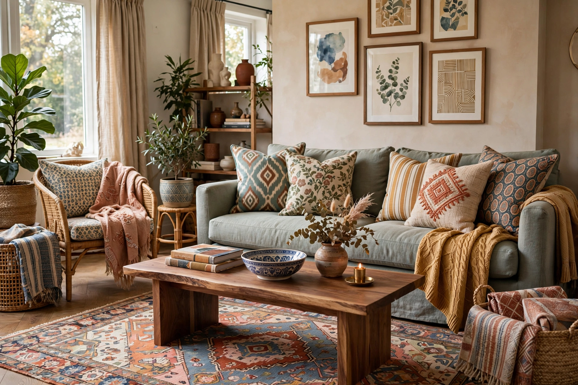
Mixing patterns successfully follows three rules: vary the scale (one large, one medium, one small), stay within a consistent color palette, and balance pattern with solids. Get these right and you can mix florals with stripes with geometrics confidently.
Rule 1: Vary the Scale
Every pattern mix needs three scales:
- Large: a bold floral or oversized geometric (curtains or rug)
- Medium: a stripe or mid-size motif (accent chair or large pillows)
- Small: a tiny print or texture (lumbar pillow, throw)
Two patterns at the same scale compete; three different scales harmonize.
Rule 2: One Color Palette
Patterns in wildly different colors clash; patterns sharing 2–3 colors coordinate. Pull your palette from the largest pattern (usually the rug or curtains), then choose smaller patterns that repeat those colors.
DrapePalette Linen Blend Pinch Pleated Floral Curtains, Beige White, 52″ W x 96″ L, 1 panel
Best for using a large floral as the room’s largest pattern and palette source.
Rule 3: Balance With Solids
The 60-30-10 of pattern mixing: 60% solids (sofa, walls), 30% primary pattern, 10% accent patterns. Solids give the eye rest. A room that’s all pattern feels chaotic no matter how well coordinated.
5 Foolproof Pattern Combinations
- Stripes + florals: the classic. Keep the stripe simple and the floral’s colors in the stripe.
- Geometrics + organic: a trellis or lattice with a botanical print. Modern meets natural.
- Two stripes, different scales: wide awning stripe + pinstripe. Preppy and safe.
- Plaid + solid texture: a plaid throw with bouclé or linen pillows. Cozy without competing.
- Animal print + anything: treat leopard/zebra as a neutral — it pairs with everything.
DEZENE 12×20 Linen Striped Pillow Covers, Natural Beige, Pack of 2
Best for the classic stripes + florals combination at a different scale.
SYSLOON Cheetah/Leopard Print Throw Pillow Covers 20×20, Set of 2, Beige Brown Leopard
Best for treating leopard as a neutral accent that pairs with almost anything.
Where to Place Each Pattern
- Largest pattern: rug or curtains (biggest surface)
- Medium pattern: accent chair or large throw pillows
- Smallest pattern: lumbar pillows, throws, ottoman
- Solids: sofa, walls, largest furniture
Loloi Chris Loves Julia Rue Collection RUE-05 Floral Area Rug, Natural/Denim, 8’6″ x 11’6″
Best for anchoring a pattern mix as the largest pattern in the room.
Pattern Mixing by Room Style
Different design styles mix patterns by different rules, and fluency in your room’s style prevents combinations that fight the architecture. Modern rooms mix patterns through geometry and restraint: pair a bold geometric (large-scale trellis, oversized chevron) with a solid texture (boucle, linen weave) and perhaps one small-scale accent. The palette stays tight — often monochromatic with one accent color. Modern pattern mixing is about contrast of scale and texture rather than variety of motif; three patterns maximum, with solids doing most of the visual work.
Traditional rooms have the richest pattern-mixing heritage — florals, stripes, damasks, and plaids have coexisted in traditional interiors for centuries. The classic formula: a large floral or botanical (curtains or upholstery), a stripe (pillows or chair), and a small geometric or damask (lumbar pillows, ottoman). Traditional mixing tolerates more patterns (up to four) because the motifs share historical DNA — they were designed to coordinate. Keep the palette classic (no neons) and the scales varied, and traditional rooms absorb pattern generously.
Eddie Bauer Sherpa Throw Blanket, 50×60, Edgewood Plaid
Best for pairing a plaid throw with solid linen or bouclé textures.
Bohemian rooms are pattern-mixing’s natural habitat: global textiles (kilim, mudcloth, suzani, ikat), layered rugs, mixed throw pillows in abandon. Boho succeeds through collected-over-time abundance rather than formula — but even boho needs the anchor of a consistent color story, usually warm earth tones with jewel accents. The boho failure mode is souvenir-shop chaos: every pattern from every trip with no palette discipline. Curate the collection with the same ruthlessness as any other style; abundance needs editing more, not less.
Woven Nook Modern Boho Geometric Throw Pillow Covers, Wells Set, 22″ x 22″, Pack of 4
Best for a modern boho mix of geometric pillows with organic, global textiles.
Coastal rooms mix patterns quietly: subtle stripes, soft geometrics, washed florals, and natural textures (jute, linen, seagrass) in a blue-white-sand palette. The patterns whisper rather than shout — coastal pattern mixing is about texture and tone more than motif. Farmhouse rooms pair plaids and grain-sack stripes with solid linens and natural wood; the pattern vocabulary is deliberately limited (plaid + stripe + solid is the whole farmhouse pattern book), which makes it nearly foolproof. Scandinavian rooms use pattern sparingly: one quiet geometric or abstract with abundant solids and white space — restraint is the style.
Mixing Patterns in Small Living Rooms
Small living rooms can absolutely mix patterns — they just need tighter discipline than large rooms. Rule one: fewer patterns, not zero. Two well-chosen patterns plus solids read as designed; zero patterns reads as flat and unfinished. The sweet spot for small rooms is two patterns at clearly different scales (one large, one small) sharing a palette, with solids covering 60-70% of surfaces. This gives the richness of pattern without the visual crowding that shrinks small spaces.
Scale down proportionally. The large-scale floral that works in a grand living room overwhelms a compact one — choose the medium-scale version of the same idea. As a guideline, the largest motif should not exceed roughly the size of your hand in a small room; motifs larger than that dominate rather than decorate. Small-scale patterns (tiny prints, fine stripes) are small rooms’ friends — they add interest without visual weight, functioning almost as texture from a distance.
Placement strategy matters more in small rooms because every surface is visible simultaneously. Put the largest pattern on the largest surface (rug or curtains — pick one, not both), the smaller pattern on pillows or a throw, and keep the sofa solid. Never pattern the two largest surfaces in competing prints — a patterned rug plus patterned curtains in a small room leaves the eye nowhere to rest. Vertical patterns (stripes, vertical geometrics) add perceived height, a valuable illusion in small rooms with standard ceilings.
Mirrors and solid breaks are essential tools: a large mirror opposite a window doubles light and provides a pattern-free reflective surface that rests the eye. Solid-colored throws, plain cushion covers mixed among patterned ones, and clear visual breaks (a solid ottoman between patterned chairs) prevent the closed-in feeling. And edit continuously — small rooms show clutter instantly, so every patterned item must earn its place. When in doubt, remove one pattern; small rooms forgive sparseness far more readily than excess.
Testing Before You Commit
Pattern mixing fails most often at the purchasing stage, when patterns chosen separately meet for the first time in your living room and clash. The testing discipline prevents this. Step one: gather physical samples of every pattern under consideration — swatches, not screen images. Colors and scales lie on screens; a “small” print on a phone becomes a large print in person. Most fabric and wallpaper companies offer inexpensive swatches; rug companies often have return policies that function as trials.
Step two: live with the samples together for at least 48 hours. Pin them to a board or lay them on the sofa, and observe them in morning, afternoon, and evening light. Patterns that harmonize at noon may fight under warm evening bulbs. This waiting period also tests your own response — the initial excitement fades, and what remains is your genuine long-term feeling. If doubt creeps in during the 48 hours, listen to it; doubt at the sample stage becomes regret at full scale.
Step three: the photograph test. Photograph the samples together, then convert the photo to black and white. This reveals value contrast (light versus dark) stripped of color distraction. Successful pattern mixes usually show varied values — some light, some dark, some mid-tone. If everything is the same value, the patterns will blur together regardless of color; if the values are wildly imbalanced, one pattern will dominate. Adjust until the black-and-white version looks balanced, and the color version will follow.
Step four: the distance test. Tape samples to the wall and view from the room’s entrance — the primary viewing position. Patterns that look distinct up close may merge into mud from twelve feet away (scales too similar), or a “subtle” pattern may shout from across the room (scale larger than expected). Design for the viewing distance, not the close-up. And keep receipts and return policies in mind throughout — even with testing, some combinations only reveal themselves at full scale, and the right to return is your final safety net.
Pattern Mixing With Existing Furniture
Most pattern mixing does not start from a blank room — it starts from a sofa you own, a rug you love, or curtains already hung. The existing piece becomes the pattern anchor, and everything else serves it. Identify your anchor’s palette (pull 3 to 4 colors from it), its scale (large, medium, or small motif), and its style (floral, geometric, traditional, modern). New patterns must share the palette, differ in scale, and complement (not necessarily match) the style.
The patterned-sofa scenario is the most challenging common case. A floral or patterned sofa is a strong statement that constrains everything else: keep the rug solid or very subtly textured, choose curtains in a solid pulled from the sofa’s palette, and add pattern only in small doses (pillows in a different scale, a throw in a complementary geometric). The sofa is the room’s pattern star; supporting players stay quiet. Fighting a patterned sofa with a patterned rug is the single most common pattern-mixing disaster — two large patterns at similar scale compete rather than coordinate, and the room feels chaotic no matter how well the colors match.
The solid-sofa scenario is the easiest and most common: a solid sofa is a blank canvas for pattern. Add the large pattern via rug or curtains, the medium pattern via an accent chair or large pillows, the small pattern via lumbar pillows and throws. Solid sofas tolerate the full three-pattern mix beautifully because the largest furniture surface provides the visual rest the patterns need. This is why designers recommend solid sofas to pattern lovers — the sofa enables everything else.
The patterned-rug scenario splits the difference: the rug anchors the palette (pull colors from it for everything else), curtains go solid or subtly textured, and pillows/throws carry the secondary patterns at different scales than the rug’s motif. One caution: rug patterns are viewed from above at an angle, which foreshortens them — a rug pattern reads smaller than the same pattern on vertical curtains. Account for this perceptual difference when judging scale relationships; the rug can handle a slightly larger motif than vertical surfaces.
Common Pattern-Mixing Mistakes and Fixes
Mistake one: same-scale competition. Two medium-scale patterns (a medium floral pillow with a medium geometric throw) fight because the eye cannot establish hierarchy. Fix: ensure clear scale separation — if two patterns feel similar in scale, replace one with a distinctly larger or smaller version. The three-scale rule (large, medium, small) exists precisely to prevent this; when a mix feels “off” but the colors work, scale is almost always the culprit.
Mistake two: palette drift. Each pattern individually contains your palette colors, but each also contains one rogue color — and the rogues clash with each other. A floral with red accents, a stripe with orange accents, and a geometric with pink accents technically share the neutral base but fight in the accents. Fix: squint at each pattern and identify its loudest 2 to 3 colors; all patterns’ loud colors must harmonize, not just their backgrounds. When shopping, filter by the accent colors first, backgrounds second.
Mistake three: pattern without rest. Every surface patterned — rug, curtains, sofa, pillows, throw, ottoman — with no solid relief. Even perfectly coordinated patterns overwhelm when there is nowhere for the eye to rest. Fix: convert the largest secondary surface to solid. The fastest rescue is swapping patterned curtains for solid ones (or vice versa with the rug) — one change, dramatic calm. The 60-30-10 distribution (60% solid, 30% primary pattern, 10% accents) is the guardrail; when a room feels chaotic, measure against it.
Mistake four: ignoring the room’s existing fixed patterns — the flooring, the fireplace stone, the kitchen backsplash visible from the living room. These count as patterns in the mix whether you planned them or not. A busy granite, a patterned tile floor, or a stone fireplace is already one pattern; your textile patterns must coordinate with it, not ignore it. Photograph the room including fixed elements when planning — the camera includes what the mind edits out. And mistake five: too many pattern types. Floral plus stripe plus geometric plus plaid plus animal print is five conversations at once; limit to two or three pattern families and let scale and color provide the variety within them.
Frequently Asked Questions
How many patterns can you mix in one room?
Three is the sweet spot. Four works if one is very subtle (a texture). Five+ risks chaos unless you’re deliberately maximalist.
Can you mix floral and geometric patterns?
Yes — it’s one of the best combinations. The contrast between organic (floral) and structured (geometric) creates visual interest. Just keep them in the same color family.
🛒 Shop This Look:
🛒 Shop This Look:
🛒 Shop This Look:



