
As an Amazon Associate, I earn from qualifying purchases. This means I may earn a commission if you purchase through links on this page — at no extra cost to you.
By Ella Knight
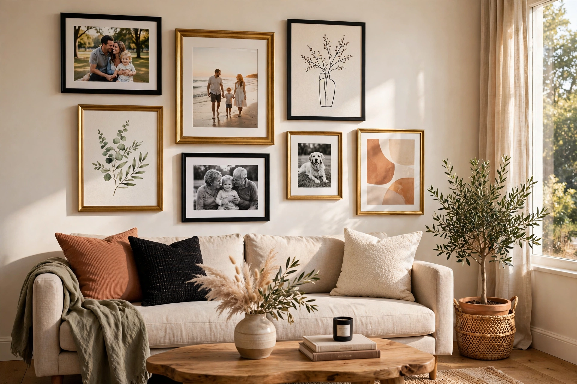
To mix photos and art in a gallery wall successfully, follow the 60-40 rule: 60% art prints and 40% personal photos (or vice versa). Unify the mix with consistent frame colors, a shared color palette across all pieces, and similar mat styles. Place the largest art print as your anchor, then weave photos throughout rather than clustering them together.
Why Mix Them?
Pure art can feel impersonal; pure photos can feel like a family album exploded on your wall. The mix gives you personality plus design polish.
The 60-40 Rule
Decide which dominates. Art-heavy (60% art, 40% photos) feels more designed. Photo-heavy feels more personal. Neither is wrong — pick based on the room’s purpose.
Unifying Strategies
Consistent Frames
Use the same frame color for everything. Black frames unify wildly different content instantly.
Pull 2-3 colors from your room and ensure every piece contains at least one of them. Convert color photos to black and white for instant cohesion.
Matching Mats
White or cream mats on every piece create visual breathing room and tie different art styles together.
Placement Tips
- Don’t group all photos together — intersperse them with art
- Place your favorite photo at eye level in a prominent position
- Balance busy photos with simple art prints nearby
- Use one oversized art print as the anchor, then build around it
Color Photo Trick
If your photos clash with your art, convert them to black and white. This single trick solves 90% of mixing problems and looks intentionally artistic.
Building a Cohesive Color Story
The difference between a mixed gallery wall that looks curated and one that looks chaotic is almost always color discipline. When photos and art share a color story, the eye reads them as a collection; when every piece brings its own palette, the eye reads noise. Here’s how to build that shared story deliberately.
🛒 Shop This Look:
Start with the room, not the art. Identify the 2–3 dominant colors already in the space — the rug, the sofa, the curtains. These are your anchor colors, and every piece on the wall should contain at least one of them. Lay all your candidate pieces on the floor and remove anything that introduces a completely foreign color. This single edit does more for cohesion than any framing trick.
Next, decide on your photo treatment. Color photographs are the usual chaos source: a bright red vacation shirt, a neon playground, a green-tinted indoor shot. You have three options. One: convert problem photos to black and white — this instantly harmonizes them with everything and looks intentionally artistic, not like a compromise. Two: apply a consistent warm or cool filter across all photos so they share a color temperature. Three: be selective and only hang photos whose colors already fit the palette. Most successful mixed walls use a combination: black-and-white for the clashing shots, color for the ones that naturally belong.
Art prints need the same discipline. When buying new prints for a mixed wall, filter your choices through the palette first and subject matter second. A abstract print in your exact palette beats a “perfect” subject in clashing colors every time. Over time, this habit builds a collection that mixes effortlessly because every piece was chosen for the wall, not just for itself.
Finally, use mats as color diplomats. A wide white or cream mat around every piece — photos and art alike — creates consistent breathing room that separates each piece’s colors from its neighbors. Mats are the visual equivalent of white space in graphic design: they let different elements coexist without competing. If your wall still feels busy after matting, the problem is probably too many colors, not too many pieces — go back to the floor, remove the outliers, and try again.
Arranging by Visual Weight, Not Content
Beginners arrange gallery walls by content — all the family photos together, all the art together. Experienced curators arrange by visual weight, treating each piece as a shape with a certain heaviness regardless of what it depicts. This is the skill that makes mixed walls feel balanced, and it’s simpler than it sounds.
Visual weight comes from four things: size (bigger is heavier), darkness (darker is heavier), complexity (busier is heavier), and contrast (high-contrast is heavier). A small, dark, busy photo can outweigh a large, pale, simple print. When you internalize this, you stop seeing “photo” and “art” and start seeing a set of weights to distribute.
The practical method: lay everything on the floor and squint until the content blurs — you’re looking at abstract rectangles of light and dark. Now arrange so the heaviness is balanced: no quadrant of the wall should feel dramatically heavier than the others. A large dark art print on the left gets balanced by two medium photos on the right. A cluster of small busy photos in one corner needs a calm, light piece nearby to give the eye rest.
This approach also solves the “photo ghetto” problem — the tendency to cluster all personal photos in one sad corner while the “real art” gets pride of place. When you arrange by weight, photos and art intermix naturally because you’re placing shapes, not categories. The result is a wall where a child’s snapshot hangs with the same confidence as a purchased print — which is exactly the effect you’re after.
One more weight trick: the bottom of the arrangement should feel slightly heavier than the top. This grounds the composition — it’s why anchors and large pieces gravitate toward the lower center. A top-heavy wall feels like it might tip forward; a bottom-weighted wall feels settled and calm.
🛒 Shop This Look:
Printing and Framing Photos Like Art
The fastest way to elevate personal photos from “family album” to “gallery wall” is treating the printing and framing with the same seriousness you’d give purchased art. Most people’s photos look amateur on the wall not because the photos are bad, but because they’re printed small, on cheap paper, and stuffed into whatever frame was handy.
Size is the biggest upgrade. Phone photos printed at 4×6 look like snapshots; the same image printed at 11×14 with a wide mat looks like art. Modern phone cameras have plenty of resolution for 11×14 and even 16×20 prints — don’t let small prints undersell good photos. As a rule, print personal photos at least as large as the art prints they’ll hang beside; nothing says “these don’t belong” like a tiny photo drowning among full-size prints.
Paper choice matters more than people expect. Glossy prints look cheap under glass and show every fingerprint; matte or luster finishes look professional and reduce glare. For black-and-white conversions, a true matte fine-art paper gives gorgeous depth. Most online print services offer paper choices at checkout — choose matte or luster as your default, and reserve glossy for nothing.
Matting is the gallery secret. A 2–3-inch mat around a photo does three things: it makes the photo look larger and more important, it creates the white-space separation that unifies mixed walls, and it keeps the print from touching the glass (which prevents sticking and moisture damage over time). Pre-cut mats in standard sizes are inexpensive; for odd sizes, a local frame shop cuts custom mats for a few dollars each.
For framing, give your photos the same frames as your art — literally the same frames. When a personal photo sits in the identical black gallery frame as the art print beside it, the wall stops distinguishing between “photo” and “art” entirely. That’s the goal: not a photo section and an art section, but one wall where everything belongs equally.
Seasonal Rotation: Keeping a Mixed Wall Fresh
A mixed photo-and-art wall has a built-in advantage over pure art walls: your life keeps producing new photos, which means the wall can evolve without spending a dime. A simple rotation system keeps it feeling fresh year after year.
The seasonal swap: Four times a year, swap 2–3 photos for recent ones. Spring brings garden and outdoor shots; summer, vacation photos; autumn, warm-toned portraits; winter, holiday and cozy indoor scenes. The art prints stay constant — they’re the wall’s permanent architecture — while the photos provide the changing seasonal layer. This rhythm means the wall never feels stale, and family members start looking forward to what’s new on the wall.
The easy-swap hardware: Rotation only happens if it’s easy. Use frames with user-friendly backs — flexi-point or swivel-tab frames open in seconds, while nailed-shut frames discourage ever changing the contents. Alternatively, dedicate 2–3 positions in the arrangement to clip frames or magnetic hangers, which swap in under a minute. Knowing which spots are “the rotating ones” removes all decision friction.
Editing the archive: Every rotation is an editing opportunity. Photos that no longer earn their spot get retired to an album. The wall should show your best, not your most. A good rule: if you wouldn’t print it today, it shouldn’t be on the wall today.
Kids’ art rotation: If children’s artwork is part of your mix, rotate it most aggressively — kids produce prolifically and are delighted to see new work displayed. Keep a simple folder for the retired pieces so nothing precious is lost. Many parents find that a dedicated section of 2–3 frames within the larger wall gives children ownership without letting the whole arrangement become a school art show.
The deeper payoff of rotation is emotional: a wall that changes with your life stays meaningful. Static walls become invisible through familiarity. A wall with a living photo layer keeps catching your eye, reminding you of recent joys every time you pass.
🛒 Shop This Look:



