
As an Amazon Associate, I earn from qualifying purchases. This means I may earn a commission if you purchase through links on this page — at no extra cost to you.
Pick a backsplash that complements your cabinets by choosing a color pulled from your countertop, keeping patterns simple if cabinets are bold (or vice versa), and considering grout color as part of the design. White cabinets pair with almost anything; navy or green cabinets look best with simple white, cream, or marble-look tile; wood cabinets need a quiet backsplash that doesn’t compete with grain patterns.
The Golden Rule: One Star Per Kitchen
If your cabinets are bold (navy, green, black), choose a quiet backsplash. If cabinets are neutral (white, wood), the backsplash can be the statement. Never let both fight for attention.
Pairings That Work
White Cabinets
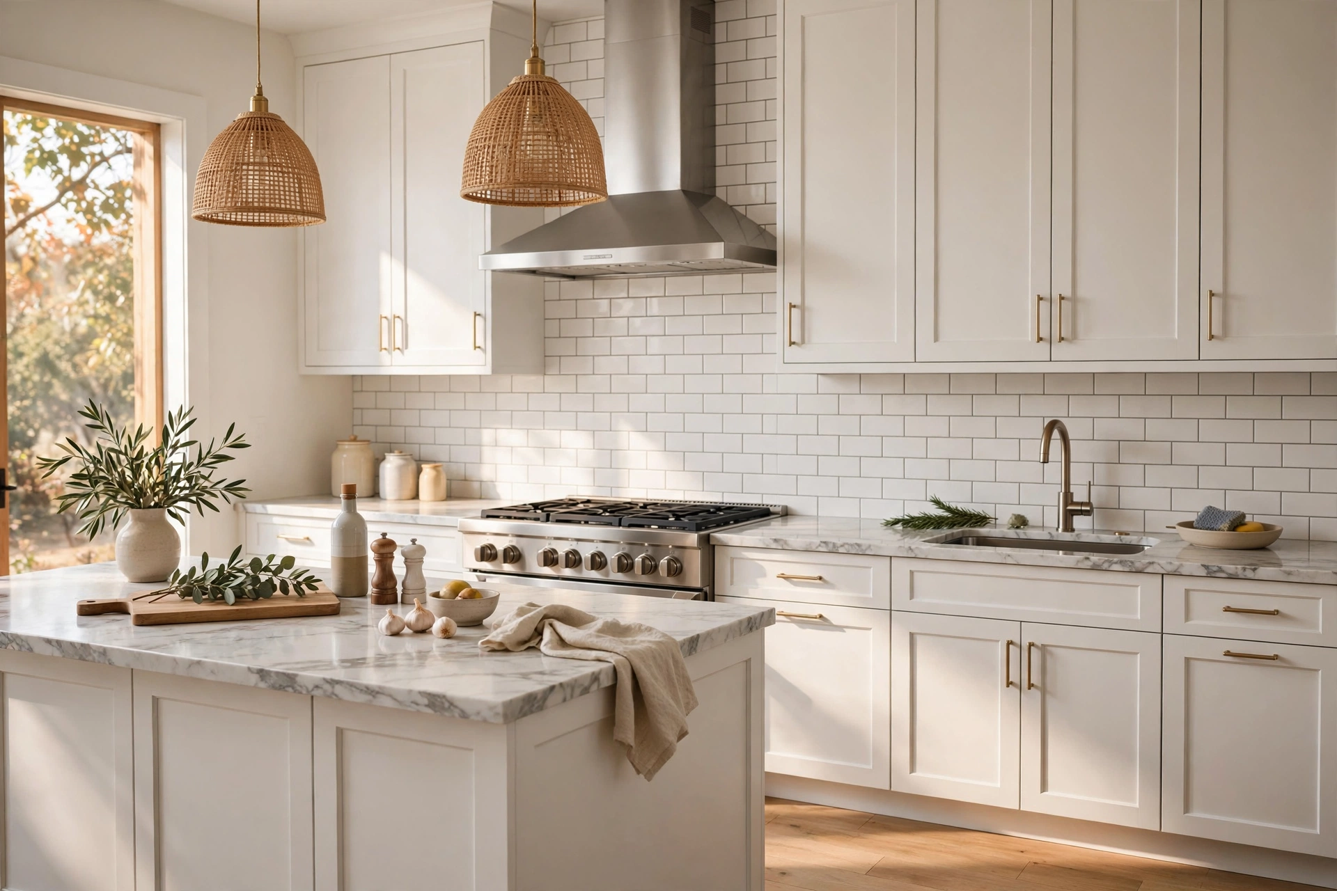
Almost anything works. Classic subway tile, colorful handmade tile, marble slab, or bold patterns — white is a blank canvas.
White or cream subway tile, light marble, or handmade white tile. Keep it bright to balance the dark cabinets.
Wood Cabinets
Simple white, cream, or soft gray tile. Avoid busy patterns that clash with wood grain. A handmade-look white tile adds texture without competing.
Green Cabinets
Cream subway tile, warm white, or soft marble. Brass grout lines (yes, really) can be stunning with green.
Grout Matters
Dark grout with white tile = graphic and modern (but shows less dirt). Light grout = seamless and calm (but stains). Match grout to tile for a quiet look; contrast for drama.
Read Your Countertop First: The Undertone Shortcut
Most backsplash mistakes happen because people match the backsplash to the cabinets and ignore the countertop — but the countertop sits directly against the backsplash, touching it along the entire run. It is the nearest neighbor, and its undertones will either harmonize with your tile or fight it visibly.
Pull the undertone out of your countertop before you shop. White marble with gray veining has cool undertones; pair it with whites and grays that lean cool, and avoid creamy tiles that will look yellow next to it. Butcher block and warm granites have warm undertones; they want creams, warm whites, and beiges. Black granite is the wildcard — it works with almost anything because it has no strong undertone of its own, so let the cabinets lead.
🛒 Shop This Look:
Hold tile samples directly against both the countertop and the cabinets at the same time. The sample that looks good against one but clashes with the other is not your tile. This two-surface test eliminates most bad choices in seconds. Pay special attention to “white” tiles: there is no such thing as a neutral white. Every white tile leans warm (creamy), cool (blue-gray), or true, and the wrong lean next to your countertop is the most common source of a backsplash that looks “off” without anyone knowing why.
If your countertop is busy — heavy veining, bold pattern — treat it as the star and choose a quiet backsplash in a solid color pulled from the countertop’s background tone. Two patterned surfaces next to each other compete; one patterned surface with one quiet partner looks designed.
Tile Shape, Pattern, and Scale
Once the color family is settled, shape and scale decide the backsplash’s personality. The classic 3×6 subway tile is classic for a reason: its proportions suit almost any kitchen, and the running-bond pattern adds subtle movement without noise. But the same tile laid in herringbone reads modern and custom, while stacked vertically it reads contemporary and taller. One tile, three personalities — the layout pattern matters as much as the tile itself.
Scale the tile to the kitchen. Large-format tiles (4×12, or even 12×24) make small kitchens feel bigger because fewer grout lines mean fewer visual interruptions; the surface reads as calmer and more continuous. Small mosaics and penny tiles add texture and craft but bring many grout lines, which reads as busier — better in larger kitchens or as an accent strip than as a full run in a galley kitchen.
Patterned and handmade-look tiles deserve a decision rule: use them where they can be the star. A bold Moroccan or encaustic-look pattern behind the range, framed by quiet tile elsewhere, gives you the impact without the overwhelm. Running a loud pattern across the entire backsplash is a commitment that dominates the kitchen for a decade — beautiful if you love it, exhausting if your taste shifts. The range-wall accent approach gives you 80% of the drama at a fraction of the visual risk.
Consider the grout line width as part of the pattern. Tight 1/16-inch joints make tile read as one continuous surface (modern, calm); wider 1/4-inch joints emphasize each tile and the grid (rustic, handmade). Handmade-look tiles actually need the wider joint — tight joints fight their irregular edges.
Full-Height Backsplash vs. Standard Height
The standard backsplash runs 18 inches from countertop to upper cabinets. The full-height (slab) backsplash runs the entire wall to the ceiling, and it has become one of the most impactful kitchen upgrades available — it turns the backsplash from a trim detail into an architectural feature.
Full height works best behind the range and on walls without upper cabinets, where it replaces what would otherwise be painted drywall above the standard splash. A marble or quartz slab running counter-to-ceiling behind a range is dramatic, seamless (no grout lines to clean), and makes the cooking zone feel like the designed centerpiece it should be. On open shelves walls, full-height tile unifies the whole composition.
The tradeoff is cost and commitment. Full-height tile roughly doubles the tile and labor of a standard splash, and slab installations need professional templating. It also raises the stakes on your material choice — you will see a lot of it, so busy patterns become risky at full height while quiet materials become luxurious. As a compromise, run standard height everywhere and go full height only on the range wall: you get the focal moment without the full-kitchen commitment.
If you have no upper cabinets at all — a growing trend — a full-height backsplash to the ceiling is almost mandatory. Painted drywall between counter and ceiling in a cabinet-free kitchen looks unfinished and gets splattered; tile solves both problems at once.
🛒 Shop This Look:
More Pairings: Black, Gray, and Two-Tone Cabinets
Black cabinets: Black needs light and texture to avoid feeling like a void. White marble-look tile, handmade white tile with visible variation, or light gray large-format tile all work. Avoid flat pure-white glossy tile — against black cabinets it can look stark and cheap rather than crisp. A tile with some hand or stone texture gives black cabinets the depth they need. Brass or gold grout-adjacent accents (through hardware, not grout) warm the combination.
Gray cabinets: The danger with gray is flatness — gray cabinets plus gray tile plus gray grout equals a kitchen with no focal point. Break it up: if cabinets are cool gray, warm the backsplash slightly (warm white, greige); if cabinets are warm gray (greige), the backsplash can go cooler. Contrast in undertone is what keeps gray kitchens from feeling like a fog.
Two-tone kitchens (e.g., navy island with white perimeter): Let the dominant cabinet color lead. Usually that means choosing the backsplash for the perimeter cabinets, since they cover more wall area, and letting the island be its own moment. The backsplash should not try to reference both colors — pick the quiet partner for the larger area and the kitchen will feel cohesive.
Wood cabinets (deeper dive): The existing advice — quiet tile, no competing pattern — holds, but the undertone of the wood matters. Orange-toned oak fights with cool gray tile; it wants warm whites and creams. Walnut’s cool brown takes cooler tiles well. When in doubt, pull the backsplash color from the lightest tone in the wood grain rather than matching the dominant tone — it lightens the whole kitchen without clashing.
Materials Compared: Cost, Durability, and Maintenance
Ceramic and porcelain: The workhorse. Affordable (approximately priced by square foot at the low end of tile options), nearly indestructible, and available in every look from handmade-look to marble-look. Porcelain is denser and less porous than ceramic — marginally better behind a heavy-use range. For most kitchens, this is the right default.
Natural stone (marble, travertine): Unmatched depth and variation, but porous. Marble etches with acids (lemon, tomato) and needs periodic sealing. Beautiful behind a range if you accept patina as part of the deal; stressful if you want it to look new forever. Budget for sealing and for the reality that natural stone changes over time.
Glass tile: Reflects light beautifully and is non-porous, but shows every imperfection in the installation behind it and can be tricky to cut cleanly. Best in small doses or with an experienced installer. The light-bouncing quality makes it excellent in dark kitchens.
Slab (quartz or marble, full height): The premium option — seamless, dramatic, easy to clean. Requires professional templating and installation, and the material cost is the highest of these options. Worth it as a range-wall statement if the budget allows.
Whatever material you choose, buy 10–15% extra for cuts and breakage, and keep a box of spare tile after the job. Tile lines get discontinued, and a future repair without matching tile means redoing the whole run.
Testing Your Choice
Get full-size tile samples and prop them against your cabinets in your kitchen lighting. View at different times of day before committing.
🛒 Shop This Look:




1 thought on “How to Pick a Backsplash That Matches Your Cabinets”
Comments are closed.