
As an Amazon Associate, I earn from qualifying purchases. This means I may earn a commission if you purchase through links on this page — at no extra cost to you.
Paint is the cheapest optical illusion ever invented. The right color does not just decorate a small room — it rewrites its dimensions, pushing walls back, lifting ceilings, bouncing light into corners that have never seen it. The wrong color does the opposite, and you feel it instantly without knowing why.
Related: Neutral Paint Colors That Feel Fresh, Not Boring Related: Paint Colours That Match Furniture Perfectly Related: How Lighting Changes the Way Paint Colors Look
Explore our complete guide to paint colors and wallpaper ideas for more inspiration.
Designers exploit this with specific tools: cool tones recede, warm whites glow, a dark accent wall adds depth instead of closing in. Finish matters as much as hue — an eggshell sheen reflects light that flat paint swallows. These nineteen designer-approved colors are chosen for what they do to space, not just how they look on a swatch.
Here are 19 paint colors recommended by designers that can completely change the feel of your small rooms.
1. Soft Warm Beige
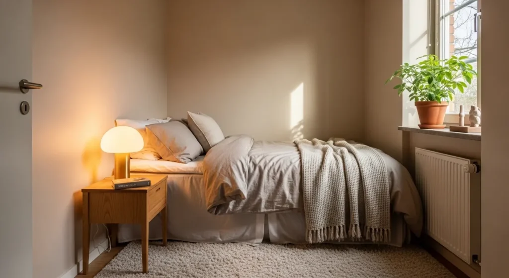
Soft warm beige is perfect for making small spaces feel cozy yet open. It reflects light while adding warmth, giving the room a welcoming atmosphere without feeling bland.
Use on walls, trims, or even ceilings to expand the visual space. Pairing with natural wood or soft textiles enhances depth, making the room feel elegant, calm, and thoughtfully designed for everyday comfort.
2. Cool Light Gray
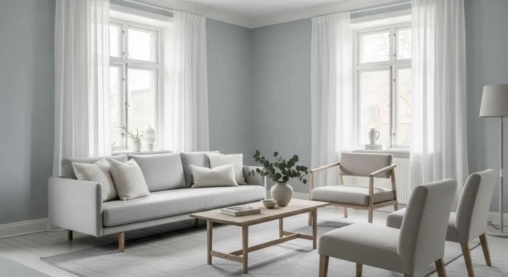
Cool light gray adds a modern, sleek feel while keeping a small room bright and airy. It balances natural and artificial light, preventing the space from feeling heavy or dark.
Pair with white trim, metallic accents, or pastel decor for a polished minimalist look. Its versatility allows the room to feel spacious, contemporary, and effortlessly stylish while complementing a variety of furniture and accessories.
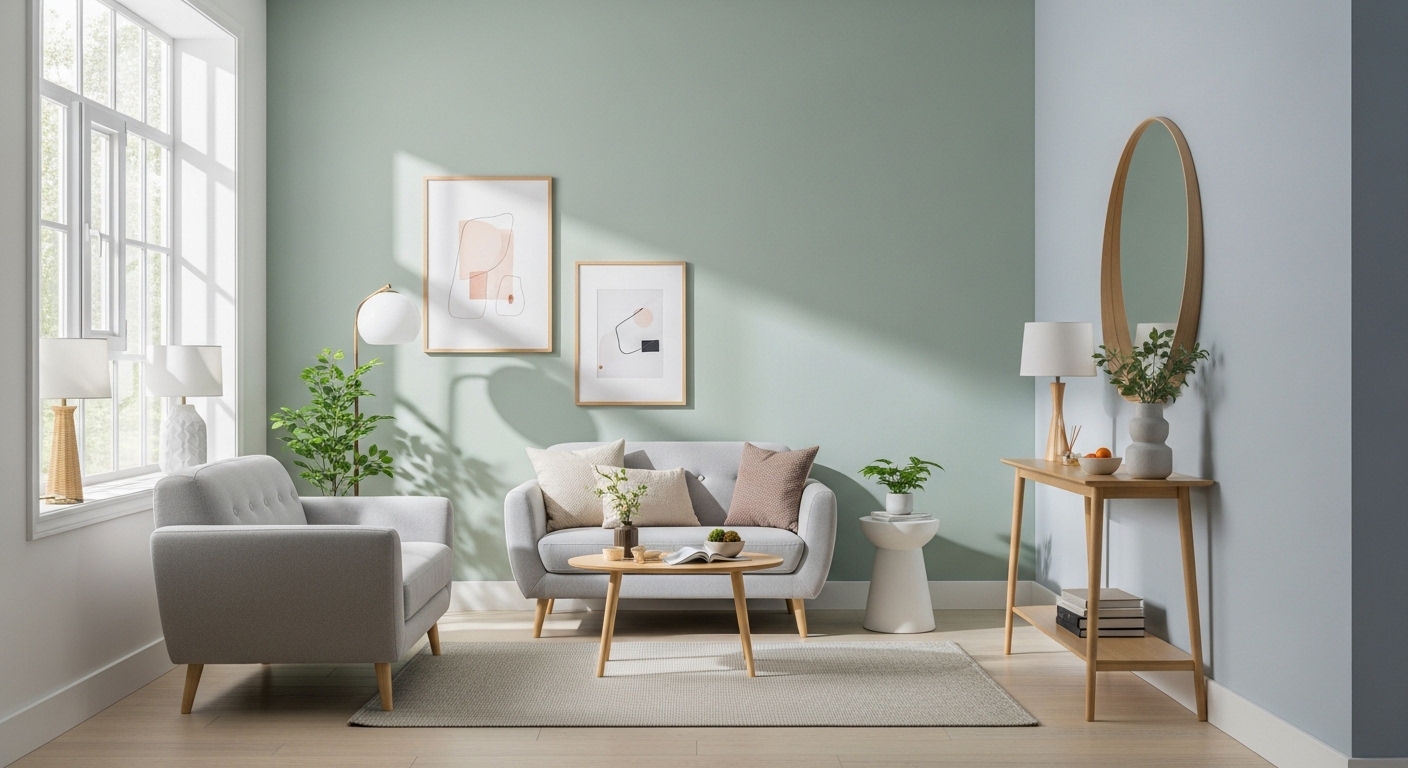
3. Muted Sage Green
Muted sage green introduces subtle color while maintaining calmness. The natural undertones bring an earthy, tranquil vibe that makes small spaces feel refreshed and balanced.
Ideal for kitchens, bathrooms, or bedrooms, sage green pairs beautifully with wood accents and soft neutrals. Its understated elegance enhances visual depth while creating a serene and cozy environment in a compact room.
4. Pale Blush Pink
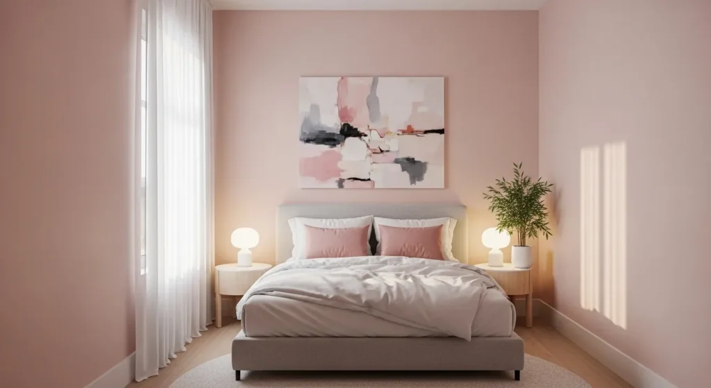
Pale blush pink adds warmth and a gentle touch of color without overwhelming a small room. It makes the space feel soft, inviting, and slightly feminine while reflecting natural light beautifully.
Use on walls or as an accent around furniture. Pairing with whites or light grays enhances the airy feel, giving the room a charming, modern, and designer-approved look that feels luxurious yet cozy.
5. Soft Sky Blue
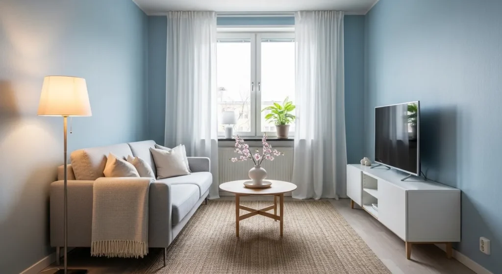
Soft sky blue instantly opens up a room and promotes a calming atmosphere. Its cool undertones make walls feel more expansive while complementing natural light beautifully.
Ideal for bedrooms, bathrooms, or home offices, sky blue pairs with whites, wood tones, or pastel accents. The result is a serene, airy, and visually enlarged space with a sophisticated yet relaxed designer-approved aesthetic.
6. Warm Ivory
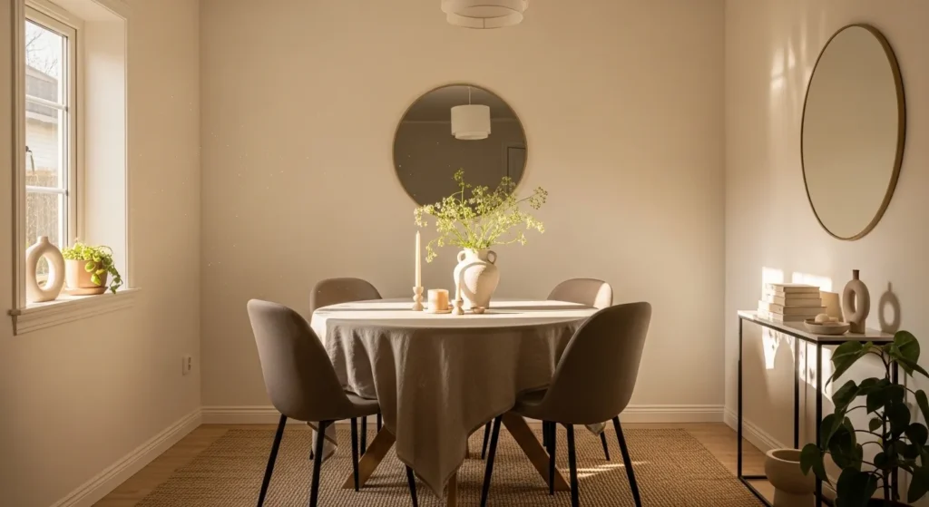
Warm ivory provides a soft, neutral backdrop that brightens and enlarges small rooms. Unlike stark white, its subtle warmth adds comfort and elegance without shrinking the space visually.
Use on all walls or as a base for accent decor. Paired with light woods, soft furnishings, or metallic accents, ivory creates a timeless, airy, and inviting environment that feels spacious and well-balanced.
7. Light Taupe
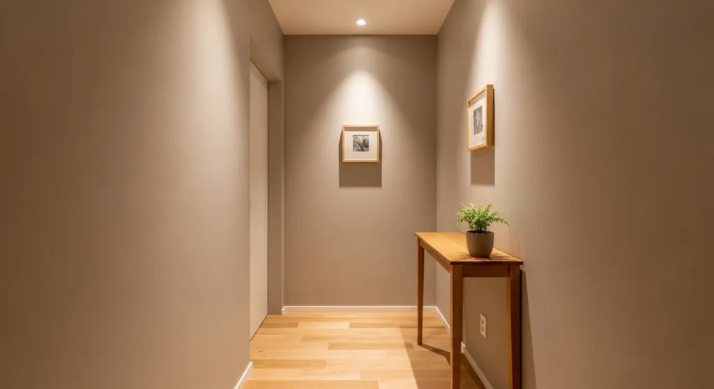
Light taupe strikes a balance between warmth and neutrality. It gives small spaces a sophisticated and cohesive look while making walls appear clean and expansive.
Pair with crisp white trim or natural textures for subtle contrast. Its soft undertones add depth, making a compact room feel airy, stylish, and perfectly curated for modern living.
🛒 Shop This Look:
8. Soft Lavender
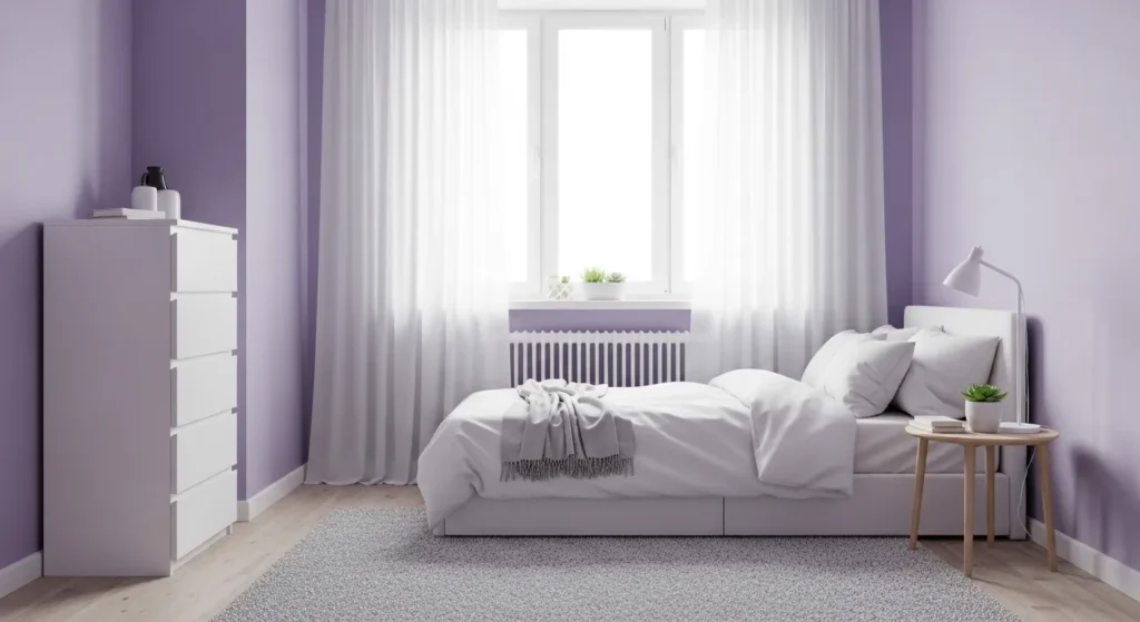
Soft lavender offers a touch of color that is calming and elegant. Its muted tones create a sense of depth while maintaining a serene and bright atmosphere in small rooms.
Use in bedrooms or bathrooms for a tranquil feel. Combined with white or pastel accents, lavender makes walls feel spacious, soothing, and designer-approved while adding subtle personality and style.
9. Creamy Almond
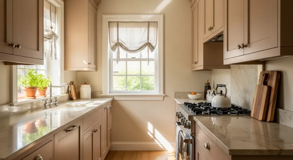
Creamy almond is a warm, versatile neutral that opens up small rooms effortlessly. It reflects light and pairs beautifully with wood, stone, or soft fabrics for a balanced look.
Apply on walls or cabinetry to enhance brightness. The gentle warmth adds elegance, making even compact kitchens, bedrooms, or bathrooms feel welcoming, airy, and thoughtfully designed.
10. Soft Mint Green
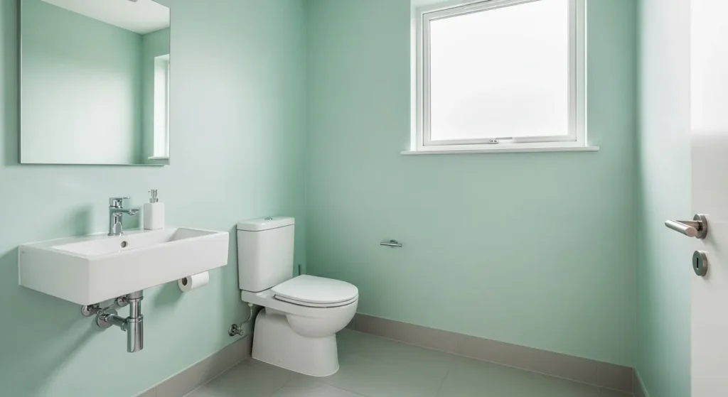
Soft mint green adds freshness and vibrancy without overwhelming a small room. Its subtle hue complements natural light and enhances the perception of space.
Ideal for bathrooms, kitchens, or kids’ rooms, mint pairs well with white, gray, or light wood accents. It creates a lively yet soothing environment that feels modern, airy, and visually expansive.
11. Powder Blue
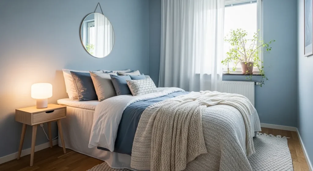
Powder blue adds a soft, serene backdrop that instantly makes small rooms feel more spacious. Its gentle hue reflects light, creating a sense of openness while adding a subtle pop of color.
Use in bedrooms or reading nooks for a calming, peaceful vibe. Pair with white trims, natural wood, or light fabrics to enhance airiness. This designer-approved color maintains minimalism while creating a fresh, tranquil atmosphere perfect for small spaces.
12. Soft Peach
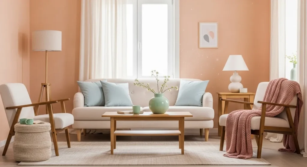
Soft peach adds warmth and cheer to compact rooms without overwhelming them. Its muted tones brighten spaces while introducing a gentle, inviting ambiance that feels sophisticated yet playful.
Place in living rooms, bedrooms, or entryways. Combine with soft creams, natural woods, or subtle metallic accents. The result is a cozy, airy, and stylish room that balances color with minimalist elegance.
13. Light Aqua
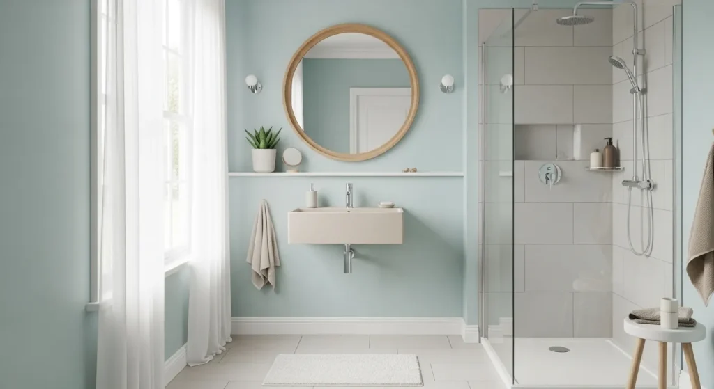
Light aqua provides a refreshing, modern touch to small spaces. Its watery tones open up walls visually while adding personality and energy to the room.
Ideal for bathrooms or kitchens, aqua pairs beautifully with white or soft wood finishes. The color creates a calm yet lively environment, making even the smallest rooms feel vibrant, airy, and thoughtfully designed.
🛒 Shop This Look:
14. Soft Lemon Yellow
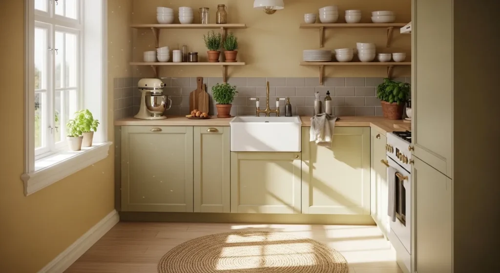
Soft lemon yellow adds cheerful warmth while keeping a small room bright and airy. Its muted shade prevents overwhelming the space while creating a welcoming, happy atmosphere.
Use in kitchens, breakfast nooks, or playrooms. Paired with whites and neutrals, it expands the room visually and brings energy, personality, and designer-approved charm to even compact spaces.
15. Warm Gray
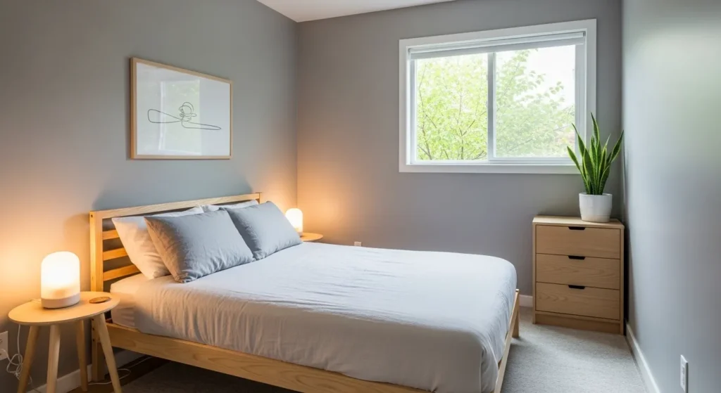
Warm gray provides depth and sophistication while remaining neutral enough to make small rooms feel spacious. Its subtle undertones add warmth without creating heaviness.
Hang light-colored artwork or pair with soft textiles to balance the look. Warm gray makes walls feel modern and cozy, offering a versatile backdrop for furniture and decor while enhancing visual space.
16. Soft Lilac
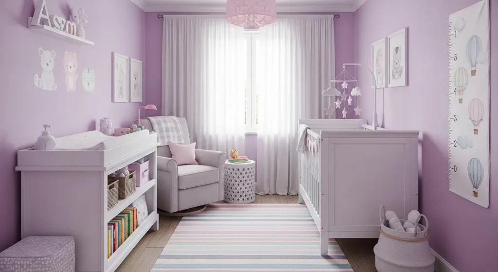
Soft lilac introduces gentle color and a whimsical touch. Its muted purple tones add calm and sophistication, keeping a compact room visually light and airy.
Use in bedrooms or nurseries for a soothing, playful feel. Lilac pairs with whites, creams, and soft pastels, creating a dreamy, designer-approved environment that feels spacious, cozy, and stylishly curated.
17. Neutral Sand
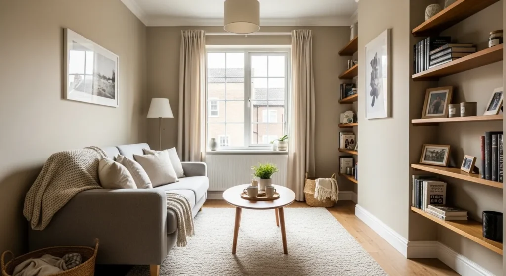
Neutral sand is an earthy, warm tone that brightens and enlarges small rooms. Its subtle hue reflects light beautifully, creating an inviting and expansive feel.
Ideal for living rooms, bedrooms, or entryways, sand pairs effortlessly with wood, metal, and soft textiles. The result is a timeless, airy space that feels open, modern, and welcoming while maintaining minimalist elegance.
18. Soft Coral
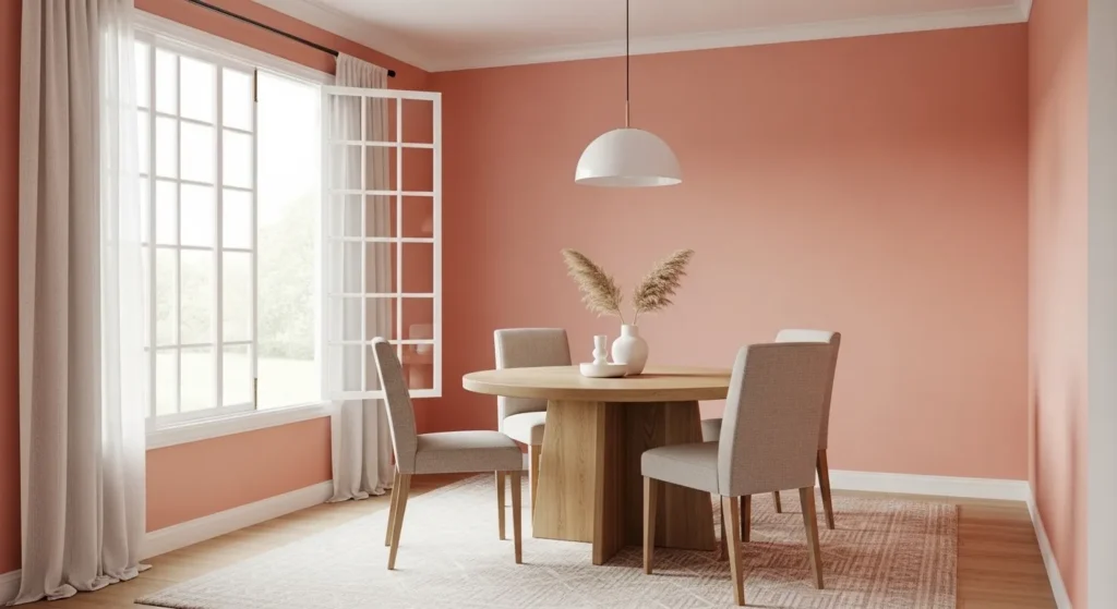
Soft coral adds warmth and energy without overwhelming small walls. Its muted pink-orange tone creates a lively, cozy atmosphere that complements natural light beautifully.
Hang in dining areas, kitchens, or playrooms. Pair with neutral furniture or light wood accents to expand the visual space while maintaining a cheerful, stylish, and designer-approved aesthetic.
🛒 Shop This Look:
19. Warm White
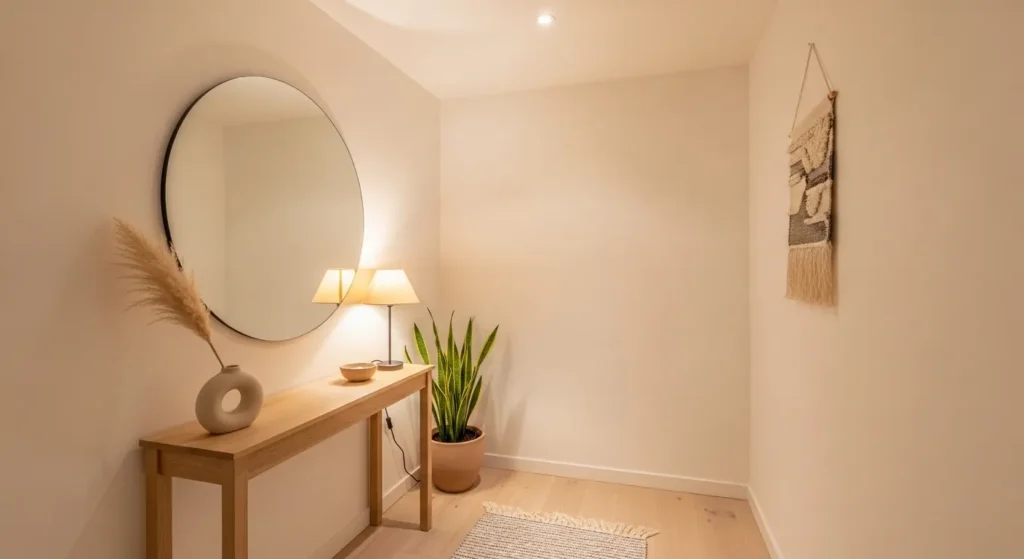
Warm white is the ultimate color for expanding and brightening small rooms. Unlike stark white, its gentle undertones prevent a cold, sterile feeling while reflecting light effectively.
Use throughout hallways, bedrooms, or kitchens to create a clean, airy, and cohesive look. Paired with soft fabrics, light furniture, or natural textures, warm white makes even the tiniest spaces feel open, inviting, and elegantly modern.
Conclusion
Choosing the right paint color can completely transform small rooms, making them feel brighter, more spacious, and stylish. Designer-approved hues like soft beiges, cool grays, muted pastels, and warm neutrals reflect light and create visual depth while maintaining calm and minimalism.
Each color can be paired with furniture, accents, and natural textures to enhance airiness and style. Whether you prefer subtle neutrals or muted pops of color, these 19 shades provide endless possibilities for creating inviting, modern, and visually expanded spaces.
Small rooms no longer need to feel cramped or dull. With thoughtful color choices, your walls can elevate the mood, style, and functionality of any compact interior, reflecting your personality while keeping the space airy, cohesive, and designer-approved.
FAQs
Can small rooms handle bold colors?
Yes, but muted versions or soft pastels work best to avoid making the space feel cramped.
Do light colors really make rooms look bigger?
Absolutely. Light tones reflect more light, creating the illusion of space and openness.
Which rooms benefit most from these colors?
Bedrooms, kitchens, bathrooms, hallways, or small living rooms benefit most from bright, reflective hues.
Can I mix neutral and pastel shades?
Yes, combining neutrals with soft pastels adds warmth, depth, and visual interest while keeping the space airy.
Do these colors work with all decor styles?
Yes, these versatile hues complement minimalist, modern, Scandinavian, and even cozy eclectic interiors.
15 Essential Questions About Designer-Approved Paint Colors For Small Rooms
1. What’s the biggest mistake people make when painting small rooms?
Choosing colors that make spaces feel smaller. Dark, saturated, or cool-toned colors visually shrink small rooms dramatically.
Many assume white is the only option for small spaces. This misconception leads to sterile, uninviting rooms.
Designers know that the RIGHT color actually makes small spaces feel larger and more intentional than white.
2. What paint colors do designers use most for transforming small rooms?
Soft white with warm undertones (cream, off-white, ivory) feels bright without coldness. This is designer favorite number one.
Pale warm gray or greige (gray-beige blend) creates sophisticated depth while maintaining spaciousness.
Warm beige or soft taupe add subtle color without overwhelming. These feel intentional and luxurious.
Pale blue-gray creates contemporary calm. This works beautifully in bedrooms and bathrooms.
3. Why do warm colors work better than cool colors in small spaces?
Warm colors feel inviting and expand space visually. They create psychological comfort in tight areas.
Cool colors (pure white, cool blue, gray-blue) can feel sterile and actually make small rooms feel colder and smaller.
Warm undertones bounce light differently, creating the illusion of more space. This is science, not opinion.
4. How do I test paint colors before committing in a small room?
Get large paint samples and paint swatches directly on walls—not just small cards. Small samples are deceptive.
View samples throughout the day: morning light, afternoon light, evening artificial light. Colors shift dramatically with lighting.
Live with samples for 2-3 days. What looks beautiful in the paint store might feel wrong in your actual space.
5. What’s the best approach to selecting undertones in paint colors?
Identify your room’s lighting first. Natural light? Artificial? Windows? This determines which undertones work.
Warm lighting rooms benefit from warm undertones (cream, beige, warm gray). Cool lighting rooms can handle cooler neutrals.
Test undertones against your existing flooring, trim, and furniture. Everything should feel cohesive.
6. Should I paint all walls the same color or use accent walls in small spaces?
All the same color creates flow and makes spaces feel larger. This is most designer-approved approach.
One accent wall can work if it’s strategic (behind bed, seating area) and uses coordinating color.
Avoid using completely different colors for accent walls in small rooms. The contrast chops up space and makes it feel smaller.
7. How do ceiling color affect small room perception?
Painting ceilings white or slightly lighter than walls makes rooms feel taller. This is a designer secret.
Darker ceilings make rooms feel lower and smaller. Avoid this in small spaces.
Matching ceiling to wall color creates seamless flow. This works beautifully in contemporary small spaces.
8. What paint finish works best for small rooms?
Matte finishes hide imperfections and create sophisticated appearance. Recommended for most small rooms.
Satin finishes offer durability and subtle sheen. These work beautifully for walls that need occasional wiping.
Avoid glossy finishes in small rooms. They show every imperfection and feel overly shiny in tight spaces.
9. Can I use bold or saturated colors in small spaces?
Yes, if used strategically. A bold accent wall with soft supporting colors can work beautifully.
Keep bold colors to one wall maximum. More creates overwhelming visual chaos in small spaces.
Pair bold with plenty of neutral supporting color. This prevents the space from feeling trapped in one intense color.
10. How do window treatments coordinate with small room paint colors?
Light, sheer curtains maximize natural light. Heavy drapes make small rooms feel darker and more cramped.
Neutral or coordinating curtain colors prevent competing visual elements. This maintains spaciousness.
Keep windows as clear as possible. Natural light is small rooms’ greatest asset.
11. What lighting should I use with specific paint colors in small rooms?
Warm white lighting (2700K) works with virtually all paint colors. Recommended for all small spaces.
Excellent lighting throughout makes even small rooms feel larger and more inviting. Poor lighting makes any color look gloomy.
Layered lighting (overhead, task, accent) prevents one-dimensional feel. Multiple light sources transform small spaces.
12. How do I make small rooms feel cozy rather than cramped with paint color?
Warm colors create coziness naturally. Cream, warm beige, soft taupe feel enveloping without being claustrophobic.
Add texture and soft elements. Paint color plus textiles and materials creates genuine coziness.
Strategic lighting combined with warm color creates the perfect balance of spacious and cozy.
13. What’s the best paint color for making small bathrooms feel luxurious?
Soft white or cream creates spa-like elegance. This is designer favorite for small baths.
Pale blue-gray or soft gray-green add subtle color with spa-like sophistication.
Avoid very warm colors in bathrooms. Neutral, sophisticated palettes work best for luxury bathroom feel.
14. Can I use paint color to visually expand small bedrooms?
Absolutely. Warm, light paint colors make bedrooms feel larger and more peaceful.
Painting walls in soft cream or warm gray while keeping trim white creates visual expansion.
Avoid dark or saturated colors in small bedrooms. Light, warm colors promote better sleep and spaciousness.
15. What mistakes do designers avoid with small room paint colors?
Using colors that make spaces feel smaller. Test colors thoroughly before committing.
Ignoring lighting conditions. Poor lighting ruins even beautiful paint colors. Prioritize excellent lighting.
Choosing trendy colors. Timeless, warm neutrals work forever. Trendy colors need updating.
Skipping quality paint. Good paint ($40-60 per gallon) lasts longer and covers better than cheap alternatives ($20-30). Better long-term value.
Ready to transform your small room with designer-approved colors? Discover more color inspiration and professional design strategies on our homepage. Explore how to choose paint colors that expand spaces and create beautiful sanctuaries. Visit homeisdecor.com and find comprehensive small room paint color ideas plus 18 more actionable concepts to transform your space into a larger-feeling, beautifully designed sanctuary that radiates warmth, sophistication, and intentional elegance for years to come today.