
As an Amazon Associate, I earn from qualifying purchases. This means I may earn a commission if you purchase through links on this page — at no extra cost to you.
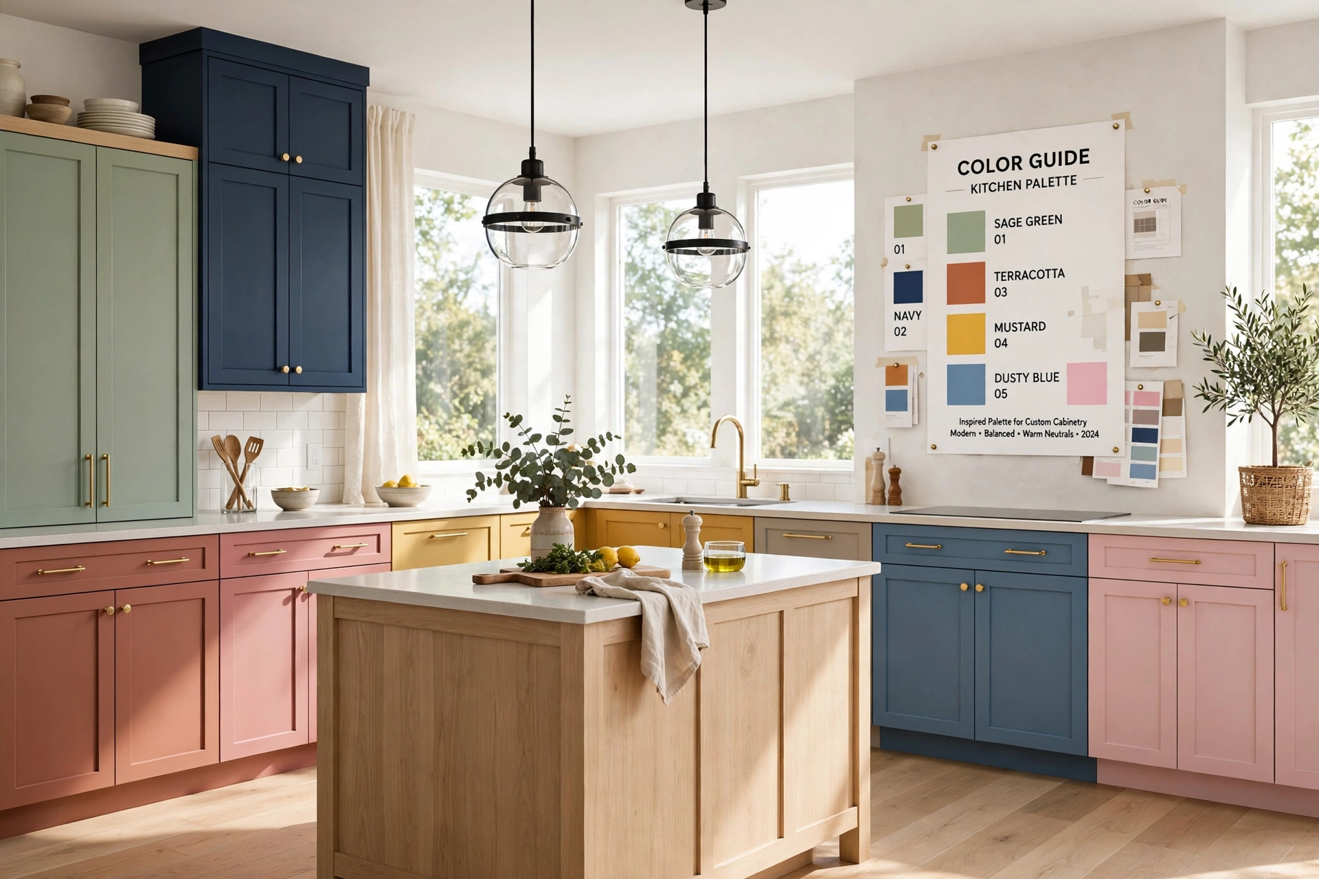
Kitchen cabinet color sets the tone for your entire kitchen. White cabinets brighten and enlarge, dark cabinets add drama and sophistication, and colored cabinets (navy, sage, forest green) inject personality. The right choice depends on your kitchen’s natural light, size, countertop color, and how long you plan to live with it — repainting cabinets is a major project, so choose carefully.
White Kitchen Cabinets: The Timeless Choice
White remains the most popular cabinet color for good reason. It reflects light (making kitchens feel larger and brighter), matches any countertop or backsplash, and never goes out of style. But not all whites are equal.
Best White Paint Colors for Cabinets
- Benjamin Moore White Dove (OC-17): Warm white, soft and inviting. The most popular cabinet white among designers. Doesn’t look stark or cold.
- Sherwin-Williams Alabaster (SW 7008): Slightly warmer than White Dove. Beautiful with brass hardware and warm wood tones.
- Benjamin Moore Chantilly Lace (OC-65): Crisp, clean, almost blue-white. Best for modern kitchens with lots of natural light. Can feel cold in dark kitchens.
- Sherwin-Williams Pure White (SW 7005): Neutral white, versatile. Good middle ground between warm and cool.
Keeping White Cabinets Clean
White shows everything — grease, fingerprints, food splatter. Choose a satin or semi-gloss finish for wipeability. Keep a microfiber cloth handy for quick touch-ups. The maintenance is real, but most white-cabinet owners say it’s worth it for the bright, clean look.
Yellowing: White cabinets can yellow over time from cooking grease, UV exposure, or low-quality paint. Prevent with good ventilation, quality paint (Benjamin Moore Advance or Sherwin-Williams Emerald Urethane), and regular cleaning.
Dark Kitchen Cabinets
Dark cabinets (navy, charcoal, black, forest green) create drama and sophistication. They work best in kitchens with good natural light and sufficient square footage — dark colors absorb light and can make small, dim kitchens feel cave-like.
Best Dark Cabinet Colors
- Navy: Hale Navy (BM) or Naval (SW). Timeless, pairs beautifully with brass hardware and white countertops. The most popular dark cabinet color.
- Forest Green: Evergreen Fog (SW) or Essex Green (BM). Earthy and sophisticated. Works with both modern and traditional kitchens.
- Charcoal/Black: Iron Ore (SW) or Black Beauty (BM). Dramatic and modern. Best with plenty of natural light and light countertops for contrast.
- Deep Teal: Less common but stunning. Adds personality while remaining sophisticated.
Making Dark Cabinets Work
Lighting is critical. Under-cabinet lighting prevents dark cabinets from creating a black hole effect. Ensure good overhead lighting too.
Contrast matters. Pair dark cabinets with light countertops and backsplash. All-dark kitchens (dark cabinets + dark counters) feel oppressive unless the space is large and well-lit.
Consider two-tone. Dark lower cabinets with white uppers gives you drama without overwhelming. This is the most popular way to incorporate dark cabinets.
Colored Cabinets: Beyond White and Dark
Sage Green
The “it” cabinet color. Muted sage (like Sherwin-Williams Clary Sage or Benjamin Moore Saybrook Sage) feels fresh and natural without being trendy. It pairs with white countertops, brass hardware, and warm wood tones. Sage is the safest “color” choice — distinctive but not polarizing.
Light Blue/Gray-Blue
Soft blues (like Benjamin Moore Boothbay Gray or Sherwin-Williams Misty) create a coastal, airy feel. Work well in kitchens with white countertops and chrome or nickel hardware.
Warm Neutrals (Greige, Taupe)
For those who find white too stark but dark too bold. Greige cabinets (like Sherwin-Williams Accessible Beige) feel warm and inviting. They hide dirt better than white and feel more interesting than plain beige.
What Color Cabinets for Resale Value?
If selling within 5 years, stick to white, light gray, or greige. These have the broadest appeal. Bold colors (bright red, orange, purple) can deter buyers. Navy and sage green are acceptable — they’re popular enough to not scare buyers but distinctive enough to stand out in listings.
Realtor consensus: White cabinets photograph best for listings and appeal to the widest buyer pool. If your cabinets are currently a bold color and you’re selling, repainting to white is one of the highest-ROI pre-sale improvements.
Painting Kitchen Cabinets: What You Need to Know
Best Paints for Cabinets
- Benjamin Moore Advance: Self-leveling, hard finish, the professional favorite. Requires 16-hour recoat time — slow but worth it.
- Sherwin-Williams Emerald Urethane Trim Enamel: Excellent durability, faster dry time than Advance. Great for DIY.
Don’t use wall paint on cabinets. Cabinet-specific enamels cure harder and resist chipping, moisture, and grease.
🛒 Shop This Look:
The Process (Simplified)
- Remove doors, drawers, and hardware. Label everything.
- Clean thoroughly with degreaser (TSP substitute). Kitchen cabinets have years of grease buildup.
- Sand lightly (220 grit) to scuff the surface. You don’t need to strip to bare wood.
- Prime with bonding primer (BIN Shellac or STIX).
- Apply 2–3 thin coats of cabinet enamel, sanding lightly between coats.
- Let cure for 7–14 days before heavy use. Paint feels dry in hours but takes weeks to fully harden.
Cost
DIY: $200–$400 in materials (paint, primer, sandpaper, brushes). Time: 3–5 days of work plus curing time.
Professional: $3,000–$10,000 depending on kitchen size and location. Worth it if you want a factory-smooth sprayed finish.
Choosing Hardware
Hardware is the jewelry of the kitchen. It can modernize traditional cabinets or warm up modern ones.
- Brass/gold: Warm, traditional, pairs with white, navy, and green cabinets. The most popular choice.
- Matte black: Modern, bold, pairs with white and light gray cabinets. Shows fingerprints less than polished finishes.
- Chrome/nickel: Classic, cool-toned, pairs with white and blue-gray cabinets.
- Sizing: Pulls should be roughly 1/3 the width of the drawer. Knobs: 1–1.5 inches diameter for doors.
Two-Tone Cabinet Combinations That Work
Two-tone kitchens — different colors for upper and lower cabinets, or a contrasting island — are the easiest way to use a bold color without committing the whole kitchen to it. The formula that works most reliably: light uppers, darker lowers. White or cream uppers keep the room feeling open at eye level, while navy, forest green, or charcoal lowers ground the space and hide the scuffs and splatters that daily life inflicts on base cabinets.
The contrasting island: If repainting every cabinet feels like too much, paint just the island. A white kitchen with a navy or black island reads as intentional and designer-approved, and it is a fraction of the work — one weekend instead of two weeks. This is also the safest way to test a bold color: if you tire of it, repainting one island is a manageable redo.
Combinations with proven track records: White uppers + navy lowers with brass hardware. Cream uppers + forest green lowers with black hardware. Light gray uppers + charcoal lowers with chrome. Warm white perimeter + walnut-stained island. The pattern is consistent — contrast between top and bottom, with the darker tone anchoring the room.
What to avoid in two-tone: Two bold colors fighting each other (navy + forest green with no neutral to mediate), and low-contrast pairings where the difference is so subtle it looks like a mistake rather than a choice. If you are going two-tone, make the contrast deliberate.
How Lighting Changes Your Cabinet Color
Cabinet color is not a fixed property — it shifts with the light in your kitchen, and this is where most color regrets come from. A white that looked warm and creamy in the store can read cold and blue under your kitchen’s existing bulbs. A gray that seemed sophisticated on the chip can turn lavender in north-facing light.
Test with large samples: Paint large sample boards (at least 12×12 inches, ideally 2×2 feet) and move them around the kitchen. Tape them to the cabinet doors they would replace. Observe them in morning light, midday light, and evening under your actual kitchen lighting. Live with the samples for at least three full days before deciding. A color chip is approximately one square inch of information about a 200-square-foot decision.
Direction matters: North-facing kitchens get cool, bluish light — warm whites and warm grays balance it. South-facing kitchens get warm, golden light — cooler whites and grays stay crisp instead of going yellow. East-facing kitchens are bright in the morning and dim in the afternoon; west-facing kitchens get harsh warm afternoon sun. If your kitchen faces north, avoid cool grays — they can read as icy and flat.
Your bulbs are part of the color: A 5000K daylight bulb and a 2700K warm bulb make the same cabinet paint look like two different colors. Decide your bulb temperature first (2700K–3000K is the standard recommendation for kitchens), then evaluate paint samples under those bulbs. Changing bulbs after painting is a $30 fix; repainting cabinets is a $300–$3,000 fix.
Matching Cabinets to Countertops and Backsplash
Cabinets do not exist in isolation. The three permanent surfaces — cabinets, countertops, backsplash — need to relate to each other, and the most reliable approach is to pick one star and two supporting players.
If your countertops are busy (dramatic marble veining, bold granite pattern), keep cabinets quiet: white, cream, or light gray. Busy + busy = visual chaos. The cabinet color should recede and let the stone be the feature.
If your countertops are quiet (white quartz, butcher block, honed black), you have room for cabinet personality: navy, sage, forest green, or warm wood tones all work. Quiet counters are a blank canvas — this is where colored cabinets shine.
Undertones must agree: This is the detail that separates professional-looking kitchens from almost-right ones. Whites have undertones — pink, yellow, blue, green. If your countertop is a cool white with blue undertones and your cabinets are a warm white with yellow undertones, they will clash even though both are “white.” Hold samples of each surface together in your kitchen’s light. They should feel like they belong to the same family.
🛒 Shop This Look:
The backsplash as bridge: When cabinets and countertops are already decided and slightly at odds, the backsplash can mediate. A backsplash tile that contains both tones — say, a handmade-look tile with white and soft gray variation — visually connects warm cabinets to cool counters. This is also why plain white subway tile remains popular: it is neutral enough to work with almost any combination.
Common Cabinet Color Mistakes to Avoid
Choosing from a screen: Digital color is unreliable. Phone screens shift hue, and brand websites render colors differently. Always get physical samples. This single habit prevents the majority of color disasters.
Following trends too literally: The “it” color of the year is designed to sell paint, not to live with for a decade. If you love this year’s trending color genuinely, use it. If you are choosing it because it is everywhere on social media, pick the version of it you would have liked three years ago — that is the one you will still like in three more.
Ignoring the rest of the house: Your kitchen should relate to adjacent rooms. If your living room is warm and traditional and your kitchen is stark modern gray, the transition feels jarring. Sightlines matter — stand in the next room and look into the kitchen. The colors should feel like they belong to the same home.
Forgetting the finish: Color gets the attention, but sheen determines how it wears. Flat and eggshell finishes on cabinets absorb grease, show fingerprints, and cannot be scrubbed. Satin or semi-gloss is non-negotiable for durability — and the sheen subtly deepens the color, so factor that into your sample testing.
Frequently Asked Questions
Are white kitchens going out of style?
No. White kitchens have been “going out of style” for a decade and remain the most popular choice. What’s changed: all-white everything (white cabinets + white counters + white backsplash) feels less fresh than white cabinets paired with contrasting elements. White cabinets with a colored island, warm wood accents, or bold backsplash is the current evolution.
Can I paint over my existing cabinets without sanding?
Technically yes with bonding primer, but light sanding dramatically improves adhesion. Skipping sanding is the #1 cause of peeling cabinet paint. The 2 hours of sanding saves you from redoing the entire job in a year.
What sheen for kitchen cabinets?
Satin or semi-gloss. Flat finishes absorb grease and can’t be wiped clean. High-gloss shows every imperfection. Satin is the sweet spot — wipeable without being shiny.
Should cabinets match the trim and ceiling color?
They do not need to match exactly, but they should harmonize. The standard approach: trim and ceiling in a true white (like Chantilly Lace or a basic ceiling white), cabinets in your chosen white or color. If your cabinets are colored (navy, green), white trim creates a crisp frame that makes the color look intentional. Avoid painting trim the same saturated color as cabinets — it overwhelms the room and eliminates the contrast that makes colored cabinets look sharp.
How often should kitchen cabinets be repainted?
A quality cabinet paint job (proper prep, bonding primer, cabinet-grade enamel) lasts 8–12 years in a typical household. High-traffic kitchens with heavy cooking may need touch-ups around handles and edges sooner — keep a small jar of the original paint for this. The areas that fail first are around the stove and sink (heat and moisture) and the edges of frequently grabbed doors. If paint is peeling within two years, the cause is almost always inadequate prep (skipped degreasing or sanding), not the color choice.
By Ella Knight
🛒 Shop This Look:
- Kitchen Ideas — our complete hub
- White Kitchen Cabinet Paint Colors
- Kitchen Countertop Decor




1 thought on “The Complete Kitchen Cabinet Color Guide (2026)”
Comments are closed.