
As an Amazon Associate, I earn from qualifying purchases. This means I may earn a commission if you purchase through links on this page — at no extra cost to you.
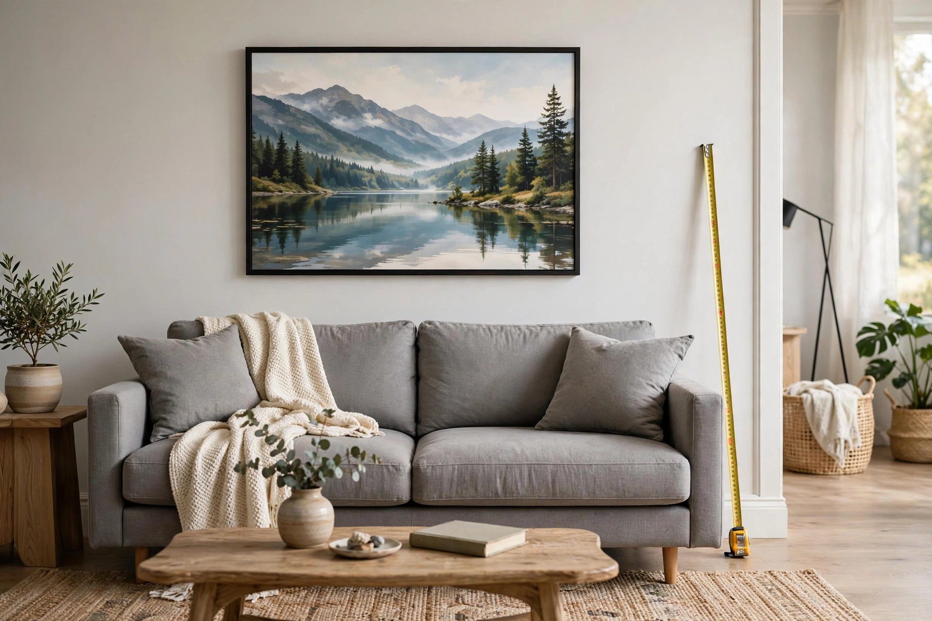
Wall art above a couch should be 60-75% as wide as the sofa. For a standard 84-inch sofa, that means art 50-63 inches wide, hung 6-8 inches above the sofa back. This proportion creates visual balance — too small looks lost, too large overwhelms the furniture.
Quick Size Chart
loveseat (48-60″): Art 29-45″ wide
Apartment sofa (72″): Art 43-54″ wide
Standard sofa (84″): Art 50-63″ wide
Large sectional (100″+): Art 60-75″ wide (or gallery wall)
Height Guidelines
Hang the center of the art 57-60 inches from the floor (museum standard). When hanging above a couch, the bottom of the frame should be 6-8 inches above the sofa back. This creates a visual connection between the furniture and art.
Single Piece vs Multiple
Single Large Piece
Best for: Minimalist looks, bold statements. Easiest to get right. One 48×36 canvas above an 84″ sofa is foolproof.
Diptych/Triptych
Best for: Visual interest without complexity. Two or three panels with 2-3 inches between them. Total width should still hit the 60-75% target.
Gallery Wall
Best for: Eclectic styles, personal photo displays. The overall arrangement (not individual frames) should span 60-75% of sofa width.
Common Mistakes
- Too small: An 11×14 print above an 84″ sofa looks like a postage stamp
- Too high: Art floating near the ceiling disconnects from the furniture
- Wrong shape: A tall narrow piece above a wide sofa creates awkward proportions — go wide, not tall
What If My Wall Is Much Wider Than My Sofa?
Center the art over the sofa, not the wall. The art relates to the furniture, not the room. If the wall feels empty on the sides, add sconces, small shelves, or plants — don’t stretch the art wider than the 75% guideline.
Choosing the Right Art for Above Your Sofa
Size and height get the geometry right, but the art itself determines whether the wall feels designed or merely decorated. Above the sofa is the most-viewed art position in most homes — it deserves the same thought you’d give the sofa itself.
Match the art’s energy to the room’s purpose
Living rooms are social spaces, so above-sofa art can be bolder and more conversational than bedroom art. Large abstracts, dramatic landscapes, and striking photography all work — this is the wall for the piece with presence. That said, “bold” doesn’t mean “loud”: a large, quiet abstract in tones that echo your rug and pillows often has more impact than something screaming for attention. The art should feel like it belongs to the room’s palette, not like it wandered in from another house.
🛒 Shop This Look:
Orientation matters as much as size
Sofas are wide and low, so above-sofa art should usually be horizontal or square — it echoes the furniture’s proportions. A tall, narrow piece above a wide sofa creates an awkward mushroom shape: wide base, skinny top. The exception is when you’re filling a tall wall: then a vertical piece can work if it’s flanked by sconces or smaller pieces that widen the overall composition. When choosing between two pieces you love, pick the one whose shape relates to the sofa, not the wall.
Color: echo, don’t match
The most common color mistake is matching the art exactly to the sofa or pillows — it looks staged. Instead, echo: if your sofa is navy, art with deep blue notes among other colors feels connected without being matchy. Pull one color from the art into a throw pillow or vice versa to create the relationship. And remember that art with some white or negative space gives the eye rest above a large piece of furniture — a wall of dense, dark art above a dark sofa can feel heavy.
Subject matter that works (and what to avoid)
Nature scenes, abstracts, architectural photography, and maps are safe, versatile choices that age well. Personal photography — travel shots, family moments — makes the wall meaningful and unique. Be cautious with: text art (quotes date quickly and guests read them once, then ignore them), anything visually chaotic at large scale (what’s charming in a small print can be exhausting at 48 inches wide), and pieces with strong directional energy that “points” out of the room. Above the sofa, the art is a backdrop to daily life — it should reward glances, not demand stares.
Hanging Above Sectionals, Loveseats, and Low-Profile Sofas
The 60–75% rule assumes a standard sofa. Other seating shapes need adjusted thinking.
Sectionals: follow the longest run
For an L-shaped sectional, size the art to the longest straight section, not the total footprint — the chaise or return leg usually sits lower and doesn’t need art above it. A sectional with a 100-inch main run wants art (or an arrangement) spanning 60–75 inches, centered on that run. Alternatively, treat the corner as the anchor: a gallery wall that wraps the corner, with the largest piece over the main seating section, handles sectionals beautifully and fills what would otherwise be dead wall space.
Loveseats and apartment sofas
Smaller sofas (48–72 inches) are where people most often hang art that’s too large — a piece sized for a standard sofa overwhelms a loveseat. Stick to the percentage: a 60-inch loveseat wants art 36–45 inches wide. A single 30×40 piece or a tidy pair of smaller frames usually beats one big canvas here. And with less wall to fill, a loveseat wall is a great candidate for flanking sconces or small shelves that add width without art mass.
Low-profile and armless sofas
Modern low-back sofas change the height math: with the sofa back at 28–32 inches instead of 36+, the 6–8 inch gap rule still applies, but the art’s center lands lower than the 57-inch standard — and that’s fine. The art relates to the furniture, not the floor. What matters is the visual connection: keep the gap tight and let the art sit lower than your instincts suggest. Floating art near the ceiling above a low sofa is the most common mistake with modern seating.
High-back and camelback sofas
Traditional high-back sofas (backs at 38–42 inches) push art higher, which can leave an awkward strip of empty wall below if the art is small. Compensate with larger art — the taller furniture can carry more visual weight above it. The 60–75% width rule still holds; just make sure the piece has enough height to bridge the gap between the tall back and the wall space above.
Beyond Frames: Creative Alternatives Above a Couch
Framed art is the default, but it’s not the only answer — and in some rooms, it’s not the best one.
Floating shelves with layered art
One or two picture ledges above the sofa let you layer frames, small objects, and books in a casual, changeable display. This is ideal for people who like to rotate art seasonally or who can’t commit to a single piece. The shelf itself should still follow the width rule (60–75% of the sofa), and layering works best with varied frame sizes leaned at slight angles — perfect alignment looks stiff on a ledge.
🛒 Shop This Look:
Mirrors
A large mirror above the sofa doubles light and the sense of space — transformative in small or dark living rooms. Size it like art (60–75% of sofa width) and hang it at the same height. The caveat: a mirror reflects whatever is opposite, so check the reflection before committing. A mirror reflecting a blank wall or a TV is a missed opportunity; one reflecting a window or a beautiful light fixture is magic.
Textile hangings and tapestries
A large textile above the sofa adds softness and texture that framed art can’t — and it absorbs sound, a real benefit in rooms with hard floors. Hang from a simple rod or wooden dowel with enough clearance that the bottom doesn’t brush the sofa back. Textiles are also the most forgiving option for renters: lightweight, single-point hanging, zero glass to worry about.
Sconces and lighting as decor
A pair of plug-in sconces flanking a smaller piece of art creates a composed, high-end vignette — the lighting becomes part of the display. This works especially well when the wall is wide and a single art piece would look lost: the sconces widen the composition without requiring more art. Battery-operated and plug-in options mean no electrician needed.
Gallery Walls Above the Sofa: Sizing the Whole Arrangement
Sometimes one piece isn’t the answer — a gallery wall above the sofa can be more personal and more interesting. But the sizing rules change when you’re composing with multiple frames.
Size the arrangement, not the frames. The 60–75% rule applies to the overall footprint of the grouping — the imaginary rectangle enclosing all the frames — not to any individual piece. A cluster of nine small frames spanning 55 inches above an 84-inch sofa follows the rule perfectly, even though each frame is small. Before hanging, tape out the full footprint on the wall with painter’s tape to check the scale.
Anchor with one larger piece. Gallery walls above sofas work best with a clear anchor — one frame noticeably larger than the rest, positioned at or near the center. Without an anchor, multi-piece arrangements above a long sofa tend to look scattered, like frames fleeing from each other. The anchor gives the eye a home base.
Keep the bottom edge consistent. The bottom of the arrangement should sit 6–8 inches above the sofa back, just like a single piece. In salon-style clusters this means the lowest frames define the line — don’t let one frame dip significantly lower than the rest, or it will look like it’s falling toward the sofa. A roughly level bottom edge keeps the composition grounded.
Mind the viewing distance. Sofa art is viewed from across the room and from the sofa itself — two very different distances. Choose art with enough scale and contrast to read from 10+ feet away; tiny, detailed pieces disappear at sofa-to-far-wall distance. If you love small pieces, group them tightly so the cluster reads as one bold shape from afar and rewards close inspection up close.
Leave room to grow. One advantage of a gallery wall over a single piece: you can start with five frames and add more over time. Plan the initial arrangement with expansion space — an asymmetric cluster with room to grow on one side looks intentional at every stage, while a “complete” grid that you later try to extend looks disrupted.
🛒 Shop This Look:



