
As an Amazon Associate, I earn from qualifying purchases. This means I may earn a commission if you purchase through links on this page — at no extra cost to you.
To choose wall art for your living room, start by measuring your wall space and identifying the focal wall, then select a size that spans 60-75% of your sofa width, choose colors that complement (not match) your existing palette, and pick a style that reflects how you use the room. Hang at 57 inches on center for perfect placement. Related: Choose Curtain Length for Living Room.
Step 1: Assess Your Space
Measure the wall where art will hang. Note the width of furniture below it. Identify the room’s color palette (walls, sofa, rug). Consider the room’s function — formal entertaining or casual family time?
Step 2: Determine the Right Size
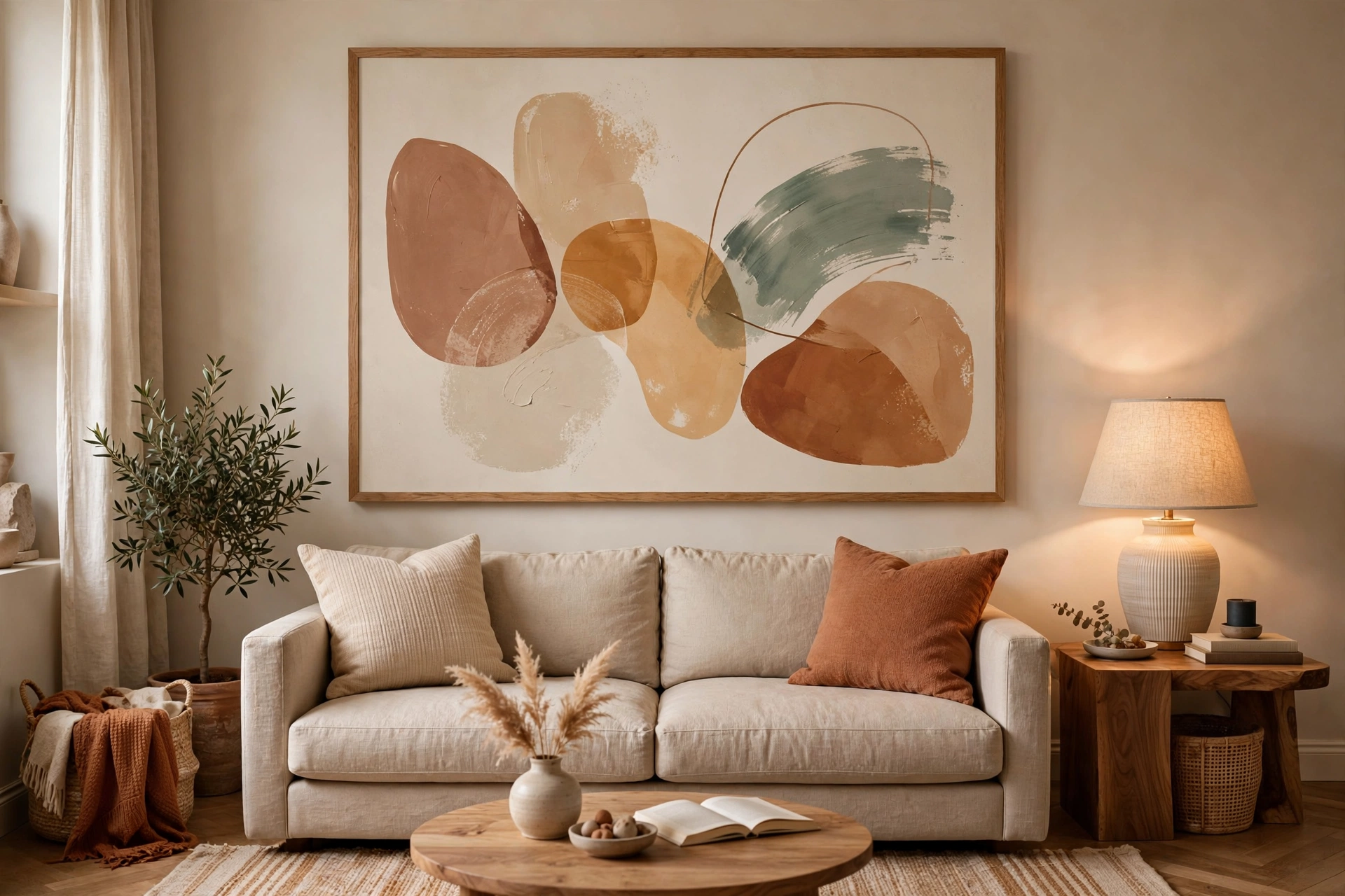
Above the sofa: 60-75% of sofa width. On a large empty wall: go big (at least 36×48) or plan a gallery wall. In our experience, most people choose art that’s too small — when in doubt, size up.
Step 3: Choose Your Color Approach
Complementary (Safe)
Pick art with colors already in your room. If you have blue pillows, art with blue tones ties together.
Contrasting (Bold)
Choose art that pops against your walls. Warm art on cool grey walls creates energy.
Neutral (Versatile)
Black and white, beige, or muted tones work with everything and won’t clash when you redecorate.
Step 4: Select a Style
- Modern: Abstracts, minimalism, bold color
- Traditional: Landscapes, classic reproductions, ornate frames
- Eclectic: Gallery walls, mixed styles, personal photos
- Coastal: Beach scenes, blues and whites, natural textures
- Boho: Textiles, macrame, earthy abstracts
Step 5: Hang It Right
Center at 57″ from floor. Leave 6-8″ above sofa. Use two hooks for wide pieces. Step back and check from the room’s entrance — that’s the view that matters most.
Gallery Walls vs Single Statement Pieces
The biggest display decision is whether your focal wall gets one large piece or a composed grouping, and the right answer depends on the wall, the room’s personality, and your art collection. Single statement pieces suit minimal, modern, and formal living rooms — one confident 36×48 (or larger) piece above the sofa creates a calm focal point and lets the art breathe. Statement pieces also suit renters and the commitment-averse: one nail hole, one decision, dramatic impact. The risk is picking wrong — a single piece you fall out of love with leaves a gaping hole in the room’s design, literally and figuratively.
Gallery walls suit eclectic, collected, and family-centered living rooms. They tell stories — travel photos beside art prints beside children’s drawings — and they forgive individual pieces you are unsure about, since no single item carries the wall. Gallery walls also solve the awkward-wall problem: huge blank walls, staircases, and walls broken by doors or windows all take groupings better than single pieces. The tradeoff is visual busyness; in an already pattern-heavy room, a gallery wall can tip into chaos where a single calm piece would have balanced things.
🛒 Shop This Look:
Planning a gallery wall well is what separates curated from cluttered. Lay the full arrangement on the floor first and photograph it from above — the photo reveals spacing and balance problems your eyes miss. Use paper templates taped to the wall to preview placement before drilling. Keep spacing consistent (2 to 3 inches between frames), align either the tops, centers, or bottoms of frames into an invisible grid, and anchor the composition with one largest piece. A unifying element — consistent frame color, a shared palette, or matching mats — is what makes mixed art read as intentional.
You can also combine approaches: a statement piece on the main focal wall and a small gallery on a secondary wall or hallway. This gives the living room both a calm anchor and a personality moment. Whatever you choose, commit fully — a timid single small frame on a huge wall and a sparse three-frame “gallery” are the two arrangements that satisfy nobody. Go bold in whichever direction you choose.
Lighting Your Wall Art Properly
Art that looks stunning by day can disappear by night without proper lighting, and bad lighting actively harms art over time. The goal is even, glare-free illumination that reveals the piece’s colors accurately. Picture lights — the small fixtures mounted on the wall or frame above the art — are the classic solution: they wash light down across the piece, create a gallery feel, and are available in plug-in and battery versions that need no electrician. Size the picture light to roughly half to two-thirds the art’s width for even coverage.
If you have track or recessed ceiling lighting, aim it at the art from about a 30-degree angle — steep enough to minimize glare on glass, shallow enough to light evenly top to bottom. Adjustable track heads are ideal because you can fine-tune each one. Avoid lighting art with standard downlights positioned directly above it; they create a hot spot at the top and leave the bottom in shadow. For gallery walls, one wide-beam light per three to four frames usually suffices — you are lighting the wall, not each piece individually.
Bulb choice matters enormously. Warm white (2700-3000K) flatters nearly all art and matches typical living room lighting; cooler daylight bulbs (5000K+) make warm-toned art look washed out and clinical. Check the Color Rendering Index (CRI) — 90+ renders colors accurately, while cheap low-CRI bulbs distort hues. Dimmers are worth adding: full brightness for entertaining, lower for cozy evenings, and dimmed light also reduces cumulative light damage to the art. LEDs are the right technology — they emit negligible UV and minimal heat compared to halogens, which can literally cook art and fade pigments over time.
Protect art from the wrong light too. Direct sunlight is art’s worst enemy — it fades pigments, yellows paper, and cracks canvas over years. Never hang valuable or beloved pieces where sun strikes them directly, even with UV-filtering glass (which slows fading but does not stop it). If a sunny wall is the only option, rotate the art seasonally or use UV window film. North-facing walls (in the northern hemisphere) get the most consistent, gentle light and are ideal for art display.
Common Sizing and Hanging Mistakes
The most universal mistake is art that is too small for its wall — a lonely 16×20 floating on a vast empty wall makes the room feel unfinished and the art look like an afterthought. The fix is the two-thirds rule (art spanning 60-75% of the furniture width below it) or, on empty walls, going substantially larger than feels comfortable in the store. When people say “I wish I’d gone bigger,” they are almost always right.
Hanging too high runs a close second. Art centered at 60+ inches reads as disconnected from the furniture below it, floating near the ceiling. The 57-inch center rule (center of the piece 57 inches from the floor) matches average eye level; above sofas, 6 to 8 inches above the sofa back keeps art conversationally connected to the seating. In rooms where everyone sits (home theaters, low modern living rooms), hanging slightly lower feels more natural. Always evaluate from the room’s entrance — the first view sets the impression.
Other frequent errors: the single tiny frame on a big wall (group it or scale up), competing focal points (art fighting with a busy gallery shelf or patterned curtains beside it — give art visual breathing room), ignoring the furniture’s width (art wider than the sofa below looks top-heavy and wrong), and crooked hanging (use a level; phone apps work fine, and for gallery walls, a laser level is worth borrowing). Also watch the “art versus TV” battle — art hung beside a large television gets visually swallowed; either commit the wall to the TV with art elsewhere, or flank the TV symmetrically with matching pieces that hold their own.
🛒 Shop This Look:
Finally, do not forget what is below the art. A console table, bench, or plant beneath wall art grounds the composition and fills the dead zone between furniture and frame. Art floating above empty floor looks stranded; the same art above a styled console looks deliberate. The vignette — art plus the surface below it — is the real design unit, not the frame alone.
Finding Great Art on Any Budget
Great living room art does not require a gallery budget — it requires knowing where to look and what to prioritize. Original art from local artists, student shows, and art fairs is the best value in the art world: one-of-a-kind pieces at a fraction of gallery prices, with the added pleasure of supporting working artists. Many cities have affordable-art fairs and open-studio events where you can buy directly and even commission custom sizes.
For reproductions, prioritize print quality over image fame. A well-printed open-edition giclee on archival paper in a good frame consistently looks better than a famous image printed cheaply. Online print shops, museum shops, and independent artists’ stores offer enormous selection; filter by your palette and size needs before falling in love with images. Vintage and antique shops are treasure troves for original oil paintings and etchings at modest prices — older art in good condition often costs less than new mass-produced prints and brings patina no new piece can match.
Photography is the sleeper budget category. Your own travel photos, printed large at a quality lab and framed simply, make deeply personal statement pieces — and large-format printing is far cheaper than most people assume. Black-and-white conversions unify disparate photos into a cohesive series instantly. Children’s art, properly matted and framed, belongs in living rooms too — a large white mat and simple black frame transform a child’s drawing into something genuinely gallery-worthy.
Wherever you buy, spend proportionally more on framing than feels natural. Framing is the multiplier: a $30 print in a $100 frame looks like a $300 piece, while a $300 print in a $15 frame looks like a $30 piece. Standard sizes keep framing affordable — buy art in standard dimensions (16×20, 18×24, 24×36) and frame off-the-shelf. Custom framing is for art you will keep for decades; for everything else, standard sizes and quality ready-made frames are the smart money.
Art Selection for Different Living Room Styles
Matching art style to room style is less about rules than about fluency — the art should speak the room’s visual language. Modern and minimalist living rooms want abstracts, bold color fields, black-and-white photography, and minimal or no frames — float frames or gallery-wrapped canvas suit the aesthetic. One large piece beats many small ones; negative space is part of the design. Avoid ornate frames and fussy traditional subjects, which fight the room’s clean lines.
Traditional living rooms welcome landscapes, classic reproductions, portraits, and botanical prints in substantial frames — wood, gold, or gilt profiles with real presence. Symmetry flatters traditional rooms: pairs flanking a mantel or window, grids of matching frames. The art can be formal, but it should feel collected rather than decorated — a mix of periods and subjects unified by quality framing reads as heritage, not theme.
Eclectic and bohemian rooms are where rule-breaking thrives: gallery walls mixing art styles, textiles and macrame alongside framed prints, vintage finds beside contemporary pieces. The unifier here is usually color palette or frame consistency — without one anchor, eclectic tips into chaotic. Global textiles (kilims, mudcloth, tapestries) make spectacular large-scale art in boho rooms and add the texture these layered spaces crave.
Coastal rooms want beach scenes, abstracts in blues and whites, natural textures like driftwood frames and woven wall hangings — but avoid the kitschy literal (no “beach” word art). Farmhouse rooms suit vintage botanical prints, landscape photography, architectural salvage signs, and simple black or natural wood frames. Scandinavian rooms need restraint: one or two quiet pieces, lots of white space, light wood frames, muted abstracts or line art. In every style, the test is the same — does the art feel like it belongs to the room, or like it wandered in from another house?
🛒 Shop This Look:
- Wall Decor Ideas – Gallery Walls, Art & Wallpaper
- 12 Best Large Wall Art Pieces Under $100
- The Complete Guide to Wall Art for Every Room (2026)



