
As an Amazon Associate, I earn from qualifying purchases. This means I may earn a commission if you purchase through links on this page — at no extra cost to you.
A quote on the wall works when the words earn their space. Most quote printables fail for the opposite reason: too many words, too many fonts, too little quiet around them, so the wall reads as noise instead of meaning. Minimalist quote art is not about having less to say. It is about saying one thing clearly, in type that stays out of the way, with enough empty space that the words can actually be read and felt.
What Makes a Quote Minimalist
Three things, and all three must be true at once. Few words — one short sentence, a fragment, or a single word, not a paragraph. One idea — the quote points in one direction instead of hedging across three. Room around it — generous margins, a quiet background, nothing competing at the edges. Remove any one of the three and the piece stops being minimalist: a long quote in a plain font is still a wall of text, and a short quote crammed into a busy frame is still clutter.
Test a quote before printing it. Read it aloud once. If you stumble, shorten it. If it could belong to anyone, it does not belong on your wall — pick words tied to a specific memory, person, or value in your home. A quote that means something to the household outlasts a fashionable slogan by years, because nobody gets tired of reading their own meaning.
Choosing the Words
Short beats clever. A line of six to ten words fits a frame, reads at a glance, and survives daily repetition. Longer lines demand small type, and small type on a wall is decoration nobody reads. If a quote you love is long, use its strongest clause instead of the whole passage — the fragment carries the meaning and fits the wall.
Match the words to the room. A desk wall earns a line about work, focus, or beginning. A bedroom wall earns something quieter — rest, patience, home. A hallway earns a greeting or a direction. Words that fit the room’s job feel inevitable; words that fight the room feel like a poster from somewhere else. Avoid quotes chosen only because they are popular. A wall full of other people’s favorite lines is a catalog, not a home.
Typography: The Real Design
In minimalist quote art, the typeface is the design. There is no illustration to hide behind, so every typographic choice shows. Serif type reads traditional and calm; clean sans-serif reads modern and direct; script reads personal and soft but turns unreadable fast at small sizes or in long lines. Pick one typeface per piece, and one per wall — mixing three fonts on one wall is the fastest way to make minimalism look accidental.
Weight and spacing matter more than decoration. A medium weight with generous letter spacing reads calm and confident; a thin weight looks elegant on screen and disappears on a wall in daylight. Line breaks are a design decision: break the line where the thought naturally pauses, not where the frame forces it, and keep the break consistent if you hang a pair. Center the text with equal margins on all sides, or align left with a strong margin — either works, but a piece that is almost centered and almost aligned looks like a mistake.
🛒 Shop This Look:
Color and Paper
Minimalist color is restraint, not absence. Black ink on warm white paper suits most rooms. Soft charcoal on cream suits bedrooms and reading corners. One accent color — drawn from the rug, the bedding, or a chair — can tie a quote print to the room, but two accents start an argument the quote cannot win. Keep the background quiet: textured white, cream, or pale gray, never a pattern behind words.
Paper choice shows in a way screen previews hide. Matte paper keeps words readable from every angle; glossy paper throws glare from windows and lamps and makes the text unreadable half the day. Choose a paper weight that lies flat in the frame without buckling — light paper ripples with humidity changes, especially in kitchens and bathrooms. If you print at home, run a test print at full size and check it in daylight before committing to the final sheet.
Printing for a Wall, Not a Screen
Print larger than you think you need. A quote print that looks generous on a laptop screen looks timid on a wall, because walls are bigger and viewing distance is longer. For a single statement piece above furniture, aim for a print that spans roughly two-thirds of the furniture width below it. For a desk piece, smaller is fine — it is read from a chair, not from a doorway.
Check the print in the room’s light before framing. Daylight from a window, warm lamplight at night, and overhead light each change how ink and paper read. A print that looks crisp under a desk lamp can look gray in daylight, and a warm paper tone can turn yellow under warm bulbs. Print one test, tape it to the wall for a day, and look at it morning and evening. The test costs one sheet and saves a framed disappointment.
Frames and Mats
The frame should disappear and the mat should breathe. Thin black, natural wood, or white frames suit minimalist quotes because they add nothing to argue with. A wide mat — wider than feels necessary — gives short text presence and keeps the eye from reading the paper edge. The mat color should match the paper or sit one quiet step away from it; a bright mat turns a minimalist print into a craft project.
Glass or no glass depends on the room. Glass protects the print and adds a finished surface, but it adds glare in bright rooms. In a bright room, hang the print where it avoids direct window reflection, or choose non-reflective glass for a statement piece. In a low-light hallway or bedroom, standard glass is fine. Whatever you choose, keep the frame consistent across a wall — one finish, one mat style — so multiple quotes read as a set instead of a collection of purchases.
Placement: Desk, Statement, and Gallery
A single quote above a desk works at eye level from the chair, not from the doorway. Sit down, look at the wall, and hang the print where your eyes naturally rest — usually lower than people expect. A single statement quote in a living room or hallway works larger, centered on the wall or above furniture, with empty wall around it. The empty wall is part of the piece; fill it and the statement collapses.
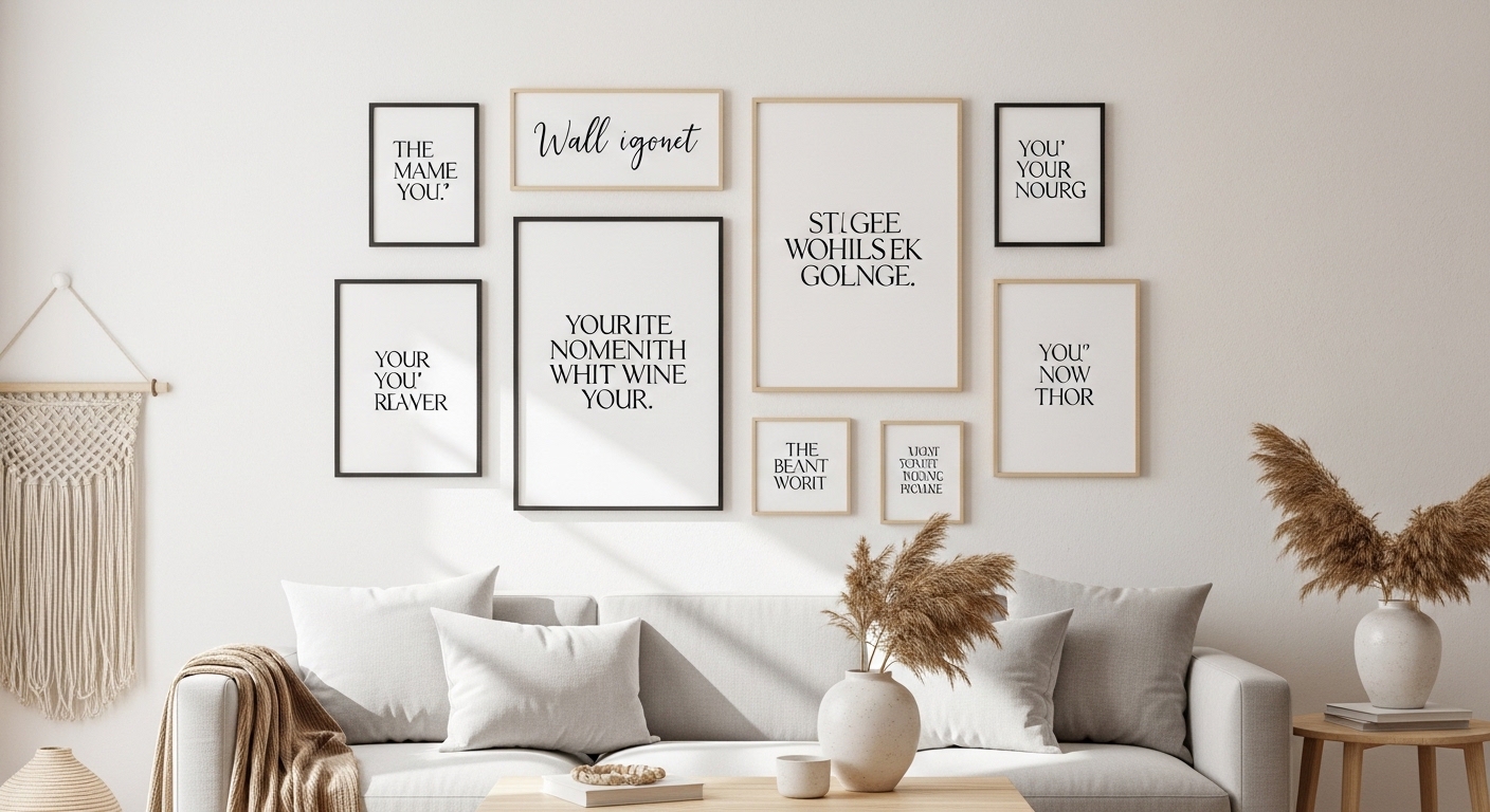
A gallery of quotes follows one rule: coordinate, don’t accumulate. Same frame finish, same mat style, consistent gaps of two to three inches, and a shared palette — then variety in the words is welcome. Mix short quotes with one-word pieces, but keep the typefaces to one or two across the whole group. When choosing between monochrome and color for a gallery, the room decides: a calm room with one accent color can carry a color print, while a busy room needs monochrome to stay calm. The monochrome versus vibrant printables guide walks through that room-first decision in detail.
🛒 Shop This Look:
A quote in a shared room belongs to everyone who uses the room, not just the person who hung it. A line that inspires one household member and irritates another will not survive long, no matter how well it is framed. Before hanging a quote in a kitchen, living room, or shared office, read it to the people who live with it. If someone winces, the quote is wrong for that wall even if it is right for you — move it to a private room where it belongs to one person.
Shared spaces reward neutral ground: words about home, welcome, patience, or beginning, rather than slogans about hustle, discipline, or personal struggle. A shared wall is not the place for a line that only makes sense to one person’s career or hobby. Keep the shared quotes short and generous, and save the specific, personal lines for bedrooms and desks, where they speak to one reader.
Children’s shared spaces follow the same rule with an extra filter: words a child will read daily shape what feels normal. Choose lines that are kind and true rather than demanding — encouragement over instruction, curiosity over achievement. A child’s room earns quotes that grow with the child, not lines that set a bar the child must clear. And in any shared space, agree a simple rule before hanging: anyone in the household can ask for a quote to come down, no argument needed. Walls that everyone can live with stay up longer than walls one person defends.
Mistakes That Break the Calm
Too many words is the first mistake, and it is the most common. A paragraph on the wall is a poster, not minimalist art, and nobody reads it after the first week. Cut the quote to its strongest clause. The second mistake is font mixing — a script word inside a sans-serif sentence, a bold word for emphasis that reads as shouting. One typeface, one weight family, and let the words do the emphasis.
The third mistake is scale: tiny print on a large wall, or an enormous print in a small room. Both make the wall feel unresolved. Size the print to the wall and the viewing distance, not to the paper size you happen to have. The fourth mistake is hanging quotes everywhere. One wall with quotes is a statement; every wall with quotes is a theme park. Choose the rooms where words belong and leave the rest of the house to art, texture, and empty wall.
Keeping It Personal
A quote wall should change as the household changes. Rotate one piece with the seasons, replace a line that no longer fits, add a new line for a new chapter. Rotation keeps the wall alive and stops quotes from becoming wallpaper the eye ignores. Keep retired prints in a folder rather than discarding them — a line that meant something once may mean something again.
Finally, protect the quiet around the words. Do not crowd a quote print with shelves, plants, and ornaments competing for the same wall. A quote needs empty space the way a sentence needs pauses. Give it that space, and a few honest words will do more for a room than a wall full of decoration. For the room around the words, explore more wall decor ideas for inspiration.
🛒 Shop This Look: