
As an Amazon Associate, I earn from qualifying purchases. This means I may earn a commission if you purchase through links on this page — at no extra cost to you.
Your home deserves better than builder-basic. Whether you’re doing a full refresh or just want a few new ideas, these 22 how to choose paint colors that flow between rooms offer something for every style and budget.
Related: How Lighting Changes the Way Paint Colors Look Related: How To Mix Wallpaper And Paint In One Room Related: Designer-Approved Paint Colors That Transform Small Rooms
Explore our complete guide to paint colors and wallpaper ideas for more inspiration.
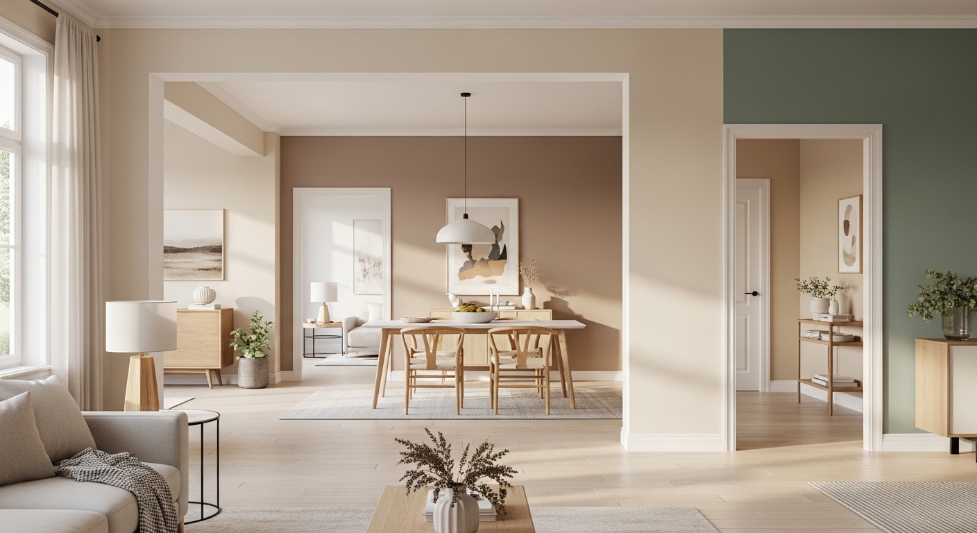
A well-planned color flow connects rooms naturally while highlighting each area’s personality. By considering undertones, complementary shades, and transitions, you can create a seamless visual journey. Subtle variation, consistent palettes, and mindful accent choices allow each room to feel distinct yet part of a unified whole.
Here are 22 tips and strategies for choosing paint colors that create a natural, flowing connection between rooms.
1. Start with a Neutral Base

Starting with a neutral base ensures continuity throughout your home. Shades like warm beige, soft gray, or creamy ivory create a calming foundation that blends seamlessly from room to room.
Use the neutral base on walls and trim to provide a versatile canvas for accent colors. This approach keeps transitions smooth, makes furniture and artwork pop, and allows small rooms to feel open, cohesive, and thoughtfully designed.
2. Consider Undertones Carefully

Undertones determine whether colors harmonize or clash between spaces. A beige with pink undertones may feel warm in one room but look off in another. Designers recommend evaluating paint samples in different lighting before committing.
Test colors in morning and evening light. Matching undertones ensures that each room flows naturally into the next, creating a subtle but sophisticated connection that feels seamless and intentional.
3. Use a Limited Color Palette

Limiting your palette to three to four colors keeps spaces cohesive and visually appealing. Too many contrasting colors can create a chaotic, disconnected feel.
Choose a dominant neutral, a complementary accent, and a secondary shade. Repeat these across rooms for consistency. This strategy ensures each space feels connected while still allowing for individual personality in bedrooms, kitchens, or living areas.
4. Gradate Colors Between Spaces

Using gradation helps rooms transition smoothly. Light to dark or cool to warm tones create a natural progression that feels elegant and intentional.
For example, a soft beige in the hallway can deepen into a richer taupe in the living room. Gradation maintains cohesion while subtly differentiating spaces, creating visual interest without disrupting the overall flow.
5. Highlight Key Architectural Features

Painting trim, molding, or doors in coordinating shades reinforces flow. Subtle contrasts emphasize architectural details while keeping walls harmonious.
Use a slightly darker or lighter shade than the main wall color. This adds depth and sophistication, helping rooms feel distinct yet connected. Architectural accents act as visual bridges between spaces, enhancing continuity.
6. Use Accent Walls Strategically

Accent walls can add personality without disrupting flow. Choose a complementary shade from your palette rather than a contrasting color to maintain continuity.
Apply accent walls in focal areas like behind a bed or sofa. This introduces subtle interest while keeping transitions smooth. Thoughtful placement ensures your accent walls feel intentional and stylish.
7. Carry Color Through Accessories

Repeating colors in furniture, textiles, and decor reinforces flow. Even if rooms have slightly different wall shades, tying in accessories maintains harmony.
Use cushions, rugs, or wall art to echo the main color scheme. This creates a cohesive, curated aesthetic, making the home feel thoughtfully designed and visually continuous.
8. Stick to a Cohesive Finish

The finish of paint can impact flow. Glossy, matte, and eggshell finishes reflect light differently and can make the same color look inconsistent.
For continuity, select similar finishes across connected rooms. Matte or satin finishes generally provide soft, unified aesthetics. Consistent finish ensures colors transition naturally, enhancing a polished, designer-approved look.
🛒 Shop This Look:
9. Use Transitional Hues in Small Spaces

In narrow spaces, choosing a transitional hue helps connect two rooms. A shade that’s slightly warmer or cooler than adjoining rooms creates a visual bridge without jarring contrast.
This strategy allows compact areas to feel spacious and cohesive. It’s perfect for hallways, landings, or small connecting rooms, ensuring smooth movement between distinct spaces while preserving style.
10. Consider Natural Light
Light dramatically changes how colors appear. North-facing rooms may need warmer tones, while south-facing spaces can handle cooler shades. Assess how natural light affects color flow between rooms.
Place samples on multiple walls at different times of day. Adjust undertones to ensure consistent transitions, making all rooms feel bright, welcoming, and harmoniously connected.
11. Repeat a Signature Color

Choosing a signature color and repeating it subtly throughout your home creates instant cohesion. It can appear on one wall, a door, or even in accessories, tying spaces together visually.
This technique ensures that, even if rooms have different primary colors, the eye perceives a continuous flow. Soft, muted tones work best for subtle repetition, making spaces feel connected, stylish, and intentionally designed without being overpowering.
12. Use Complementary Colors

Complementary colors are opposite on the color wheel but balance each other beautifully when used thoughtfully. Pairing muted complements creates harmony without monotony.
For example, a soft gray living room transitioning into a muted blue dining area keeps the spaces distinct yet visually connected. Complementary shades add depth and interest while maintaining a sophisticated, flowing design throughout your home.
13. Transition with Neutrals

Neutrals act as natural connectors between rooms. Using a neutral wall or trim in transition areas softens contrasts between bolder shades and ensures smooth color flow.
Hallways, staircases, and entryways are perfect for this approach. Neutral transitions provide continuity, reduce visual tension, and allow accent colors in adjacent rooms to shine without creating chaos.
14. Use Color Families

Choosing colors from the same family—warm tones, cool tones, or pastels—creates a subtle gradient across rooms. This maintains individuality in each space while ensuring visual unity.
For instance, a soft taupe hallway can lead into a creamy beige living room. Color families enhance flow, prevent visual clashes, and make the home feel thoughtfully coordinated and designer-approved.
🛒 Shop This Look:
15. Incorporate Patterns Carefully

Patterns can bridge two colors or rooms when used subtly. Soft stripes, geometric prints, or textured walls act as visual transitions without overwhelming the space.
Use one patterned wall as a focal point or corridor accent. By connecting the colors in the pattern to adjacent rooms, the flow feels natural and stylish, adding dimension and personality while maintaining cohesion.
16. Use Transitional Flooring

Floor color or finish also affects color flow. A consistent floor helps unify different wall colors, making transitions feel seamless.
Wood tones, tiles, or neutral carpets create continuity that ties contrasting wall colors together. This ensures rooms feel connected visually, even if walls differ, and enhances the overall sense of spaciousness.
17. Test Colors Together

Testing color samples in adjoining rooms is crucial. Colors may look different depending on lighting, furniture, and neighboring shades, affecting flow.
Paint large swatches and observe them throughout the day. This prevents clashes, ensures harmony, and allows you to adjust undertones, resulting in a smooth, visually connected, and cohesive interior.
18. Consider Ceiling Color

Ceilings influence how colors flow visually. Painting ceilings a consistent shade or complementary tone across rooms creates unity and adds height perception.
Even subtle differences can affect transitions. Coordinated ceilings help rooms feel connected while maintaining individuality, elegance, and a balanced visual flow.
19. Use Accent Decor for Transition

Repeating colors from adjacent rooms in decor items helps the eye perceive flow. Pillows, rugs, or artwork in shades from the next room create a smooth transition.
This technique links spaces without repainting walls and enhances a curated, designer-approved look. It’s subtle, flexible, and perfect for maintaining harmony between distinct rooms.
20. Maintain Consistent Undertones

Even if colors differ, consistent undertones create cohesion. Warm or cool undertones repeated across rooms prevent jarring transitions and make the palette feel intentional.
Check swatches under natural and artificial light to ensure they harmonize. This approach maintains elegance and continuity, ensuring every room feels part of a unified design story.
21. Use Color to Define Zones

In open-plan layouts, color helps delineate functional zones without interrupting flow. Subtle variations in shade indicate separate areas while keeping the palette connected.
For instance, a muted sage in the dining space paired with soft cream in the living area highlights zones visually. This technique enhances both continuity and clarity of purpose within rooms.
🛒 Shop This Look:
22. Trust Your Instincts

Finally, trust your intuition when selecting colors. While guidelines help, your personal style and comfort matter most. Harmonious flow comes from observing, adjusting, and ensuring colors feel right together.
Test, step back, and visualize your home as a whole. Your instincts, combined with design principles, ensure a seamless, balanced, and stylish color flow that connects every room beautifully.
Conclusion
Choosing paint colors that flow between rooms is essential for creating a cohesive, harmonious home. Designer-approved strategies like consistent undertones, complementary shades, and neutral transitions help small and large spaces feel connected, stylish, and inviting.
From subtle gradients and accent decor to consistent flooring and ceilings, these techniques make transitions seamless while highlighting each room’s individuality. Thoughtful planning ensures your home feels curated, airy, and visually expansive, with each space contributing to a unified, elegant design.
When done well, a well-flowing color palette transforms the home experience, making movement between rooms effortless, calming, and aesthetically beautiful.
FAQs
How do I make different colors feel connected between rooms?
Use consistent undertones, a limited palette, and transitional hues to create cohesion.
Can bold colors flow between rooms?
Yes, when paired with neutrals, accents, or complementary shades to maintain balance.
Do flooring and ceiling colors affect flow?
Absolutely. Consistent floors and complementary ceilings enhance visual continuity between spaces.
How many colors should I use in a home?
Limiting to 3–4 main colors across rooms maintains harmony while allowing variety.
Should I consider lighting when choosing flowing colors?
Yes, natural and artificial light can change how colors appear, impacting room-to-room transitions.
15 Essential Questions About Paint Colors That Flow Between Rooms
1. What’s the biggest mistake people make when selecting paint colors across multiple rooms?
Choosing colors without considering how they connect. Rooms painted in isolation feel disjointed and intentionally separate rather than cohesive.
Each color shift between rooms should feel intentional and planned—not like you ran out of paint and grabbed something random.
Great homes flow seamlessly from room to room. Poor color transitions feel like walking through disconnected apartments.
2. Should all rooms in my home have the same paint color?
Not necessarily. But they should coordinate intentionally. Identical color everywhere feels monotonous and impersonal.
Strategic variation with coordinated undertones creates visual interest while maintaining flow. This is designer approach.
Think of it like a color story: one main theme with subtle chapters in different rooms.
3. What’s the foundation for creating paint color flow between rooms?
Undertone consistency is everything. All colors should come from the same undertone family (warm, cool, or neutral).
Warm undertones throughout (cream, warm gray, warm beige, soft gold) create cohesion. Cool undertones throughout work equally well.
Mixing warm and cool undertones creates jarring transitions. Consistency in undertone family is the secret to flow.
4. How do I transition between different paint colors without it looking jarring?
Use the same undertone family but vary intensity. Soft cream in one room, warm beige in the next creates progression, not jarring change.
Gradual shifts feel intentional. A leap from pale cream to deep burgundy feels disconnected. Gradual darkening feels designed.
Think of a color journey through your home, not random color stops.
5. Should I use the same paint color in connected spaces like living room and kitchen?
In open-concept spaces, the same color creates seamless flow. This is usually best approach.
If using different colors, ensure undertones match perfectly. The shift should feel intentional, not accidental.
In separate rooms connected by doorways, slight color variation can work beautifully if coordinated.
6. What role does lighting play in paint color flow between rooms?
Different rooms have different lighting conditions. A color in a bright kitchen might look completely different in a dim hallway.
Test paint samples in each room’s actual lighting. Morning light, afternoon light, artificial light—all change color perception.
This is why colors can feel disconnected: different lighting makes the same color appear different in different spaces.
7. How do I create flow in open-concept spaces with multiple functional areas?
One continuous wall color creates ultimate flow. This unifies living, dining, and kitchen beautifully.
If using variations, keep undertones identical. Pale gray in living room, soft beige in dining—same warm family.
Minimal color transitions prevent visual chaos in open spaces. Simplicity creates sophistication.
8. Should trim color stay consistent throughout my home?
Yes. Consistent trim color throughout creates flow and continuity. This is designer essential.
White or cream trim coordinates with virtually any wall color. This consistency anchors the entire home.
Matching trim throughout prevents jarring visual transitions and creates professional, intentional appearance.
9. How do I choose a main color that works throughout my entire home?
Select a neutral that genuinely speaks to you. You’ll see it constantly—it should feel like home.
Test the color in multiple rooms under different lighting. If it works everywhere, it’s your foundation.
This main color becomes your home’s personality. Every other choice coordinates around it.
10. What’s the best approach to color flow between upstairs and downstairs?
Maintaining the same undertone family creates visual continuity. Upstairs and downstairs feel connected.
Slight color variations are fine—slightly warmer upstairs, slightly cooler downstairs—if undertones match.
Avoid completely different color stories. This makes homes feel disjointed and unplanned.
11. How do I create intentional color transitions between rooms?
Map your color journey before painting. Sketch out which rooms get which colors and why.
Ensure each transition feels purposeful. A shift should enhance the experience, not feel like a mistake.
Consider traffic flow. Where do people move between rooms? Transitions should feel natural at these points.
12. What undertones work best for creating flow throughout a home?
Warm undertones (cream, warm gray, warm beige, soft gold) create inviting, cohesive homes. Most popular choice.
Cool undertones (soft blue-gray, cool gray, cool white) create contemporary, sophisticated flow.
Either works beautifully—consistency matters more than warmth or coolness. Pick one direction and commit.
13. How do I coordinate paint colors with flooring and trim for maximum flow?
All three should come from the same undertone family. Warm flooring, warm walls, warm trim feels intentional.
Flooring typically stays consistent. Paint and trim coordinate with flooring’s undertones for visual cohesion.
When everything coordinates, rooms flow seamlessly despite color variation.
14. Can I use accent colors in certain rooms without disrupting flow?
Yes, if accent colors coordinate with your undertone family. A warm burgundy works with warm undertones.
Limit accent colors to one or two rooms maximum. Too many accent walls disrupt flow and create chaos.
Accent colors should feel intentional, not random. Ask yourself why this room deserves an accent color.
15. What mistakes do people make when trying to create paint color flow?
Ignoring undertones. Mixing warm and cool creates disconnect. Consistency in undertone family is foundational.
Testing paint in one room only. Colors shift dramatically between lighting conditions. Test everywhere before committing.
Overthinking. Simple coordination—same undertone family with subtle variations—creates beautiful flow. Complexity isn’t necessary.
Ready to create seamless paint color flow throughout your home? Discover more color coordination inspiration and professional design strategies on our homepage. Explore how to choose colors that connect rooms beautifully and intentionally. Visit homeisdecor.com and find comprehensive paint color flow ideas plus strategies for creating cohesive, beautifully coordinated homes where every room feels connected, intentional, and thoughtfully designed to work together harmoniously today.



