
As an Amazon Associate, I earn from qualifying purchases. This means I may earn a commission if you purchase through links on this page — at no extra cost to you.
By Ella Knight
Our free gallery wall layout planner includes six printable templates: 3×3 grid, salon style cluster, linear hallway row, staircase diagonal, above-sofa arrangement, and asymmetric grouping. Each template shows exact frame positions, recommended sizes, and spacing measurements. Download, cut out the shapes, tape to your wall, and hang with confidence — no measuring required. Related: Free Bedroom Layout Planner.
What’s Included
Template 1: Classic 3×3 Grid
Nine 8×10 frames with 2-inch spacing. Total dimensions: 28″ wide x 34″ tall. Best for: bedrooms, offices.
Template 2: Salon Style Cluster
Twelve mixed-size frames (5×7 to 16×20) in organic arrangement. Total: approximately 48″ x 60″. Best for: living rooms.
Template 3: Linear Hallway
Five 11×14 frames in a single row with 3-inch gaps. Total: 67″ wide. Best for: hallways, above consoles.
Template 4: Staircase Diagonal
Eight frames following a 30-degree angle. Includes height-from-step measurements. Best for: stairwells.
Template 5: Above-Sofa Arrangement
Seven frames (one 16×20 anchor + six smaller) spanning 60% of sofa width. Best for: living rooms.
Template 6: Asymmetric Grouping
Nine varied frames with intentional imbalance. Includes visual weight guide. Best for: eclectic spaces.
How to Use the Templates
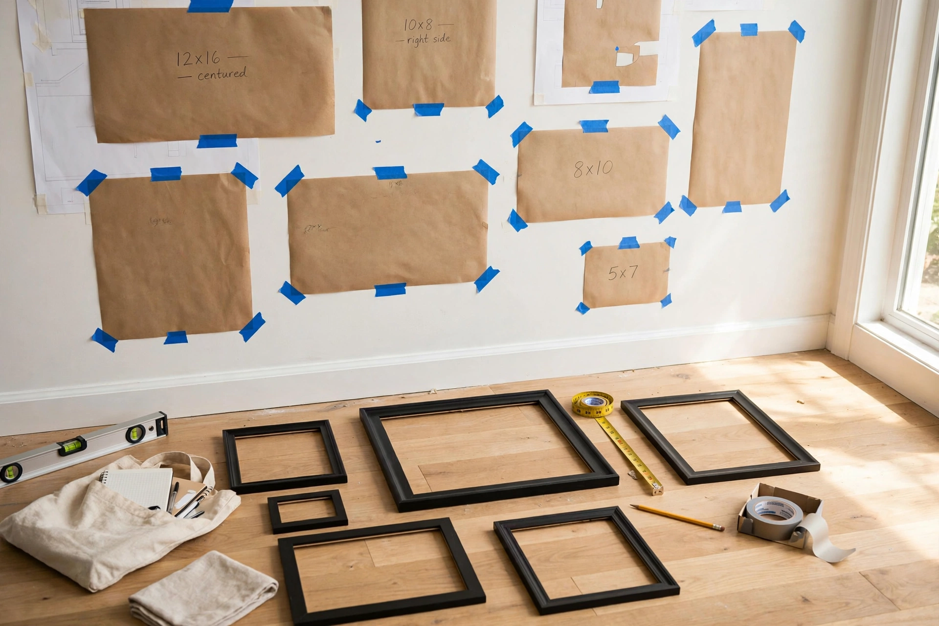
- Download and print at 100% scale (do not “fit to page”)
- Cut out each frame shape
- Arrange on the floor first to choose your layout
- Tape templates to wall with painter’s tape
- Mark nail positions through the template
- Hang frames, remove paper
Customizing for Your Space
Measure your wall width and multiply by 0.65 — that’s your target gallery width. Scale the template proportionally or eliminate/add pieces to fit.
Choosing Art That Hangs Well Together
Templates solve the geometry of a gallery wall, but the art itself determines whether the result looks curated or chaotic. Before you print a single template, make these decisions about what goes inside the frames.
🛒 Shop This Look:
Pick a unifying rule — then break it once
The most reliable formula: choose art that shares two of these three traits — color palette, subject matter, or style. All black-and-white photography in mixed frames works. All botanical prints in matching black frames works. What doesn’t work is nine unrelated pieces with nothing in common. The deliberate exception: one “wildcard” piece that’s completely different adds personality and keeps the wall from feeling like a catalog page. A single colorful abstract among muted landscapes, or one vintage find among modern prints, gives the eye somewhere to land.
Mix orientations and sizes intentionally
All same-size frames in a grid is foolproof but can feel stiff. All different sizes in a salon cluster is characterful but harder to balance. The sweet spot for most people: two or three sizes, mixed orientations (some portrait, some landscape), with one anchor piece about twice the size of the others. The anchor gives the arrangement a visual center of gravity — without it, mixed-size clusters tend to look scattered.
Don’t overlook your own photos
Personal photography is the most underused gallery wall art. A set of travel photos edited with the same filter, or family photos all converted to black and white, looks genuinely gallery-worthy — and nobody else has your version. Print them at a drugstore or online printer on matte paper; glossy prints show every reflection and fingerprint. The key is consistency: same editing treatment, same print finish, and frames that match or coordinate.
Where to find art beyond the obvious
Beyond printable downloads: old books with illustrated plates (botanical guides, atlases, and natural history books are goldmines — a single $2 thrift-store book yields a dozen framable prints), vintage sheet music, maps of meaningful places, children’s book illustrations, fabric remnants, and even beautiful wrapping paper. Frame stores’ “oops” bins sometimes hold deeply discounted mis-cut mats that fit standard frames. The constraint of a tight budget often produces more interesting walls than unlimited spending — scarcity forces curation. Related: Free DIY Project Planner.
Hanging Hardware and Tools: What You Actually Need
You don’t need a professional installer’s kit, but the right handful of tools turns gallery-wall hanging from a dreaded chore into a 30-minute job.
The essential kit
Tape measure: For marking the 57-inch center height and checking spacing. A 16-foot tape is plenty.
24-inch level: Non-negotiable for grids and linear arrangements. For salon clusters, a small torpedo level per frame is faster. Phone level apps work in a pinch but are slower and less accurate.
Hammer: A standard 16 oz claw hammer. For plaster walls, pre-drill pilot holes first — hammering nails directly into plaster cracks it.
Painter’s tape: For holding paper templates to the wall and marking positions without damage.
Picture-hanging hooks: The angled-nail hooks sold in hardware stores hold far more weight than a bare nail and leave smaller holes. Get an assortment pack covering 10–50 lbs.
Matching hardware to frame weight
Frames under 5 lbs: a single small nail or adhesive strip is fine. 5–20 lbs: use a proper picture hook rated for the weight, ideally into a stud for anything over 10 lbs. Over 20 lbs: two hooks spaced apart (which also prevents tilting), or a French cleat for the most secure hold. When in doubt, over-engineer — a frame that falls doesn’t just break the frame, it takes wall paint and neighboring frames with it.
The template method, refined
The templates in this planner do the heavy lifting, but two refinements help: first, mark the nail position on the template by measuring from the top of the frame to its hanging wire or hook — don’t eyeball it. Second, after taping all templates to the wall, photograph the arrangement and look at the photo rather than the wall. Photos reveal spacing imbalances your eyes miss in person. Adjust the paper, not the nails.
🛒 Shop This Look:
Troubleshooting Common Gallery Wall Problems
“My frames keep tilting”
Frames hung from a single nail pivot on that point — it’s physics, not your fault. Fix it with two nails spaced a few inches apart (the frame can’t rotate around two points), a small piece of museum putty behind each bottom corner, or adhesive bumper pads. For wire-hung frames, shorten the wire so it sits closer to the top of the frame — less wire means less swing.
“The spacing looks wrong but I can’t tell why”
Uneven spacing is almost always a measurement problem, not a taste problem. The fix: consistent gaps (2–3 inches everywhere) matter more than perfect alignment of frame edges. In salon-style arrangements, it’s fine if tops and bottoms don’t line up — but the gaps between neighbors should be uniform. Step back at least 10 feet to judge; spacing issues invisible up close scream from across the room.
“My wall is much bigger than my arrangement”
A gallery wall should fill roughly two-thirds of the available wall width. If yours looks lost, you have three options: add more pieces (the easiest), increase spacing slightly to expand the footprint (works up to a point), or add larger pieces — swapping two small frames for one big anchor piece changes the scale dramatically. Alternatively, shrink the “wall” visually by flanking the arrangement with sconces, a tall plant, or a floor lamp.
“I’m renting and can’t make holes”
Adhesive strips handle frames up to about 16 lbs each — enough for most gallery walls if you keep frames modest in size. For heavier anchor pieces, lean the large frame on the floor or a console and hang only the lighter pieces above it. Picture ledges (mounted with minimal hardware, or even heavy-duty adhesive brackets) let you create a gallery look with zero per-frame holes.
“It looked great on the floor but wrong on the wall”
Floor arrangements lie — you view them from above at an angle, while walls are viewed straight-on from a distance. Always do the paper-template step on the actual wall, and photograph it before committing. The most common floor-to-wall translation error: arrangements that looked balanced on the floor feel top-heavy on the wall. Fix by moving the largest piece slightly below center.
Adapting Templates for Unusual Walls
The six templates cover standard situations, but real homes have sloped ceilings, windows, doors, and radiators interrupting perfectly good gallery walls. Here’s how to adapt.
Around windows and doors: Treat the opening as a hard boundary — the arrangement should sit entirely on one side of it, not straddle it awkwardly. If a window splits your wall, build two smaller arrangements (one on each side) rather than one stretched one. Flanking a window symmetrically with matching arrangements looks intentional and frames the view.
Sloped ceilings and attic walls: Follow the slope rather than fighting it. Arrange frames so the top edge of the grouping roughly parallels the ceiling line, stepping down as the ceiling drops. Keep the bottom edge level — the eye forgives a stepped top much more easily than a slanted bottom. Measure your lowest clearance point first and plan the arrangement to fit under it.
Above radiators and heaters: Leave at least 6 inches of clearance above a radiator — heat rising directly behind frames can warp them and fade art over time. If the radiator dominates the wall, shift the arrangement’s center above it but keep the bottom frames clear of the heat zone. This is also a good argument for the paper-template step: tape templates up, run the heat for a day, and check whether rising warm air disturbs them.
Very narrow walls: On walls under 3 feet wide, skip multi-piece arrangements entirely — a single vertical piece or a linear column of two to three small frames suits the proportions. Trying to force a cluster onto a narrow wall makes both the wall and the art look wrong.
Combining templates: Large walls can host two templates side by side — a grid on one half, a salon cluster on the other — as long as they share a unifying element (same frame color, same mat, related art). Leave a clear gap of at least 12 inches between the two groupings so they read as intentional neighbors rather than one sprawling accident.
Download
[Printable PDF templates would be attached here — six pages, one per layout, with cutting guides and hanging instructions.]
🛒 Shop This Look:



