Soft design creates calm. Watercolor printable wall art brings that calm into your home with effortless elegance. The gentle blending of colors, fluid brush strokes, and airy compositions add movement without visual heaviness. It’s artistic, expressive, and refined all at once.
If your space feels too sharp or structured, watercolor prints can soften the mood instantly. They introduce color in a subtle way while keeping the overall look light and sophisticated. These ideas will help you add a delicate artistic touch without overwhelming your decor.
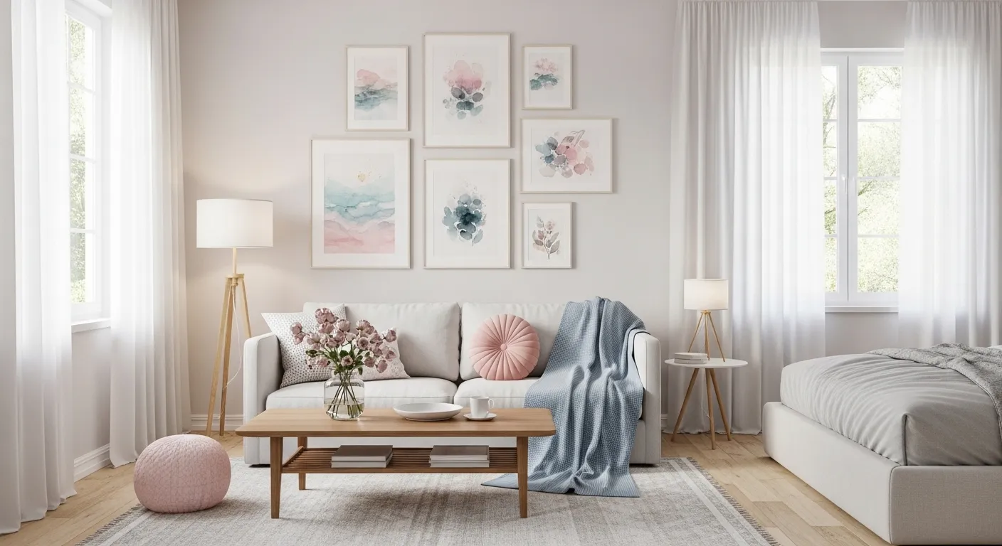
1. Soft Floral Watercolor Blooms
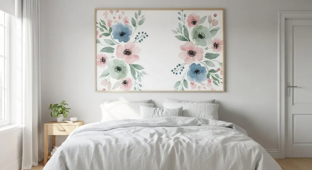
Watercolor floral prints bring a delicate and romantic feeling into any room. The soft blending of petals in muted pinks, gentle blues, and fresh greens creates movement without feeling overwhelming. Unlike bold botanical art, watercolor florals feel light and breathable, making them perfect for bedrooms or calm living spaces.
To style this look, choose simple white or light wood frames and allow generous spacing around the artwork. Pair with neutral bedding and soft textiles to enhance the airy effect. The key is restraint. Let the watercolor texture remain the quiet focal point of the wall.
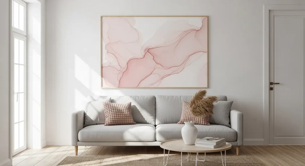
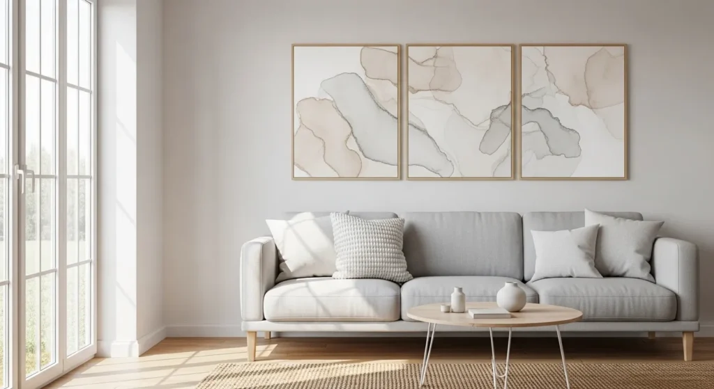
2. Abstract Pastel Wash Art
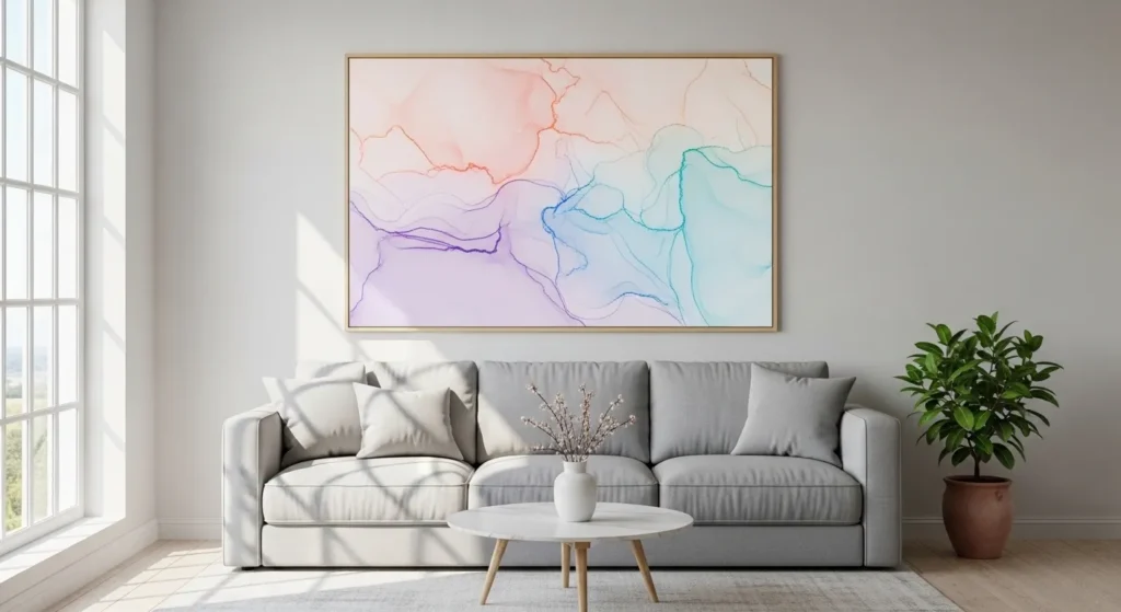
Abstract pastel wash prints offer softness without specific structure. The gentle blending of color feels organic and fluid, creating visual interest while maintaining calm. These designs work especially well in minimalist interiors that need subtle warmth and dimension.
Place one oversized piece above a sofa or console table to anchor the space. Keep surrounding decor simple and avoid heavy contrasts. The softness of pastel watercolor becomes more effective when it is not competing with bold furniture or strong patterns.
3. Watercolor Landscape Scenes

Watercolor landscapes create a peaceful escape within your home. Misty mountains, soft horizons, or gentle coastal scenes painted in faded blues and grays add depth without visual noise. The blurred edges give the artwork a dreamy, atmospheric quality.
This style works beautifully in living rooms and bedrooms where relaxation is important. Combine with textured fabrics like linen or cotton to enhance the organic feel. The softness of watercolor landscapes complements natural materials and warm lighting effortlessly.
4. Minimalist Watercolor Line Art

Minimalist line art combined with a soft watercolor background strikes a perfect balance between structure and fluidity. The light wash behind the line drawing adds depth while keeping the design understated and elegant.
Use thin frames and neutral walls to maintain the refined aesthetic. This approach works well in contemporary or Scandinavian-inspired spaces. It provides artistic character without overwhelming the room’s simplicity.
5. Soft Botanical Leaf Prints
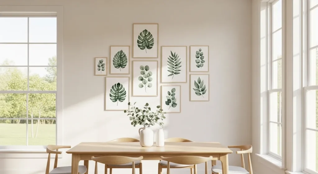
Botanical leaf prints in watercolor form feel fresh and calming. The soft green hues blend gently into white space, making the artwork feel airy and light. Unlike bold tropical prints, these designs offer a subtle connection to nature.
Hang two or three coordinating leaf prints side by side for balance. Maintain even spacing to keep the wall from feeling crowded. This style works especially well in dining areas or entryways where calm energy is welcome.
6. Blush and Beige Watercolor Abstract
Blush and beige watercolor prints introduce warmth without strong contrast. The flowing pigments blend gently, creating a soothing focal point that complements neutral interiors beautifully.
Pair this art with layered textiles and warm wood tones for cohesion. The subtle color variation adds visual depth while preserving a soft, inviting atmosphere. It’s ideal for spaces that need warmth rather than boldness.
7. Watercolor Ocean-Inspired Prints

Ocean-inspired watercolor art captures the serenity of water through fluid brush strokes and soft gradients. Gentle aqua tones fading into white create a calming visual flow.
Style this artwork in rooms where relaxation is key. Combine with light fabrics, woven textures, and soft lighting. The airy blend of color enhances the peaceful ambiance without overpowering the decor.
8. Soft Neutral Watercolor Text Prints
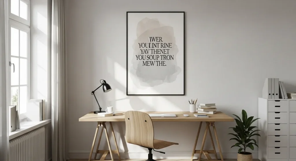
Watercolor text prints offer a refined alternative to bold typography. The gentle color wash behind the words keeps the message subtle and elegant rather than loud.
Place these prints in home offices or reading nooks for quiet motivation. Keep frames simple and spacing balanced. The soft background ensures the artwork enhances the room without demanding attention.
9. Watercolor Wildflower Collection
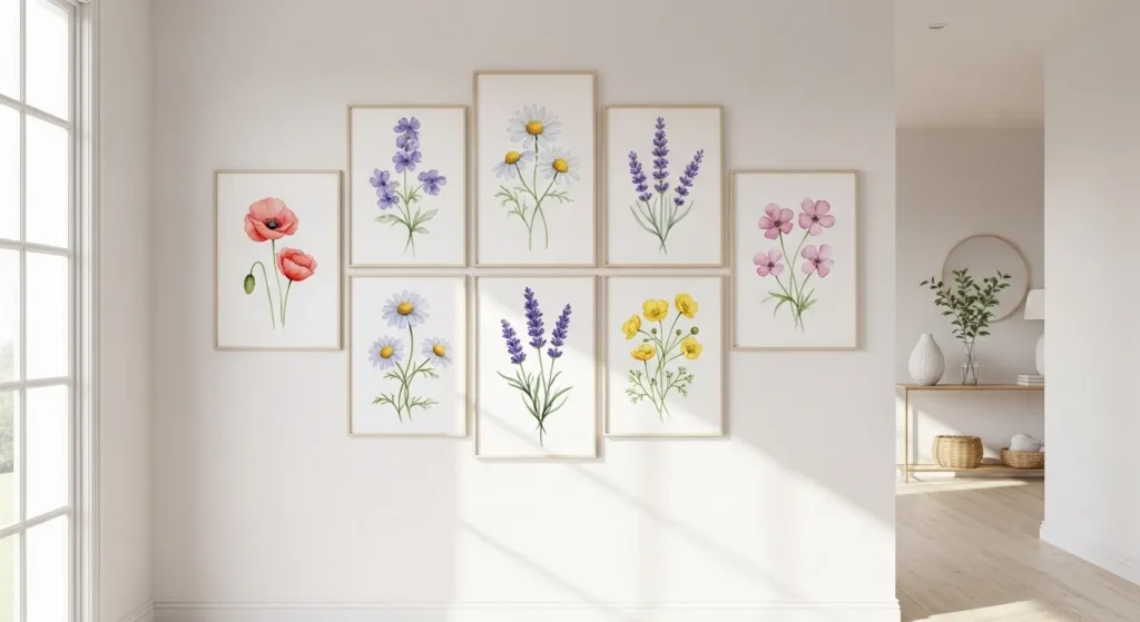
Wildflower watercolor prints feel delicate and slightly whimsical. The scattered petals and soft pastel tones add movement and charm without heaviness.
Arrange multiple prints in a straight line or grid for a clean presentation. Uniform framing keeps the display polished while the organic design adds personality and softness.
10. Monochrome Watercolor Art
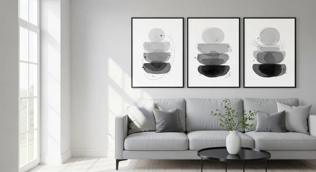
Monochrome watercolor art proves that softness doesn’t require multiple colors. Gentle gray washes layered with depth create a sophisticated and calming visual.
This style pairs well with modern interiors. The subtle tonal variation adds dimension without overwhelming neutral decor. It’s perfect for spaces that favor minimalism with artistic detail.
11. Lavender and Lilac Watercolor Dreams
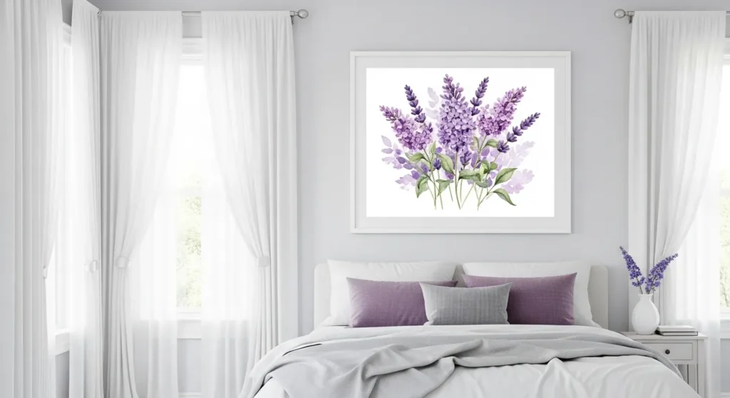
Lavender and lilac watercolor prints introduce a soothing yet slightly romantic atmosphere. The gentle blending of purple tones feels calming without appearing dull. These shades add personality while maintaining a soft, artistic presence that works beautifully in bedrooms or quiet sitting areas.
To style this look, keep surrounding decor neutral and light. White bedding, pale wood furniture, and soft textiles allow the watercolor gradients to stand out subtly. The key is balance. Let the cool purple hues add depth while preserving an airy overall feel.
12. Earthy Terracotta Watercolor Abstract

Terracotta watercolor art brings warmth and grounded energy into a space. The soft blending of clay tones with beige or muted rust creates a cozy yet artistic statement. It feels organic and refined at the same time.
Pair these prints with warm wood furniture and woven textures. This enhances the earthy palette and creates cohesion. The watercolor texture keeps the bold terracotta from feeling heavy, allowing warmth without overpowering the room.
13. Soft Blue Sky Watercolor Panels
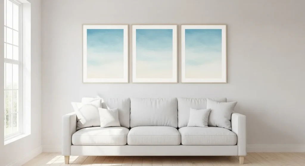
Soft blue watercolor panels mimic the calm of open skies. The light gradient washes create an expansive feeling, making smaller rooms feel more open and breathable. The gentle transitions between tones prevent visual harshness.
Install two or three coordinating panels side by side for symmetry. Maintain consistent spacing and simple frames to keep the look clean. This style works especially well in living rooms where calm and clarity are priorities.
14. Watercolor Feather Illustrations

Watercolor feather prints offer a subtle artistic detail that feels light and graceful. The soft pigment variations along each feather create texture while keeping the design airy and refined.
These prints pair well with natural textiles and layered bedding. Use light wood or white frames to maintain softness. The gentle detail of feathers adds character without introducing strong contrast or bold shapes.
15. Blended Coral and Peach Watercolor
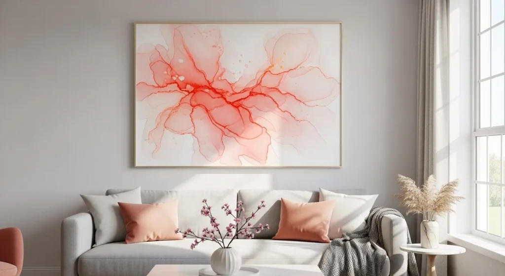
Coral and peach watercolor blends introduce warmth with a touch of vibrancy. The fluid transition between soft orange and pink tones adds movement while maintaining elegance.
Keep surrounding decor minimal to prevent color overload. Neutral sofas and subtle accessories help the artwork glow without competing elements. This palette works beautifully in spaces that need warmth but not intensity.
16. Soft Watercolor City Silhouettes
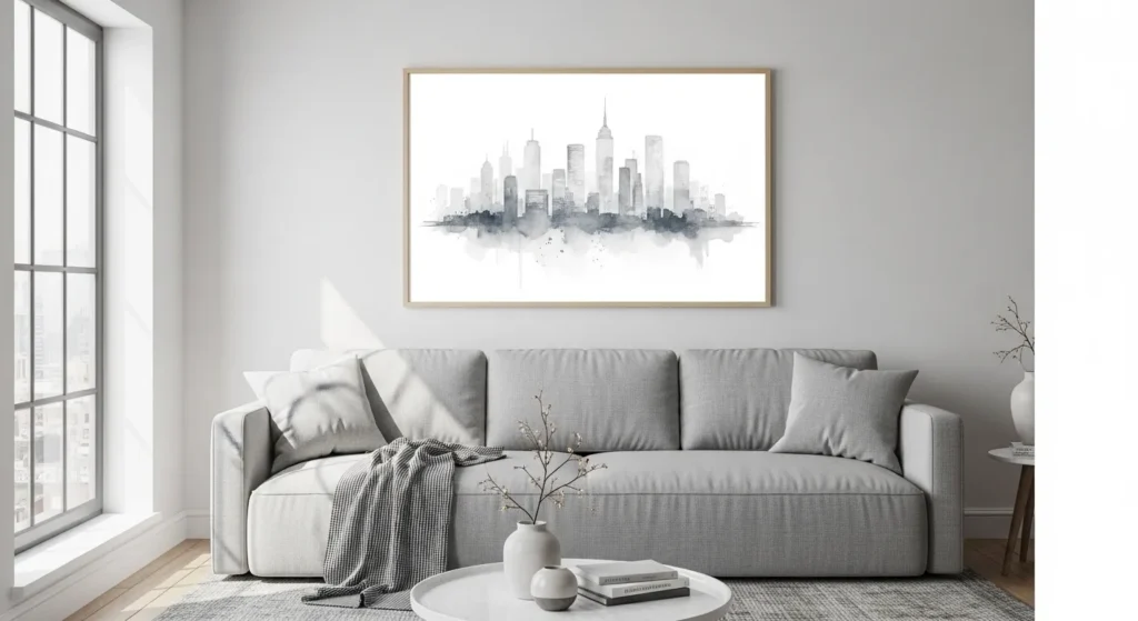
Watercolor city silhouettes combine structure with softness. The faint outlines of buildings layered over gentle pigment washes create a modern yet calming visual effect.
Hang one large skyline piece above a sofa or desk to establish focus. The muted tones keep the artwork refined, making it suitable for modern apartments or minimalist interiors.
17. Delicate Watercolor Butterfly Prints

Butterfly watercolor prints bring a sense of lightness and quiet beauty. The delicate wings painted in pastel tones feel expressive without becoming dramatic or loud.
Arrange multiple butterfly prints in a clean grid for a balanced display. Consistent framing keeps the presentation elegant while the soft colors add gentle charm to the room.
18. Neutral Watercolor Texture Panels
Neutral watercolor texture panels focus on subtle depth rather than bold color. Layered washes in beige and gray create visual interest while maintaining a calm aesthetic.
Use two or three aligned panels for structure. Keep spacing consistent and frames simple. This approach adds artistic sophistication to minimalist interiors without disturbing their clean and balanced design.
Conclusion
Watercolor printable wall art proves that impact doesn’t have to be bold to be beautiful. Soft gradients and flowing pigments create warmth, texture, and personality while maintaining a peaceful atmosphere.
Choose tones that complement your space and allow the artwork to breathe with proper spacing and simple framing. When styled intentionally, watercolor prints can transform any room into a serene and artistic retreat.