
As an Amazon Associate, I earn from qualifying purchases. This means I may earn a commission if you purchase through links on this page — at no extra cost to you.
Wallpaper can make a small room feel larger — or close it in like a box. The difference is not luck: it comes down to pattern direction, pattern scale, light behavior, and where the paper goes. The old approach of listing dozens of near-identical patterns hides the real decisions, so this guide groups patterns into families and explains what each one actually does in a small room, how to measure for it, and which mistakes shrink a space.
The Three Direction Rules
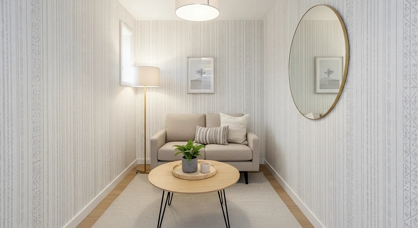
Direction is the first decision, and it beats pattern choice. Vertical patterns — stripes, vertical botanicals, tall motifs — pull the eye upward and make a room feel taller. They suit rooms with low ceilings and narrow rooms where height is the missing dimension. Horizontal patterns — horizontal stripes, wide bands — pull the eye sideways and make a room feel wider, which suits short, boxy rooms and narrow hallways that need width more than height.
Diagonal patterns add movement and energy: chevrons, diagonal leaves, diagonal stripes. They work as accents on one wall, but a whole room of diagonals feels restless, so confine them. The practical rule: pick the dimension the room lacks — height, width, or energy — and let direction serve it. A room that is both short and narrow benefits most from vertical patterns, since height is usually the harder dimension to fake.
Pattern Families, Grouped by What They Do
Stripes are the most predictable family. Vertical pinstripes and slim vertical stripes add height quietly; wide vertical stripes add height with more presence. Horizontal stripes widen, but wide horizontal bands can also lower a ceiling visually if they sit high on the wall, so keep them at or below eye level in low rooms. Stripes in soft, low-contrast tones expand better than high-contrast stripes, which chop the wall into bands.
Geometrics add structure: small-scale geometric tiles, subtle diamonds, and herringbone patterns give a wall texture without shouting. In small rooms, small-scale geometrics work better than large, bold ones, because large geometrics dominate a wall the eye cannot step back from. Keep geometric contrast soft — tone-on-tone or two close tones — so the pattern reads as texture rather than as a picture.
Florals and botanicals work when they are light and airy: small floral motifs, slim vertical leaves, watercolor-style botanicals with plenty of background showing. Dense, dark, large-scale florals close a small room in, because the eye reads them as a heavy curtain rather than a wall. If you love a bold floral, confine it to one wall and keep the other walls plain.
🛒 Shop This Look:
Scale and Repeat: The Numbers That Matter
Pattern scale decides whether a wall feels spacious or busy. Small-scale patterns — tiny dots, slim motifs, fine textures — recede and suit small rooms. Large-scale patterns demand viewing distance a small room does not offer, so they crowd the eye. The exception is a single large-scale accent wall in a room with one clear focal wall, where the pattern reads as art rather than as wallpaper.
Repeat size decides waste and cost. A large repeat means more paper is cut away matching the pattern from strip to strip, so ordering must account for it. A guide to calculating wallpaper covers measuring, pattern-repeat waste, and ordering without waste — read it before ordering, because guessing the quantity is how small-room projects end up short one roll or over-ordered by three. Always order a spare roll: dye lots vary, and a later batch can differ visibly from the first.
Light Colors and Light Behavior
Light grounds expand rooms because they reflect light instead of absorbing it. Pale, warm grounds — cream, soft white, pale sage, light gray — keep a small room bright, while dark grounds absorb light and shrink it. Soft contrast beats hard contrast: a pattern in two close tones reads as texture, while a pattern in black and white reads as a bold graphic that dominates a small wall.
Light direction changes everything. A pattern that looks airy in a bright room can look muddy in a dim one, so sample in the room’s actual light, including evening lamplight. A guide to how lighting changes paint colors covers the same light-direction effect for paint, and the lesson transfers directly: check any sample in morning, noon, and lamplight before committing. For rooms with genuinely low light, a guide to wallpaper patterns for low-light rooms covers which light grounds and soft contrasts hold up when light is scarce — the same principles apply, with even more emphasis on pale grounds and reflective finishes.
Texture, Sheen, and Reflective Accents
Texture adds depth without adding visual weight, which makes it ideal for small rooms. Light-colored textured wallpaper — grasscloth looks, fine linen textures, subtle embossing — gives a wall interest that flat paper lacks, and it hides minor wall imperfections that flat paper shows. Metallic and mirrored accents — thin metallic threads, subtle foil motifs, mirrored dots — bounce light around and can brighten a dim corner, but use them sparingly: a whole wall of metallic paper glares under direct light.
Sheen works like paint sheen. A slight sheen reflects light and brightens; a dead-matte finish absorbs it and quiets the wall. In a dim small room, a gentle sheen helps; in a bright room with a window opposite the papered wall, matte avoids glare. Check the sample where the light actually falls, not just under shop lights.
🛒 Shop This Look:
Where to Paper — and Where Not To
One papered wall is usually enough in a small room. The focal wall — behind a bed, behind a sofa, the wall you face on entering — carries the pattern, and the other walls stay painted in a tone pulled from the paper. Papering all four walls in a busy pattern closes a small room in; papering all four in a very light, subtle texture can work, but only when the pattern is quiet enough to read as texture.
Small rooms where wallpaper shines: powder rooms, entries, and the wall behind a bed, because these are spaces seen briefly or from one viewpoint, so a bolder pattern does not tire the eye. Combined living and dining spaces need extra restraint, since one pattern must serve two jobs; a guide to small living-room and dining-room combos covers how those rooms share walls and furniture. Rooms where restraint matters: small living rooms used all day, where a busy all-over pattern becomes tiring, and rooms with many doors and windows, where pattern matching around openings wastes paper and breaks the pattern’s rhythm.
Ceilings are a special case. Papering a ceiling can add height illusion in a tall room, but in a small room with a low ceiling it usually lowers the perceived height and complicates lighting. Skip ceiling paper in small rooms unless the ceiling is genuinely high and the pattern is very light.
Peel-and-Stick vs Pasted
Peel-and-stick suits renters and the uncertain: it removes cleanly, lets you test a pattern for a season, and forgives measuring mistakes since a strip can be repositioned. Its limits are real, though — it grips poorly on textured walls, it can fail in steamy rooms, and very large patterns are harder to align than pasted paper because the adhesive grabs immediately. Pasted paper suits permanent rooms and textured walls, holds better in humidity, and aligns more forgivingly while wet, but removal is a real job.
Whichever type you choose, preparation decides the result. Walls must be clean, smooth, and primed — paste and adhesive both fail on dusty or glossy unprimed surfaces. Fill and sand imperfections first, because wallpaper shows every bump the old paint hid, and small rooms show them from close up.
Measuring and Ordering Without Waste
Measure each wall’s width and height, subtract nothing for doors and windows at the ordering stage — offcuts around openings rarely match the next strip’s pattern — and account for the repeat before ordering. A large repeat can add a full roll or more to a small room’s order, which is why the calculation guide matters more than any pattern list. Order one spare roll beyond the calculation, and keep it: a future repair from a different dye lot can show as a visible patch.
🛒 Shop This Look:
Working With Slopes, Alcoves, and Awkward Walls
Small rooms rarely offer four clean walls. Sloped ceilings, alcoves, chimney breasts, and boxed-in pipes break up the surface, and each one changes how a pattern behaves. The rule is to center the pattern on the focal wall and let the awkward parts take the offcuts. Start hanging from the center of the main wall outward, so the fullest, best-matched part of the pattern sits where the eye lands, and the partial repeats fall at the edges and inside alcoves where they draw less attention.
On sloped ceilings, run the pattern vertically and let it die into the slope rather than trying to bend it around the angle — a horizontal pattern forced around a slope looks broken at the joint. In alcoves, either paper the back wall only, treating it as a framed panel, or paper the whole alcove in a quiet texture and keep the bold pattern for the main wall. Papering an alcove in the same bold pattern as the main wall usually makes the alcove look like a mistake rather than a feature.
Chimney breasts deserve their own decision. Papering the breast in the room’s main pattern while leaving the alcoves beside it painted creates a natural focal point and saves paper. Papering everything, breast and alcoves alike, flattens the architecture and wastes the pattern-matching effort on surfaces nobody looks at. Measure the breast separately, and remember that its narrow width often means a single strip with no side matching at all — one of the few places where a large repeat costs nothing extra.
Mistakes That Shrink a Small Room
The first mistake is a busy, small-scale pattern on all four walls — it reads as visual noise and makes the room feel smaller, not more interesting. The second is a dark, heavy pattern in a dim room, which absorbs the little light available. The third is ignoring light direction: a pattern chosen under shop lights that turns muddy at home. The fourth is mismatched repeats at seams, which the eye catches instantly in a small room where every seam is close.
The fifth is papering around too many obstacles. Rooms with many doors, windows, and built-ins break patterns constantly, wasting paper and producing a chopped look — in such rooms, paint is usually the better choice, and a guide to painting tricks that make small rooms look bigger covers the paint side of the same problem. The sixth is skipping sampling: a small sample taped to the wall for a day, seen in daylight and lamplight, prevents nearly every other mistake on this list.
Done right, wallpaper is one of the strongest tools for a small room: direction adds the missing dimension, light grounds keep it bright, texture adds depth without weight, and one well-chosen wall does more than four busy ones. Pick the dimension the room lacks, sample in real light, measure for the repeat, and the paper will expand the room instead of closing it in.