
As an Amazon Associate, I earn from qualifying purchases. This means I may earn a commission if you purchase through links on this page — at no extra cost to you.
By Ella Knight
A gallery wall glossary covering 25 essential terms: from “salon style” (floor-to-ceiling eclectic hanging) to “sight line” (eye-level viewing height), “visual weight” (how heavy a piece feels), “anchor piece” (the largest central frame), and “negative space” (intentional empty areas). Understanding these terms helps you plan, discuss, and execute gallery walls like a designer.
Layout Terms
Anchor Piece
The largest or most prominent frame in an arrangement. All other pieces are positioned relative to it.
Salon Style
A dense, floor-to-ceiling hanging style originating from Paris art salons. Mixed sizes, minimal spacing, maximalist feel.
Grid
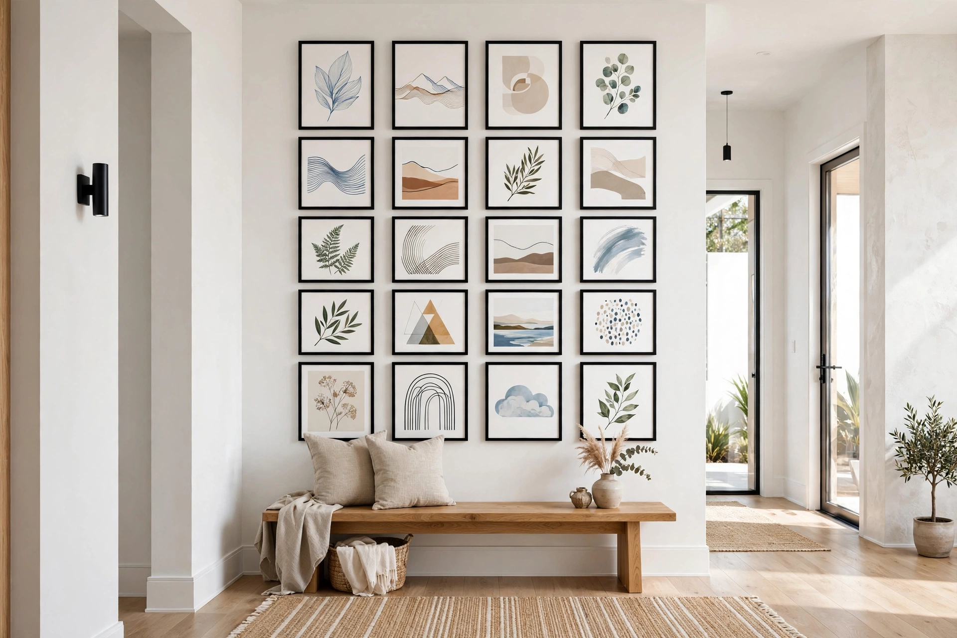
Identical frames in perfect rows and columns. The most structured gallery wall style.
Sight Line
The horizontal line at average eye level (57 inches from floor). Gallery centers should align with sight lines.
Visual Weight
How “heavy” a piece feels based on size, color darkness, and complexity. Dark, large, busy pieces feel heavier.
Negative Space
Intentional empty wall area around or within an arrangement. Essential for preventing cluttered looks.
Focal Point
The area that draws the eye first — usually the anchor piece or visual center.
Hanging Terms
French Cleat
A two-piece interlocking bracket system for heavy frames. Extremely secure.
Sawtooth Hanger
The zigzag metal bracket on frame backs. Simple but less adjustable than wire.
Monkey Hook
Curved wire hook that grips drywall from behind. Holds up to 50 lbs without a stud.
Toggle Bolt
Expanding anchor for heavy items in drywall. Requires drilling a larger hole.
Level
Tool ensuring horizontal alignment. Non-negotiable for grid-style walls.
Design Terms
Eclectic
Mixing styles, periods, and types intentionally for a collected look.
Cohesive
Elements that feel unified through shared colors, materials, or themes.
Mat (or Mount)
The cardboard border between art and frame. Creates breathing room and a professional look.
Float Frame
A frame where art appears to float with a gap between canvas and frame edge.
Gallery Wrap
Canvas stretched around thick stretcher bars, no frame needed. The image wraps around the sides.
🛒 Shop This Look:
Measurement Terms
Center Height
The standard 57 inches from floor to center of arrangement (museum standard).
Spacing (or Gapping)
Distance between frames, typically 2-3 inches for gallery walls.
Aspect Ratio
The proportional relationship between width and height (e.g., 4:5, 16:9).
Scale
How frame sizes relate to wall size and each other. Proper scale prevents pieces from looking lost or overwhelming.
Style Terms
Japandi
Japanese + Scandinavian fusion. Minimalist, natural materials, muted tones.
Maximalist
More-is-more philosophy. Bold colors, layered patterns, abundant objects.
Wabi-Sabi
Japanese aesthetic finding beauty in imperfection and asymmetry.
Curated
Thoughtfully selected and arranged, as opposed to randomly placed.
12 More Terms Worth Knowing
Diptych
A single artwork presented across two panels, designed to be hung together. The two halves relate — continuing an image, mirroring each other, or telling a before-and-after story. Hang with 2–3 inches between panels and treat the pair as one unit for sizing.
Triptych
The three-panel version of a diptych. Triptychs suit wide walls beautifully — the three vertical divisions add rhythm that a single wide canvas lacks. Keep gaps between panels consistent (2–4 inches) so the trio reads as intentional rather than accidental.
Giclée
Pronounced “zhee-KLAY” — a high-quality inkjet printing process using archival inks on fine art paper or canvas. When you buy art prints online, “giclée” signals better color accuracy and longevity than standard printing. Worth seeking out for pieces you plan to keep for years.
Archival (Acid-Free)
Materials manufactured to resist yellowing and deterioration over decades. Archival mats, backing boards, and papers matter for any art you want to preserve — standard cardboard backing contains acids that migrate into art and cause browning within years. For inexpensive prints you’ll rotate out, it doesn’t matter; for anything meaningful, specify archival.
Museum Glass
Anti-reflective, UV-protective glazing that virtually disappears — you see the art, not the glass. It costs significantly more than standard glass, so reserve it for valuable pieces or art hung opposite windows where reflections would ruin the view. For most gallery walls, standard glass or acrylic is fine.
Standoff Mounts
Metal hardware that holds acrylic, metal, or wood panels off the wall by about an inch, creating a floating shadow effect. Common for modern photography and metal prints. They require precise measurement — the mounts must align perfectly — but the result looks distinctly high-end.
Dry Mounting
A framing process that bonds a print flat to a rigid backing board using heat-activated adhesive. Eliminates waviness in large prints and posters. Irreversible, so never dry-mount anything valuable or irreplaceable — it’s for display prints, not collectibles.
Passe-Partout
The European term for the mat or mount board — the border between art and frame. You’ll encounter it when buying frames or art from European sources. Same concept as “mat”: it creates breathing room and a professional finish.
Gallery Depth
The thickness of a canvas’s stretcher bars — typically 0.75 inches (standard) or 1.5 inches (gallery depth). Deeper canvases look more substantial and modern unframed; the image wrapping around the deep edge becomes part of the presentation. When buying canvases, depth affects both the look and the hanging hardware needed.
Picture Rail
A molding strip mounted near the ceiling from which art hangs on wires or cords — common in older homes. It’s the original damage-free hanging system: you can rearrange art endlessly without touching the wall below. If your home has one, use it — it’s a feature, not a relic.
Composition
The arrangement of elements within a single artwork or across a whole gallery wall — how the eye moves through the piece. Good composition has a clear focal point, balanced visual weight, and intentional negative space. When a gallery wall feels “off” but you can’t say why, the problem is usually composition, not the individual pieces.
🛒 Shop This Look:
Provenance
A record of an artwork’s history — who made it, who owned it, where it’s been. Matters for valuable originals and collectibles; irrelevant for prints and decor art. If you ever buy original art at a price that makes you nervous, ask about provenance — legitimate sellers provide it.
Using These Terms to Plan Your Gallery Wall
Vocabulary is only useful if it changes what you do. Here’s how the glossary translates into a planning sequence.
Step 1 — Establish scale: Measure your wall and decide the arrangement’s overall footprint using the two-thirds rule (the arrangement should span roughly two-thirds of the available wall width). This is scale in action — the relationship between your frames and the wall.
Step 2 — Choose an anchor piece: Select your largest or most meaningful frame. Everything else gets positioned relative to this anchor, and it establishes the focal point — where eyes land first.
Step 3 — Set your sight line: Mark 57 inches from the floor — the center height standard. Your anchor’s center (or the arrangement’s visual center) goes here. This single measurement prevents the most common gallery wall error: hanging everything too high.
Step 4 — Balance visual weight: Distribute dark, large, and busy pieces around the arrangement so no quadrant feels heavier. A large dark frame on the left needs visual counterweight on the right — perhaps two medium frames or one piece with strong color. Squint at your layout: squinting reveals weight imbalances that details hide.
Step 5 — Lock in spacing: Commit to a consistent gapping — 2 to 3 inches between frames — and hold it everywhere. Consistent spacing is what makes mixed pieces read as one cohesive arrangement instead of a random collection.
Step 6 — Protect your negative space: Resist filling every inch. Negative space around and within the arrangement is what keeps a gallery wall from reading as clutter. If you’re unsure whether to add one more piece, don’t.
Quick Planning Checklist
Run through this before you hang anything:
- Wall measured; arrangement footprint planned at roughly two-thirds of wall width (scale)
- Anchor piece selected and positioned first
- Center height marked at 57 inches (sight line)
- Visual weight balanced across all four quadrants
- Consistent spacing (2–3 inches) between all frames
- Negative space preserved — no cramming
- Hanging hardware matched to each frame’s weight (French cleat for heavy, monkey hooks for medium, strips for light)
- Cohesion check: do the pieces share palette, frame style, or theme?
- Layout tested with paper templates and photographed before any holes are made
- Level on hand — non-negotiable for grids, strongly recommended for everything else
Terms for Buying Art and Frames
Once you start shopping for art rather than just hanging it, a second vocabulary appears — on listings, in frame shops, and in galleries. Here’s what the sellers mean.
Limited Edition
A print run capped at a specific number (e.g., “edition of 50”). Each print is numbered (7/50) and typically signed by the artist. Smaller editions generally cost more. The cap is the point — once the edition sells out, no more are made.
Open Edition
Prints produced in unlimited quantities with no numbering. More affordable and widely available — the right choice when you love the image and don’t care about collectibility.
Artist Proof
Extra prints pulled beyond the numbered edition, traditionally kept by the artist (marked “A.P.”). Occasionally sold; valued similarly to numbered prints. If you see one for sale, it’s legitimate — not a defect or a fake.
Custom Framing
Frames built to your art’s exact dimensions, as opposed to ready-made standard sizes. Necessary for odd-size or valuable pieces; significantly more expensive than off-the-shelf. For standard sizes, ready-made frames plus a custom-cut mat give you 90% of the custom look for a fraction of the price.
Float Mount
A framing style where the art sits on top of the backing board with a visible gap around its edges, rather than being covered by a mat. Common for textured papers, deckled edges, and anything where the paper’s edge is part of the appeal. The art appears to float within the frame.
Conservation Framing
Framing using all archival, reversible materials — acid-free mats and backing, UV-protective glazing, hinging instead of dry-mounting. The standard for anything valuable, sentimental, or irreplaceable. Worth specifying by name at the frame shop; standard framing is cheaper but can damage art over time.
Certificate of Authenticity
Documentation from the artist or gallery confirming a work’s origin and edition details. Expected with limited editions and originals; meaningless for open-edition decor prints. Keep it with the art — it matters for resale and insurance.
Chop Mark
An embossed seal pressed into fine art paper, usually identifying the papermaker or publisher. A sign of quality paper stock — you’ll feel it as a subtle raised mark, often in a corner. Not a flaw; don’t try to flatten it.
🛒 Shop This Look:



