
As an Amazon Associate, I earn from qualifying purchases. This means I may earn a commission if you purchase through links on this page — at no extra cost to you.
To mix wallpaper and paint in one room, use wallpaper on the focal wall and paint the remaining walls in a color pulled directly from the wallpaper — this guarantees harmony. The 60-30-10 rule helps: 60% dominant (usually the paint), 30% secondary (wallpaper), 10% accent. Done right, the combination adds depth that all-paint or all-paper rooms lack. Related: What Is an Accent Wall.
The Foolproof Method: Pull Colors From the Paper
Choose your wallpaper first, then take it to the paint store and match 2–3 colors from the print: the background color (safest for other walls), one mid-tone (for trim or an adjacent room), and one bold accent (for accessories). Paint chips held against the wallpaper in your room’s light remove all guesswork.
7 Combinations That Always Work
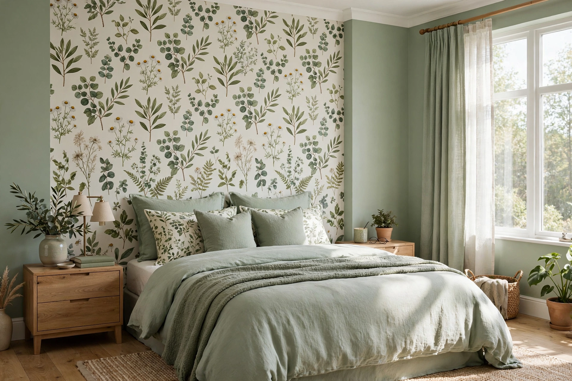
- Botanical wallpaper + warm white paint: The background color of the print, lightened 50%.
- Geometric wallpaper + charcoal paint: Pick up the darkest line in the pattern.
- Striped wallpaper + solid coordinating color: Use the stripe’s quieter tone on other walls.
- Textured grasscloth-look + soft greige: Texture + neutral = calm luxury.
- Dark mural + deep matching paint: Color-drench the room for a cocooning effect.
- Subtle damask + crisp white: Classic contrast that never dates.
- Chinoiserie panels + muted sage: Let the art be the star; paint recedes.
Where to Put Each
Wallpaper the focal wall: behind the bed, behind the sofa, the dining room’s main wall, or the powder room (all walls — small rooms can take it).
Paint the rest: remaining walls, ceiling (usually), and trim. Keep trim consistent throughout for cohesion.
Common Mistakes to Avoid
- Competing patterns: one pattern per room. If the wallpaper is busy, the paint must be quiet.
- Wrong white: wallpaper “white” backgrounds are rarely pure white — match, don’t assume.
- Ignoring the ceiling: a stark white ceiling can clash with creamy wallpaper; consider tinting it.
- Forgetting the fifth wall: in small rooms, continuing the paint color onto the ceiling unifies everything.
Testing Paint Colors Against Your Wallpaper
Choosing the paint color is where most wallpaper-and-paint combinations succeed or fail — and it’s the step people rush. A color that looks perfect on a tiny chip can turn muddy or clashy across a whole wall. Here’s how to get it right before you buy gallons.
Start with sample pots, not chips
Paint two large swatches — at least 2×2 feet each — on foam board or poster board, not directly on the wall. Hold the boards against your wallpaper at different times of day: morning light, afternoon light, and evening lamplight. Colors shift dramatically; a warm white that looks creamy at noon can read yellow under warm bulbs at night. Live with the boards taped up for at least two full days before deciding.
Pull from the wallpaper, then adjust
The background color of the wallpaper is your safest starting point, but don’t match it exactly — a wall painted the precise background tone can look flat next to the paper. Instead, go one or two shades lighter or darker on the same paint strip. This creates subtle depth while guaranteeing the undertones match, because undertones (the pink, yellow, or gray hiding inside a “neutral”) are what cause clashes. If the wallpaper background is warm cream, your paint must be warm too — a cool gray-white next to it will look dingy by comparison. Related: Living Room Has No Focal Point? 6 Ways to Create One.
The 50% formula for bold wallpapers
When the wallpaper is dramatic — dark botanical, deep mural, saturated color — the standard move is painting the other walls a tint of the wallpaper’s background at 50% strength (most paint stores will mix any color at half strength). This gives you a color that harmonizes perfectly but recedes, letting the wallpaper be the star. The result feels intentional rather than like you ran out of wallpaper.
Don’t forget the ceiling in your test
Hold your paint sample against the ceiling too. A stark bright-white ceiling next to creamy wallpapered walls creates a visible “lid” effect that cheapens the whole room. If your walls are going warm white or greige, have the ceiling tinted to 25–50% of the wall color. It reads as white but eliminates the clash.
🛒 Shop This Look:
Room-by-Room Combination Ideas
Different rooms ask different things of a wallpaper-and-paint pairing. Here’s what works where — and why.
Bedroom: calm behind the bed
Wallpaper the wall behind the headboard and paint the rest in the wallpaper’s quietest tone. Bedrooms want restfulness, so avoid high-contrast pairings here; tone-on-tone is the move. A subtle grasscloth-look paper with warm greige walls feels luxurious without stimulating. Keep the ceiling soft white or tinted to match — bright white overhead kills the cocoon effect.
Dining room: permission to be dramatic
Dining rooms are used mostly in the evening, when lamplight flatters rich color. This is the room for a dark mural or bold botanical on the main wall with deep, matching paint (color-drenching) on the rest. The low light hides the boldness and the room feels intimate and special. Metallic accents in the wallpaper catch candlelight beautifully.
Powder room: go all in
Small powder rooms can take wallpaper on all walls — it’s the one room where more pattern is better, since guests experience it for two minutes and it reads as jewel-box intentional. If you still want paint in the mix, paper above a chair rail and paint below, or vice versa. The chair rail gives you a clean dividing line and protects the lower wall from splashes.
Home office: focus-friendly pairing
Paper the wall behind your desk (it’s your video-call backdrop) and keep the remaining walls a calm, light neutral. Avoid busy patterns in your direct line of sight — a subtle texture or small-scale print behind you looks professional on camera while the plain walls keep the room from feeling distracting during work hours. This is also the room where peel-and-stick shines, since you can change it when you change jobs or tastes.
Living room: anchor the seating wall
Wallpaper the wall behind the sofa and paint the rest in a pulled neutral. In open-plan spaces, this trick defines the living zone without any physical divider — the wallpapered wall becomes the room’s anchor. Keep the pattern scale in proportion to the wall: large walls can take large-scale prints; a big bold pattern on a small wall section looks cramped.
Trim, Ceilings, and Doors: The Details That Tie It Together
People obsess over the wallpaper-versus-paint decision and then default the trim to bright white without thinking. But trim, ceilings, and doors are large surfaces too — and they can make or break the combination.
Three trim strategies
Match the paint: Painting trim the same color as the walls (in a higher sheen — satin or semi-gloss against matte walls) creates a seamless, modern look that makes rooms feel larger. This is the safest choice and the current designer default.
Pull from the wallpaper: Painting trim a color drawn from the wallpaper — the background tone, or a quiet mid-tone from the print — ties everything together and looks custom. This works especially well with bold wallpapers where white trim would create too much contrast.
🛒 Shop This Look:
Go bold: Dark trim (charcoal, deep green, black) against light walls with wallpaper creates a tailored, high-contrast look. It’s dramatic and not for every room, but in a dining room or study it can be stunning. Commit fully — half-measures with trim color look like mistakes.
Ceilings deserve a decision
The ceiling is the fifth wall and it’s always visible. Beyond tinting to match warm walls, consider painting the ceiling the same color as the walls in small rooms (it erases the boundary and makes the room feel larger), or carrying a bold wallpaper onto the ceiling in a powder room for full drama. At minimum, never let the ceiling be an afterthought — a clashing white ceiling can undo an otherwise perfect combination.
Don’t forget the doors
Interior doors painted the trim color disappear; painted the wall color they blend; painted a bold accent they become features. In a wallpaper-and-paint room, doors in the trim color keep things calm, while a door in a deep tone pulled from the wallpaper can be a gorgeous surprise — especially on a pantry or powder room door.
Paint Finishes for Wallpapered Rooms
Once you’ve chosen the color, the finish (sheen) is the next decision — and it affects both the look and the durability of your paint-and-wallpaper combination.
Matte or flat: The best choice for most walls paired with wallpaper. It hides imperfections, doesn’t compete with the wallpaper’s texture or sheen, and gives a soft, modern backdrop. The trade-off is washability — matte marks more easily, so reserve it for low-traffic rooms like bedrooms and dining rooms.
Eggshell: The versatile middle ground. Slightly more durable and wipeable than matte, with just a whisper of sheen. A good default for living rooms, hallways, and home offices paired with wallpaper.
Satin: Best for high-traffic or high-moisture areas — kitchens, bathrooms, kids’ rooms, and entryways. It wipes clean easily and stands up to scrubbing. Use it when the painted walls need to work hard.
Semi-gloss and gloss: Reserve these for trim, doors, and cabinetry — never large wall areas next to wallpaper. Large glossy walls create harsh reflections and visually fight with the paper. But glossy trim against matte walls and wallpaper looks crisp and intentional; the sheen contrast actually makes each surface look better.
One more rule: keep the sheen consistent across all painted walls in the room. Mixing matte on one wall and eggshell on another creates subtle but visible differences in how light plays across the surfaces — exactly the kind of detail that makes a combination feel “off” without anyone knowing why.
🛒 Shop This Look:




1 thought on “How to Mix Wallpaper and Paint in One Room”
Comments are closed.