
As an Amazon Associate, I earn from qualifying purchases. This means I may earn a commission if you purchase through links on this page — at no extra cost to you.
Light gray and greige (gray + beige) are the two most popular neutral paint colors, and they create noticeably different moods. Gray feels crisp, modern, and cool. Greige feels warm, inviting, and versatile. Choosing wrong means living with undertones that fight your furniture and lighting. Here’s how to decide.
The Fundamental Difference
Light gray has cool undertones (blue, green, or purple). It feels clean, contemporary, and slightly formal. It pairs well with white trim, chrome, glass, and modern furniture.
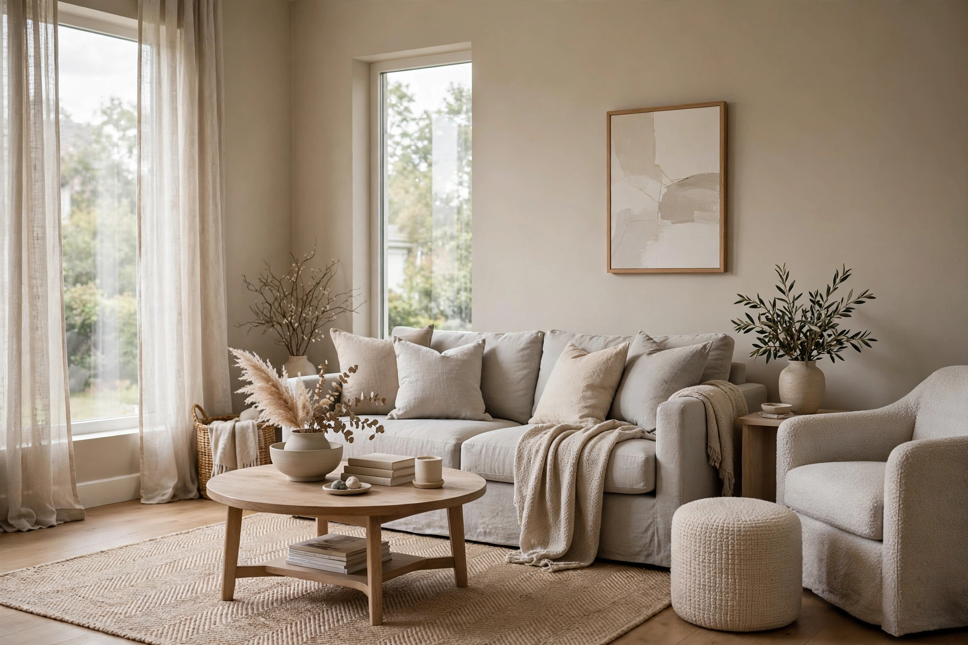
Greige blends gray with beige, adding warmth. It feels cozy, timeless, and adaptable. It works with both warm wood tones and cool metals, making it the more forgiving choice.
When Light Gray Wins
Modern/contemporary homes with clean lines, minimal decor, and cool-toned finishes.
Rooms with warm fixed elements — if your floors are warm oak, a cool gray wall creates beautiful contrast.
South or west-facing rooms where warm sunlight balances the cool undertones.
Top light gray picks: Repose Gray (SW 7015), Passive (SW 7064), Gray Owl (BM 2137-60).
When Greige Wins
Transitional and traditional homes where warmth matters.
Open floor plans — greige flows better between rooms with different lighting.
North-facing or low-light rooms where cool gray would feel cold and dreary.
Homes with mixed wood tones — greige bridges warm and cool elements.
Top greige picks: Agreeable Gray (SW 7029), Edgecomb Gray (BM HC-173), Accessible Beige (SW 7036).
The Undertone Test
Compare your top gray and greige contenders side by side against a pure white. The gray will reveal its cool undertone (blue/green/purple). The greige will show warmth (beige/yellow/pink). Then hold each near your largest furniture piece or flooring — the right one will feel harmonious, the wrong one will feel “off” even if you can’t articulate why.
What About Resale?
Both are safe for resale, but greige currently has a slight edge with buyers because it photographs warmer and feels more inviting in listing photos. That said, a well-executed light gray in a modern home appeals strongly to younger buyers.
Can You Mix Them?
Yes, but carefully. Use greige in main living areas and light gray in bedrooms or bathrooms — but ensure they share a similar depth (LRV within 10 points) and don’t clash in undertones. When in doubt, stick to one family throughout for guaranteed cohesion.
Comparison Criteria: What Actually Differs
Light gray and greige differ along four measurable dimensions. Understanding each one turns the choice from a gut feeling into an informed decision.
1. Undertone family. Every gray and greige leans toward a hidden hue. Light grays lean blue, green, or violet — blue-leaning grays (like Gray Owl) feel crisp and airy; green-leaning grays feel softer and more natural; violet-leaning grays can look unexpectedly purple in certain light. Greiges lean beige, taupe, or occasionally pink — beige-leaning greiges (Agreeable Gray) are the crowd-pleasers; pink-leaning greiges can clash with orange wood tones. Identify the undertone by comparing the swatch against a pure white card in daylight, as described in the undertone test above.
🛒 Shop This Look:
2. Light Reflectance Value (LRV). LRV measures how much light a color reflects, on a scale of 0 (black) to 100 (white). Popular light grays sit around LRV 55–65; popular greiges around LRV 55–62. Colors within 5 LRV points of each other read as the same depth. Why this matters: if you want to mix gray and greige in different rooms, matching their LRV keeps the house feeling cohesive even though the hues differ.
3. Warmth perception. This is the subjective headline difference — gray reads cool and formal, greige reads warm and relaxed — but it is really the sum of undertone plus context. The same gray looks cooler next to warm oak floors and warmer next to white tile. Always evaluate warmth in your room, not in the store.
4. Finish and sheen. Both colors are typically applied in eggshell for walls, but sheen shifts perception: higher sheen (satin) makes any color look slightly darker and cooler because it reflects more light directionally; flat finishes look softer and slightly warmer. In a north-facing room where you are worried gray will feel cold, a flat or matte finish takes the edge off.
Room-by-Room Guidance
Living rooms: Greige usually wins in living rooms because these spaces need to feel welcoming at all hours. An open-plan living area in greige flows naturally into kitchens and hallways. Choose light gray only if the living room has strong warm elements (wood floors, leather, warm textiles) to balance it — or if the aesthetic is deliberately crisp and modern.
Bedrooms: Either works, and this is the best room to follow personal preference. Cool light gray in a bedroom feels serene and hotel-like; greige feels cozy and enveloping. North-facing bedrooms lean greige (gray turns chilly); south-facing bedrooms can take either.
Kitchens: Light gray pairs naturally with the stainless steel, white cabinetry, and stone that dominate kitchens — it is the more harmonious choice in cool-toned kitchens. In warm kitchens (wood cabinets, brass hardware), greige bridges the cabinetry and the walls without fighting either.
Bathrooms: Small bathrooms with white fixtures look clean and spa-like in light gray. Greige works better in bathrooms with warm tile or wood vanities. Avoid violet-leaning grays in bathrooms — artificial vanity lighting exaggerates purple undertones unflatteringly.
Hallways and entries: These transitional spaces benefit from greige’s flow-friendly nature — one greige through all hallways unifies the house. Narrow, windowless hallways should stay at LRV 60+ regardless of which family you choose; dark neutrals in windowless halls feel like tunnels.
Home offices: Light gray reads as focused and professional on video calls; greige reads warmer and more personal. If your office doubles as a guest room, greige is the more versatile host.
Lighting: The Deciding Factor
Light orientation changes these colors more than any other variable. North-facing rooms receive cool, bluish, indirect light all day — it amplifies blue undertones in gray (making icy grays feel frigid) while greige’s warmth acts as a counterbalance. Default to greige in north-facing rooms unless you specifically want the crisp look. South-facing rooms get warm, direct sun that flatters cool grays beautifully and can make warm greiges look slightly muddy or yellow at midday — this is gray’s home turf. East-facing rooms are warm in the morning and cool in the afternoon; either color works, but test your swatch at both times. West-facing rooms get intense warm evening light that exaggerates warm undertones — a beige greige can look almost peach at sunset, while a cool gray stays balanced.
🛒 Shop This Look:
Artificial lighting deserves equal attention since you live with it half the day. Warm bulbs (2700K) push both colors warmer — pleasant with greige, potentially muddying with warm-leaning greiges. Cool bulbs (4000K+) push both cooler — flattering for gray, potentially draining for greige. The sweet spot for testing neutrals is 3000K–3500K, which renders both families honestly. And always test with large swatches: paint two coats on a foam board at least 2 by 3 feet, move it around the room, and live with it for 48 hours before deciding.
Whole-House Flow Strategy
The most common regret is not the color itself but the patchwork effect — four different neutrals in four connected rooms that clash at every doorway. Three strategies prevent this:
One color throughout: the simplest and most cohesive. A versatile greige like Agreeable Gray or Accessible Beige flows through open plans beautifully. This is the right choice if your home has an open floor plan or you dislike visible transitions.
One family, varied depths: use the same color family but go one shade lighter or darker in specific rooms — for example, a light greige in living areas and a deeper greige in the dining room for intimacy. Paint brands organize colors in strips precisely for this; staying on one strip guarantees harmony.
Gray and greige zones: assign gray to the private zone (bedrooms, bathrooms) and greige to the public zone (living, kitchen, halls), or vice versa. Keep LRVs within 10 points of each other so the transition feels deliberate rather than accidental. Use a transitional space — a hallway or landing — as the buffer between zones rather than switching colors at a single doorway.
Trim, Ceiling, and Door Pairings
The neutral on your walls is only half the equation — what surrounds it defines how it reads. Trim: crisp white trim (a true white like Chantilly Lace or Extra White) makes both gray and greige look cleaner and more intentional; it is the default pairing for a reason. Creamy off-white trim softens the contrast and suits greige in traditional homes, but can make cool grays look dingy by comparison — avoid pairing icy grays with yellowed trim. Ceilings: flat white is standard, but painting the ceiling the same color as the walls in a lighter dilution (50 percent formula) creates a cocooning effect that works beautifully with greige in bedrooms. Interior doors: painting doors the wall color in a satin finish is a current designer move that makes rooms feel larger and more custom — it works with both families. If doors stay white, ensure the white matches the trim white for a crisp, unified look.
Frequently Asked Questions
Which is better for resale, gray or greige? Both are safe, but greige currently photographs warmer in listing photos, which gives it a slight edge with the broadest buyer pool. That said, a well-executed gray in a modern home is a selling point, not a liability — execution matters more than the family.
Can I paint an open floor plan half gray and half greige? It is risky where the colors meet. If you must, transition at a natural architectural break (a cased opening, a corner) rather than mid-wall, and keep the LRVs close. Most designers would instead recommend one family with varied depths for open plans.
Do gray walls make furniture look different? Yes — wall color is the backdrop everything sits against. Cool gray walls intensify the warmth of wood furniture (a flattering contrast) but can make beige upholstery look muddy. Greige walls are more forgiving across furniture types, which is part of their popularity.
What sheen should I use? Eggshell for living areas and bedrooms (washable with a soft glow), satin for kitchens, bathrooms, and trim (more moisture-resistant and durable), flat or matte for ceilings and low-traffic formal spaces. Never use flat in a hallway — it will show every scuff.
🛒 Shop This Look:



