
As an Amazon Associate, I earn from qualifying purchases. This means I may earn a commission if you purchase through links on this page — at no extra cost to you.
Painting an entire room only to discover the color looks wrong is an expensive, time-consuming mistake. Proper testing takes a little effort upfront but saves you from repainting regret. Here are five testing methods ranked from least to most reliable, plus exactly how to evaluate your test.
Method 1: Peel-and-Stick Swatches (Easiest)
Brands like Clare and Benjamin Moore offer large peel-and-stick swatches. Stick them on the wall, move them around, observe in different light. Pros: No mess, repositionable, true paint color. Cons: Smaller than a real test area, doesn’t show texture/sheen accurately. Best for: Narrowing from 10 options to 3.
Method 2: Small Swatch Cards (Quick but Limited)
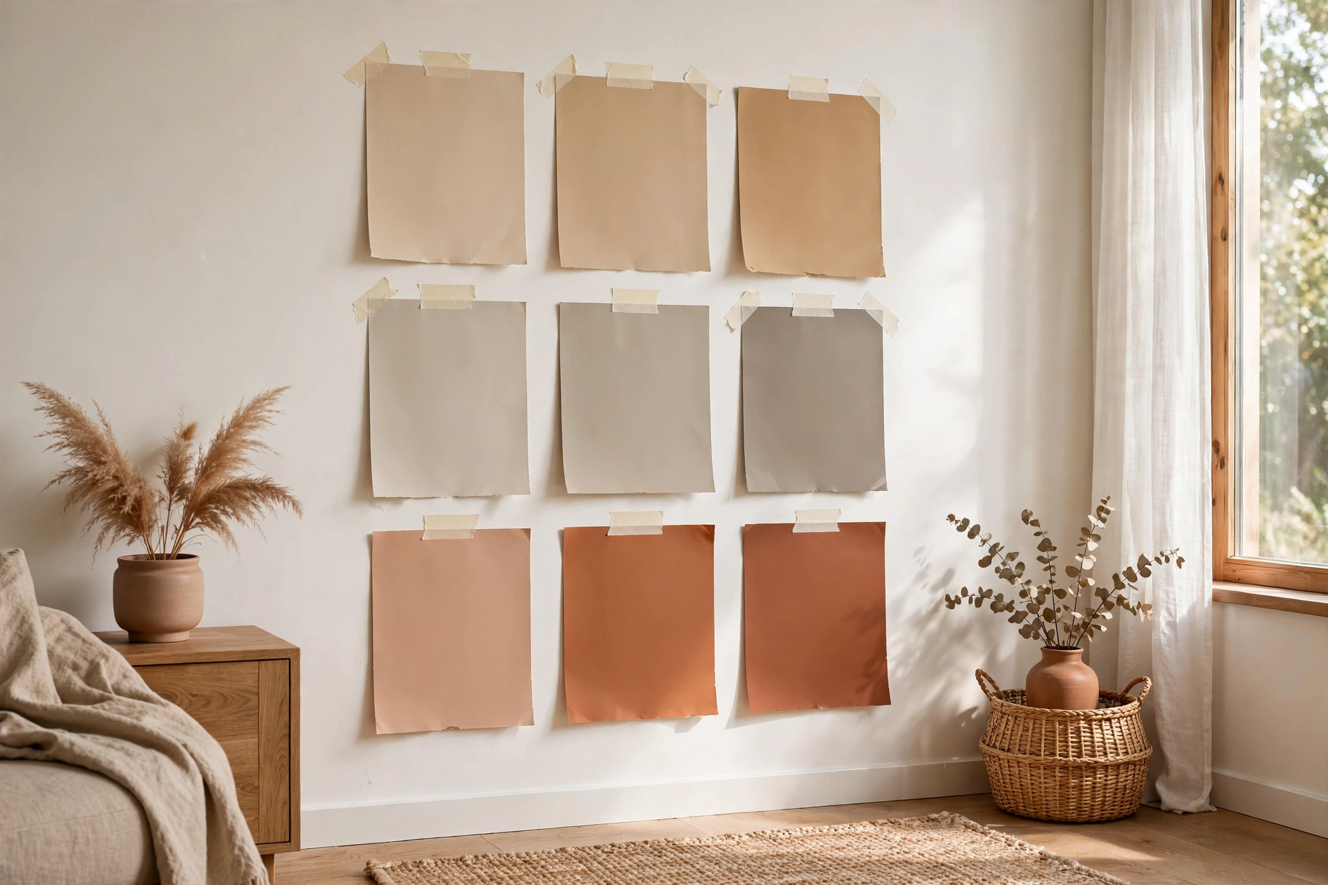
The free cards from the paint store. Tape several to the wall and compare. Pros: Free, instant. Cons: Way too small to judge accurately. Colors look different at scale. Best for: Initial elimination only — never make a final decision from a 2-inch chip.
Method 3: Sample Pots on Poster Board (Recommended)
Buy sample pots ($5-8 each) and paint 2×2 foot squares on white poster board. Move the boards around the room — lean against different walls, check near windows and in corners. Pros: Large enough to judge, movable, shows true color. Cons: Costs a bit, takes time to dry. Best for: Final decision between 2-3 contenders. This is the method professionals recommend.
Method 4: Test Directly on the Wall (Most Accurate)
Paint test squares directly on the wall you’ll be painting. Prime first if the current wall color is very different. Pros: Shows exactly how the color interacts with your wall texture and lighting. Cons: You’ll need to prime over the test spots before final painting. Best for: When you’re down to 2 finalists and want zero surprises.
🛒 Shop This Look:
Method 5: Digital Visualizers (Supplemental)
Apps that overlay color on a photo of your room. Pros: Fun, instant, good for narrowing options. Cons: Screen colors are unreliable — never make a final decision from a phone screen. Best for: Initial brainstorming only.
How to Evaluate Your Test
Check three times of day: Morning (cool light), midday (bright), and evening (warm artificial light). A color that looks perfect at noon might go muddy at 7pm.
Look at it next to fixed elements: Hold the test near your flooring, countertops, fireplace, or large furniture. Undertone clashes become obvious.
Live with it for 48 hours: Don’t rush. Your eyes adjust, and initial excitement can fade. If you still love it after two days, commit.
Photograph it: Phone photos sometimes reveal undertones your eyes miss in person. Compare the photo to what you see — discrepancies are informative.
The $30 Rule
Spending $30 on sample pots feels wasteful until you compare it to $200+ in paint plus a weekend of labor for a color you hate. Testing isn’t optional — it’s the cheapest insurance in home improvement.
Reading Your Test: A 3-Day Evaluation Method
Painting a sample is only half the test — evaluating it properly is the other half, and most people rush it. Give every serious candidate a full three days on the wall. Day 1: the shock test. Fresh paint always looks more intense than it will once cured — paint darkens slightly as it dries and your eye calibrates. Don’t judge on day one; just note your gut reaction. Day 2: the light tour. Check the sample in morning light, midday, late afternoon, and evening under your actual lamps. Photograph it at each stage (phone cameras are fine for comparison purposes). You’re looking for a color that works across all four — a color that’s perfect at noon but muddy at 7pm will disappoint you daily.
Day 3: the living test. Stop staring at the sample directly and notice it peripherally as you go about your day. Does it recede pleasantly or demand attention? Hold your key furnishings, fabrics, and flooring samples against it. View it from the adjoining rooms through doorways — this is where flow succeeds or fails. By day three, you’ll either have stopped noticing the sample (usually a good sign — it means it harmonizes) or you’ll have a specific complaint (“too blue in the evening,” “disappears against the trim”). Specific complaints are actionable: too blue in evening means the undertone fights your warm bulbs; disappearing against trim means you need more contrast. Vague unease after three days means keep looking — don’t talk yourself into a color your eye keeps rejecting.
Testing in Different Light: The Orientation Guide
Your room’s orientation changes everything about how a test color reads, and the sample board lets you see it before committing. North-facing rooms get cool, indirect, slightly blue-gray light all day — colors read truer to their undertones here, and warm colors are your friend. A beige that looks neutral in the store can read distinctly pink in north light; test specifically for undertone honesty. These rooms also get the least light overall, so test at the darkest part of the day — if the color holds up at 4pm in December, it’ll hold up anytime.
South-facing rooms get abundant warm direct sun — colors look brighter and warmer than their chips suggest, and intense afternoon sun can wash out subtle colors entirely. If your pale sage disappears at 2pm, it needs more saturation, not a different hue. East-facing rooms get bright warm morning light that fades to cooler, dimmer afternoon — test both extremes, because a color chosen for the gorgeous morning glow may look flat by evening. West-facing rooms are the trickiest: dim cool mornings, then intense warm-to-orange late afternoon sun that supercharges warm undertones — that “neutral” greige can go full peach at 5pm. For west rooms, the late-afternoon test is the one that matters most. In every orientation, remember that trees, neighboring buildings, and colored exteriors tint incoming light — a big green tree outside the window casts a green tint on everything, which cool grays will pick up mercilessly.
🛒 Shop This Look:
What If None of Your Samples Work?
Sometimes you test five colors and hate all of them. This is useful information, not failure — it means your mental target is off, and the samples are telling you so. First, diagnose the pattern. If every sample reads too dark, your room needs colors 1–2 shades lighter than you imagined (very common — people consistently underestimate how dark colors go up on walls). If every sample’s undertone bothers you, you’re shopping in the wrong undertone family entirely — switch families (warm to cool or vice versa) rather than trying another shade of the same family.
Second, check your reference points. Bring home the actual fixed elements — a flooring sample, a cabinet door, a fabric swatch — and test paint against them, not against your memory of them. Half of all “none of these work” situations resolve the moment the real flooring sample enters the picture, because the undertone conflict becomes obvious. Third, go one step up or down the strip. Paint strips are gradients for a reason — the color you want is often adjacent to the ones you tested, and the strip’s darkest chip reveals the undertone you’re actually reacting to. Finally, consider that the problem might be the finish, not the color. A flat finish absorbs light and deepens color; an eggshell or satin reflects more light and reads lighter and livelier. The same color in different sheens can look like different colors — test your top candidate in two sheens before giving up on it.
The Whole-Room Test: Beyond the Sample Board
For finalists — the one or two colors that survived the 3-day test — consider a whole-wall test before buying gallons. Paint one full wall (or a large 4×4-foot section) with two coats of your sample pot. This sounds excessive, but a sample pot costs $5–$8 and a gallon of the wrong color costs $40–$60 plus your weekend. The whole-wall test reveals things boards can’t: how the color behaves at scale (colors intensify with coverage — a color that looked subtle on a board can feel enveloping on four walls), how it interacts with the ceiling line and trim at real proportions, and — critically — how you feel in the room.
Live with the test wall for at least 48 hours, including one evening of normal life in the room. Notice whether the color energizes or calms you, whether it fights your furniture or embraces it, whether you keep glancing at it with pleasure or with doubt. Trust the glance test: if you walk into the room and your first involuntary reaction is positive, that’s your color. If you walk in and immediately start rationalizing (“well, it’ll look better with the new curtains…”), it’s not. The $8 sample pot that prevents a $200 repaint is the best money in all of home improvement.
Testing Trim and Ceiling Colors Too
Walls get all the testing attention, but trim and ceiling colors deserve the same rigor — a wrong white is just as regrettable as a wrong wall color, and it covers even more linear footage. Test trim whites on an actual trim board or a primed piece of molding held against your wall color, because whites reveal their undertones only in context: a white that looked pure on the chip can read yellow, pink, or dingy next to your chosen wall color. The classic mistake is pairing a warm wall color with a cool blue-white trim (or vice versa) — the trim then looks dirty or harsh rather than crisp.
Test at least two whites against your finalist wall color: one warm white and one clean/cool white. View them together in daylight and lamplight — the right one will look intentional, the wrong one will look “off” in a way that’s hard to articulate but impossible to unsee. For ceilings, the decision is usually between standard ceiling white and a tinted version of the wall color; test the tinted option if your walls are deeply colored, since bright white ceilings above dark walls create a stark line that chops the room. One board, two whites, ten minutes — the cheapest insurance in the whole painting project.
🛒 Shop This Look:



