
As an Amazon Associate, I earn from qualifying purchases. This means I may earn a commission if you purchase through links on this page — at no extra cost to you.
You fell in love with a swatch, painted an entire room, and now it looks… wrong. Too dark, too bright, wrong undertone — somehow completely different from what you expected. This is one of the most common painting frustrations, and it happens for predictable, avoidable reasons.
Reason 1: Scale Changes Everything
A 2-inch swatch doesn’t prepare you for 400 square feet of color. Colors intensify dramatically at scale — they look richer, deeper, and more saturated on a full wall. That subtle sage becomes unmistakably green. That soft gray goes full concrete. Lesson: Always assume the color will read 20-30% more intense on the wall than on the swatch.
Reason 2: Lighting Transforms Color
Natural light direction matters enormously. North-facing light is cool and blue, intensifying cool undertones. South-facing light is warm and golden, warming up every color. East light is bright and clear in the morning, fading by afternoon. West light is warm and dramatic in the evening.
Artificial light matters too. Cool LEDs (4000K+) make colors look bluer and harsher. Warm bulbs (2700K) add yellow. The swatch you loved under store fluorescents may look entirely different under your home lighting.
Reason 3: Surrounding Colors Influence Perception
Colors don’t exist in isolation. Your wall color interacts with your flooring, furniture, trim, and even the view through windows. A gray wall next to warm wood floors will look cooler than the same gray next to white tile. Green grass visible through a window can cast a green tint on light walls. This simultaneous contrast effect is powerful and unpredictable from a swatch.
Reason 4: Sheen Affects Color Depth
The swatch is typically shown in eggshell or satin. If you paint in flat, the color will look slightly lighter and chalkier. If you go semi-gloss, it’ll look richer and deeper. Same color, different finish, noticeably different appearance.
Reason 5: Primer and Base Color
Painting over a dark red wall with two coats of light beige? The old color will influence the new one, making it look muddier or darker than expected. Always prime when making dramatic color changes — it gives you a neutral base that lets the true color show.
How to Test Paint Colors the Right Way
A swatch is a starting point, not a decision. Here is a testing process that professionals use:
1. Narrow to three candidates. Pick three swatches that are close to what you want, including one slightly lighter than you think you need — colors deepen at scale, so your instincts will skew dark.
2. Buy sample pots, not just chips. Small sample pots cost a few dollars each and give you real paint in the real finish. Peel-and-stick paint samples are another good option: they are large, repositionable, and show the color accurately without painting your wall.
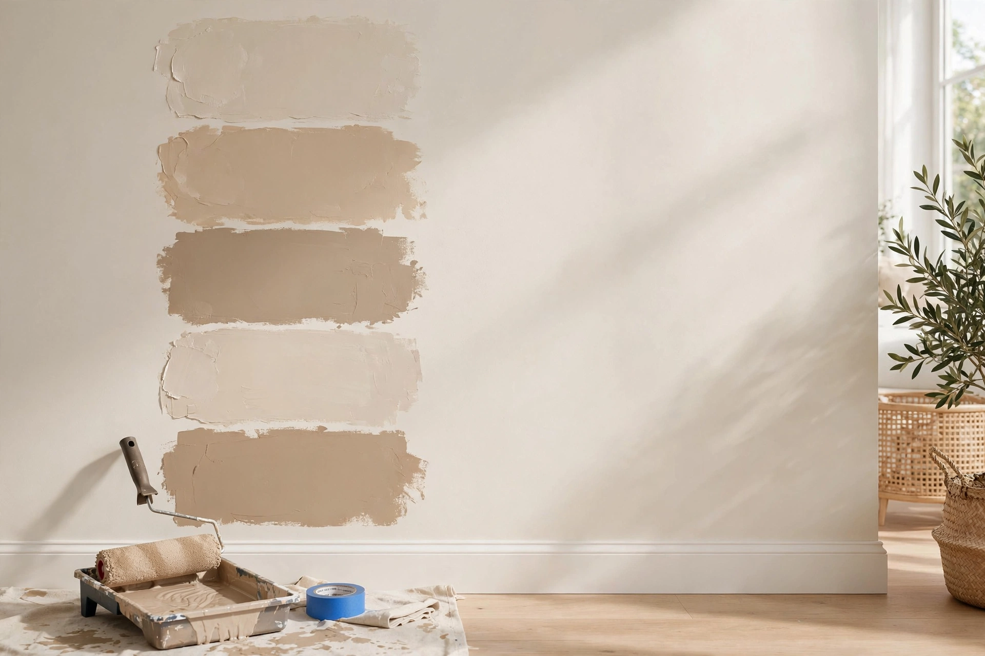
3. Paint large test boards, not the wall. Use foam core boards or poster board, at least 2×2 feet. Two coats, same as a real paint job. Boards are better than painting the wall directly because you can move them around the room and hold them against furniture.
🛒 Shop This Look:
4. Observe at three times of day. Check your samples in morning light, midday, and evening under your artificial lights. A color that works at noon can look completely different at 8 PM — and you will live with the evening version for hours every day.
5. Look at the sample against everything. Hold the board next to your flooring, your sofa, your trim, your curtains. Move it to every wall of the room, since light differs by wall direction.
6. Live with it for at least 48 hours. Your eyes adapt. A color that shocks you on day one may feel perfect by day three — or the reverse. Give your perception time to settle before committing to gallons.
Every paint color has a mass tone (the color you see on the swatch) and an undertone (the subtle color hiding beneath it). Undertones are the single biggest cause of “wrong” paint jobs.
How to spot undertones
Hold the swatch next to a true white piece of paper. The undertone suddenly becomes visible — that “neutral” gray reveals its blue, green, or purple heart. Compare several grays side by side and the differences leap out, even though each one looked neutral alone.
Common undertone traps
- Grays: almost always lean blue, green, or violet. In a north-facing room, a blue-leaning gray can look icy and unwelcoming.
- Beiges and greiges: can lean pink, yellow, or green. Pink-leaning beige is the classic “why does my wall look flesh-toned?” surprise.
- Whites: are never just white. They lean warm (yellow, cream), cool (blue, gray), or pink. A warm white next to cool white trim looks dingy.
- Sages and greens: can lean blue or yellow. A blue-leaning sage in a cool room reads as straight blue.
The undertone rule
Match undertones across the room. If your flooring has warm yellow undertones, choose paint with warm undertones. Clashing undertones — a pink-beige wall with yellow-oak floors, for example — create a visual tension that reads as “something is off” even when you cannot name it.
The Science: Metamerism and Simultaneous Contrast
Two color phenomena explain why swatch-to-wall surprises are so consistent and so hard to predict.
Metamerism
Metamerism is when two colors match under one light source but look different under another. This is why the swatch that matched your sofa perfectly in the store looks wrong at home: store fluorescents and your living room LEDs are different light sources, so the colors literally render differently. There is no way around this except testing in your own light.
Simultaneous contrast
Your eyes judge every color relative to its neighbors. A gray wall surrounded by warm wood looks cooler than the same gray surrounded by white tile, because your brain exaggerates the difference between adjacent colors. This is why the swatch — viewed in isolation on a white card — can never tell you how the color will behave in your room. The room is the context, and context changes color.
Sheen, Primer, and Application: The Technical Variables
Sheen changes perceived color
Flat paint absorbs light, so colors look slightly lighter and chalkier. Eggshell adds a whisper of depth. Satin and semi-gloss reflect more light, making the same color look richer, deeper, and sometimes darker. If you tested in eggshell and painted in flat, expect a visible difference — always test in the sheen you plan to use.
Primer matters more than you think
Painting over a strong existing color without priming lets the old color show through, shifting the new color darker or muddier. Tinted primer (primer tinted toward your final color) gives the truest result, especially for deep or saturated colors that need fewer coats over a tinted base.
Number of coats
One coat almost never gives full color. Paint reaches its true color at two full coats; a third may deepen it slightly. If your test board got two careful coats but the wall got one hurried one, the wall will look different — patchier and less saturated.
🛒 Shop This Look:
Fixing a Color That Looks Wrong (Without Repainting Everything)
If the room is already painted and the color is not what you hoped, you have options before committing to a full repaint.
Live with it first. Give it two full weeks. Color perception adapts remarkably, and many “wrong” colors become “fine” once the shock wears off and furniture returns to the room.
Change the lighting. Swapping cool bulbs for warm ones (or the reverse) can shift how a color reads dramatically. If a gray looks too blue, warmer bulbs may neutralize it. This is the cheapest fix available.
Adjust the surroundings. Adding warm wood, colorful art, or textured textiles changes the context your eyes compare the wall against, which can tame an aggressive undertone.
Glaze or tone it. A translucent glaze in a neutralizing tone, applied over the existing paint, can soften a color that is too intense — a technique worth researching before a full repaint.
Repaint one wall. If one wall is the problem (usually the one catching the most light), repainting just that wall in a corrected shade is far cheaper than redoing the room.
FAQs
Should I trust digital paint visualizer apps?
Use them for rough ideas only. Phone screens cannot reproduce paint colors accurately, and the apps do not account for your room’s light. They are useful for comparing two options side by side, not for final decisions.
Is it better to paint test squares directly on the wall?
Test boards are better for most people because you can move them. If you do paint directly on the wall, prime over the test squares before the final paint job — otherwise the test patches can show through as slightly different texture.
Why does my white look yellow (or blue, or pink)?
Undertones plus lighting. North light cools whites toward blue-gray; warm bulbs push whites toward yellow. Hold your white swatch against a pure white sheet of paper to see its true lean, then choose the lean that flatters your room’s light.
Can the paint store computer-match fix a wrong color?
Color matching copies a color accurately — but if the problem is undertone, lighting, or scale, an accurate copy of the same color will have the same problem. Matching helps when you want to reproduce a color you love elsewhere, not when the color itself is wrong for the room.
How to Avoid the Surprise
Paint large test squares (2×2 feet minimum) directly on the wall. Observe at three times of day. Look at the test next to your furniture and flooring. Live with it for 48 hours. This 30-minute investment prevents the most common painting regret.
🛒 Shop This Look:



