
As an Amazon Associate, I earn from qualifying purchases. This means I may earn a commission if you purchase through links on this page — at no extra cost to you.
The biggest small space mistakes are pushing all furniture against walls, using tiny rugs, blocking natural light, choosing oversized furniture, and accumulating clutter. Each makes rooms feel smaller than they are — and each is easy to fix.
1. Pushing Everything Against Walls
Why it’s wrong: Creates a bowling-alley effect with dead space in the middle.
Fix: Float key pieces 3-4 inches off walls. Creates shadow lines that add depth.
2. Using Tiny Rugs
Why it’s wrong: Chops the floor into small visual pieces.
Fix: Rug should extend under front legs of all seating. Bigger is better.
3. Blocking Windows
Why it’s wrong: Natural light is the top spaciousness factor.
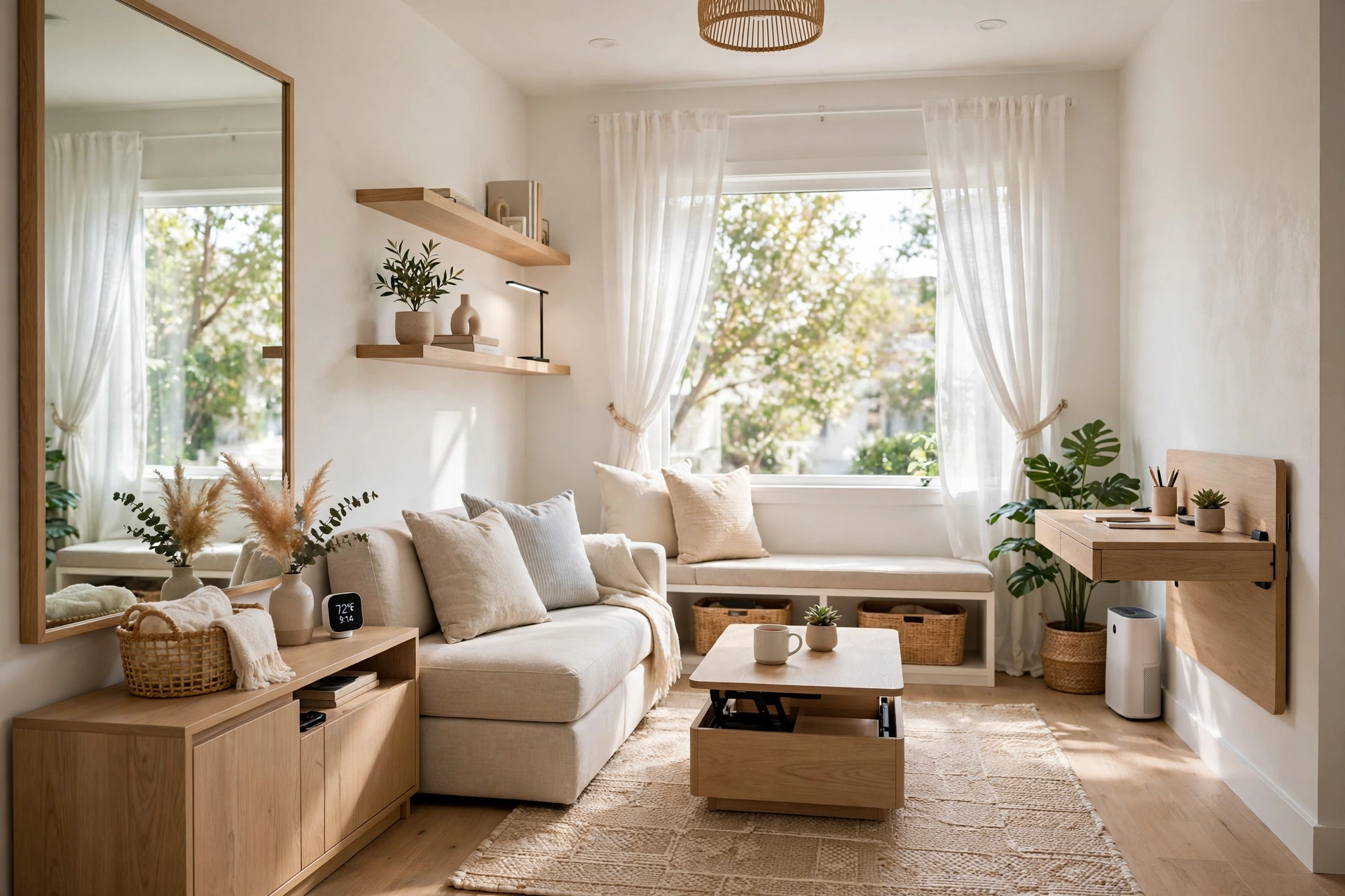
Fix: Keep window walls clear. Use sheer curtains.
4. Oversized Furniture
Why it’s wrong: One bulky piece overwhelms a small room.
Fix: Choose apartment-scale (loveseat not sofa, 36″ table not 48″).
5. Too Many Small Decor Items
Why it’s wrong: Reads as clutter, not curation.
Fix: Fewer, larger pieces. Clear surfaces.
6. Dark, Heavy Curtains
Why it’s wrong: Absorbs light, adds visual weight.
Fix: Sheers or light linen. Hang high and wide.
7. Ignoring Vertical Space
Why it’s wrong: Wastes 50% of the room’s volume.
Fix: Tall shelves, wall-mounted storage, art hung high.
Deeper Dive: Why Each Mistake Shrinks the Room
Mistake 1 — Pushing Everything Against the Walls
The psychology: furniture tracing the walls outlines the room’s exact dimensions, and your brain registers every inch of the boundary. Floating the sofa even 3–4 inches off the wall creates a shadow line that reads as depth — the wall appears to continue behind the furniture. In living rooms, pull the seating inward onto a rug; in bedrooms, a headboard wall is fine but nightstands and dressers gain air from a small gap. The exception: galley kitchens and true micro-rooms where walkways genuinely require wall placement — there, keep the gaps consistent so they read as intentional.
Mistake 2 — The Too-Small Rug
The psychology: a rug that floats between furniture, touching nothing, chops the floor into “rug island” plus “floor moat” — two small zones instead of one larger one. The fix is the front-legs rule: the rug must extend under the front legs of the sofa and chairs, unifying them into one zone that borrows the rug’s full dimensions. In a 10×12 room, an 8×10 rug makes the seating area feel like 80 square feet; a 5×7 makes it feel like 35. When budget forces a smaller rug, layer it over a larger inexpensive jute or flat-weave — the layered look is stylish and the footprint reads large.
Mistake 3 — Blocking Windows
The psychology: natural light is the single strongest spaciousness signal — brighter rooms consistently test as larger in perception studies. A tall bookcase beside (not in front of) a window is fine; anything that covers glass is not. Beyond furniture: heavy curtains mounted inside the frame cover up to a foot of glass on each side even when “open.” Mount rods 6–10 inches beyond the frame so open curtains clear the glass entirely. And clean the windows — dirty glass can cut light transmission noticeably, the cheapest brightness upgrade there is.
Mistake 4 — Oversized Furniture
The psychology: one piece that is clearly too big becomes the room’s defining feature, and the room is then “the room with the giant sectional” — small by comparison. Apartment-scale does not mean uncomfortable: a 72-inch apartment sofa with a 36-inch depth seats two adults comfortably while saving 6+ inches of floor over a standard sofa. Measure doorways and walkways, not just the wall — and remember depth matters more than width in small rooms. A loveseat that is 40 inches deep eats more walkway than a sofa that is 34 inches deep.
Mistake 5 — Death by a Thousand Knick-Knacks
The psychology: every small object is a separate visual event the brain must process; twenty small objects create twenty units of visual noise, while three larger objects create three. The eye cannot rest, and a room the eye cannot rest in feels smaller. The fix is not minimalism — it is consolidation: the tray method (one tray reads as one object), the odd-number grouping (three varied heights read as one arrangement), and the one-in-one-out rule for new acquisitions. Open shelving is the highest-risk zone: style it with 30–40% empty space or it will always read as clutter.
Mistake 6 — Dark, Heavy Curtains
The psychology: floor-to-ceiling dark fabric adds a massive vertical block of visual weight that absorbs light and stops the eye. Sheers or light linen in a color close to the wall keep the window as a light source rather than a wall. The mounting matters as much as the fabric: hung 4–6 inches below the ceiling and extending beyond the frame, curtains make windows read larger and ceilings taller — the hardware placement alone can add perceived height. If privacy demands lining, use a light-filtering liner rather than blackout except in bedrooms.
Mistake 7 — Ignoring Vertical Space
The psychology: rooms are volumes, not floor plans — but most small-room decorating happens below 5 feet. Everything above eye level is free real estate: tall bookcases that draw the eye up (making ceilings feel higher), art hung with its center at 57–60 inches rather than slumping low, wall-mounted storage that frees floor, and plants on stands that add height without footprint. The fastest vertical win: move one piece of art higher and add one tall plant — the room’s perceived height changes immediately.
Three More Mistakes That Deserve a Mention
8. Matching Furniture Sets
A sofa-loveseat-chair set in identical fabric reads as a showroom and wastes the opportunity to vary scale — the exact thing small rooms need. Mixed pieces in a cohesive palette look collected and let you choose each piece’s size deliberately: an apartment sofa, one armless chair, one small-scale accent chair.
9. One Overhead Light
A single ceiling fixture flattens the room and casts the corners into shadow — shadows read as the room ending. Three light sources at different heights (overhead, floor lamp, table lamp) create depth and draw the eye around the full volume. Dimmers on all of them let one room serve bright-day and cozy-evening modes.
10. No Clear Focal Point
When nothing anchors the eye, it bounces around the room’s boundaries — noticing exactly how small they are. One confident focal point (oversized art, a bold accent wall, a statement light fixture) gives the eye a destination, and a room with a destination feels like it has somewhere to be — which reads as larger.
The 80/20 Fix: If You Do Only Three Things
Overwhelmed? These three fixes deliver most of the spaciousness gain:
- Fix the rug — size up so front legs of all seating sit on it. Single biggest visual change per dollar.
- Free the windows — move blocking furniture, remount curtains high and wide, switch to light fabrics. Single biggest light change, often free.
- Edit surfaces — tray-method every surface, removing half the small objects. Single biggest calm change, free.
Small rooms are not a design problem to solve — they are a design constraint to embrace. Every one of these mistakes is really a missed opportunity to let the small space be what it is good at: intimate, efficient, and easy to make beautiful.
The Psychology of Spaciousness
Understanding why these tricks work helps you improvise beyond the list. Spaciousness is a perception built from four signals:
- Light level: the strongest signal. Brighter rooms consistently test as larger — which is why window access, light colors, and mirrors outperform every furniture trick. When choosing between two improvements, pick the one that adds light.
- Visual continuity: the eye measures rooms by counting boundaries — color changes, floor transitions, furniture edges. Fewer boundaries read as more space. This is the mechanism behind monochromatic palettes, large rugs, and matching the trim to the walls.
- Visible floor: the brain estimates room size largely from visible floor area. Furniture on legs, wall-mounted pieces, and clear pathways all increase the visible floor — the actual square footage never changed, but the estimate did.
- Prospect and depth: sightlines that travel — through a doorway, into a mirror’s reflection, down a hallway — make a room feel connected to more space. Arrange furniture to preserve long sightlines rather than blocking them; a clear diagonal view across the room is worth more than any decor object in its path.
Every fix in this article works through one of these four mechanisms. When facing a new small-space puzzle, ask which signal is weakest and strengthen it — the framework generates solutions the list never covered.
Small Spaces for Real Life: Kids, Pets, and Guests
- Kids: small rooms with kids need indestructible zones, not precious ones — washable rug, wipeable surfaces, closed storage for the toy explosion. A small room with a toy system (one bin out, rest stored) stays livable; without it, the room belongs to the toys.
- Pets: designate the pet’s spots deliberately (a washable bed in the corner, not the sofa by default) and choose pet-camouflaging colors and textures. A small room with a large dog needs clear floor lanes — the dog’s path is a walkway that furniture must respect.
- Guests: a small living room hosts fine with flexible seating — the storage ottoman, floor cushions stored in a basket, dining chairs borrowed for the evening. The trick is seating that appears when needed and disappears after, not permanent guest furniture eating daily space.
- Working from home: the small-space office needs a real boundary — even a folding screen or a specific lamp that turns on for “work mode.” Without the boundary, work colonizes the room psychologically even when the laptop is closed.
🛒 Shop This Look:
🛒 Shop This Look:
🛒 Shop This Look:




1 thought on “7 Small Space Mistakes That Make Rooms Feel Cramped”
Comments are closed.