
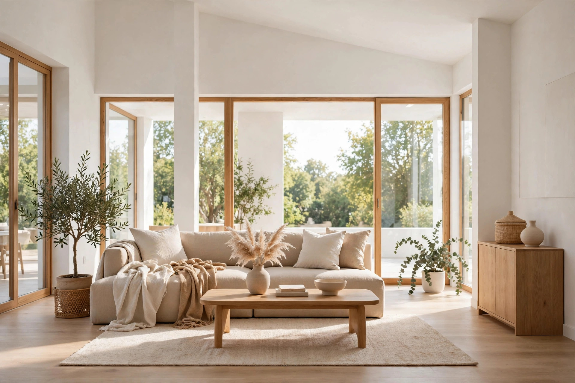
White paint colors all look similar on swatches — but on actual walls, in real lighting, the differences are dramatic. We painted five popular whites on different walls of the same room and compared them at three times of day. The results surprised even us. Here’s what we learned about how white paints really behave.
The Test Setup
Room: 12×14 ft bedroom, east-facing window, warm oak floors, white trim.
Colors tested: Chantilly Lace (BM), White Dove (BM), Simply White (BM), Alabaster (SW), Pure White (SW).
Method: Each color evaluated in a 4×6 ft section on a different wall, at 8am (morning light), 1pm (bright daylight), and 7pm (warm artificial light, 2700K LEDs). Photos are AI visualizations of the same test room in each color.
Morning Light (8 AM, Cool East Light)
Chantilly Lace: Crisp and bright, almost blue-white in the cool morning light. Clean and modern.

White Dove: Soft and warm, noticeably creamier than Chantilly. Inviting even in cool light.

Simply White: Balanced — not as stark as Chantilly, not as warm as White Dove. Very versatile.

Alabaster: Clearly the warmest. Almost buttery in morning light. Cozy but potentially too yellow for some.

Pure White: Clean with a hint of warmth. Less stark than Chantilly Lace, more neutral than White Dove.
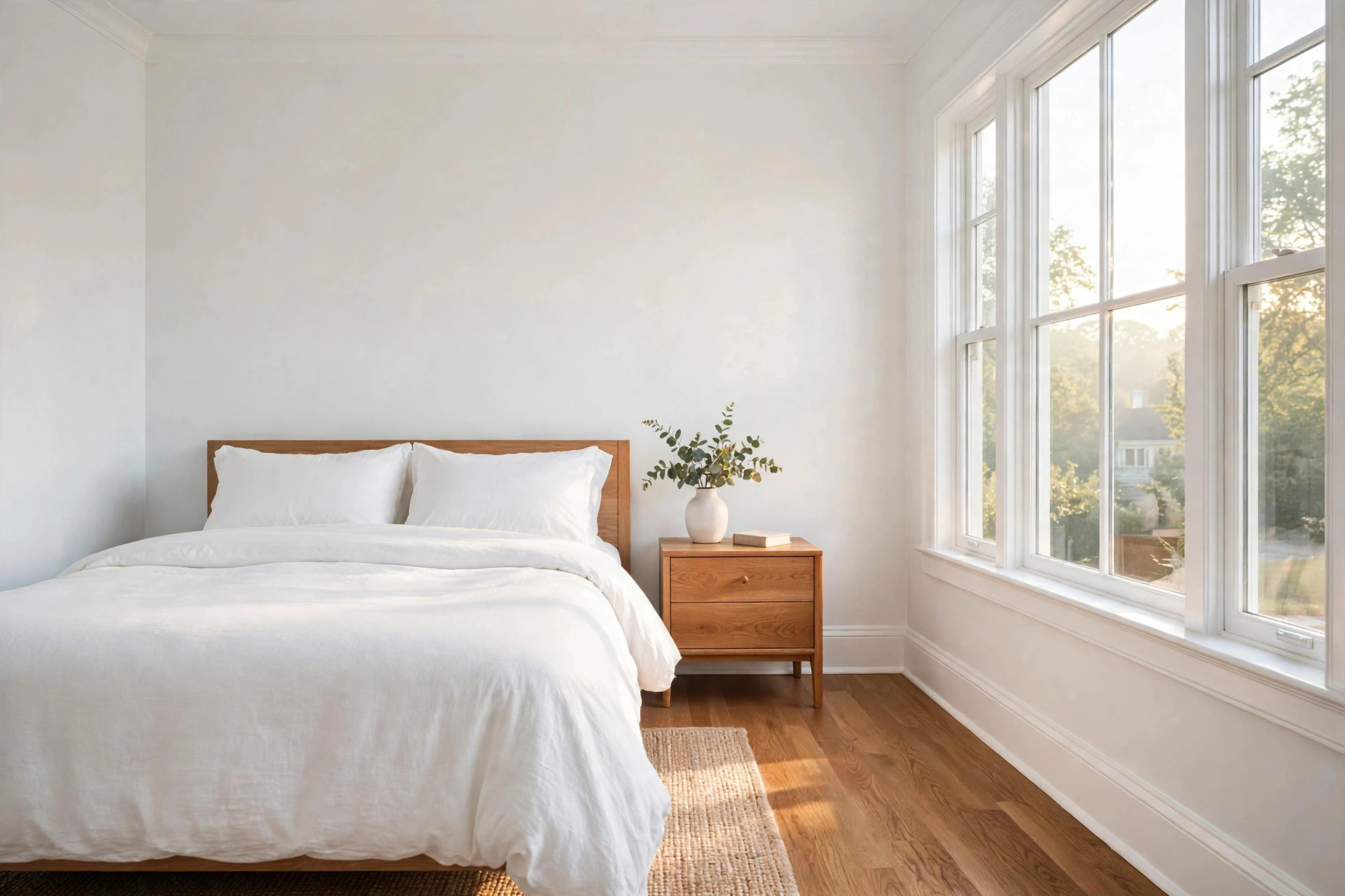
Midday (1 PM, Bright Neutral Light)
All five looked their best and most similar at midday. Differences were subtle — mainly in warmth level. This is why testing at only one time of day is misleading; midday flatters every white.
Evening (7 PM, Warm Artificial Light)
This is where the real differences emerged.
Chantilly Lace: Still read as white, but the cool undertone became more apparent against warm light. Slightly stark.
White Dove: Glowed warmly. Looked rich and inviting — the clear winner in evening light.
Simply White: Held up well, reading as a clean warm white.
Alabaster: Went noticeably yellow-cream. Too warm for this tester’s taste under artificial light.
Pure White: Stayed neutral and pleasant. Didn’t shift dramatically.
Key Takeaways
Most versatile overall: Simply White and Pure White — they shifted the least across lighting conditions.
Best in warm light: White Dove — it comes alive under warm bulbs.
Best for modern/crisp: Chantilly Lace — but pair with warm furnishings to balance the coolness.
Warmest: Alabaster — beautiful in the right setting, but test carefully if you’re sensitive to yellow.
Biggest lesson: Never choose a white based on midday appearance alone. Evening light reveals the true character.
What This Means for You
If your room gets primarily cool natural light (north-facing), lean toward warmer whites (White Dove, Alabaster) to balance. If it’s south-facing with warm sun, you have more flexibility — even Chantilly Lace works. And always, always test under your evening artificial lighting, because that’s when you’ll actually be looking at your walls most.
Understanding White Paint Undertones
“White” is never just white — every white paint has an undertone, a whisper of another color that becomes obvious once it’s on your walls. The main undertone families are blue/gray (crisp, clean, modern — but can feel cold or sterile), yellow/cream (warm, cozy, traditional — but can look dingy in the wrong light), pink (soft and flattering, common in warm whites), and green (subtle, earthy, often the most neutral-looking). Truly neutral whites with minimal undertone exist but are rare; most whites lean one way or another.
Here’s the practical part: undertones reveal themselves in comparison, not in isolation. A white that looks perfectly neutral on the chip can read clearly yellow next to your white trim, or clearly blue next to your warm wood floors. This is why testing whites against your actual fixed elements — trim, flooring, countertops, tile — matters more than judging the chip alone.
As a rough guide, if your home has warm elements (oak floors, brass fixtures, cream tile), a white with a warm undertone will harmonize; if your home leans cool (gray tile, chrome, dark woods), a cleaner white with minimal yellow works better. When whites clash with their surroundings, the result always looks “off” in a way that’s hard to name but impossible to unsee.
How Lighting Changes White Paint
Lighting is the great deceiver of white paint, and it’s why the same white can look perfect in one room and wrong in another. Natural light direction: North-facing rooms get cool, bluish light that amplifies blue/gray undertones and mutes warm ones — a crisp white can look icy here, while a warm white looks balanced. South-facing rooms get warm, intense light that flatters cool whites but can push warm whites into yellow territory. East-facing rooms get cool morning light and warm afternoon light; west-facing rooms get the reverse.
Artificial light matters just as much: The color temperature of your bulbs (measured in Kelvin) tints everything. Warm 2700K bulbs add yellow to your whites; cool 4000K+ bulbs add blue. A white chosen under showroom fluorescents will look different under your living room lamps — always evaluate samples under your own bulbs, at night, since that’s when you’ll see the walls most.
Light quantity matters too: In a dark room with little natural light, whites look darker and their undertones intensify — a white with a hint of gray can read as actually gray. In a bright, sun-flooded room, whites wash out and undertones fade. There’s no universally perfect white; there’s only the right white for your specific light.
Choosing the Right White for Each Room
Different rooms have different light and different jobs, so consider choosing whites room by room rather than defaulting to one for the whole house. Bedrooms: Warm whites (with soft yellow or pink undertones) feel restful and flattering in morning light — avoid stark blue-whites, which can feel clinical where you wake up. Living rooms: Versatile territory. A balanced white with minimal undertone works with most furniture; lean warm if the room gets cool northern light, lean clean if it gets warm southern light.
Kitchens and bathrooms: Crisp, clean whites look fresh and hygienic here and pair well with the chrome, stainless, and white fixtures typical of these rooms. Just make sure the wall white doesn’t clash with the undertone of your cabinets or tile — hold samples directly against them.
Trim and ceilings: The classic approach is trim in a clean, bright white (it makes the “frame” of the room crisp) with walls in a slightly warmer or deeper white. Using the exact same white on walls and trim can look flat; a subtle contrast adds dimension. If you want a seamless modern look, one white everywhere in different sheens (flat walls, satin trim) gives you subtle definition without color contrast.
How to Sample Whites Properly
Sampling whites demands more care than sampling colors, because the differences are subtle and lighting-dependent. Paint large sample boards — at least 2 by 2 feet — rather than dabbing small patches on the wall. Small patches are useless for whites; you need enough area for the undertone to register. Paint two coats (one coat looks different from the final result) and test the boards in multiple spots: against the trim, next to the floor, near the window, and in the darkest corner.
Evaluate at three times of day minimum: morning, midday, and evening under artificial light. Photograph the samples too — cameras are less forgiving than eyes and often reveal undertones you’ve adapted to.
And compare finalists side by side, not from memory; human color memory is terrible, especially for near-whites. Give it at least two full days. Choosing a white in a hurry at the paint counter is how you end up repainting — the most common and most avoidable white-paint regret.
Samplize Benjamin Moore Chantilly Lace Peel & Stick Sample OC-65
Best for sampling Chantilly Lace on your own walls in morning, midday, and evening light before committing.
Coordinating Whites Across an Open Floor Plan
Open floor plans punish white indecision — when the kitchen, living, and dining areas share sight lines, three slightly different whites look like a mistake rather than a design choice. You have two good options.
One white everywhere: The simplest and often the best. Pick a versatile white with minimal undertone, use it on all walls, and let furniture and decor provide the variety. Different sheens (flat on walls, satin on trim) give you subtle definition without color shifts. This approach makes open spaces feel larger and calmer, and it eliminates the “why does the kitchen look yellow next to the living room” problem entirely.
Related whites with a shared undertone: If one white feels flat, use two or three whites from the same color strip or with the same undertone family — for example, a clean white in the kitchen and a slightly warmer version in the living area. The shared undertone keeps them harmonious; the variation adds subtle depth. What never works: whites with competing undertones side by side — a pink-white next to a green-white next to a blue-white reads as dirty, not designed. Test candidates together on boards held up in the actual sight line between rooms, because that’s the only view that matters.
White Paint and Resale Value
If a sale is in your future, white is your ally — but which white matters. Broadly appealing, neutral whites (soft, balanced, minimal undertone) photograph beautifully and let buyers project their own taste onto the space. Stark blue-whites can photograph harshly and feel cold in person; heavily warm whites can read as dated or dingy in listing photos. The resale sweet spot is a warm-but-clean white that feels fresh in person and bright on camera.
Consistency matters more than the specific shade: a house painted in one cohesive white throughout feels larger, newer, and more expensive than the same house in a patchwork of different whites accumulated over years. If you’re prepping to sell, repainting mismatched rooms into a single unified white is one of the highest-return cosmetic moves available — it erases years of piecemeal decorating decisions in a weekend. And keep the finish consistent too: flat or eggshell on walls, satin on trim, throughout. Cohesion reads as care, and care is what buyers pay for.




2 thoughts on “We Painted the Same Room 5 Different Whites: Photo Comparison”
Comments are closed.