
As an Amazon Associate, I earn from qualifying purchases. This means I may earn a commission if you purchase through links on this page — at no extra cost to you.
Light colors with high Light Reflectance Values (LRV above 60) make rooms feel larger by bouncing more light. Soft whites, pale greys, light beiges, and muted pastels expand perceived space. But color alone isn’t enough — finish, lighting, and contrast matter equally.
The Science: LRV Explained
LRV measures how much light a color reflects (0=black, 100=white). Colors above LRV 60 reflect enough light to brighten a room significantly. A white at LRV 90 reflects nearly twice the light of a mid-grey at LRV 45.
Best Colors for Small Rooms
Warm whites (LRV 85-92): Bright without feeling sterile.
Pale greys (LRV 65-75): Modern and airy.
Soft beiges (LRV 70-80): Warm and inviting.
Light sage (LRV 60-70): Adds color while staying bright.
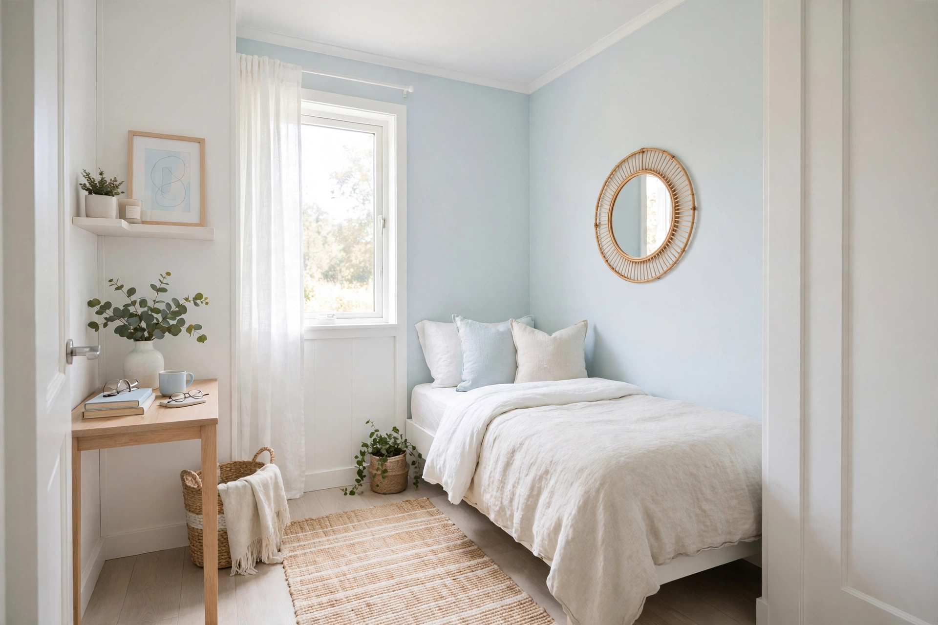
Pale blue (LRV 65-75): Recedes visually, expanding walls.
Beyond Wall Color
Keep ceilings white or lighter than walls. Use low-contrast trim (not stark white against colored walls). Choose light flooring or large light rugs. These choices matter as much as wall color.
Can Dark Colors Work?
Yes — in small doses. A dark accent wall adds depth. Dark colors in a powder room create cozy drama. The key: balance dark accents with plenty of light elsewhere and good lighting.
How to Read an LRV Number Like a Designer
Paint chips and manufacturer websites list LRV for every color. Here is how to use it:
- LRV 85–100: true whites and near-whites. Maximum light bounce; can feel flat or glaring in rooms with abundant natural light unless warmed up with texture and wood tones.
- LRV 60–85: the sweet spot for small rooms. Light enough to expand the space, with enough pigment to give walls character. Most “small room” recommendations live here.
- LRV 40–60: mid-tones. Workable in small rooms only with excellent lighting and light furnishings; otherwise they close the walls in.
- LRV below 40: genuinely dark. Use as accents, not field color, in compact spaces.
One caution: LRV is measured under standardized light, but your room’s light is not standard. A north-facing room’s cool, dim light will make colors read darker and grayer than their LRV suggests — go 5–10 LRV points lighter than you think you need in north-facing or basement rooms. South-facing rooms can handle slightly deeper colors because abundant warm light compensates.
Warm vs. Cool: Which Expands More?
Both families work, but they expand space differently:
- Cool colors (blues, blue-greens, cool grays) visually recede — the wall appears farther away than it is. This is the strongest “push the walls out” effect. Pale blue-grays are the classic small-bedroom choice for this reason.
- Warm colors (warm whites, pale peaches, light warm grays) advance slightly, but they make a room feel sunlit and welcoming, which reads as spacious in a different way — the room feels good to be in, so it feels bigger.
- The deciding factor is light direction. North-facing rooms get cool light and benefit from warm colors that compensate. South-facing rooms get warm light and can take cool colors without feeling chilly. East and west rooms change through the day — choose a balanced neutral.
Specific Color Strategies by Room
Small Bedrooms
Pale blue-grays and soft sage greens are ideal — they recede, they calm, and they pair beautifully with white bedding, which amplifies the airy effect. Keep the ceiling bright white and the bedding lighter than the walls for maximum lift.
Small Living Rooms
Warm whites and light warm grays (greige) work hardest here because living rooms need to feel welcoming at night under artificial light. Cool colors can go flat and chilly under warm bulbs; warm neutrals glow. If the room is dark, choose a warm white with an LRV above 85.
Small Kitchens
White and near-white cabinets with a light wall color erase visual boundaries between wall and cabinetry, which is exactly what makes galley kitchens feel tunnel-like. If you want color, put it on a single element — the island, or the backsplash — and keep everything else light.
Small Bathrooms
This is the one small room where going dark can be a power move: a deep, moody color in a powder room reads as intentional drama rather than cramped, because nobody expects a powder room to feel spacious. For full bathrooms used daily, stay light — pale aqua, soft white, or light warm gray.
Hallways and Entryways
Light colors with a satin or eggshell finish (which reflects more light than flat paint) keep narrow passages bright. Paint the ceiling the same color as the walls to erase the boundary line — the hallway reads as one continuous, taller space.
Finish Matters as Much as Color
- Flat/matte absorbs light and hides wall imperfections, but in a dark small room it can deaden what little light exists.
- Eggshell and satin reflect subtly more light — the best all-around choice for small rooms. Satin on trim creates gentle highlights that define architecture.
- Semi-gloss bounces the most light but shows every flaw; reserve it for trim, doors, and ceilings in small spaces.
- A ceiling in flat bright white with walls in eggshell creates a barely-there contrast that lifts the ceiling without a harsh line.
High contrast chops a small room into visual pieces, and every piece reads as smaller. The fixes:
- Paint trim close to the wall color — not stark white against a colored wall, but a slightly lighter or darker version of the same hue. The room reads as one continuous envelope.
- Match the ceiling to the walls (or go just one shade lighter) to erase the line where wall meets ceiling. This is the single most effective trick for low ceilings.
- Keep large furniture close to the wall color. A white sofa against white walls dissolves; a black sofa against white walls becomes a visual boulder that stops the eye.
- Extend one color across adjacent spaces. Painting the living room, hallway, and entry the same light color removes visual stops between rooms, so the whole area reads as larger.
What to Avoid in Small Rooms
- Accent walls in a different, darker color — the classic advice — actually makes small rooms feel smaller by breaking the envelope. If you want an accent, use texture (shiplap, limewash) in the same color family instead.
- Busy, high-contrast patterns on walls or large rugs. They give the eye too much to process in a confined space.
- Dark flooring with light walls creates a harsh horizon line that visually shortens the room. If the floors are dark, use a large light rug to soften the transition.
- Multiple paint colors in one small room. Every color change is a visual stop. One color, varied in finish and texture, is the spacious choice.
Color cannot change your room’s square footage, but it changes how your brain processes it. Light, low-contrast, thoughtfully finished color tells the eye “this continues” — and a room that seems to continue feels bigger than one that clearly ends.
Testing Paint Colors Before Committing
Small rooms punish wrong color choices more than large ones — there is nowhere for a bad color to hide. Test properly:
- Sample on large boards, not the wall. Paint two coats on 2×3-foot foam boards and move them around the room for several days. Wall splotches are too small to judge and they alter the final finish.
- Check at four times of day: morning, midday, late afternoon, and under evening artificial light. Colors shift dramatically — a grey that looks perfect at noon can go lavender under warm bulbs at night.
- Test against your fixed elements: hold the sample next to the flooring, the sofa, the countertops. Undertone clashes reveal themselves here — the “why does this look off” feeling is almost always an undertone mismatch with something permanent.
- Go one shade lighter than your instinct in rooms under 120 square feet. Paint always reads darker on four walls than on a chip, and small rooms amplify the effect.
- Photograph the samples in the room. Photos flatten the color in a way that reveals undertones your eye adapts to in person — the camera is a ruthless undertone detector.
Color Drenching: The Bold Small-Room Move
Color drenching — painting walls, ceiling, and trim all one color — sounds like it would shrink a small room. Done in a light-to-mid tone, it does the opposite: with zero contrast lines, the eye finds no boundaries to measure, and the room reads as a continuous envelope. It works best in:
- Powder rooms and small offices where the enveloping effect feels intentional and cocooning.
- Light warm tones (warm white, pale greige, soft sage) — drenching in a dark color shrinks; drenching in a light color expands.
- Rooms with good trim and detail — drenching unifies, but the shadows on molding and paneling still give the eye texture to enjoy.
If full drenching feels too committed, the halfway version — walls and ceiling one color, trim one shade lighter in the same family — captures most of the boundary-erasing benefit with a whisper of definition.
When White Is the Wrong Answer
Conventional wisdom says paint small dark rooms white. But white in a room with almost no natural light does not create brightness — it creates a grey, flat, institutional box, because there is no light for the white to bounce. In genuinely dark small rooms (basements, interior bathrooms), a saturated mid-tone often works better: deep teal, warm terracotta, rich olive. The room will not feel bigger, but it will feel intentional and atmospheric instead of like a failed bright room. Dark and cozy beats dim and dreary — commit to the mood the architecture gives you.
🛒 Shop This Look:
🛒 Shop This Look:
🛒 Shop This Look:



