
As an Amazon Associate, I earn from qualifying purchases. This means I may earn a commission if you purchase through links on this page — at no extra cost to you.
The biggest wall art mistakes that shrink rooms are hanging art too high (disconnects from furniture), choosing pieces that are too small for the wall, cluttering with too many small frames, using dark heavy frames in tight spaces, and ignoring scale relative to furniture. Fixing these instantly makes rooms feel larger and more balanced.
Mistake 1: Hanging Too High
Problem: Art floating near the ceiling makes walls feel shorter and rooms cramped.
Fix: Center art at 57″ from floor. Above furniture, leave only 6-8″ gap.
Mistake 2: Too Small for the Wall
Problem: A tiny print on a big wall emphasizes emptiness.
Fix: Art should fill 60-75% of available wall width. When in doubt, go bigger or do a gallery wall.
Mistake 3: Too Many Small Pieces
Problem: Dozens of tiny frames create visual clutter that overwhelms.
Fix: Replace 10 small frames with 3 medium ones, or consolidate into one gallery wall with breathing room.
Mistake 4: Heavy Dark Frames in Small Rooms
Problem: Thick black frames visually weigh down walls.
Fix: Use thin frames, light woods, or frameless canvases in small spaces.
Mistake 5: Ignoring Furniture Scale
Problem: Art that’s wider than the furniture below looks top-heavy.
Fix: Keep art narrower than the furniture it hangs above.
Mistake 6: No Breathing Room
Problem: Frames crammed edge-to-edge feel claustrophobic.
Fix: Leave at least 2-3″ between frames, more in small rooms.
The 57-Inch Rule, Explained (And When to Break It)
The 57-inch rule — hang art so its center sits 57 inches from the floor — is the single most useful guideline in art hanging, and it exists for a reason: 57 inches is roughly the average human eye level. When art centers sit at eye level, the room feels proportioned to the people in it. When art floats high, the wall below it becomes dead space, the furniture feels disconnected from the wall, and the whole room reads as smaller and more awkward than it is. Related: Does Wallpaper Make a Room Look Smaller.
To use it, measure your piece, divide the height by two, and add the distance from the top of the frame to the hanging wire at its tightest. That total, subtracted from 57, tells you where the hook goes. For a 24-inch-tall frame with the wire 2 inches below the top, the hook sits at 57 − 12 − 2 = 43 inches from the floor. It takes one minute and eliminates the most common hanging mistake entirely.
🛒 Shop This Look:
Break the rule when art relates to furniture rather than to the room. Above a sofa, console, or mantel, the 6-to-8-inch gap between furniture top and frame bottom matters more than the absolute height — a low console with art centered at 57 inches would leave a chasm between them. In rooms with very tall ceilings, you can nudge large pieces up a few inches so they do not look stranded at the bottom of a vast wall, but resist the urge to center art on the wall itself. Art relates to people and furniture, not to wall area.
Stairways and sloped walls are the other legitimate exception. Along a staircase, hang pieces so their centers follow the stair’s rising line, keeping each piece’s center at 57 inches above the stair tread directly below it. This keeps every piece at eye level for someone standing on that step.
Sizing Art for Your Wall: The 60–75% Rule in Practice
The guideline that art should fill 60–75% of the available wall width sounds abstract until you do the math. Take the width of the empty wall — or, if the art hangs above furniture, the width of the furniture — and multiply by 0.6 and 0.75. That range is your target art width. A 60-inch console wants art between 36 and 45 inches wide. A 10-foot empty wall wants a piece (or grouping) 6 to 7.5 feet wide.
When people get this wrong, it is almost always on the small side. A single 16×20 print above a 7-foot sofa looks like a postage stamp, and worse, it makes the sofa look bigger and the wall emptier than either really is. The instinct to “start small and see” is what shrinks rooms. If your budget only stretches to one piece, buy the largest single piece you can afford rather than a small one you plan to supplement later — one generous piece always outperforms a small piece plus good intentions.
For groupings, measure the grouping as one unit: the outer edges of the outermost frames define the width. Tape the outline on the wall with painter’s tape before hanging anything. This costs nothing and reveals sizing mistakes while they are still reversible. Step back, look at the taped rectangle in the context of the whole wall, and ask whether it holds its own. If the tape rectangle looks lost, the art will too.
Oversized art is the fastest way to make a small room feel bigger, which surprises people. One large piece gives the eye a single confident focal point and makes the wall feel intentionally designed; the same wall covered in small scattered pieces feels busy and, paradoxically, smaller. When in doubt between two sizes, choose the larger one.
Gallery Walls That Enlarge Instead of Shrink
Gallery walls get blamed for shrinking rooms, but the wall is not the problem — the layout is. A well-planned gallery wall acts like one large piece of art and follows the same sizing rules. A chaotic one reads as clutter and closes the room in.
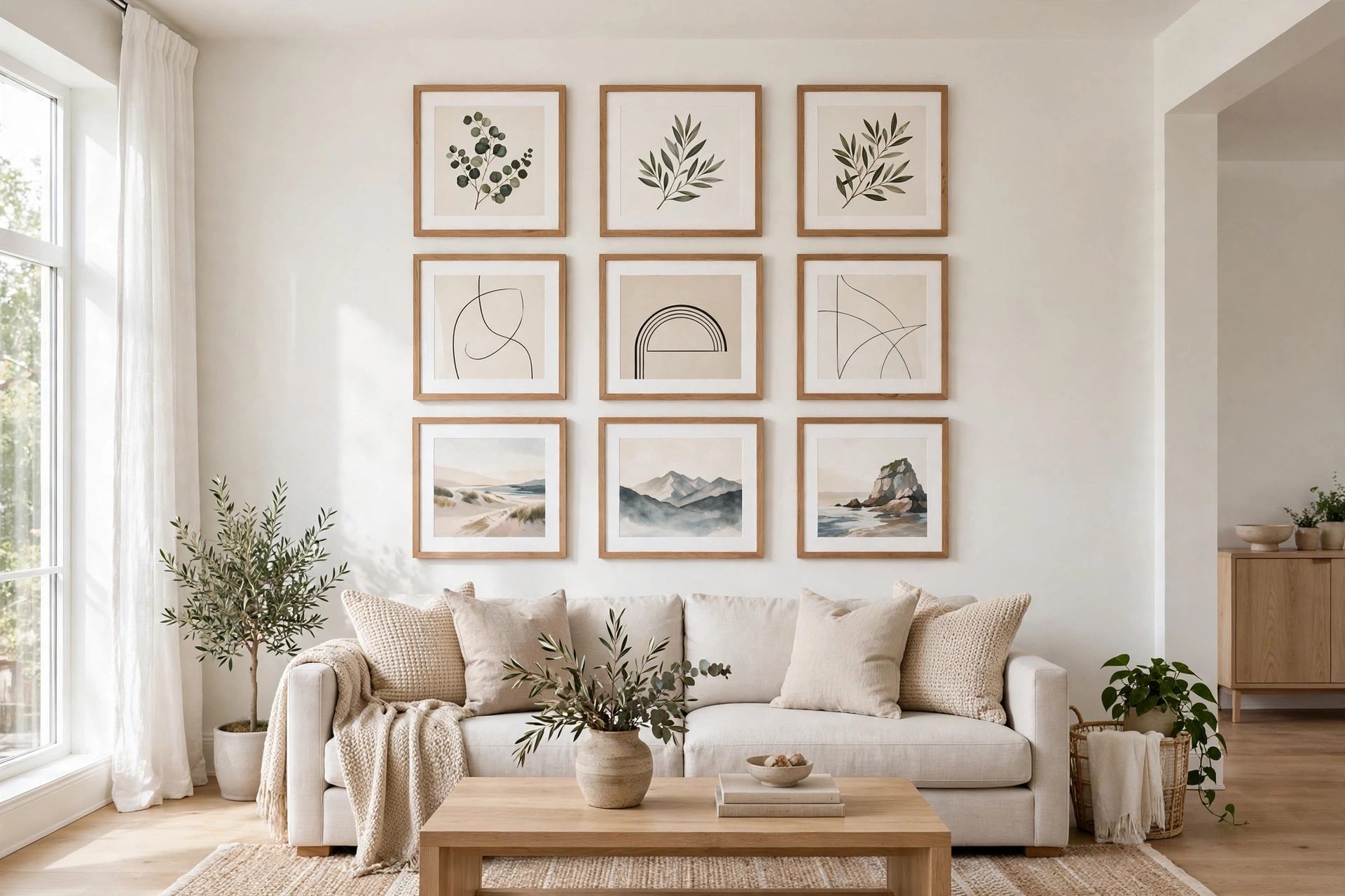
Start by treating the grouping as a single rectangle. Lay the arrangement on the floor first, adjusting until the outer shape is roughly rectangular or square — ragged, irregular outlines feel messy and make the wall feel disorganized. Keep 2–3 inches between frames; tighter than 2 inches reads as cramped, wider than 4 inches breaks the grouping apart into separate small pieces, which is exactly the scattered look you are trying to avoid.
Limit the frame variety. Two frame finishes at most — say, all black plus one wood tone — and consistent mat colors. Ten different frame styles in ten different colors is what makes gallery walls feel like clutter rather than composition. If your frames are mismatched, spray-painting them all one color is a fast, cheap fix that instantly unifies the wall.
Include breathing room around the grouping. The gallery should occupy the 60–75% sweet spot of its wall zone, with clear wall space on all sides. A gallery that runs edge to edge with no margin feels like the wall is closing in; one with generous margins feels curated. And keep the center of the whole arrangement at 57 inches — groupings creep upward when people hang the top piece first and work down, so anchor from the center outward instead.
🛒 Shop This Look:
Frames, Color, and Visual Weight in Small Rooms
Every frame adds visual weight, and in a small room that weight counts double. Thick, dark, ornate frames draw a heavy outline around each piece, which chops the wall into segments and makes the room feel busier and smaller. This does not mean small rooms need boring art — it means the frame should not compete with the art.
In tight spaces, choose thin-profile frames (half an inch to an inch), light woods like oak or maple, white, or frameless presentations like gallery-wrapped canvas. These let the artwork itself carry the impact while the frame quietly disappears. If you love the look of a substantial frame, reserve it for one statement piece rather than using it on everything — one confident heavy frame reads as intentional; six read as clutter.
Glass and glazing matter too. Standard glass reflects light and creates glare spots that visually interrupt the wall. In rooms with windows opposite the art, non-reflective (museum) glass or acrylic keeps the piece readable from every angle and removes the bright glare rectangle that makes walls feel smaller. It costs more, but for the one or two pieces that anchor a small room, it is worth it.
Match frame color to the room’s existing metals and woods rather than introducing a new finish. Black frames in a room with brass hardware and warm wood add one more competing element; warm wood frames tie in. Every new finish in a small room is a small visual tax.
Art Placement Over Furniture: A Room-by-Room Guide
Above the sofa: The art (or grouping) should span 60–75% of the sofa’s width and sit 6–8 inches above the back. Center it on the sofa, not on the wall — in most rooms these are the same, but if the sofa is off-center, follow the sofa. One wide horizontal piece is ideal; two matching verticals side by side also work if their combined width hits the target.
Above the bed: Same math as the sofa, but you can go slightly larger relative to the bed since headboards are visually lighter than sofa backs. Keep the bottom of the frame at least 8–10 inches above the headboard so pillows and bedding do not overlap it. Avoid heavy frames directly above where people sleep — partly for safety peace of mind, partly because visual weight overhead feels oppressive in a room meant for rest.
Above a console or dresser: Leave 6–8 inches between the furniture top and the frame bottom, and keep the art narrower than the furniture. This is also the spot where leaning art works: a large framed piece leaned against the wall on top of the console looks relaxed and intentional, and it lets you layer a smaller piece in front for depth.
In hallways: Hang series at a consistent center height of 57 inches, spaced evenly. Hallways are narrow, so keep frames slim-profiled to avoid a tunnel of protruding corners. A sequence of same-size frames in a row stretches the hallway visually and makes it feel like a gallery rather than a passage.
In dining rooms: Hang slightly lower than 57 inches — seated eye level is around 48–52 inches, and dining art is viewed sitting down. This small adjustment makes dining art feel correctly placed in a way guests notice but cannot name.
Mistake 7: Wrong Orientation
Problem: Vertical art above a wide sofa (or vice versa) creates awkward proportions.
Fix: Match art orientation to furniture shape — wide art for wide furniture.
🛒 Shop This Look:



