
As an Amazon Associate, I earn from qualifying purchases. This means I may earn a commission if you purchase through links on this page — at no extra cost to you.
By Ella Knight
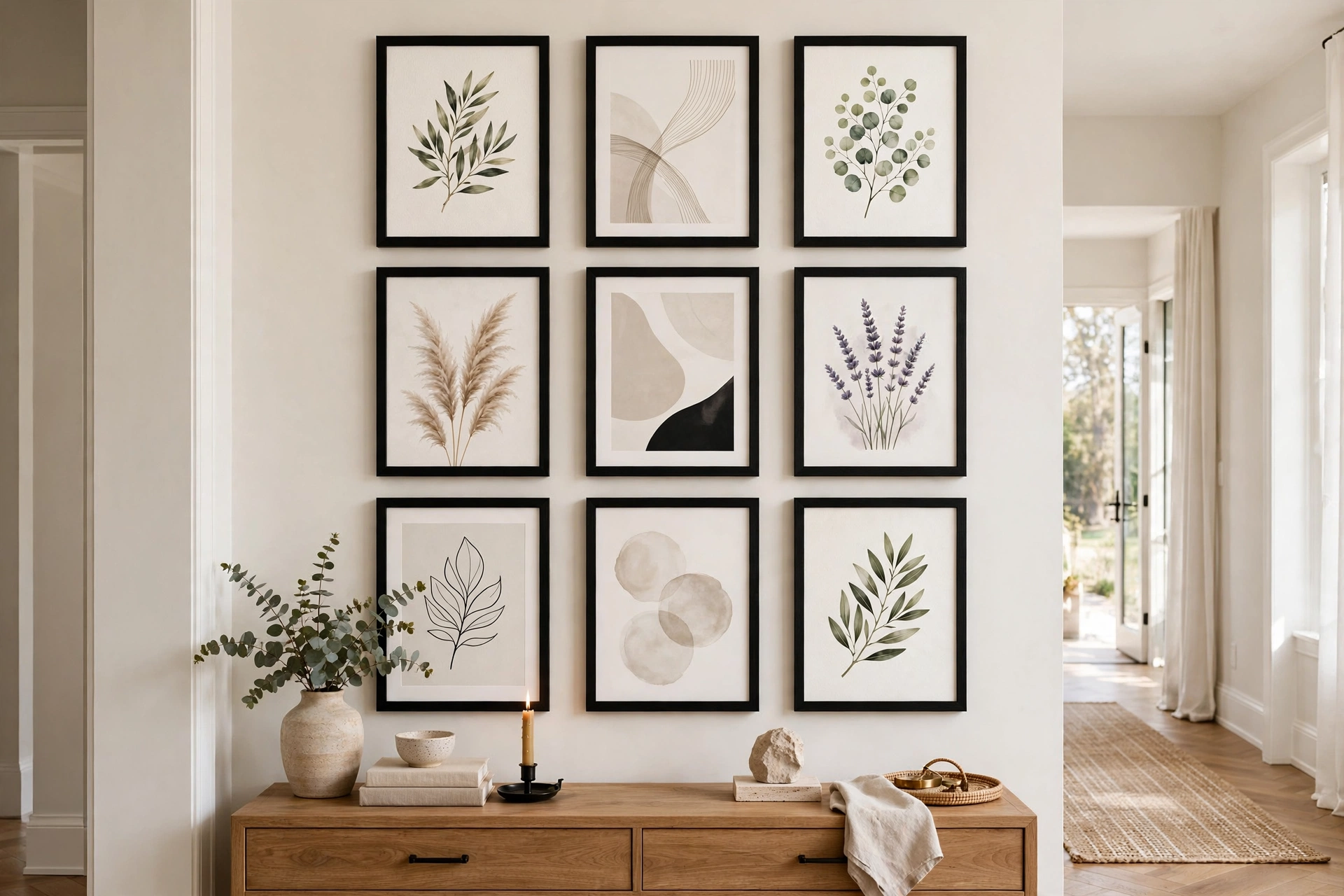
To create a symmetrical gallery wall using the grid method, use identical frame sizes arranged in perfect rows and columns with exactly equal spacing (usually 2 inches) between every frame. A 3×3 grid of 8×10 frames or a 2×4 grid of 11×14 frames are the most popular configurations. The key is precision — measure twice, hang once.
Why Choose a Grid?
Grid gallery walls bring order and calm. They’re perfect for bedrooms, home offices, and hallways where you want visual structure rather than eclectic energy.
Choosing Your Grid Size
- 2×2: Four large frames (16×20). Bold and simple.
- 3×3: Nine medium frames (8×10 or 11×14). The classic gallery grid.
- 2×4: Eight frames in two rows. Great above a sofa or console.
- 4×4: Sixteen small frames (5×7). High impact, lots of hanging.
The Grid Formula
Calculate Total Width
Total width = (frame width × number of columns) + (gap × (columns – 1)). For a 3-column grid of 11-inch-wide frames with 2-inch gaps: (11 × 3) + (2 × 2) = 37 inches.
Find Your Center
Mark the horizontal center of your wall space. Your grid will be centered on this point.
Hang the Center Frame First
Start with the middle frame of the middle row. Level it perfectly — everything else references this piece.
Work Outward
Hang the rest of the middle row, then the rows above and below. Use a level for every single frame.
Grid Spacing Calculator
For a polished look, keep gaps between 1.5 and 2.5 inches. Smaller gaps feel modern and tight; larger gaps feel airy.
What to Put Inside
Grids work best with a cohesive series: black-and-white photos, botanical prints, abstract art in the same palette, or typography posters.
Hanging a Perfect Grid: The Step-by-Step
Grids live or die on precision, so this is the one gallery wall where measuring isn’t optional — it’s the entire technique. Here’s the method that produces crisp, professional results.
🛒 Shop This Look:
Step 1: Do the math on paper first. Calculate your total grid width: (frame width × number of columns) + (gap × (columns − 1)). For a 3×3 grid of 11-inch-wide frames with 2-inch gaps: (11 × 3) + (2 × 2) = 37 inches. Do the same for height. Write both numbers down — they define the rectangle your grid will occupy.
Step 2: Mark the grid’s outer rectangle on the wall. Find the horizontal center of your wall space and mark it lightly in pencil. Measure out half your total width on each side and mark the left and right edges. Do the same vertically for top and bottom, centering the grid’s middle at 57 inches from the floor (or 6–8 inches above furniture). Connect the marks with light pencil lines or painter’s tape to visualize the full rectangle.
Step 3: Establish a level baseline. Run a long level (or a laser level, the grid-hanger’s best friend) along the bottom edge of your rectangle and adjust until it’s perfectly horizontal. Everything hangs from this line. A laser level that projects a horizontal line across the wall is worth borrowing for this project — it turns a fussy job into a fast one.
Step 4: Hang the center frame of the middle row first. This is your reference point for everything. Position it using your measurements, level it obsessively, and step back to confirm. Then hang the rest of the middle row outward from center, using your gap measurement between each frame and the level for every single one.
Step 5: Build rows above and below. Work one complete row at a time, always referencing the row below for vertical alignment. Check each frame with the level — no exceptions. In a grid, one tilted frame doesn’t look charmingly handmade; it looks like a mistake, because the grid’s whole promise is precision.
Step 6: The final audit. Step to the far side of the room and sight along the rows. Check horizontals with the level one last time. Take a photo — the camera catches tilts your eyes have started to forgive. Adjust now, because a grid you “fix later” stays crooked for years.
Grids That Don’t Feel Boring
The knock on grids is that they’re sterile — all that order with no soul. But the grid is just a structure; what you put inside it determines whether it feels like a corporate hallway or a curated collection. Here’s how to keep the precision and add personality.
Vary the content, not the containers. The golden rule of interesting grids: identical frames, surprising art. A 3×3 grid of matching black frames containing nine wildly different images — a portrait, an abstract, a landscape, a typographic print — has the grid’s calm structure with a gallery wall’s eclectic energy. The uniformity of the frames is what gives you permission to be adventurous inside them.
Try a series with a twist. Grids are the perfect showcase for a true series: nine botanical prints, twelve travel photos, six abstract studies in one palette. But add one deliberate break — eight black-and-white photos plus one in color, or a series where the center frame is a mirror. The single exception becomes the focal point precisely because everything else is so disciplined.
Play with orientation inside identical sizes. Square frames containing a mix of portrait and landscape crops (matted to fit) add subtle variety without breaking the grid’s geometry. Or use identical frames but alternate mat colors — white, cream, soft gray — in a pattern. From a distance the grid reads as uniform; up close it rewards attention.
Let the grid breathe with objects. Not every cell needs flat art. Swap one or two frames for shallow shadow boxes holding small objects — a ceramic piece, dried botanicals, a vintage camera. The dimensional contrast against flat prints adds richness, and the grid’s order keeps it from feeling random.
🛒 Shop This Look:
Scale up for drama. A grid of sixteen tiny frames can feel fussy; a grid of four huge frames feels bold and confident. If your grid feels boring, the problem might be timidity, not the concept — bigger frames, fewer cells, more presence.
Where Grids Fail (and What to Do Instead)
Grids are wonderful on the right wall and miserable on the wrong one. Knowing when not to grid saves you from fighting architecture.
Sloped ceilings and attic walls: A grid’s power comes from its relationship to horizontal and vertical lines. Under a sloped ceiling, those references go haywire — the grid looks like it’s sliding downhill. Instead, use a linear arrangement that follows the slope, or a free-form cluster that doesn’t promise geometric precision it can’t deliver.
Walls interrupted by doors and windows: A grid chopped in half by a door frame looks accidental. If the interruption falls within your planned grid area, either shrink the grid to fit the uninterrupted section or switch to an asymmetrical cluster that treats the door as a design element to work around rather than an obstacle to ignore.
Very large walls: A modest grid on a huge wall looks lost — a 3×3 of 8×10s on a 15-foot wall is a postage stamp. Either scale the grid up dramatically (bigger frames, more cells) or abandon the grid for a salon style that can fill the space organically. The grid needs to hold its own against the wall’s scale.
Uneven or textured walls: Grids demand that frames sit flat and aligned; heavily textured walls make consistent hanging genuinely difficult, and old houses with visibly wavy walls will betray every tiny misalignment. In these spaces, an organic cluster is more forgiving — its charm doesn’t depend on millimeter precision.
When you crave evolution: Grids are commitments. Adding a tenth frame to a 3×3 grid breaks it; the structure resists growth. If you love discovering new art and want your wall to evolve, choose a salon-style cluster from the start. Grids suit people who want to hang once, perfectly, and enjoy the calm for years.
Choosing Art for a Grid: What Works Best
A grid’s structure does half the design work, but the art inside still makes or breaks it. Certain types of content thrive in grids; others fight the format.
Best in grids: series and sets. Anything conceived as a collection — a photographer’s travel series, a set of botanical prints, sequential abstract studies, a child’s drawings from one year — finds its natural home in a grid. The grid’s order mirrors the series’ coherence, and the combination feels inevitable rather than arranged.
Also excellent: single images divided across frames. One panoramic photograph or artwork split across a 2×3 or 3×3 grid creates a striking multi-panel effect with far more presence than the image would have as a single print. Many print services offer this image-split option, or you can do it with any photo editor by slicing the image into equal tiles. Keep the gaps tight (1.5 inches) so the image reads as continuous.
Surprisingly good: mixed content with strict discipline. Different subjects work in a grid if you enforce one unifying rule ruthlessly — all black and white, all the same color palette, all the same orientation. The grid forgives subject variety when color or tone is consistent. What it doesn’t forgive is chaos on both axes: mixed subjects and mixed colors read as clutter no matter how precise the hanging.
Avoid: single precious pieces. Don’t put the one artwork you most love in the middle of a grid of filler — the grid democratizes everything in it, and your favorite piece deserves a spotlight, not a cell. Grids are for collections, not for showcasing individuals. If one piece matters most, give it its own wall or make it the anchor of an asymmetrical arrangement instead.
Sizing the content within frames: Use generous mats. In a grid, the mat is part of the architecture — wide white mats (2.5 to 3 inches) create rhythm and breathing room that makes even modest prints feel gallery-grade. Uniform mat widths across all frames are as important as uniform gaps between them.
🛒 Shop This Look:



