
As an Amazon Associate, I earn from qualifying purchases. This means I may earn a commission if you purchase through links on this page — at no extra cost to you.
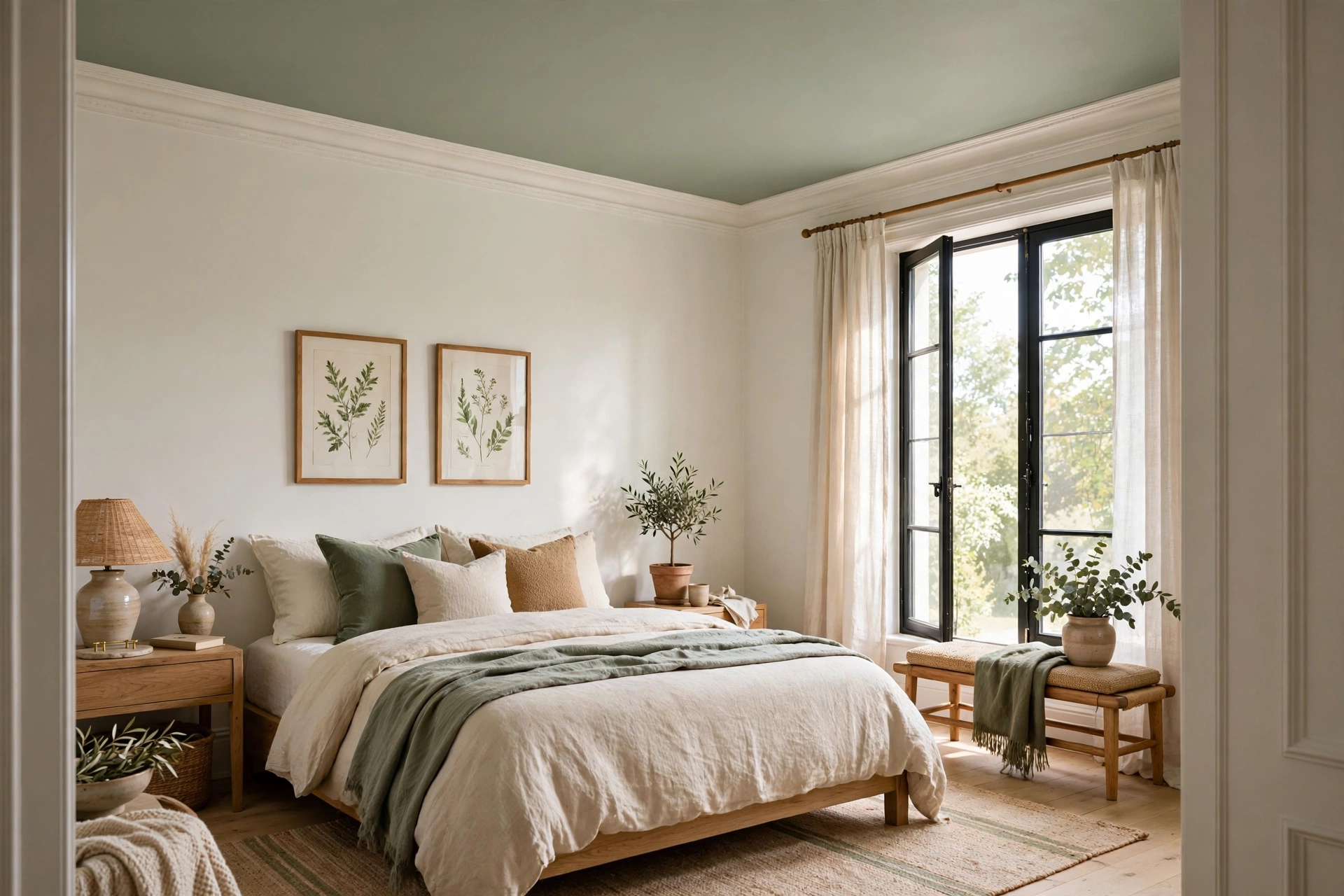
White ceilings are the default, but they’re not the only option — and sometimes not even the best one. The right ceiling color can make a room feel taller, cozier, more dramatic, or more cohesive. Here’s how to think beyond basic white and choose a ceiling color with intention.
When White Is Actually Best
White ceilings work when: you want maximum light reflection, the room has low ceilings (white feels higher), you’re selling (broadest appeal), or the walls are already bold and need visual rest. If you go white, use a flat finish — it hides imperfections and doesn’t compete with walls.
Ceiling Color Strategies
The 50% Lighter Trick
Ask the paint store to mix your wall color at 50% strength for the ceiling. This creates subtle harmony — the ceiling relates to the walls without matching exactly. It works especially well with soft blues, greens, and greiges.
Tonal Ceilings (Same Color, Different Finish)
Paint the ceiling the exact wall color but in flat finish while walls are eggshell. The slight sheen difference creates depth without introducing a new color. This makes rooms feel larger and more enveloping — a designer favorite.
Bold/ Dark Ceilings
Deep navy, charcoal, or forest green ceilings create dramatic coziness. Best in: dining rooms (intimate dinner party vibe), bedrooms (cocoon-like for sleep), powder rooms (jewel-box effect). Avoid in rooms with ceilings under 8 feet unless you want a deliberately cave-like feel.
Warm Whites and Creams
If stark white feels too cold, try Swiss Coffee, White Dove, or Natural Choice on the ceiling. These add warmth without darkening. Particularly good with warm wall colors where bright white would clash.
Ceiling Finish Matters
Always use flat/matte on ceilings. Higher sheens highlight every imperfection — and ceilings have plenty (drywall seams, texture variations, roller marks). Flat paint is forgiving and makes ceilings visually recede.
How Ceiling Color Changes Perceived Room Height
Ceiling color is one of the strongest levers you have over how tall a room feels, and it works through two mechanisms: light reflection and edge definition. Light colors bounce both natural and artificial light back down into the room, which the eye reads as openness. Dark colors absorb light, so the ceiling surface becomes harder to locate visually — it recedes, which can feel either cocooning or oppressive depending on the room.
As a rule of thumb, rooms with ceilings under 8 feet should stay light. A ceiling painted darker than the walls in a low room draws the eye straight up to a surface that is closer than it should be, and the room feels compressed. Rooms with 9-foot ceilings or higher give you real freedom: a dark ceiling up there reads as atmosphere rather than weight, because the surface is far enough away that the eye never feels it pressing down.
🛒 Shop This Look:
The sharpest trick for low ceilings is to eliminate the line where the wall ends and the ceiling begins. When the ceiling is the same color as the walls — or even just a half-tone lighter — there is no visible boundary for the eye to measure, and the wall seems to continue upward indefinitely. This is why tonal ceilings work so well in small bedrooms and hallways. Conversely, a crisp white ceiling against colored walls draws a hard line at exactly 8 feet, and your brain records that measurement. If your goal is spaciousness, soften that line; if your goal is drama, sharpen it.
Pay attention to Light Reflectance Value (LRV), the number on every paint swatch that runs from 0 (pure black) to 100 (pure white). For ceilings meant to lift a room, choose colors with an LRV above 75. For intentional drama — a dining room or media room — anything below 30 will give you that enveloping effect. Between 30 and 75 you are in neutral territory where the ceiling simply matches the room’s mood.
Ceiling Color by Room
Different rooms ask different things of their ceilings, so match the color to the job the room does.
Living room: This is where subtlety usually wins. A ceiling one shade lighter than the walls, or the wall color at 50 percent, keeps the room feeling open without the coldness of stark white. If your living room has warm wood floors and warm-toned walls, a warm white ceiling like White Dove prevents the chilly contrast that bright white creates.
Dining room: The best candidate in the house for a dark ceiling. Dining happens mostly in the evening under warm lighting, when a deep charcoal, navy, or forest green ceiling glows instead of looming. It pulls the room inward around the table and makes pendant lights feel like they are floating. This is the one room where you can safely go dark even with standard 8-foot ceilings, because the evening mood does half the work for you.
Bedroom: Deep, restful colors on the ceiling work beautifully here because you spend time looking at it while lying down. A soft inky blue, deep sage, or warm charcoal overhead feels like a blanket. Keep it muted rather than saturated — you want calm, not energy — and make sure it relates to something else in the room, like bedding or curtains, so it feels intentional rather than random.
Kitchen: Stay light and stay practical. Kitchens need brightness for task work, and ceilings collect cooking residue over time, so choose a quality flat or matte paint (flat hides imperfections best) and accept that kitchen ceilings need repainting more often than other rooms. A pale warm white is the workhorse choice.
Bathroom: Light colors plus a mildew-resistant paint formula. Bathrooms are the one place where the paint’s chemistry matters more than its color: moisture will find any weakness. A soft white or very pale color in a bathroom-specific paint keeps the small space bright and resists the mildew that plagues steamy rooms.
Powder room: The jewel box of the house — small, visited briefly, and the perfect place for a bold ceiling. Because nobody lingers, you can go dramatic: deep teal, aubergine, even a metallic-look finish. It is the lowest-risk place in the house to experiment.
How to Test Ceiling Paint Before Committing
Ceiling color is notoriously hard to judge from a swatch, because you always see it in context — surrounded by wall color, under your specific lighting, from below. Never commit based on the paint chip alone. Buy sample pots and test properly.
🛒 Shop This Look:
Paint two large poster boards (not small swatches — you need scale) with your candidate ceiling colors. Tape them to the ceiling in different parts of the room and live with them for at least 48 hours. Look at them in morning light, afternoon light, and with your lamps on at night. Ceilings look dramatically different under warm evening lighting than under cool daylight, and this is where most color regrets come from.
Test next to your actual wall color, not against white. A ceiling color that looks perfect on its own can clash with your walls’ undertones once they sit together. Hold the board right at the wall-ceiling junction and check whether the undertones agree — a ceiling with pink undertones next to walls with yellow undertones will always look slightly off, even if you cannot name why.
If you are choosing between two close options, paint each on its own board and view them side by side on the ceiling. Subtle differences that are invisible on swatches become obvious at scale. And remember to check the boards with the finish you will actually use — flat paint reads lighter and chalkier than the same color in eggshell, and since ceilings should almost always be flat, test in flat.
Common Ceiling Color Mistakes
Using anything but flat: The most common and most visible mistake. Eggshell or satin on a ceiling acts like a spotlight on every drywall seam, patch, and roller mark. Even on a perfectly finished ceiling, sheen creates distracting bright spots under downlights. Flat paint is non-negotiable for ceilings.
Painting over stains without sealing: Water marks and smoke stains bleed through regular paint, including ceiling paint, no matter how many coats you apply. Spot-prime every stain with a stain-blocking primer first (shellac-based for the stubborn ones), then paint. Skipping this step means repainting the whole ceiling twice.
Choosing the color under store lighting: Paint stores use bright, cool fluorescent lighting that makes colors look cleaner and lighter than they will in your home. Always test in the actual room.
Forgetting the fifth wall in open plans: In open-plan spaces, the ceiling is one continuous surface spanning the living, dining, and kitchen areas. Changing ceiling color at an invisible boundary between zones looks like a mistake. Pick one ceiling treatment for the whole open area and let walls, rugs, and furniture define the zones instead.
Ignoring trim: If your crown molding or trim is bright white and you paint the ceiling a warm cream, the trim will look dingy by comparison. Either match the ceiling to the trim or repaint the trim to harmonize. The ceiling, trim, and walls are a trio — change one and check the other two.
Special Cases
Wood ceilings/beams: Don’t paint them white by default. Natural wood adds warmth and character. If you must paint, consider a soft white that lets the texture show.
Popcorn ceilings: Paint doesn’t fix texture. If you hate it, scrape (test for asbestos in pre-1980 homes first) or cover with thin drywall.
Tray or coffered ceilings: Use the recessed areas for subtle color contrast — paint the inset a shade deeper than the main ceiling for architectural emphasis.
🛒 Shop This Look:



