
As an Amazon Associate, I earn from qualifying purchases. This means I may earn a commission if you purchase through links on this page — at no extra cost to you.
In small rooms, light wallpaper generally works best — it reflects light and keeps the space feeling open. But dark wallpaper can work beautifully in small rooms when used strategically: on one accent wall, in a powder room, or in a room with good natural light. The real answer isn’t light vs dark — it’s about contrast, scale, and lighting.
The Case for Light Wallpaper
Light wallpapers (whites, creams, pale pastels) bounce natural and artificial light around the room, which is the single biggest factor in making a small space feel larger.
They also recede visually — the walls feel farther away. For the safest small-room
choice, a light wallpaper with a subtle texture is nearly foolproof.

NuWallpaper x Society Social Cream Cashmere Classic Faux Grasscloth Peel & Stick Wallpaper, SSS6013
Best for a light, textured small room that still feels open and calm.
The Case for Dark Wallpaper
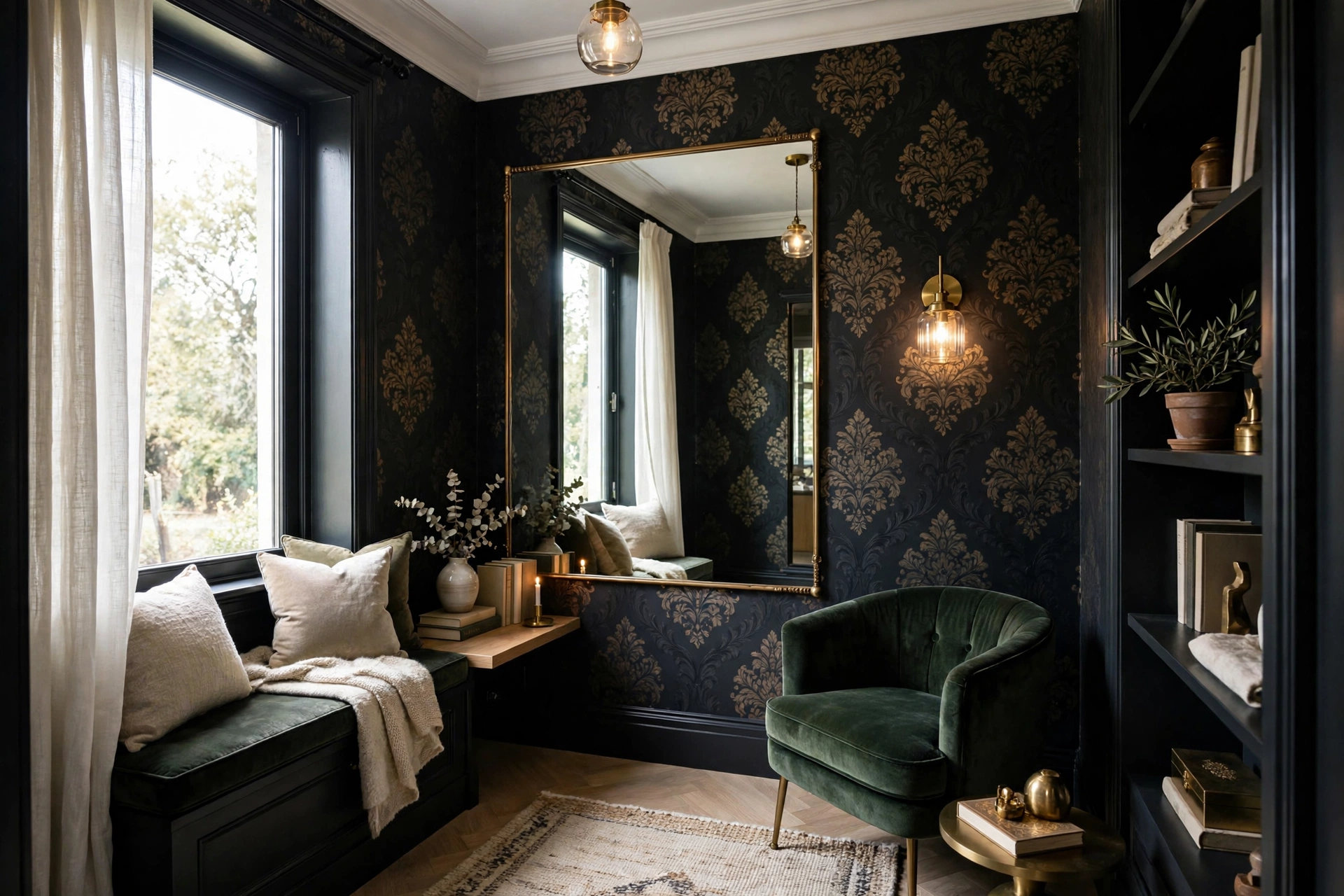
Dark wallpaper doesn’t make small rooms feel smaller — it makes them feel intentional. A deep charcoal, navy, or forest green blurs the corners of a room, which can actually make boundaries disappear. Powder rooms, small dining rooms, and cozy dens are where dark wallpaper shines brightest. The trick: balance with good lighting and lighter furnishings.
TOTIO Grey Concrete Wallpaper Peel Stick, Dark Cement Look, Charcoal Gray, 32×78 inch
Best for a dramatic dark accent wall or powder room that still feels intentional.
What Actually Matters More Than Light vs Dark
- Pattern scale: Large-scale prints make small rooms feel bigger regardless of color; tiny busy patterns feel chaotic.
- Contrast: Low-contrast (tone-on-tone) wallpapers recede; high-contrast patterns advance. In small rooms, lower contrast is safer.
- Lighting: A well-lit dark room beats a dim light room every time.
- Ceiling: Continuing the wallpaper onto the ceiling eliminates the visual “lid” and adds height.
Best Wallpaper Patterns for Small Rooms
Pattern choice influences spatial perception more than color does, and small rooms reward specific pattern strategies. Large-scale patterns are the counterintuitive winner: oversized florals, big geometrics, and expansive motifs make walls feel farther away because the eye reads fewer repeats as a larger surface. A small room with a large-scale pattern feels curated and intentional; the same room in a tiny busy print feels cluttered and chaotic. When sampling, hold the sample at arm’s length — if you cannot distinguish the motif easily, the scale is too small for the effect you want.
Vertical stripes are the classic small-room tool because they draw the eye upward, emphasizing height over width. The effect is real but conditional: stripes need sufficient contrast to register as vertical lines, but too much contrast advances the walls visually and shrinks the room. The sweet spot is tone-on-tone or low-contrast striping — subtle vertical movement without visual shouting. Wide stripes (4+ inches) feel modern and calm; narrow pinstripes feel traditional and can read as busy in very small rooms.
Murals and panoramic wallpapers are the boldest small-room move and often the most successful. A mural with depth — a landscape, an architectural scene, a misty forest — creates the illusion of space beyond the wall, effectively “adding” visual square footage. Powder rooms with scenic murals feel dramatically larger than their dimensions. The key is choosing murals with atmospheric perspective (softer, lighter in the distance) rather than flat graphic murals, which decorate without expanding.
Textured and grasscloth-look wallpapers are the safe luxury option: they add richness and tactility without any pattern to fight the room’s scale. In small rooms, texture reads as sophistication — the walls have depth without demanding attention. Tone-on-tone damasks and subtle geometrics occupy the middle ground: pattern interest at low visual volume. What to avoid: small high-contrast geometrics (they vibrate visually and shrink rooms), novelty prints at small scale (they read as clutter), and horizontal stripes (they emphasize the room’s narrowness — the opposite of what you want).

NextWall Classic Striped Check Peel and Stick Wallpaper (Charcoal & Linen)
Best for adding vertical, low-contrast pattern that draws the eye up in a small room.
Lighting Tricks That Make Any Wallpaper Work
Lighting is the variable that makes dark wallpaper succeed or fail in small rooms — more decisive than the wallpaper choice itself. The fundamental rule: a well-lit dark room always beats a dimly lit light room. Dark wallpaper absorbs light, so you must supply more of it: aim for three light sources minimum in a small dark-walled room (overhead + task + accent), where a light-walled room might need only two. Layered light eliminates the cave effect that gives dark small rooms their bad reputation.
Wall washing is the specific technique that transforms dark wallpaper. Picture lights, wall-mounted sconces, or adjustable recessed lights aimed to graze the wallpapered wall create pools of light that reveal the pattern’s depth and keep the wall visually present rather than receding into blackness. The grazing angle also flatters textured wallpapers spectacularly — grasscloth and embossed patterns come alive under raking light in ways flat lighting never achieves. If you can only add one light to a dark-papered room, make it a wall washer.
Mirrors multiply whatever light exists and are essential companions to dark wallpaper in small rooms. A large mirror opposite or adjacent to a window doubles the natural light; even opposite a lamp, it doubles the lamp. Metallic and mica-flecked wallpapers interact beautifully with light — their subtle shimmer brightens dark patterns from within. Bulb temperature matters too: warm light (2700-3000K) flatters dark, cozy wallpapers and makes small rooms feel inviting; cool daylight bulbs on dark walls can feel stark and institutional.
Do not forget natural light management. Sheer curtains (not blackout) on small-room windows maximize daylight while providing privacy — dark wallpaper needs every photon. Keep window glass clean (dirty glass cuts surprising amounts of light), trim exterior foliage blocking windows, and consider the room’s orientation: north-facing small rooms get cool, dim light that struggles against dark wallpaper, while south-facing rooms flood with light that makes even near-black wallpaper workable. Match the wallpaper’s darkness to the room’s actual light, not its imagined light.
Small-Room Wallpaper Mistakes to Avoid
The most damaging mistake is wallpapering all four walls in a high-contrast, small-scale pattern. Each wall shouts, the corners chop the pattern awkwardly, and the room feels like the inside of a jewelry box — dazzling for a minute, oppressive to live in. If you love a bold pattern, commit it to one accent wall (ideally the wall you face when entering) and paint the others in a coordinating solid pulled from the paper. You get the drama without the enclosure.
Ignoring the ceiling is the second mistake. A white ceiling above dark wallpaper creates a harsh visual “lid” that emphasizes the room’s smallness — the eye stops dead at the ceiling line. Continuing the wallpaper onto the ceiling (or painting the ceiling a tint of the wall color) erases that boundary and adds perceived height; it is the single most effective trick for cozy rooms. In small rooms with dark wallpaper, a dark ceiling feels counterintuitively larger than a white one because the boundaries disappear.
Scale errors in sampling cause the third mistake. A 8×10-inch sample cannot represent how a large-scale pattern fills a wall — the sample shows one motif, the wall shows the rhythm. Always order the largest sample available, tape multiple samples together to see repeats, and view them on the actual wall in the room’s light. Better yet, many companies offer large swatches or sample rolls; the small extra cost prevents the most expensive mistake (wallpapering a room in the wrong pattern).
Other pitfalls: pairing busy wallpaper with busy furnishings (one pattern star per room — if the wallpaper is bold, keep textiles solid), choosing dark wallpaper for a room with genuinely poor light and no plan to add lighting (the wallpaper is not the problem; the darkness is), and forgetting the fifth wall — the floor. A dark wallpaper with a dark floor doubles the cave effect; lighter flooring or a light rug balances dark walls. Every surface participates in the small room’s perception; wallpaper is just the loudest voice.
Wallpaper Finishes and Textures for Small Spaces
Finish — the surface sheen of the wallpaper — affects small rooms as much as pattern. Matte finishes absorb light and recede, making them the safest choice for small rooms in any color; they also hide wall imperfections best. Subtle sheens (satin, silk-effect) reflect light gently and can brighten small rooms, but they also highlight every bump and patch in the wall underneath — wall prep matters more with sheen. Metallic finishes (gold, silver, mica flecks) are the secret weapon for dark small rooms: they catch and scatter light, keeping dark patterns luminous rather than flat.
Texture adds the dimension that flat print cannot. Grasscloth and natural fiber wallpapers bring organic warmth that makes small rooms feel curated rather than cramped — the texture gives the eye something to explore, which paradoxically makes walls feel larger (visual interest reads as spaciousness). Embossed and flocked wallpapers add tactile luxury; in small doses (a powder room, a headboard wall) they are stunning, but full-room flock in a tiny space can overwhelm. Textured vinyls offer grasscloth’s look with scrubbability — the practical choice for small high-traffic spaces.
Consider the hand-feel test when sampling: run your fingers over the sample. Quality textured wallpapers feel substantial and even; cheap ones feel papery or have visible backing show-through at the edges. In small rooms where walls are always within arm’s reach, texture quality is constantly experienced — it is worth the upgrade. And remember that texture collects dust; in small rooms, a quick vacuum with a brush attachment every few months keeps textured walls looking fresh.
Combining finishes strategically elevates small rooms: matte on most walls with a metallic or textured accent wall, or grasscloth throughout with crisp white trim for contrast. The trim contrast matters enormously in small rooms — sharp white baseboards and crown against wallpapered walls define the architecture and prevent the paper from blurring the room’s edges into mush. Never skip the trim refresh when wallpapering; it is the frame around the art.

JiffDiff Woven Wallpaper Peel and Stick, Grasscloth, Gray, 17.3" x 120"
Best for adding woven, natural-fiber texture to a small room without a busy pattern.
Accent Wall Strategies for Small Rooms
The accent wall is the small room’s best friend — all the wallpaper drama with none of the enclosure risk. Placement is everything: the ideal accent wall is the one you face when entering the room (the headboard wall in bedrooms, the sofa wall in living rooms, the vanity wall in powder rooms). This wall gets the pattern; the remaining walls get a coordinating solid. The eye lands on the beautiful wall immediately, and the plain walls recede — the room feels designed rather than decorated.
Color-pulling is the technique that makes accent walls look professional: choose the solid paint color from within the wallpaper pattern (the background tone or a secondary motif color). This creates a seamless relationship between the walls — the solid walls feel like an extension of the paper rather than an unrelated choice. Paint stores can color-match from a wallpaper sample; bring a generous cutting. When the solids harmonize, even bold accent wallpapers feel integrated.
Architectural features make natural accent walls: the fireplace wall, a wall with built-in shelving (wallpaper the back of the shelves for depth), the wall behind the bed, or a nook/alcove. Wallpapering inside an alcove or niche turns awkward architecture into a deliberate feature — the recessed space becomes a jewel box. In open-plan small spaces, an accent wallpaper wall can also define zones: the dining zone’s wall in pattern distinguishes it from the living zone without any physical barrier.
Commitment-phobes have options: peel-and-stick wallpaper makes accent walls renter-friendly and reversible, and a single wall is the ideal peel-and-stick project (manageable size, low stakes, easy to redo if the first attempt has flaws). Even painted accent walls with stenciled or mural techniques achieve the effect. The principle is universal regardless of material: one wall of pattern, resting walls of calm, and the small room gains personality without losing spaciousness.

Best for smoothing a peel-and-stick accent wall and finishing its seams cleanly.

Roman’s E-Z Hang Peel & Stick Wallpaper Helper, Clear, Non-Staining, 32 Fluid Ounces
Best for repositioning peel-and-stick wallpaper on a small accent wall.
The Verdict by Room
Small bedroom: Light wallpaper, or dark on the headboard wall only.
Powder room: Go dark and dramatic — the one room where bold always works.
Small living room: Light with texture, or a medium tone with large-scale print.
Home office nook: Medium tones hide video-call background clutter best.
🛒 Shop This Look:
🛒 Shop This Look:
🛒 Shop This Look:



